Fluentui: RFC: Intent to contribute FAST web components for FluentUI
Overview
FAST is a collection of JavaScript packages centered around web standards, designed to help you efficiently tackle some of the most common challenges in website and application design and development. For over a year now, we've been syncing regularly with several of the folks involved with the FluentUI effort in an effort to continually find opportunities to align and converge. We're also an active part of the W3C Open UI effort. While we've always had a desire to converge from a code standpoint, previous requirements and deltas in implementation made it difficult to do so with our now deprecated/archived React implementation. As we've made the shift to focus solely on web components (HTML Custom Elements), we believe now is a great time to partner on the FluentUI effort and provide a Web Component offering built on FAST.
Currently there is a MSFT package of components which lives in the FAST repository, we'd like to bring that here and make it a FluentUI offering.
Goals & Convergence
Our long term goals for this would be to have alignment across design, as well as having unified API and terminology that aligns with the patterns established in Open UI. Considering that there are teams both inside and outside Microsoft leveraging these controls, and knowing that certain design requirements feed certain technical implementations, we do see some of this as a longer-term goal. Some things may be easier to align on than others, but we don't believe that the current divergence is a reason to block this move.
Proposed model for pursuing convergence
In the short term, we'd like to move the package over and continue our development openly here as a first step. As we identify gaps in current conventions, potentially new requirements, or opportunities to find alignment, we'd like to drive and track those through Github issues. The design issues and things like how we calculate and apply color will likely be larger areas and require a bit more investment across our own design partners and teams. Ultimately though, we are committed to doing so and believe that moving forward will create the momentum needed to make this happen. Anything that relates to component naming, parts, or anatomy we are committed to resolving through Open UI.
What this means in regards to FAST
In FAST, we primarily focus on primitives, common UI patterns, utilities, and some composed components or experiences for our own FAST design system implementation (shown on our component explorer). We have several layers that make up FAST. I won't go into a ton of detail on these as there is plenty of documentation on the site, but I do want to highlight a couple of important things about the packages and how it may impact convergence.
fast-element:
The fast-element library is a lightweight means to easily building performant, memory-efficient, standards-compliant Web Components. FAST Elements work in every major browser and can be used in combination with any front-end framework or even without a framework.
fast-foundation:
The fast-foundation package is a library of Web Component classes, templates, and other utilities intended to be composed into registered Web Components by design systems (e.g. Fluent Design, Material Design, etc.). The exports of this package can generally be thought of as un-styled base components that implement semantic and accessible markup and behavior.
This package does not export Web Components registered as custom elements - it exports parts and pieces intended to be composed into Web Components, allowing you to implement your own design language by simply applying CSS styles and behaviors without having to write all the JavaScript that's involved in building production-quality component implementations.
The Web Component classes defined in fast-foundation should provide the base functionality of a given component without the prescriptive semantics specific to a give design language. While a Fluent button may have defined appearances, these would be defined when the button is composed, rather than on the primitive. In the event I wanted to create a "navigation-item" component, I may not have a need for those appearances. This should help enable convergence as we can focus our efforts in FAST on supporting much of the base functionality for these components, while leaving more prescriptive attributes and choices up to the implementor - in this case, our work here in FluentUI. We follow this pattern for our FAST components and would be committed to preserving that here. From our conversations with the Fluent UI team, we believe we're aligned here 🎉 .
fast-components: This is the last layer we export, in addition to the fast-components-msft which we are proposing to move over here. This is a library of Web Components that composes the exports of fast-foundation with stylesheets aligning to the FAST design language, whereas the MSFT package is more closely aligned with Microsoft's design language.
_NOTE: The fast-components package would not be a dependency brought in, it is simply our own composed components with our FAST design system and denoted here for awareness of how we build components._
Existing Package
As mentioned above, to start, I'd like to raise a PR to move the existing fast-components-msft package into the repo and have our team continue our work here. This will create some awareness, transparency, and help us start working more closely towards convergence across our parts, tokens, anatomy, etc. The current package takes a dependency on fast-element and fast-foundation and provides the following primitives:
- accordion
- anchor
- badge
- button
- card
- checkbox
- design-system-provider ("Fluent" design system)
- dialog
- divider
- flipper
- menu
- menu-item
- progress
- radio
- radio-group
- slider
- slider-label
- switch
- tabs
- text-area
- text-field
- tree-view
- tree-item
We are currently tracking several others and actively working on select. That work would continue here once we migrate the package into the FluentUI repository. As part of our work on convergence, we're happy to explore and land a new thoughtful name for the package that aligns with the FluentUI repo. For the time being, to prevent regressions and churn for existing partners, we would request that no changes be made as part of the move.
What about non-primitives which currently exist in FluentUI:
My personal hope is that we begin to build these out as well over time. Moving to FluentUI will give us the opportunity to create more bespoke Fluent controls which don't necessarily fit within the model we have in FAST. Once we land the final primitives I hope we can move towards more complex and composed patterns that exist elsewhere in Fluent.
Ownership
As our team remains SME's on FAST and the patterns for building web components, and since we have a deep knowledge of the requirements of those currently leveraging this package, we would request to be the sole owners of this package for the time being. We have an existing model for bringing on new codeowners and would be happy to evaluate that process with the team here. My hope is that folks excited about the effort would contribute and we would have the opportunity to include those making valuable contributions to the package over time as Code Owners, even replacing folks from our side as owners.
Final Thoughts
We are excited about the possibility of moving the fast-components-msft package here and providing a FluentUI Web Component offering for those inside and outside Microsoft. We believe this benefits FAST, FluentUI, and ultimately the web development community. I'm excited to open this RFC. Please do feel free to add any questions or comments you have!
Thanks,
The FAST Team
 chrisdholt
All 3 comments
Super exciting! One Microsoft!
 dzearing
on 17 Jul 2020
dzearing
on 17 Jul 2020
Are you going to keep the components simple and just style them according to FluentUI design? Or are you going to re-create the react FluentUI components as web components for FAST?
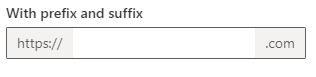
I noticed that fast-text-field has a start and end slot that would allow one to mimic the FluentUI react component TextField where you can have a "prefix" and "suffix". (The styling is not set though.)
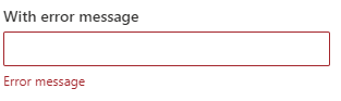
But what about an error message (for validation) or a required symbol?
It seems there are two goals for FAST:
- To make your components work in any framework.
- To make a universal set of components that you can style for any UI design system.
Are you planning to just style your universal components to FluentUI? Or are you going to recreate the react components?
If styling universal components only, how are you deciding to add extra functionality to these universal components? For example, adding the start and end slot to text-field, even though that is not normally part of a form input. What stops you from adding more?
I guess from re-reading the main post, how do you decide on the primitives? So for a complete port of the react TextField component, it won't be a primitive since it's got more functionality than your text-field?
 limefrogyank
on 23 Jul 2020
limefrogyank
on 23 Jul 2020
Hey @limefrogyank, thanks for reaching out and asking these questions! For such simple questions there is quite a bit to unpack here. For context, as I speak to the goals here in Fluent UI, I'll be speaking primarily from a place of intent and long term goals. I do want to leave room for some of this to change as we partner with the Fluent team to bring a web component offering to FluentUI. My answers below are not intended to speak for the overall Fluent team but as a maintainer of FAST and how we have and are approaching some of these things.
Are you going to keep the components simple and just style them according to FluentUI design? Or are you going to re-create the react FluentUI components as web components for FAST?
The short answer here is "Yes, both - and...". I think we'll have some simple components which will primarily be a styling issue. Some may already be fairly close; the package we are contributing is an implementation of Fluent principles that's primarily lived in our repo up until now. Button is a common example here, but likewise, I think Text Field is another where much of that may just be a matter of updating or further aligning the visual system. Part of this will also be creating controls which are specifically "Fluent" that don't exist and don't fit in the FAST ecosystem. Perhaps not the best examples, but sometimes some of these patterns are variations on primitives which are commonly used across apps and sites.
Consider the following variations of a button:
- Compound button
- Call to action
- Icon button
- Split button
While all of these could be created and composed with simple FAST primitives, we want to add value by providing some of these controls for use out of the box. If everything always has to be composed, I'm not sure that would benefit those looking for a Fluent compound button. The question is less of a matter of whether we'll provide these controls, but what is the best way to implement that (do we overload button, is it separate, etc). My hope is that we have that conversation transparently by proposing solutions through GH issues. The nice thing here is that if there is a common "Microsoft" thing which may not qualify as a primitive that should exist in FAST, we can still build that as a Fluent control.
What I do want to stress is that when we build these Fluent controls, I'm not sure we can promise parity in terms of implementation. This is something I'm certain we'll be discussing with the Fluent team more in-depth, but while React and Web Components are both in the web space, there are patterns which are unique to each. Beyond the technological requirements, I think it's important as we look to create something "technically" net-new, that we take as fresh a look at it as we can. For context, many of the web components we have today, started as React components. In FAST, we took a hard line to revisit every decision and not take on the debt of previous implementations. This may be a bit controversial, but I do think the exercise is valuable. Just because something was the way, doesn't mean it's the right way. To be a bit blunt, if there were a control which already exists in React that we were building, we would explore how we can best support all those scenarios, but it would not be a port or clone of the React implementation. It may end up that way in the end, but our goal going into the exercise would be to deliver the component (or components) and not a specified implementation. Hopefully that makes sense.
To bring this back to the example above, the question I would ask for both examples above is, "What is the goal of these two designs, and how can we best support that?" In some cases, such as the instance with a prefix and suffix that may be the inclusion of conditional styles at the Text Field layer. Alternatively, perhaps it's search functionality and a Search component is warranted there to provide a more robust API. For the error message example - "How do we provide the ability to hook error messages into the controls and what are the implications there (spacing, styling, etc)." I can't speak to exact implementation here, but I can say that if the above exists in Fluent UI today, there is likely a principle being applied and we will look to do that in a way that meets the requirements and enables the flexible, extensible, and performant UI.
This leads to the larger and more important question you asked, which is "How do you decide on primitives?" There are a few things we consider but two primary things which drive how we approach this:
Is it a common interaction model or pattern as defined by the W3C? FAST wants to provide the parts needed to create extensible and accessible instances of these.
Is it a very common pattern across design systems. We are committed to aligning our anatomy, naming, parts, etc through Open UI. Currently, we are working on adding "Breadcrumb" and "Avatar" as foundational controls. Breadcrumb has common patterns which aren't explicitly called out by the W3C and Avatar is a common pattern. When looking at something like "Avatar", our goal is to find the commonalities across systems and hoist those to have first party support. The goal is not to elevate every possible permutation or implementation detail to FAST, but to elevate those which are common. An example of this is something like "appearances" of buttons (accent, neutral, stealth, lightweight aka link). While those are common in design system implementations, the semantics are typically unique to the system and not common across all buttons. In that case, we want to be sure we can enable those goals to be accomplished while not hoisting it to the primitive. Similarly, if most "Avatars" aren't clickable, we likely would look at how that can be enabled in an implementation.
When we go to add a primitive, we write a spec to articulate the case, illustrate the usages, and propose a common API that can hopefully enable the common instances and allow for extensibility. Outside components we do tend to try and identify common utilities we can export as well which may be leveraged by components, but the above is a very brief overview on how we think about and identify our primitives.
Hopefully that adds a bit more context to how we think through these things. My hope is that we will eventually support, in some fashion, all the controls that the Fluent UI team currently offers in their React package. I just can't commit to parity in terms of how that is implemented or consumed. What I can commit to is that we'll strive to build these patterns transparently, in the open, and in conversation with the community.
For such a straight forward question, there is a lot to unpack there 😄 . Please let me know if you need clarity on any of the above or have follow up questions!
chrisdholt
on 23 Jul 2020
Related issues
 carruthe
·
3Comments
carruthe
·
3Comments
carruthe
·
3Comments
carruthe
·
3Comments
 satbai
·
3Comments
satbai
·
3Comments
 nekoya
·
3Comments
nekoya
·
3Comments
 VincentBailly
·
3Comments
VincentBailly
·
3Comments
Most helpful comment
Super exciting! One Microsoft!