Fluentui: The Text Color of Disable Label in High Contrast Mode is Wrong
Environment Information
- Package version(s): (fill this out) latest
- Browser and OS versions: (fill this out) Chromium Edge 81.0.416.64
Describe the issue:
Please provide a reproduction of the issue in a codepen:
https://codepen.io/lijinglin29/pen/RwWVJXW
Actual behavior:

Expected behavior:
The text in disabled text color, which is:

 Lijing29
All 8 comments
I'm not sure that the green should be expected.
 aneeshack4
on 27 Apr 2020
aneeshack4
on 27 Apr 2020
@Lijing29 I am able to reproduce this, I'm guessing there is something wrong in the azure theme because this seems to work fine with the default theme. We'll take a look.
 joschect
on 28 Apr 2020
joschect
on 28 Apr 2020
When we set the text to be disabled, it should follow the system design in high contrast mode. In black-on-white mode, the disabled text color is the green. In other words, what the disabled text color is depends on the mode and the system setting.
Below figure is from https://docs.microsoft.com/en-us/windows/uwp/design/accessibility/high-contrast-themes

Another useful doc is https://developer.mozilla.org/en-US/docs/Web/CSS/@media/-ms-high-contrast
Lijing29
on 28 Apr 2020
@Lijing29 I am able to reproduce this, I'm guessing there is something wrong in the azure theme because this seems to work fine with the default theme. We'll take a look.
Thanks~
Lijing29
on 28 Apr 2020
@hyoshis, @Jacqueline-ms, @wsmd, - as codeowners of azure-theme, is this something you all could pickup and fix?
 JustSlone
on 8 Aug 2020
JustSlone
on 8 Aug 2020
@JustSlone absolutely, thanks for bringing to our attention. I will follow the high contrast theme doc provided and report back shortly.
 Jacqueline-ms
on 19 Aug 2020
Jacqueline-ms
on 19 Aug 2020
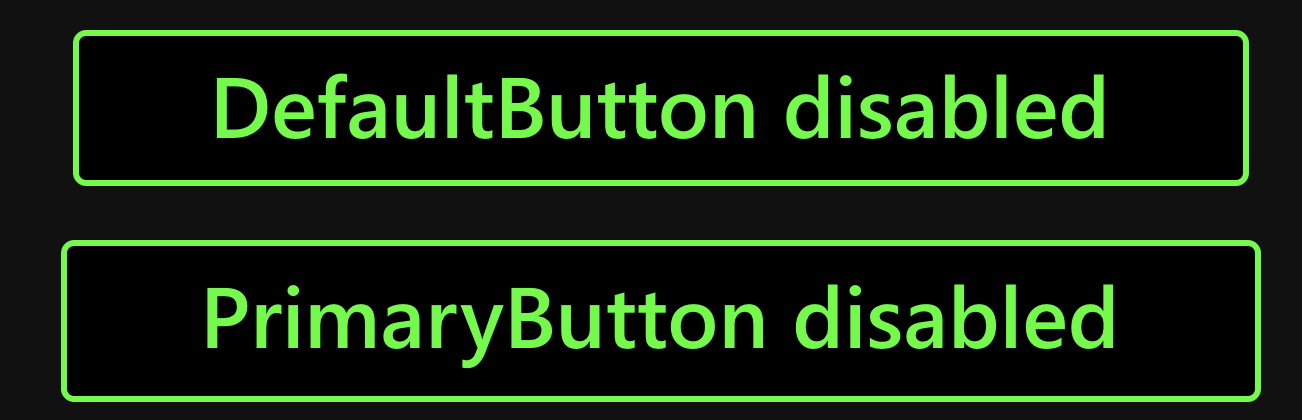
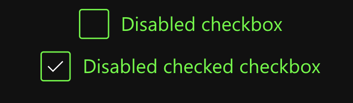
High contrast dark

High contrast light


If you notice any discrepancies (such as high contrast dark vs light checkboxes) we followed exactly what is in the portal playground and are actively making design recommendations.
The last 2 commits in PR https://github.com/microsoft/fluentui/pull/14534 address this bug!
Jacqueline-ms
on 21 Aug 2020
Fixed by #14534, closing
JustSlone
on 14 Sep 2020
Related issues
 gabrielruss
·
3Comments
gabrielruss
·
3Comments
 luisrudge
·
3Comments
luisrudge
·
3Comments
 justinwilaby
·
3Comments
justinwilaby
·
3Comments
 satbai
·
3Comments
satbai
·
3Comments
 mattcoxonline
·
3Comments
mattcoxonline
·
3Comments
Most helpful comment
@JustSlone absolutely, thanks for bringing to our attention. I will follow the high contrast theme doc provided and report back shortly.