Fluentui: Datepicker calendar content illegible in dark mode
Environment Information
- Package version(s): none
- Browser and OS versions: Version 79.0.3945.117
Please provide a reproduction of the bug in a codepen:
Actual behavior:
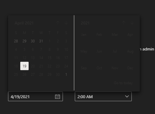
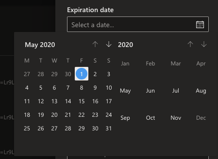
Calendar days are illegible on components demo site in dark mode.
Not sure if it the bug is reproducing in npm packages since I've never used the library.
https://developer.microsoft.com/en-us/fabric#/controls/web/datepicker

Expected behavior:
Calendar works in dark mode on the demo website.
Priorities and help requested:
Are you willing to submit a PR to fix? (No)
Requested priority: (Normal)
 macimaging
All 11 comments
Hi @macimaging thanks for filing this issue! I can confirm that I can repro this behavior on the website.
@marygans you recently added the Dark mode functionality, right? Do you know the right steps to get what the correct design should be for the DatePicker and Calendar components?
 khmakoto
on 30 Jan 2020
khmakoto
on 30 Jan 2020
I just hit this same issue. Any known workarounds?
 jeffersoneagley
on 4 Feb 2020
jeffersoneagley
on 4 Feb 2020
Hi @machineloop and @jeffersoneagley, the DatePicker and Calendar components are pulling some styles from the sass stylesheets currently. There is a way to override the theme styles though using SASS directly.
But I'm thinking long-term it needs to be fully converted to CSS-in-JS, since dark mode design doesn't convert well for these variables. I'm investigating this and will get back to you ASAP one an approach is confirmed.
 marygans
on 5 Feb 2020
marygans
on 5 Feb 2020
@marygans any updates on this?
khmakoto
on 13 Mar 2020
Here is a short term fix.
CSS, if you want to hard code colors for a typical dark theme (change colors as needed):
.ms-DatePicker-table td {
    color: white;
 }

 .ms-DatePicker-header div {
    color: white;
 }

 th.ms-DatePicker-weekday {
    color: white;
 }

 button.ms-DatePicker-prevMonth {
    color: white;
 }

 button.ms-DatePicker-nextMonth {
    color: white;
 }

.ms-DatePicker-table td[class*=dayIsHighlighted][class*=daySelection] {
    background-color:#605e5c !important;
}
In code, using semantic colors (may not work for IE):
        let css: CSSStyleSheet = document.styleSheets[0] as CSSStyleSheet;
        css.insertRule(".ms-DatePicker-table td {color: " +  myTheme.semanticColors.bodyText + "}", 0);
        css.insertRule(".ms-DatePicker-header div {color: " +  myTheme.semanticColors.bodyText + "}", 0);
        css.insertRule(".th.ms-DatePicker-weekday {color: " +  myTheme.semanticColors.bodyText + "}", 0);
        css.insertRule("button.ms-DatePicker-prevMonth {color: " +  myTheme.semanticColors.bodyText + "}", 0);
        css.insertRule("button.ms-DatePicker-nextMonth {color: " +  myTheme.semanticColors.bodyText + "}", 0);
        css.insertRule(".ms-DatePicker-table td[class*=dayIsHighlighted][class*=daySelection] {background-color: " +  myTheme.semanticColors.disabledBodySubtext + " !important}", 0);
Hope this helps.
 BizH
on 15 Mar 2020
BizH
on 15 Mar 2020
We are also seeing this issue in our repo. Would love a cleaner path forward.
 mltejera
on 25 Mar 2020
mltejera
on 25 Mar 2020
same here, cannot use date picker component currently in dark mode.
 tavikukko
on 26 Mar 2020
tavikukko
on 26 Mar 2020
Please fix this issue, customer experience is terrible:
 bhushan2511
on 24 Apr 2020
bhushan2511
on 24 Apr 2020
The Calendar component dark mode did not get fixed by this merged #12423 PR after installing the latest office-ui-fabric-react 7.110.0.
tavikukko
on 1 May 2020
This is still not working, could you please take a look? @marygans
bhushan2511
on 1 May 2020
ok got it working,
You need to import the fixed themes from theme-samples package. When applying the DarkCustomizations theme to the app, then the DatePicked component works correctly.
import { DarkCustomizations, DefaultCustomizations } from '@uifabric/theme-samples'
/* our other code */
return (
 <Fabric>
  <Customizer {...DarkCustomizations}>
  </Customizer>
 </Fabric>
)
So the fix was made in the theme, not the component it self.
tavikukko
on 2 May 2020
Related issues
 prashkan
·
3Comments
prashkan
·
3Comments
 gabrielruss
·
3Comments
gabrielruss
·
3Comments
 VincentBailly
·
3Comments
VincentBailly
·
3Comments
 justinwilaby
·
3Comments
justinwilaby
·
3Comments
 carruthe
·
3Comments
carruthe
·
3Comments
Most helpful comment
Hi @macimaging thanks for filing this issue! I can confirm that I can repro this behavior on the website.
@marygans you recently added the Dark mode functionality, right? Do you know the right steps to get what the correct design should be for the
DatePickerandCalendarcomponents?