Fluentui: Color contrast of Label of disabled dropdown fails test
Environment Information
- Package version(s): 7.64.2
- Browser and OS versions: Version 78.0.3904.108 (Official Build) (64-bit)
Describe the issue:
Color contrast test fails on label color for disabled dropdowns.
Please provide a reproduction of the issue in a codepen:
The issue present on the official office ui fabric website
https://developer.microsoft.com/en-us/fabric#/controls/web/dropdown
Actual behavior:
Color contrast test fails on label color of disabled dropdown
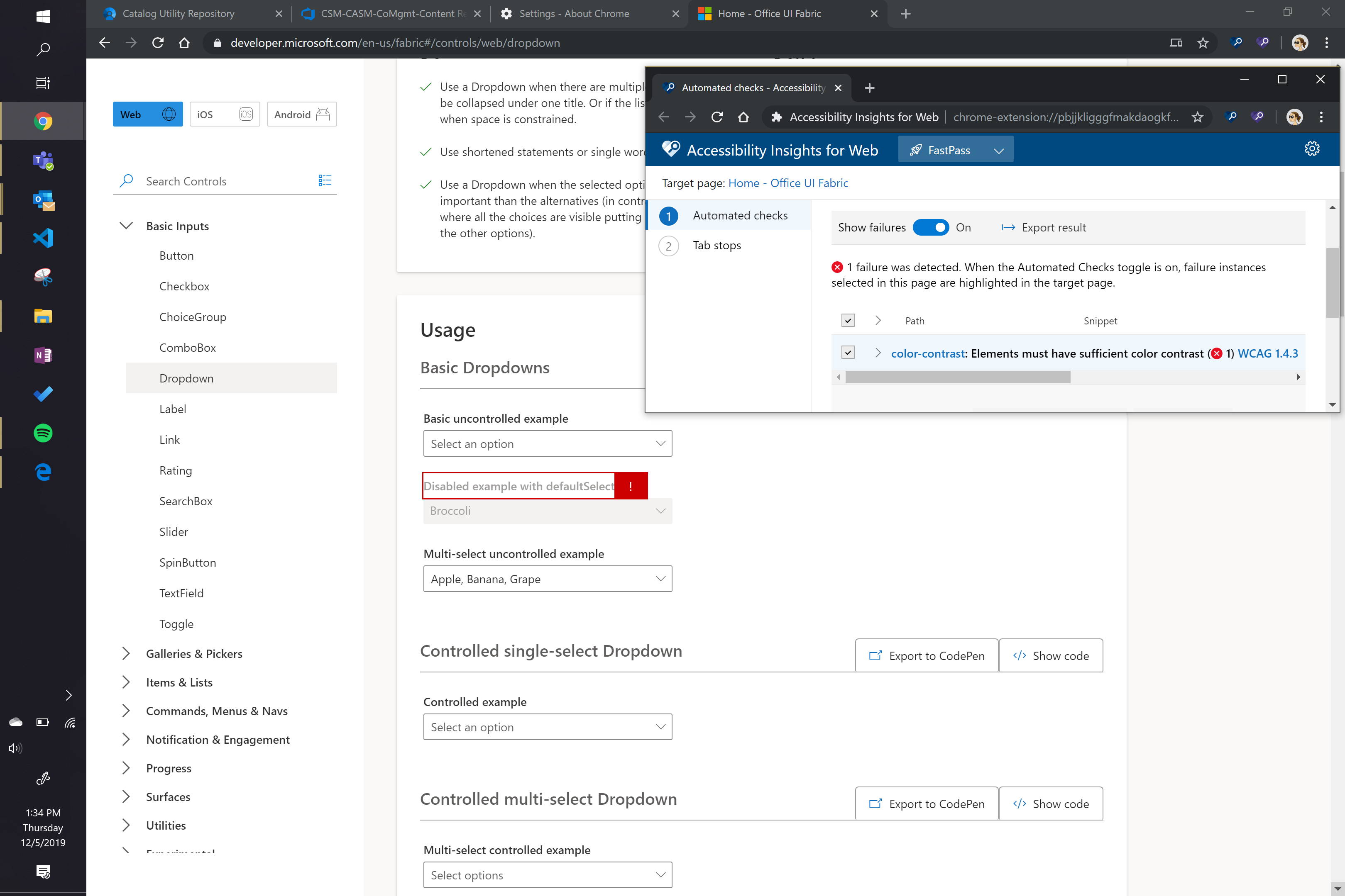
Here are the details of this bug

Expected behavior:
The color contrast should not be this low.
Documentation describing expected behavior
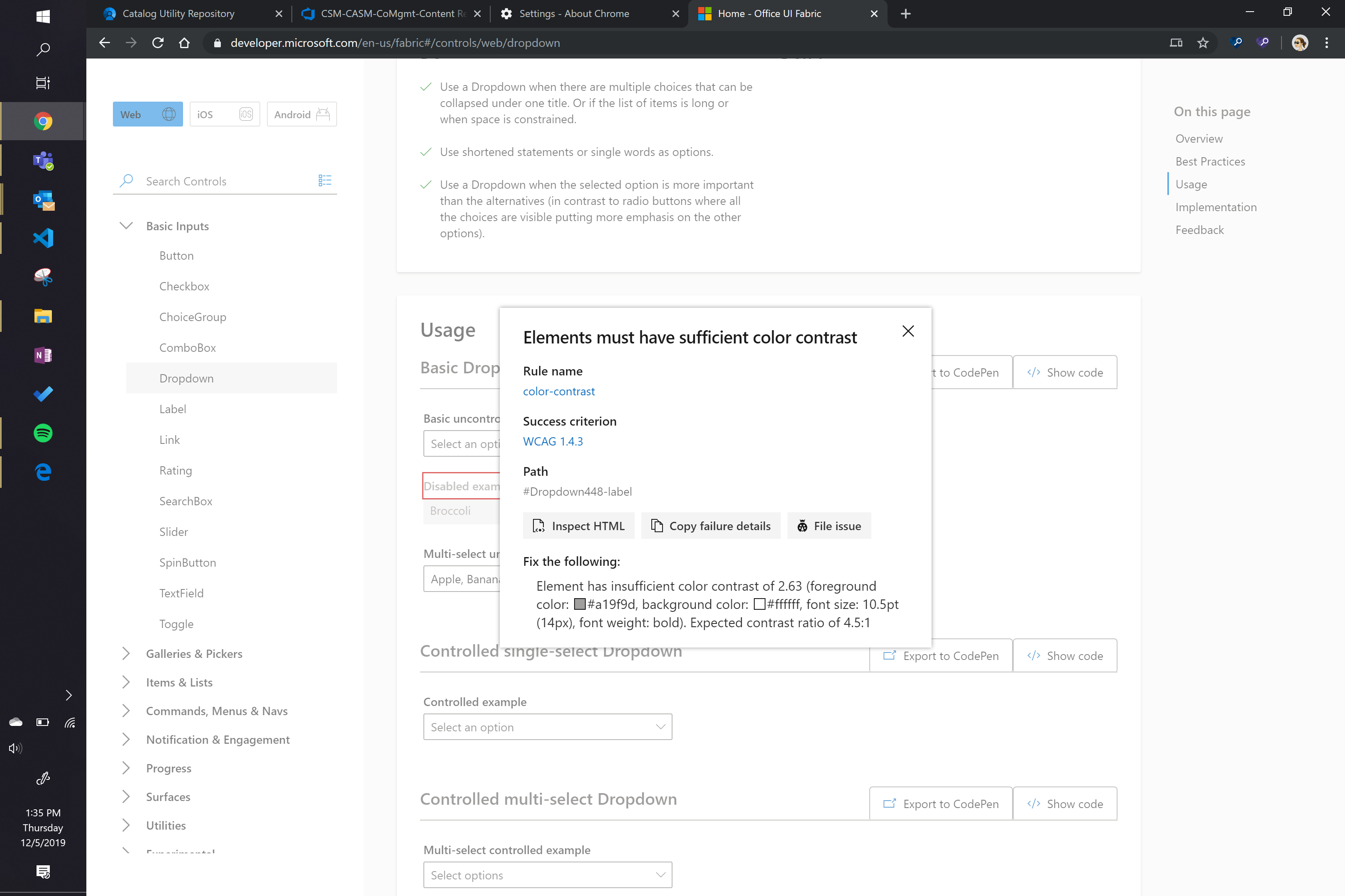
Title: WCAG 1.4.3: Elements must have sufficient color contrast (#Dropdown448-label)
Tags: Accessibility, WCAG 1.4.3, color-contrast
Issue: Elements must have sufficient color contrast (color-contrast - https://dequeuniversity.com/rules/axe/3.3/color-contrast?application=msftAI)
Target application: Home - Office UI Fabric - https://developer.microsoft.com/en-us/fabric#/controls/web/dropdown
Element path: #Dropdown448-label
Snippet:
How to fix:
Fix any of the following:
Element has insufficient color contrast of 2.63 (foreground color: #a19f9d, background color: #ffffff, font size: 10.5pt (14px), font weight: bold). Expected contrast ratio of 4.5:1
Environment: Chrome version 78.0.3904.108
====
This accessibility issue was found using Accessibility Insights for Web 2.10.3 (axe-core 3.3.2), a tool that helps find and fix accessibility issues. Get more information & download this tool at http://aka.ms/AccessibilityInsights.
 taparikh
All 15 comments
thanks @taparikh for reporting, will look into it
 xugao
on 6 Dec 2019
xugao
on 6 Dec 2019
@taparikh , please see responses in this issue #10902
according to accessibility guidelines:
"Text or images of text that are part of an inactive user interface component, that are pure decoration, that are not visible to anyone, or that are part of a picture that contains significant other visual content, have no contrast requirement."
So I will conclude that this is not an issue according to the guidelines above.
xugao
on 6 Dec 2019
This is not a decoration text. This fails the fast pass accessibility test and hence needs to be fixed/
taparikh
on 6 Dec 2019
Can we reopen this issue ?
taparikh
on 6 Dec 2019
it is not decoration text, but it is part of an inactive user interface component. @betrue-final-final i know that content inside of a disabled input does not need to meet those guidelines, but is that also true for the label?
Is there a way that we need to mark up a disabled label?
 micahgodbolt
on 11 Dec 2019
micahgodbolt
on 11 Dec 2019
@taparikh sorry i missed your message!
@micahgodbolt thanks for following up here :)
xugao
on 12 Dec 2019
@betrue-final-final is on vacation. @ecraig12345 what's your opinion on this?
xugao
on 13 Dec 2019
@ecraig12345 helped found an old issue
https://github.com/OfficeDev/office-ui-fabric-react/issues/9909
https://github.com/microsoft/accessibility-insights-web/issues/981
this confirms that this is not a bug on the fabric side but rather it's a false negative from the a11y tests.
@taparikh pls help close this issue if this answers you
xugao
on 13 Dec 2019
@xugao This issue is different from the one you have specified. The color of the label of a disabled dropdown is failing the color contrast check
taparikh
on 13 Dec 2019
Despite being a different component it's the same root cause.
 ecraig12345
on 13 Dec 2019
ecraig12345
on 13 Dec 2019
However, the fast pass of the accessiblity insights tool marks this as failed. Which means that the label (not placeholder) of a disabled component should meet color contrast guidelines?
taparikh
on 13 Dec 2019
@taparikh - no, there is no accessibility issue here. this is a test issue. pls read through this bug: https://github.com/microsoft/accessibility-insights-web/issues/981
xugao
on 13 Dec 2019
Thanks for catching that @xugao! Glad we got a resolution here.
micahgodbolt
on 13 Dec 2019
making as "not an issue". External usually means the bug is 'caused' by an external tool. In this case there is no bug, it's just a false positive created by an external tool.
micahgodbolt
on 13 Dec 2019
Closing this bug as it is a false positive
taparikh
on 13 Dec 2019
Related issues
 satbai
·
3Comments
satbai
·
3Comments
 gabrielruss
·
3Comments
satbai
·
3Comments
gabrielruss
·
3Comments
satbai
·
3Comments
 VincentBailly
·
3Comments
VincentBailly
·
3Comments
 carruthe
·
3Comments
carruthe
·
3Comments
Most helpful comment
it is not decoration text, but it is part of an inactive user interface component. @betrue-final-final i know that content inside of a disabled input does not need to meet those guidelines, but is that also true for the label?
Is there a way that we need to mark up a disabled label?