Fluentui: [Nav] Expand icon overlaps item icon
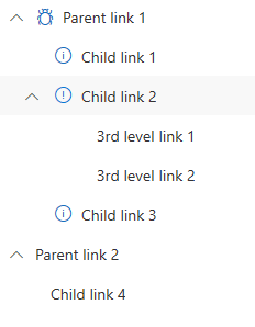
It appears a Nav item cannot both have child links and an icon:

This might be a consequence of fixing https://github.com/OfficeDev/office-ui-fabric-react/issues/3945
 frevds
All 10 comments
Update: The easiest workaround is to add a margin next to the icon (but this ignores the parent, which looks a bit too far indented if the parent has no icon set):
.ms-Nav-link > * > .ms-Button-icon:not(:empty) {
margin-left: 28px;
}
The current construct is a DIV with a BUTTON in it (absolutely positioned) and another BUTTON (or A link) (which is thus overlapped) which contains the icon and label.
Child elements seem to be offset from the start using a calculated padding-left.
If the item has an icon set, this padding must be increased (e.g. by 28px) and children must inherit it.
Doing so makes it look correct:
frevds
on 24 Apr 2019
There is another (unrelated) bug in the Nav (which apparently nobody uses):
If a sub item has sub items and is selected (e.g. by passing Nav.selectedKey or by not defining it), there is a second highlight, because of a .chevronButton::after definition that conflicts with the general .link::after.
One workaround here is:
.ms-Nav-chevronButton::after { content: none; }
.ms-Nav-chevronButton { background-color: transparent; }
Thank for the update. I am working with our design to verify the fixes could be integrated.
 apneer
on 26 Apr 2019
apneer
on 26 Apr 2019
Is there any temporary solution to change default Chevron Icon without overlapping? Thanks.
 savkelita
on 13 Aug 2019
savkelita
on 13 Aug 2019
Yes, my hack should do that:
https://github.com/OfficeDev/office-ui-fabric-react/issues/8830#issuecomment-486025019
frevds
on 13 Aug 2019
@frevds i mean to replace current icon with new one
savkelita
on 13 Aug 2019
@savkelita Not sure what you mean with current icon. If you don't assign the icon property for a INavLink item then it shows no icon unless it has child items in which case it shows a chevron. If you assign an icon it shows both, the chevron and the icon, but on-top of each others (that's the bug). My workaround is a CSS hack to put additional margin to separate the two icons, but it is limited (e.g. every item should have an icon per level). There is also another bug mentioned here with double highlighting which can be fixed with another CSS hack.
frevds
on 13 Aug 2019
Is there any temporary solution to change default
Chevron Iconwithout overlapping? Thanks.
I guess you can use this: https://stackoverflow.com/questions/49542450/override-officeui-nav-chevron-icon?rq=1
 robert1826
on 25 Aug 2019
robert1826
on 25 Aug 2019
here my hack:
.ms-Nav-chevronButton {
  right: 10px;
  left: unset;
}
 yalian-icom
on 30 Apr 2020
yalian-icom
on 30 Apr 2020
@yalian-icom's solution (hack) is the simplest but has the side effect of relocating the chevron to the right - which is I guess the point as it gets the chevron out of the way so that there is no overlap. It does make for an inconsistent UI if you use groups as the chevron for them remains on the left. However, I quite like it as it make it very clear as to what is a group and what is a nav link.
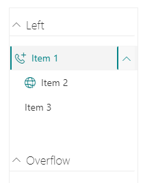
A few other points to note:
- For anyone doing this in a SharePoint Framework (SPFx) solution, I had to mark the CSS as global in the module.scss file for this to take. But it's only global within the parent CSS class and so the Nav control will need to be wrapped in a container that uses the primary CSS class.
- Setting the right attribute to 10px resulted in the group chevrons being cut off on the left and I found that a value of 4px works better.
- As can be seen from the screenshot, we are still suffering from the other issue identified by @frevds, the second highlight bar
So I was able to sort these issues out with the following:
.linkBar {

  :global .ms-Nav-chevronButton {
     right: 4px;
     left: unset;
     background-color: transparent;
  }

  :global .ms-Nav-chevronButton::after { content: none; }
...
After that all is well.
However, I would like to point out that is over a year since @frevds identified these bugs and I think we could have expected a proper fix by now. I suspect it would only take someone 10 minutes to sort this out on the control itself rather than forcing us to use ugly hacks!
 ColinGardner
on 2 May 2020
ColinGardner
on 2 May 2020
Related issues
 VincentBailly
·
3Comments
VincentBailly
·
3Comments
 gabrielruss
·
3Comments
gabrielruss
·
3Comments
 rickyp-ms
·
3Comments
gabrielruss
·
3Comments
rickyp-ms
·
3Comments
rickyp-ms
·
3Comments
gabrielruss
·
3Comments
rickyp-ms
·
3Comments
Most helpful comment
There is another (unrelated) bug in the Nav (which apparently nobody uses):
If a sub item has sub items and is selected (e.g. by passing Nav.selectedKey or by not defining it), there is a second highlight, because of a .chevronButton::after definition that conflicts with the general .link::after.
One workaround here is: