Fluentui: Required prop doesn't trigger browser's message like TextField
Environment Information
- __Package version(s)__: latest
Please provide a reproduction of the bug in a codepen:
https://codepen.io/MinhThienDX/pen/rRJaML
Actual behavior:
When submit form, only TextField trigger browser's message (like call reportValidity())
Expected behavior:
Dropdown, ComboBox, DatePicker or any component with required should trigger browser's message
Priorities and help requested:
Are you willing to submit a PR to fix? No
Requested priority: Normal
 MinhThienDX
All 7 comments
@MinhThienDX can you clarify the issue you're reporting above? Specifically, what "browser's message" is in reference to?
What is the expected output?
Otherwise this is difficult to take action on.
 KevinTCoughlin
on 14 Mar 2019
KevinTCoughlin
on 14 Mar 2019
Expected output:
When submit form (you can click button submit to see), the browser focus empty required field and display browser's message like in 2 pictures I have attached below.
Firefox's message:
Chrome's message:

However, Dropdown's "input" is a span so there is no way this is going to happen.
ComboBox's input doesn't have the required attribute so doesn't have expected outcome.
Now, DatePicker's input is another thing:
The input does have required attribute but does not even trigger expected outcome 😕
And if you click button submit then focus DatePicker and lose focus, the border of DatePicker's input become red.
I tried to pass required attribute to ComboBox using autofill prop but it just add required attribute and still no expected outcome.
MinhThienDX
on 15 Mar 2019
Dropdown
@MinhThienDX re: Dropdown triggering the browser's native required prompt, see the discussion in https://github.com/OfficeDev/office-ui-fabric-react/pull/7357#issue-237824973
ComboBox
As you mention in https://github.com/OfficeDev/office-ui-fabric-react/issues/8313#issuecomment-473210768, the <input /> element within ComboBox can be targeted via autofill?: IAutoFillProps since it accepts native properties: https://github.com/OfficeDev/office-ui-fabric-react/blob/0f6ea8642f22d2fdf3ae9534bdcf5026eafe6f76/packages/office-ui-fabric-react/src/components/Autofill/Autofill.types.ts#L43
As an example:
diff --git a/packages/office-ui-fabric-react/src/components/ComboBox/examples/ComboBox.Toggles.Example.tsx b/packages/office-ui-fabric-react/src/components/ComboBox/examples/ComboBox.Toggles.Example.tsx
index fad5ed182..391b5cce0 100644
--- a/packages/office-ui-fabric-react/src/components/ComboBox/examples/ComboBox.Toggles.Example.tsx
+++ b/packages/office-ui-fabric-react/src/components/ComboBox/examples/ComboBox.Toggles.Example.tsx
@@ -46,6 +46,7 @@ export class ComboBoxTogglesExample extends React.Component<{}, IComboBoxToggles
           key={'' + state.autoComplete + state.allowFreeform /*key causes re-render when toggles change*/}
           allowFreeform={state.allowFreeform}
           autoComplete={state.autoComplete ? 'on' : 'off'}
+          autofill={{ required: true }}
           options={INITIAL_OPTIONS}
         />
         <Toggle
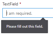
Which shows "Please fill out this field." native behavior on hover in Chrome (as an example).
Conclusion
It seems like the ask here is to normalize error states across office-ui-fabric-react input fields deferring to native behavior where possible. Is that correct @MinhThienDX?
This is a large ask that I will require @micahgodbolt's help with triaging.
KevinTCoughlin
on 18 Mar 2019
Yeah, this is a large backlog item we've had for a bit. Go through all of our inputs and normalize their labels, error states, required etc....This could happen in many ways either by adding functionality to each control, or wrapping the 'input' with a parent that includes label, error etc.
 micahgodbolt
on 18 Mar 2019
micahgodbolt
on 18 Mar 2019
I've created this epic to track much of the work we want to do to improve input consistentcy
7636
micahgodbolt
on 18 Mar 2019
Thank you guys, somehow I missed that epic issue at #7636
So I should close this issue right?
MinhThienDX
on 19 Mar 2019
Sure @MinhThienDX, if you think your concern is covered in that epic (or feel free to leave a comment in that issue). It's certainly nice to keep dup issues out of our queue.
micahgodbolt
on 19 Mar 2019
Related issues
 rickyp-ms
·
3Comments
rickyp-ms
·
3Comments
 luisrudge
·
3Comments
luisrudge
·
3Comments
 gabrielruss
·
3Comments
gabrielruss
·
3Comments
 satbai
·
3Comments
satbai
·
3Comments
 nekoya
·
3Comments
nekoya
·
3Comments