Fluentui: Improve design of aka.ms/fabricdemo
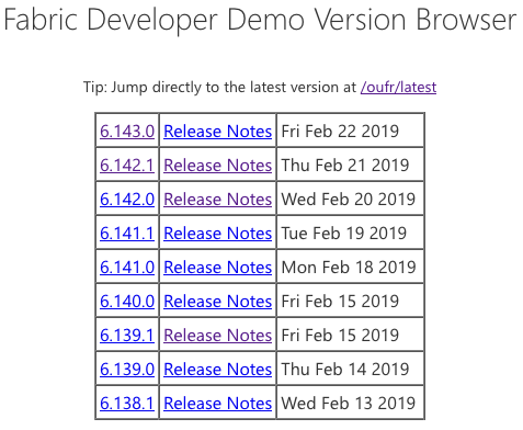
Current design
From the live site:
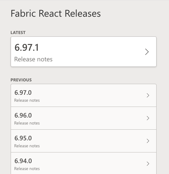
Proposed design
From the CodeSandbox for a redesign:
Goals
- Emphasize the most common action for this page, which is to view a demo of the latest release.
- Increase the target size for each release for faster use.
- Give the version numbers more prominence as the most important piece of information.
- Basic visual polish (type, colors, shadows) to match the PR deployed sites page
Potential issues
- The list has less density than beforeand this results in more scrolling to find an old release.
- Consider adding a filter for the releases to quickly locate one.
- The date is shown as a tooltip on hover. It seems like extra information to me; am I missing a scenario where locating a release by date is essential?
- We could do more to separate major, minor, and patch releases. For example, by using bold for the portion of the version number that has changed: 6.96.0, 6.97.0, 6.97.1
- The page is gray on gray on gray and, while functional, could use some personality.
 mikewheaton
All 13 comments
FYI @Jahnp and @ecraig12345
mikewheaton
on 25 Feb 2019
Consider adding a filter for the releases to quickly locate one.
I like this idea, and it shouldn't be very hard to implement.
The date is shown as a tooltip on hover. It seems like extra information to me; am I missing a scenario where locating a release by date is essential?
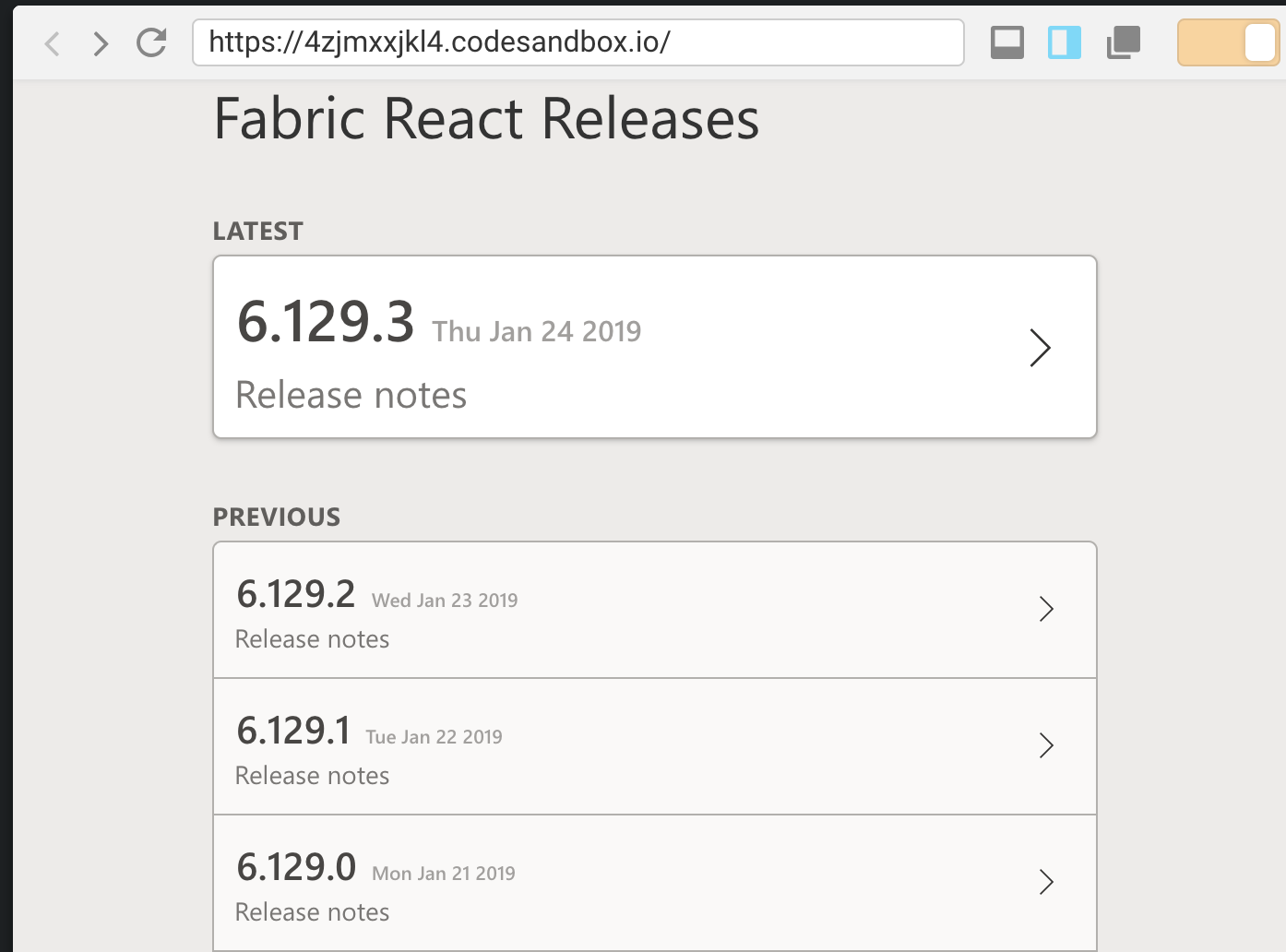
I think it would be nice to have the date visible by default--maybe next to the release notes link?
 ecraig12345
on 25 Feb 2019
ecraig12345
on 25 Feb 2019
This is awesome @mikewheaton ! Also flagging @cliffkoh for his feedback too.
My $0.02:
- Overall, this is a great improvement over the existing page. The improvements to the hit target size and alignment to the PR deployed sites page are nice.
- +1 to filtering releases!
- IMO the date could be considered essential. Sometimes I'll use this page when debugging to understand which releases came out during a particular time period.
Visualizing this could be straightforward:
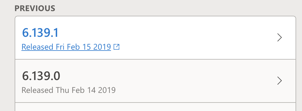
For brevity, you could also just use the "Date" text with the "Release notes" link, though another date format might be better.
 Jahnp
on 25 Feb 2019
Jahnp
on 25 Feb 2019
Should have added, nice work! :)
ecraig12345
on 25 Feb 2019
Great job.
Only little request is if we can have a major version selector somewhere as well. Once we have version 7 (or if we back-publish Fabric 5), it would be great if the page doesn't show more than 1 major version (for performance reasons as well).
 cliffkoh
on 25 Feb 2019
cliffkoh
on 25 Feb 2019
Agree with @Jahnp on displaying the date. It is an important piece of the puzzle when troubleshooting/debugging :)
cliffkoh
on 25 Feb 2019
Great idea, @Jahnp, I've added the date to the release note text. I'll look at adding a version filter and a way to quickly jump to a major release.
mikewheaton
on 25 Feb 2019
Maybe pivots would be appropriate for separating out major releases?
ecraig12345
on 26 Feb 2019
I've added a pivot to select the major version and a filter for the releases:
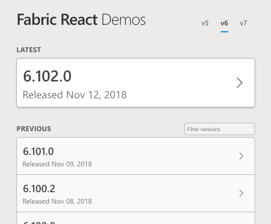
I'm not entirely convinced on the placement of the Pivot. I didn't want to use up vertical space since I wouldn't anticipate it being changed often. But the alignment looks odd. Maybe a Dropdown would work better for that placement.
mikewheaton
on 26 Feb 2019
I've assigned this to Peter and marked it as needing backlog review. That review can determine who's going to implement this in the actual site. 😄
mikewheaton
on 27 Feb 2019
Excellent work @mikewheaton! Thank you 🙇
 KevinTCoughlin
on 27 Feb 2019
KevinTCoughlin
on 27 Feb 2019
Assigning to myself and @ecraig12345 (who previously volunteered).
cliffkoh
on 20 Mar 2019
Done!
cliffkoh
on 21 Mar 2019
Related issues
 prashkan
·
3Comments
prashkan
·
3Comments
 satbai
·
3Comments
satbai
·
3Comments
 justinwilaby
·
3Comments
justinwilaby
·
3Comments
 mattcoxonline
·
3Comments
mattcoxonline
·
3Comments
 gabrielruss
·
3Comments
gabrielruss
·
3Comments
Most helpful comment
Great idea, @Jahnp, I've added the date to the release note text. I'll look at adding a version filter and a way to quickly jump to a major release.