Hi, Is there a roadmap to support "dynamic theming" that provides features like the one implemented in stardust-ui/react?
I see now activity around fluent theming support, but this is still based on static prebuilt SCSS, in no way something like e.g. on https://stardust-ui.github.io/react/components/icon#types-icon
Related to this, anything discussions so far around style-components or similar?
Thx, Eric
 echarles
All 9 comments
Regarding styled-components, see https://github.com/OfficeDev/office-ui-fabric-react/issues/5328.
@dzearing and @JasonGore are driving the story around theming and would be best equipped to answer your question.
 cliffkoh
on 23 Oct 2018
cliffkoh
on 23 Oct 2018
Thx @cliffkoh, #5328 discussion on the css-in-js is very instructive.
Fyi, I made a choice for office-ui-fabric-react 1 year ago based on its widget richness and its typescript support - Very happy about this choice! Now I reevaluating for a toolkit that also brings strong dynamic theming support.
Btw, as a user, when I see people from Microsoft contributing to stardust-ui, I am wondering if Microsoft/OfficeUI has already a strategy on the theming topic (sounds like both stardust-ui and office-ui devs like fela, see also stardust-ui/react/issues/170 and that office-ui is linked from the stardust README.
PS: The Fluent for Fabric home page links to uifabric.io which is not live.
(cc/ @dzearing and @JasonGore @levithomason)
echarles
on 23 Oct 2018
I work with Zearing every week to move Stardust UI and Fabric toward convergence on theming. What you see in Stardust UI is the collaboration Semantic UI React (Semantic) and Fabric to bring about an ideal future component. One that allows consumers to fully manage state, styles, and accessibility while providing sane defaults.
Stardust UI aims to produce specifications and tools to enable UI libraries and developers to create great UIs and components. You can think of the Stardust UI _React_ implementation as the "proving grounds" for Stardust UI patterns.
As Zearing and I work through these patterns and solidify them, our goal is to then propagate them to both Fabric and Semantic. That work is just beginning but is certainly underway.
What you see in the Stardust UI docs regarding theming will only get, much, much, better as well. We also hope to share a similar doc experience giving user a rich interface for customizing themes.
 levithomason
on 23 Oct 2018
levithomason
on 23 Oct 2018
Thx for confirmation @levithomason, this is what I interpreted from the outside. I guess going to fabric, semantic... is my solely decision, I am just trying to anticipate what those frameworks will be in a few months once the foundations will have evolved.
echarles
on 23 Oct 2018
One q @echarles: where are you seeing scss fluent work? I'm not aware of active scss work. We do have some work building a set of Fluent customizations. And if you look at PR deploy links, you'll see theme switchers (which aren't exposed on the public doc site.)
As Levi mentioned, we're converging on common theming here. We have 2 different css in js solutions in Fabric and Stardust; we need to either normalize or generalize. We built a solution in the fabric repo (merge-styles) which works similar to other css in js solutions, is performant, and we can guard and optimize. We've considered Fela and it's still being evaluated, (there are a LOT of passionate fans for many of the different libraries; styled-components, jss, emotion, styletron, fela, glamor, etc etc) but for now we need to focus as much as possible on theming and how components will be customizable.
Currently the theming process for the end user will go from very simple and minimal, to robust but complex. In that order:
You can provide "site variables", e.g. your app palette to change to your own product colors, typography, and spacing. You can be choosey about this; we will support "partial themes" so you don't have to change everything.
You can provide "component style variables" which abstract the styling knobs for a component. Perhaps buttons should have shadows and corners. You provide those, we'll put those in the right place.
You can provide styling overrides per component. Not recommended as this level of customizability is error prone (e.g. selector specificity).
In addition, we need to support a few new concepts:
Schemes (aka named themes). Apps tend to have different areas with non-default background colors. Sometimes areas have theme colored backgrounds (teaching bubbles), sometimes inverted (headers), and sometimes just a neutral shade (left navs). We will have a way to contextually opt into a scheme, which can make components look correct in that box (e.g. a blue primary button should look different when rendered within an blue background.)
Contextual language and contextual RTL (especially for email scenarios with mixed languages on the page.) This requires us to rethink how we approach these things.
If you have any specific scenarios that this might not cover, would love to hear your thoughts. We do have a lot of theming support, but theming really goes beyond color customization. That's what we're shooting for here!
 dzearing
on 24 Oct 2018
dzearing
on 24 Oct 2018
where are you seeing scss fluent work?
I was just referring to the Fluent customizations.
If you have any specific scenarios that this might not cover, would love to hear your thoughts.
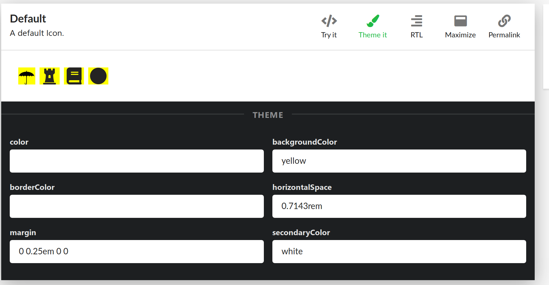
From your inputs, I am not sure if I need to define the variables, then build and can not change them anymore, or if I can override live the theme's variables like the stardust ui screenshot at the beginning of this issue. I am looking to the ability to change/build new themes on a programmatic way while the user is browsing, a kind of "mutating themes".
echarles
on 24 Oct 2018
Just running npm start in the packages/experiment folder and the Theming section demonstrates a bit what I was expecting for this dynamic/mutating themes. I guess the exposed themes have been created thanks to CSS variables, but can they be changed by the user via code?
echarles
on 24 Oct 2018
@echarles not css variables. CSS in JS. You can absolutely change things via code, go here, choose some colors, press the codepen button to see an example.
https://developer.microsoft.com/en-us/fabric#/customizations/colors
We have the architecture to load new themes dynamically; even for legacy sass solutions, we use a package called load-themed-styles which has a similar loadTheme api and rewrites the injected css. This solution works with scss, but does not work with the contextual theming scenarios (blue background, inverted primary buttons.) That's what we're improving, amongst the other things listed above.
dzearing
on 24 Oct 2018
Closing, answers have been provided. Thx!
echarles
on 26 Oct 2018
Related issues
 gabrielruss
·
3Comments
gabrielruss
·
3Comments
 justinwilaby
·
3Comments
justinwilaby
·
3Comments
 rickyp-ms
·
3Comments
justinwilaby
·
3Comments
rickyp-ms
·
3Comments
justinwilaby
·
3Comments
 holysnake91
·
3Comments
holysnake91
·
3Comments
Most helpful comment
@echarles not css variables. CSS in JS. You can absolutely change things via code, go here, choose some colors, press the codepen button to see an example.
https://developer.microsoft.com/en-us/fabric#/customizations/colors
We have the architecture to load new themes dynamically; even for legacy sass solutions, we use a package called load-themed-styles which has a similar
loadThemeapi and rewrites the injected css. This solution works with scss, but does not work with the contextual theming scenarios (blue background, inverted primary buttons.) That's what we're improving, amongst the other things listed above.