Fluentui: CommandBar FarItems Overflow behavior
Hi all,
When resizing the a CommandBar control that has both items and farItems the item overflow behavior is a bit counter intuitive.
There is an example in: https://developer.microsoft.com/en-us/fabric#/components/commandbar#Implementation
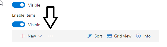
When the screen is wide, the presentation is OK, since all the items are displayed:

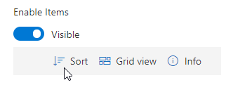
But when the screeen gets smaller, the only elements that are sent to the overflow menu are the ones in the left (which usually are more used that the ones in the right):
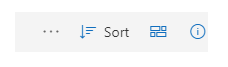
And in the end the overflow menu in the left is hidden, while all the elements in the right are still there, making it unusable in mobile environments:
I think that the first items to be sent to the overflow menu should be the ones in the right and the overflow menu should be always visible. It would be great to have a way to specify which items are sent to the overflow menu, is there any way to do that?
Thanks a lot!
 enriquin
All 7 comments
These are actually two sets of commands in the command bar. The commands on the right are view oriented commands, whereas the ones on the left act on objects in the list. In your last screenshot you are seeing a bug. At that size, there should be two commands to the left, and all the commands should change to icon only.
 betrue-final-final
on 16 May 2018
betrue-final-final
on 16 May 2018
@dzearing - this should be fixed with the 6.0 update. I just verified that the CommandBar in experiments fixes this issue. Looks like this with the overflow '...' when squished:
 aditima
on 17 May 2018
aditima
on 17 May 2018
A question: Why collapse the left items first? I think that the right ones are less important. I mean, it's ok to make all buttons icon only, but the ones in the right should be the first to overflow. What do you think about it?
It would be great if we could adjust something like "button priority" to stablish an order to collapse the buttons. Maybe is a bit "sci-fi" at the moment.
Also in the capture from @aditima it seems that the sort button should be icon only.
enriquin
on 18 May 2018
We must be missing each others meanings. Did you read my previous reply? Those are two sets of commands.
Part of the reason is that we don't want the view commands to go away because that controls so much of the content viewing.
betrue-final-final
on 18 May 2018
Oops I accidentally closed the issue and reopened it later!
@betrue-final-final I got it thanks :), I only stated that _in my opinion_ the view commands should be the first ones to go to a overflow menu (the menu with the 3 dots) to save screen real state. I think the users will feel lost if when they access a listing using a mobile device they can see how to set the order of the items, or change the columns displayed, but they don't find at first sight the "create new item" option which is the ones that they use the most.
Just an opinion, don't take it too seriously. Thanks a lot for your time!
enriquin
on 18 May 2018
Actually the Create new should almost always be the first item.
betrue-final-final
on 18 May 2018
The component itself should not have an opinion about which commands are most important.
You're welcome to have wrapper logic which provides a different command configuration at different stops. This could be managed outside of the command bar.
 dzearing
on 21 Jun 2018
dzearing
on 21 Jun 2018
Related issues
 satbai
·
3Comments
satbai
·
3Comments
satbai
·
3Comments
satbai
·
3Comments
 gabrielruss
·
3Comments
gabrielruss
·
3Comments
 rickyp-ms
·
3Comments
satbai
·
3Comments
rickyp-ms
·
3Comments
satbai
·
3Comments