Fluentui: Drop down: regression of DropDown not opening up when rendered at bottom of its containter
Bug Report
- __Package version(s)__: latest
- __Browser and OS versions__: Chrome/Edge
Priorities and help requested (not applicable if asking question):
Requested priority: (High)
Products/sites affected: (web parts property pane)
Describe the issue:
The drop down is used to open as "drop-up" when the DropDown is rendered at the bottom of page or its container.
Actual behavior:
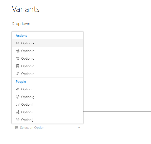
(from: https://officedevcentersite-devx.azurewebsites.net/fabric#/components/dropdown)

The drop down opened at bottom with scroll bar, looks bad when there is not enough space after drop down control. (See CodePen at the bottom to see the case where it looks bad)
Expected behavior:
(from: https://dev.office.com/fabric#/components/dropdown)
The drop down opened at top.
If applicable, please provide a codepen repro:
https://codepen.io/anon/pen/OjQyzp
Scroll to bottom and open the drop down.
Note: I assume codepen should be using the latest version.
 ipip2005
All 5 comments
This was an intentional change to make dropdowns actually dropdown (they were popping out to the side previously). I would support maybe popping up, but at some point the options will need to scroll to fit onto the page, so it's not 100% cut and dry.
 micahgodbolt
on 23 Aug 2017
micahgodbolt
on 23 Aug 2017
I also have the same issue. The previous way did show a more convenient list height, while now you are pretty much limited to the remaining height between your dropdown and the bottom of the screen. Changing it to go on top would be a wise choice imo.
 spplante
on 19 Sep 2017
spplante
on 19 Sep 2017
I think this is still should be marked as a bug. I get that showing the drop down on top can be an arguable decision. Though, I personally don't see any issues popping it on top. Moreover it's a de facto standard to show the dropdown on top if there's not enough space down:
- In web world all the major browsers do it for
<select>HTML element - All native Windows comboboxes are like that
- Desktop Office products do the same
And to make it even worse look at this screenshot from official Office Fabric samples:
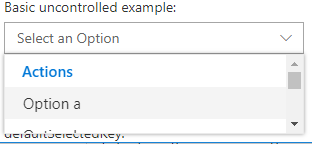
It's kind of OK. I have a scroller, I can see only 2 items out of 20, it's not convinient, but at least usable.
But if you have slightly less space available down:
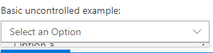
What is that? I can't see nothing, I can't scroll. All I see is a weird not usable artifact.
And to reproduce it you simple need to scroll your page to the the list at the bottom.
 mshmelev
on 12 Jan 2018
mshmelev
on 12 Jan 2018
+1 to @mshmelev 's example of the dropdown at the bottom of a page opening as an unusable artifact.
I have small real estate to work with in an iframe and I have a combobox at the bottom. The control is completely unusable because opening the dropdown gets that scrunched callout. It only opens upward once you've obscured part of the bottom of the combobox with the bottom of the page/iframe.
 just-joshing
on 5 May 2018
just-joshing
on 5 May 2018
Fixed by #3719
micahgodbolt
on 6 Aug 2018
Related issues
 nekoya
·
3Comments
nekoya
·
3Comments
 rickyp-ms
·
3Comments
rickyp-ms
·
3Comments
 carruthe
·
3Comments
carruthe
·
3Comments
 satbai
·
3Comments
satbai
·
3Comments
 luisrudge
·
3Comments
luisrudge
·
3Comments
Most helpful comment
I think this is still should be marked as a bug. I get that showing the drop down on top can be an arguable decision. Though, I personally don't see any issues popping it on top. Moreover it's a de facto standard to show the dropdown on top if there's not enough space down:
<select>HTML elementAnd to make it even worse look at this screenshot from official Office Fabric samples:
It's kind of OK. I have a scroller, I can see only 2 items out of 20, it's not convinient, but at least usable.
But if you have slightly less space available down:
What is that? I can't see nothing, I can't scroll. All I see is a weird not usable artifact.
And to reproduce it you simple need to scroll your page to the the list at the bottom.