Fluentui: How do I make a compound button the primary button?
If I understand the documentation (https://dev.office.com/fabric#/components/button) correctly, a button can be a primary button _or_ a compound button but not both.
Question: From a design perspective, was it intentional to not allow a compound button layout to be a primary button?
Question: Is there a work around for me to either make a primary button have the ability to display descriptions or make a compound button color itself 'blue' (or whatever is the primary button color in context).
 kngrace
All 14 comments
You can always pass in a styles object to the compound button that makes it look like the primary button.
 micahgodbolt
on 12 Jul 2017
micahgodbolt
on 12 Jul 2017
Thanks for the color override suggestion. Is there a way to make the colors I set dynamic and respond to tenant color theme changes?
For example, this button may appear on three different sites/tenants. Site/Tenant 1 uses classic blue for their primary button. Site/Tenant 2 uses a trendy shade of hot pink for their primary button. Site/Tenant 3 likes a special shade of green to match their brand colors.
Is there a way for my Compound Button to mimic whatever the primary button color is based on the set theme?
kngrace
on 12 Jul 2017
Oh to mimic the primary? Yeah, just use the same colors that the primary is using. i.e.
So if you change themePrimary, it'll change both buttons.
micahgodbolt
on 12 Jul 2017
Okay, how might I use the same colors that the primary is using? That's what I've been trying to do. :)
I attempted to override this button's appearance by adding a class as following:
 <CompoundButton
          className='ms-bgColor-themePrimary'
          description='description text here'
          onClick={ () => this.setState({ showPanel: true }) }
        >
          Button text here
        </CompoundButton>
But it is overridden by the injected class style isEnabled_bf9d8693 when its rendered:
<button type="button" class="root_3696fcf9 ms-bgColor-themePrimary ms-Button ms-Button--compound root_bf9d8693 isEnabled_bf9d8693" aria-labelledby="8" aria-describedby="9">...</button>
I simply want this _single_ instance of a compound button to have the background color of the primary theme color. How can I accomplish this?
kngrace
on 12 Jul 2017
Also, in reply to your earlier suggestion:
You can always pass in a styles object to the compound button that makes it look like the primary button.
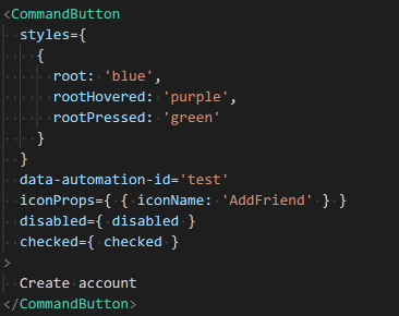
I attempted the following:
<CompoundButton
   styles={
      { root: 'blue',
      rootHovered: 'purple',
      rootPressed: 'green'
      }
    }
    description='description text here'
    disabled={ disabled }
    onClick={ () => this.setState({ showPanel: true }) }
>
  Button text here
</CompoundButton>
But I receive compiler error:
Error:(41, 11) TS2339:Property 'styles' does not exist on type 'IntrinsicAttributes & IntrinsicClassAttributes<CompoundButton> & IButtonProps & { children?: Reac...'.
Did I misinterpret your suggestion or am I missing something that would allow me to pass a CompoundButton component a styles object?
kngrace
on 12 Jul 2017
Do you know which version of fabric you are using? It's been semi recent since that was added.
micahgodbolt
on 12 Jul 2017
It looks like my team's project is currently using version 2.31.0...
Hmm, we followed the getting started guide well after the May 19th release (2.31.0) but this is the package I have. I hadn't even realized it wouldn't get the latest.
I'll get this sorted and follow-up once I've re-tested the code. Thanks for asking me to check!
kngrace
on 14 Jul 2017
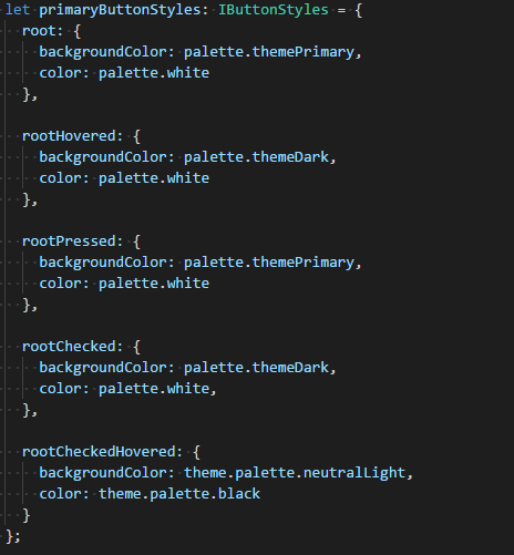
Update successful. It now allows me to define styles within the CompoundButton but I am still uncertain how to access the dynamic theme palette.
For instance, I see that in PrimaryButton.tsx there is a call on a BaseButton to apply the correct theme and style:
return (
   <BaseButton
      { ...this.props }
      variantClassName='ms-Button--primary'
      onRenderDescription={ nullRender }
      styles={ getStyles(theme, styles) }
   />
);
Is there an exposed style object I can pass to styles that will allow me to identify the primary button colors?
kngrace
on 15 Jul 2017
Hmm, I also tested your static override suggestion and discovered a few issues.
styles={ {
   root: {backgroundColor: '#0078d7', color: 'white'},
   rootHovered: {backgroundColor: 'rgb(0, 90, 158)', color: 'white'},
   rootPressed: {backgroundColor: '#0078d7', color: 'white'},
   rootChecked: {backgroundColor: 'rgb(0, 90, 158)', color: 'white'},
   rootCheckedHovered: { backgroundColor: 'rgb(0, 90, 158)', color: 'black'}
}
First, what worked based on the styles written above: primary text and background default colors, primary text and background hover colors.
Work didn't work: focus color for border, description text color
When the button gains :focus (for instance, once clicked), an ::after element triggers creating a border around that button. For a PrimaryButton theme, that border is rgb(255, 255, 255) aka white. For the CompoundButton theme, that color is rgb(102, 102, 102).
_If_ I'm going to recolor my button via passing it styles, what style must I pass to also recolor the border and recolor the description text (which is nearly impossible to read).
kngrace
on 15 Jul 2017
Yeah, i don't think we support that much customization. It's probably be easier to either support that 2nd line of text in the primary button, or have you create your own custom button (basically copy the 2 primary button files, change the name and tweak it).
Sorry about the late reply.
micahgodbolt
on 21 Jul 2017
probably easiest to just allow buttons with descriptions (and yeah, it was a design thing.....this is how buttons with 2 lines of text look).
micahgodbolt
on 21 Jul 2017
Might I request that you allow buttons to have two lines of text then? :)
kngrace
on 9 Aug 2017
I've got a PR open right now to support primary compound buttons. Take a peak and see if that'd work for you #2446
micahgodbolt
on 11 Aug 2017
Thanks for making the changes to 13 files with 200 additions and 161 deletions to implement and document the primary=true/false prop for styling. 👍
kngrace
on 20 Sep 2017
Related issues
 nekoya
·
3Comments
nekoya
·
3Comments
 satbai
·
3Comments
satbai
·
3Comments
 prashkan
·
3Comments
nekoya
·
3Comments
prashkan
·
3Comments
nekoya
·
3Comments
 justinwilaby
·
3Comments
justinwilaby
·
3Comments