As it stands there are inconsistencies with the progress bar and readability issues, some desists to consider:
https://getuikit.com/docs/progress
https://i.pinimg.com/originals/f7/b7/99/f7b799956a4e61194c9cd3778f40d634.jpg
https://cdn.dribbble.com/users/247600/screenshots/1090476/percentage-bar.jpg
 sachaw
All 8 comments
@sachaw Can you be more specific about which inconsistencies and readability issues you're experiencing?
In another thread, someone mentioned adding a border to the progress bar, and I'm wondering if this would be sufficient to address your issues, too.
 jfurrow
on 26 Oct 2017
jfurrow
on 26 Oct 2017
I would also be in favor of a thicker progress bar. I actually greatly prefer the rutorrent bar, showing the percentage inside of the bar as well.
 liquidox
on 26 Oct 2017
liquidox
on 26 Oct 2017
I wouldn't say no to a bit animated progress bar if it's actively being downloaded even. Would mean just taking a look at the bar I'll know everything I need to know.
 Avamander
on 28 Oct 2017
Avamander
on 28 Oct 2017
As for inconsistencies, I was referring to the varying height

sachaw
on 29 Oct 2017
I like https://i.pinimg.com/originals/f7/b7/99/f7b799956a4e61194c9cd3778f40d634.jpg so the 2nd one. It's still a bit pale, though. A darker border would be nice. Also because percentages are properly displayed. I miss seeing percents.
 randomnonsense
on 29 Oct 2017
randomnonsense
on 29 Oct 2017
I do actually prefer the actual loading bar.
 lucasdcrk
on 2 Nov 2017
lucasdcrk
on 2 Nov 2017
I'm obviously biased, but I definitely prefer the minimalism of the current implementation. I'll mock up my interpretations of the suggested variations and post my thoughts on each. I'm not promising to replicate any of the provided examples — honestly, I think they are a little gaudy.
@sachaw The inconsistent height is a weird bug — would you mind filing that as a separate issue? Sorry, I know that's what you originally intended. This issue has turned into a discussion about the legibility of the current progress bar. In your new issue, I'd love for you to include which browser and OS you are using.
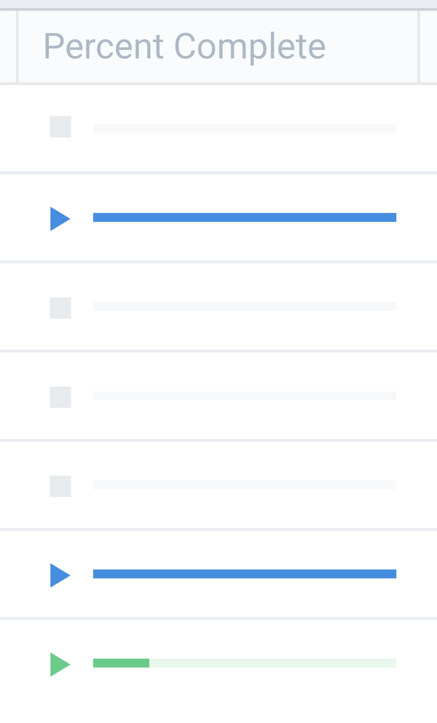
For reference, this is what Flood's percent complete column should look like on every device. This particular screenshot is from Chrome on macOS 10.12:
jfurrow
on 4 Nov 2017
517
sachaw
on 6 Nov 2017
Related issues
 noeuse
·
5Comments
noeuse
·
5Comments
 angristan
·
4Comments
angristan
·
4Comments
 rarescosma
·
3Comments
rarescosma
·
3Comments
 Phr33d0m
·
6Comments
randomnonsense
·
5Comments
Phr33d0m
·
6Comments
randomnonsense
·
5Comments
Most helpful comment
I'm obviously biased, but I definitely prefer the minimalism of the current implementation. I'll mock up my interpretations of the suggested variations and post my thoughts on each. I'm not promising to replicate any of the provided examples — honestly, I think they are a little gaudy.
@sachaw The inconsistent height is a weird bug — would you mind filing that as a separate issue? Sorry, I know that's what you originally intended. This issue has turned into a discussion about the legibility of the current progress bar. In your new issue, I'd love for you to include which browser and OS you are using.
For reference, this is what Flood's

percent completecolumn should look like on every device. This particular screenshot is from Chrome on macOS 10.12: