Flexbugs: IE11: Child containers overflow when max-height on parent is reached
I'm stacking some divs vertically with flexbox and limiting the height of the parent with max-height. One of the containers will have a potentially large amount of content and is expected to end up with a scroll bar; it has flex-shrink: 1.
<html><head></head>
<body>
    Here's some content before the flexbox container.
    <div style="display: flex; flex-direction: column; max-height: 200px; background: aliceblue">
        <div style="flex: 0 0 auto">Small header</div>
        <div style="flex: 0 1 auto; overflow-y: auto">
            This<br/>is<br/>a<br/>very<br/>long<br/>piece<br/>of<br/>content<br/>that<br/>should<br/>
            get<br/>height-limited<br/>by<br/>the<br/>max-height<br/>of<br/>the<br/>parent<br/>div,<br/>
            if<br/>everything<br/>is<br/>working<br/>correctly
        </div>
        <div style="flex: 0 0 auto">Small footer</div>
    </div>
    Here's some content after the flexbox container.
</body>
</html>
The problem is that in Internet Explorer (tested in 11 only), the content from the long container overflows the rest of the page:

The page works as expected in Chrome, Firefox, and Edge.
Workarounds I've found so far:
If I set the height of the parent container instead of the max-height, IE renders correctly. (This has the drawback that it will not render the container smaller than the given height, in case there is less content.)
If the heights of all but one of the child containers are predictable, the remaining container can have a max-height set to the remaining space (using calc if necessary).
 AlexLandau
All 17 comments
Thanks for reporting. However, this issue does not contain all the information needed as outlined in the reporting guidelines. Please update it with more information or close it if it's no longer relevant.
 philipwalton
on 23 Jun 2017
philipwalton
on 23 Jun 2017
I'm getting this one too, unfortunately. Glad I found this, was having trouble finding anyone else with the exact same bug. Seems like a very simple use case, sad that it's broken in IE11 :(
In order to help this bug meet the reporting guidelines I've created some JSBin's highlighting the issue. Open this JSBin in pretty much any browser and it works as expected (middle section scrolls, no overflow!), however open it in IE11 and the middle section overflows the flex container.
https://jsbin.com/suyojonezu/1/edit?html,output
This following JSBin shows the 1st workaround (setting parent height explicitly instead of max-height)
https://jsbin.com/kirozutuyi/1/edit?html,output
This following JSBin shows the 2nd workaround (setting max-height of the flex item element that overflows)
https://jsbin.com/qabimokufa/1/edit?html,output
I think all that's left to meet the guidelines is a link to the IE11 bug report, however since they're not actually fixing anything in that crufty old browser anymore, is this necessary? If so, can you link me to where I might find a list of reported IE11 bugs?
Thanks!
 Techn1x
on 6 Aug 2017
Techn1x
on 6 Aug 2017
@philipwalton Is this issue sufficient in detail enough to able to be added to the flexbugs list?
Techn1x
on 1 Sep 2017
Sorry for the late response! The lack of IE bug report is no problem, but I'm a bit concerned about the workarounds proposed.
The first one doesn't seem like a workaround IMO since height isn't really a good substitute for max-height. The second one is a lot better and seems like it'd work in some cases, but it doesn't handle the case where the header and footer's height aren't known, so I'm not quite sure it'd satisfy many people facing this issue...
philipwalton
on 6 Dec 2017
I'm struggling with getting this to work with percentages for max-height.
 buddyp450
on 17 Dec 2017
buddyp450
on 17 Dec 2017
Regarding the workaround: Wouldn’t it be possible to set a fixed height for IE 11 and unset it later with @supports? IE <11 does not support Feature Queries but all browsers who can deal with max-height only do.
 ovlb
on 18 Dec 2017
ovlb
on 18 Dec 2017
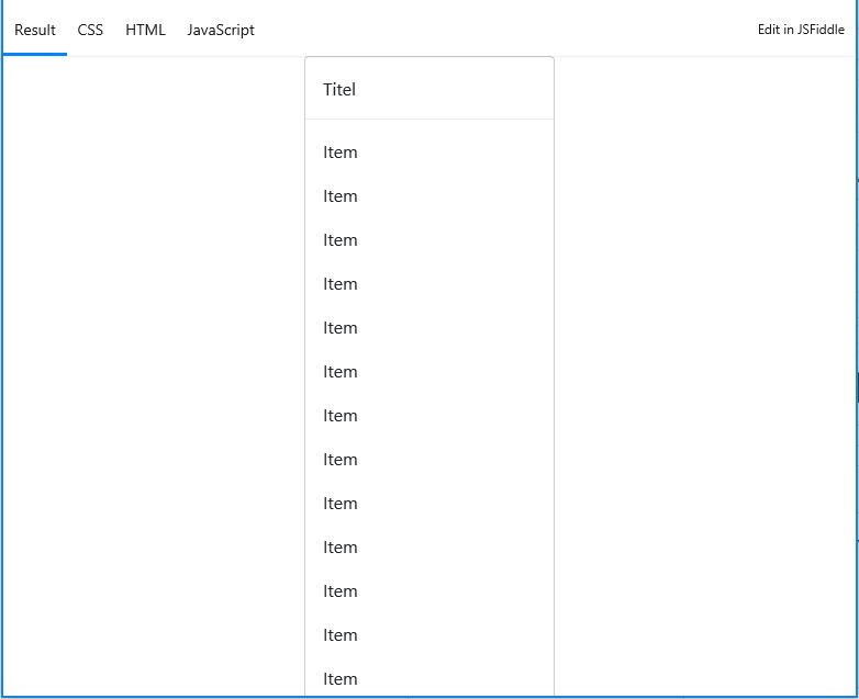
Dealing with the same bug I stumble over this Issue. The solution is to wrap the container in an element with display: flex; and flex-direction: row;. No need for calc() or extra max-height
Here is the example that works in Chrome, Firefox, and Safari: https://jsfiddle.net/zzyrrw7x/1/ - but it does _not_ work in IE11.
Here is the same example again but with the fix applied: https://jsfiddle.net/gktpsyv5/
Screenshot before:

Screenshot after:

 hkjorgensen
on 19 Jan 2018
hkjorgensen
on 19 Jan 2018
I have run into this and came across a workaround on stackoverflow (sadly I cannot find the post for credit):
IE11 seems to behave if both the max-height and height values are set.
<html><head></head>
<body>
    Here's some content before the flexbox container.
    <div style="display: flex; flex-direction: column; max-height: 200px; height:200px; background: aliceblue">
        <div style="flex: 0 0 auto">Small header</div>
        <div style="flex: 0 1 auto; overflow-y: auto">
            This<br/>is<br/>a<br/>very<br/>long<br/>piece<br/>of<br/>content<br/>that<br/>should<br/>
            get<br/>height-limited<br/>by<br/>the<br/>max-height<br/>of<br/>the<br/>parent<br/>div,<br/>
            if<br/>everything<br/>is<br/>working<br/>correctly
        </div>
        <div style="flex: 0 0 auto">Small footer</div>
    </div>
    Here's some content after the flexbox container.
</body>
</html>
This does not fix the issue for content that is less than the max-height but helps. Sadly JavaScript is the only solution I could find for height under the max. 😞
 cary-smith
on 23 Feb 2018
cary-smith
on 23 Feb 2018
In my case, I want the whole panel be adjusted accordingly to the screen size. So, the inner content (overflow: auto) should adjust depending on the whole size.
Based on the fiddles above, I created this one. It is the only way I could make it work on all browsers, and unfortunately it uses a position absolute:
 pelizza
on 2 Mar 2018
pelizza
on 2 Mar 2018
I've confirmed that @hkjorgensen's recommended fix works. Thanks Henrik!
 petermikitsh
on 24 Jul 2018
petermikitsh
on 24 Jul 2018
Dealing with the same bug I stumble over this Issue. The solution is to wrap the container in an element with
display: flex;andflex-direction: row;. No need forcalc()or extramax-heightHere is the example that works in Chrome, Firefox, and Safari: https://jsfiddle.net/zzyrrw7x/1/ - but it does _not_ work in IE11.
Here is the same example again but with the fix applied: https://jsfiddle.net/gktpsyv5/
Screenshot before:
Screenshot after:
It's not working, unless I add extra css property. More details, please reference the css of scroll paper, that need to review element.
 xingqiwu55555
on 9 Nov 2018
xingqiwu55555
on 9 Nov 2018
In my case, unfortunately, I can not just create another container. I had the same problem and found a very simple solution (though not so pretty): Media Queries for IE Browser + overflow-y: scroll for the article
/ * CSS for IE9 / 10 /11 * /
@media screen and (-ms-high-contrast: active), (-ms-high-contrast: none) {
  section {
    height: 100vh; / * not min-height: 100vh * /
  }

  article {
    overflow-y: scroll;
  }
}

 f-g-s
on 21 Nov 2018
f-g-s
on 21 Nov 2018
I had a very similiar issue with unknown content and container height but none of the solutions mentioned here really helped me. I finally found two working solultions that I would like to share.
This example is cut off in IE11 when the window is too small: https://jsfiddle.net/wx4tzqae/embedded/result,css,html,js
Solution 1 is to add another overflow-y: auto to the container: https://jsfiddle.net/wx4tzqae/1/embedded/result,css,html,js

Solution 2 is to use max-height: calc(100% - 1px) instead of max-height: 100%: https://jsfiddle.net/wx4tzqae/2/embedded/result,css,html,js
 simonschuh
on 10 Jan 2019
simonschuh
on 10 Jan 2019
Dealing with the same bug I stumble over this Issue. The solution is to wrap the container in an element with
display: flex;andflex-direction: row;. No need forcalc()or extramax-height
Here is the example that works in Chrome, Firefox, and Safari: https://jsfiddle.net/zzyrrw7x/1/ - but it does _not_ work in IE11.
Here is the same example again but with the fix applied: https://jsfiddle.net/gktpsyv5/
Screenshot before:
Screenshot after:
It's not working, unless I add extra css property. More details, please reference the css of scroll paper, that need to review element.
This solved my problem. Thanks
 hetianqi
on 22 Apr 2019
hetianqi
on 22 Apr 2019
My solution was even simpler:
I had to change this:
overflow: auto scroll;
... to this...
  overflow-x: auto;
  overflow-y: scroll;
I'm not sure why, but IE11 just ignored the all-in-one "overflow" CSS, but was happy with separate overflow-x and overflow-y styling.
 MikeInSwitzerland
on 13 Aug 2019
MikeInSwitzerland
on 13 Aug 2019
@hkjorgensen 's solution worked for me and @simonschuh 's caused the container to disappear from the screen completely. If different things are working for different people, this might be two distinct issues.
 antony
on 18 Sep 2019
antony
on 18 Sep 2019
Faced similar issue while styling https://github.com/reach/reach-ui in IE11. @hkjorgensen 's solution helped.
But had to adapt the flex direction to suit better for modal layer rendering. Ref: Link to adapted JSFiddle
 abhishekdev
on 30 Mar 2021
abhishekdev
on 30 Mar 2021
Related issues
 thasmo
·
6Comments
thasmo
·
6Comments
 DrummerHead
·
7Comments
DrummerHead
·
7Comments
 walidvb
·
4Comments
walidvb
·
4Comments
 AidaLigia
·
9Comments
AidaLigia
·
9Comments
 shans
·
8Comments
shans
·
8Comments
Most helpful comment
Dealing with the same bug I stumble over this Issue. The solution is to wrap the container in an element with
display: flex;andflex-direction: row;. No need forcalc()or extramax-heightHere is the example that works in Chrome, Firefox, and Safari: https://jsfiddle.net/zzyrrw7x/1/ - but it does _not_ work in IE11.
Here is the same example again but with the fix applied: https://jsfiddle.net/gktpsyv5/
Screenshot before:

Screenshot after:
