Flatpickr: Flatpickr theme does not apply on small screen device
Hello,
I am currently building a mobile-first designed, responsive web app using Ruby on Rails.
I adapted flatpickr to fit to small screen devices, with the dark theme.
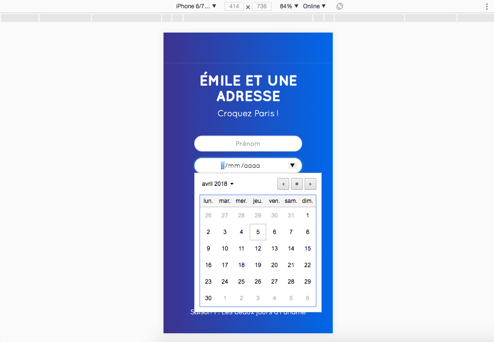
The issue is every time I go to localhost, with a iPhone6/7/8 device width screen, as a typical user would do, all my CSS and dark theme does not apply, it just shows the default flatpickr design calendar.

However, if I hard refresh on a desktop width screen, it applies.
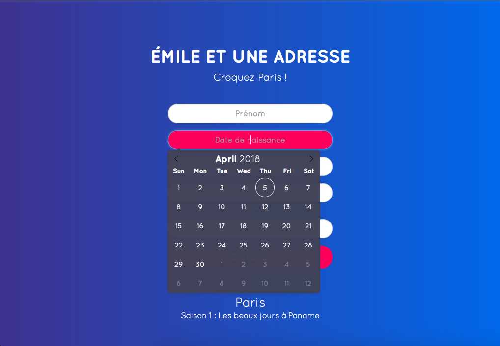
Then if I resize (without refreshing) to iPhone6/7/8, it still applies.
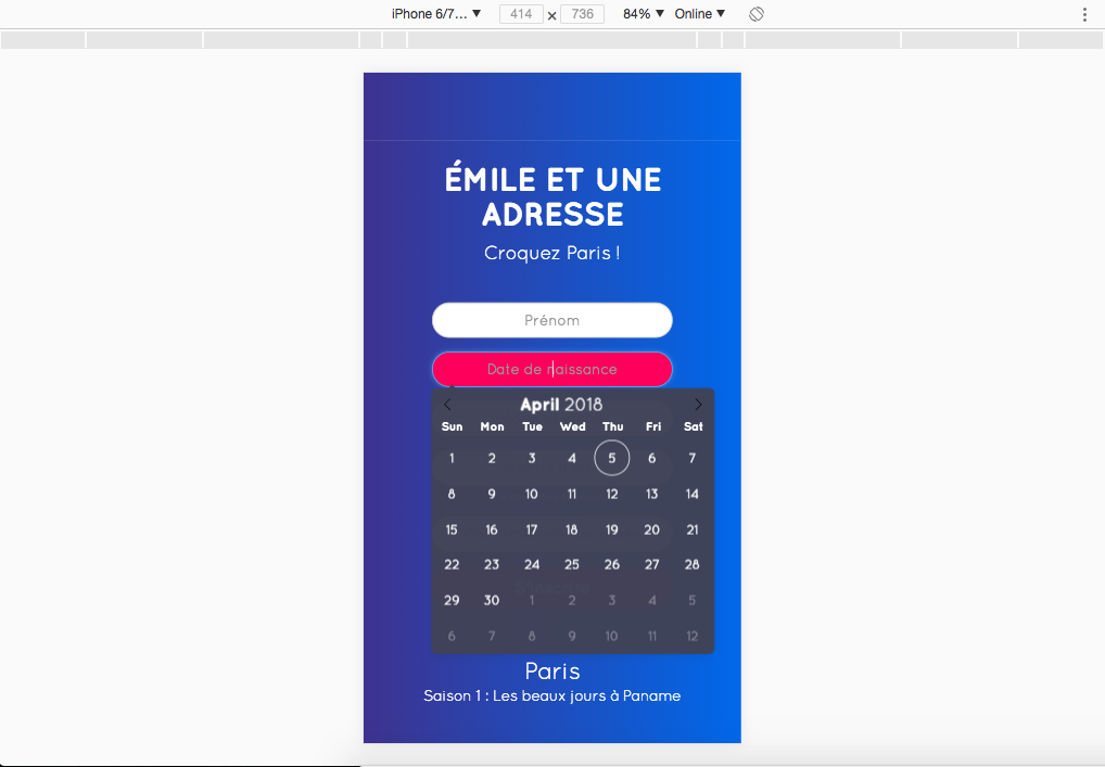
But then again, if I refresh on this same iPhone6/7/8 screen, it does not apply anymore.
Did someone already have this issue? Is there any way to fix it?
Thank you!
Your Environment
- flatpickr version used: 4.4.3
- Browser name and version: Chrome version 65.0.3325.181
- OS and version: macOS High Sierra Desktop
 PierreGirbau
All 3 comments
Old issue but I didn't see a resolution. For anyone coming here in the future:
The issue is every time I go to localhost, with a iPhone6/7/8 device width screen, as a typical user would do, all my CSS and dark theme does not apply, it just shows the default flatpickr design calendar.
I don't think that is the default flatpickr design. That looks like desktop Chrome's native datetime picker. Flatpickr changes to a <input type="date"> on mobile and doesn't have an altInput. Notice your input box lacks the placeholder or red background. You can disable this behaviour if you want to always show flatpickr calendar by adding the option disableMobile: false https://flatpickr.js.org/options/.
 aldhsu
on 2 Jan 2019
aldhsu
on 2 Jan 2019
@aldhsu that is spot on.
Closing the issue as resolved. Please reopen if necessary
 viorelsfetea
on 21 Mar 2019
viorelsfetea
on 21 Mar 2019
I think @aldhsu meant disableMobile: true to always show the Flatpickr calendar.
 orrd
on 18 Sep 2019
orrd
on 18 Sep 2019
Related issues
 zortext
·
3Comments
zortext
·
3Comments
 bedakb
·
3Comments
bedakb
·
3Comments
 overtune
·
3Comments
overtune
·
3Comments
 titiyoyo
·
3Comments
titiyoyo
·
3Comments
 pimskie
·
3Comments
pimskie
·
3Comments
Most helpful comment
I think @aldhsu meant
disableMobile: trueto always show the Flatpickr calendar.