I find the flameshot UI very confusing and dysfunctional:
- All icons are round and violet. I cannot just select what I want, I have to stop and understand them first.
- They are moving around as the selection changes, so I can't even memorize their positions.
- Especially the X icon is placed among the others like any others and a casual user may wonder if it is a tool and use it by mistake.
- I definetely prefer text to icons anyway (similar to Greenshot). Icons are not so distinctive (check "marker" vs "pencil" or the "open app" too similar to "upload to Imgur"). At first, I thought the four radial arrows icon was supposed to be dragged around to just reposition the selection (I believe I saw this behaviour in some other application) and the selection size icon to set an exact size manually. These icons are more or less passive and they are the only ones. They are odd. "Undo" turns counterclockwise while "Redo" turns clockwise and I don't see any special reason for that (apart from the clock metaphore, which is a bit sophisticated if you are in a hurry). Tooltips are not enough.
- "Undo" is right there even when there is nothing to undo, the same for "Redo".
- Instead of instructions to use a color picker, I would prefer an icon/voice to just select the color. Plus, the right click instructions are not working for me because easystroke interferes with it.
 jscham
All 9 comments
I aggree with the second one.
 ZetaoYang
on 3 Jul 2019
ZetaoYang
on 3 Jul 2019
I thought the same when I first use it, but once I'd take a few screen shots it was easy enough to know at a glance which icon does what and easily access the one i wanted.
 nicekiwi
on 17 Jul 2019
nicekiwi
on 17 Jul 2019
I find the UI very confusing as well.
I mostly use copy to clipboard, save and a few others. Maybe there could be a way to group the
buttons and/or highlight the most used.
Also, there could be keyboard shortcuts. Haven't found anything about this on the configuration.
 sparcbr
on 27 Jul 2019
sparcbr
on 27 Jul 2019
There are keyboard shortcuts and you can choose which icons you see in the preferences. Check the documentation and the -help command.
nicekiwi
on 28 Jul 2019
I mostly use copy to clipboard, save and a few others. Maybe there could be a way to group the
buttons and/or highlight the most used.
Or maybe just hiding the not needed icons? Changing the order of the tools, because the pencil is always at the same position?
But it is an amazing application. Thank you!
 Murmele
on 29 Aug 2019
Murmele
on 29 Aug 2019
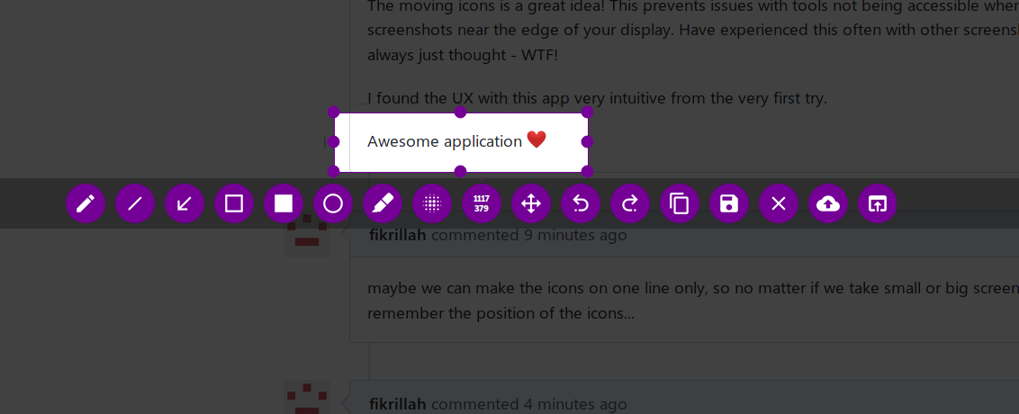
The moving icons is a great idea! This prevents issues with tools not being accessible when you make screenshots near the edge of your display. Have experienced this often with other screenshot tools and always just thought - WTF!
I found the UX with this app very intuitive from the very first try.
Awesome application :heart:
 Tset-Noitamotua
on 3 Sep 2019
Tset-Noitamotua
on 3 Sep 2019
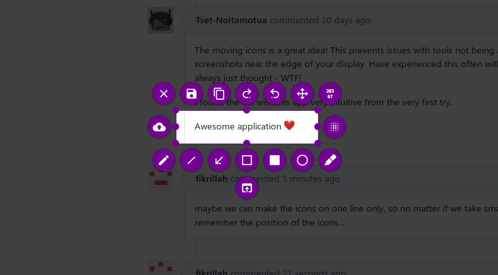
maybe we can make the icons on one line only, so no matter if we take small or big screenshot, we can remember the position of the icons...
this is what i mean
(the icons is above the selection if we take lower screen)
it's better than what we got now
 fikrillah
on 23 Sep 2019
fikrillah
on 23 Sep 2019
also, selected tool is not distinctive enough, i mean it's hard to know which tool that is active at a time
fikrillah
on 23 Sep 2019
ok so, i made the ui concept as attempt to solve this issue.
(sorry for badly drawn picture)
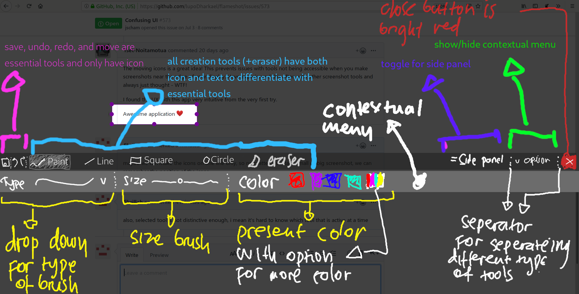
that's for drawing tool, and here's contextual menu for other tool:
LINE
- two button for selecting normal and highlight tool
- if normal line selected, there should be option for arrow
- round/boxy end option
- size and color like in the picture
SQUARE
- option for stroke, fill, and blur
- if stroke selected, there should be thickness control
- if blur selected, intensity control
- roundness level control
- if stroke and fill selected, color present
CIRCLE
- same as square maybe, but stroke menu should be there
ERASER
- size
- hardness (not necessary actually)
note:
- all component of the tool bar should be less standout than selected screenshot area
- all contextual menu should be easy to discover/understood
- toolbar shrinks when side panel activated
fikrillah
on 23 Sep 2019
Related issues
 orschiro
·
3Comments
orschiro
·
3Comments
 bingoIsCoder
·
4Comments
bingoIsCoder
·
4Comments
 dajare
·
4Comments
dajare
·
4Comments
 xstable
·
3Comments
xstable
·
3Comments
 omkarnathsingh
·
4Comments
omkarnathsingh
·
4Comments
Most helpful comment
ok so, i made the ui concept as attempt to solve this issue.
(sorry for badly drawn picture)

that's for drawing tool, and here's contextual menu for other tool:
LINE
SQUARE
CIRCLE
ERASER
note: