Firacode: 1.207 looks terrible in Emacs
Default Emacs, Arch Linux x86_64 5.2.1-arch1-1-ARCH
1.207

1.206

Can you revert whatever change caused this?
 sooqua
All 51 comments
I'm also facing a similar issue, same Arch Linux, using the otf-fira-code package.
I am using Alacritty, 10.5 pt font size.
1.206

1.207 (Font is just generally shorter)

1.206

1.207 (Notice the misalignments to the bottom of the chevron)

Edit: I did some bisecting and found commit https://github.com/tonsky/FiraCode/commit/2202877946b191b88f41a01b018958015fbfe64c to result in the misaligned chevrons.
 AidanGG
on 22 Jul 2019
AidanGG
on 22 Jul 2019
Also having the same problem everywhere on Linux. Downgraded to 1.206 until this issue is resolved. 1.207 is very blurry and I have not changed my fontconfig at all.
 Tatsh
on 23 Jul 2019
Tatsh
on 23 Jul 2019
Having the exact same issue as @sooqua.
Tested on Arch Linux and Alpine Linux. No fontconfig changes.
The issue is not unique to Emacs: also appears in suckless dwm, dmenu, st.
No other applications seem affected.
Edit: I was using the TTF version. Replacing with OTF seems to have fixed the issue.
 zoickx
on 23 Jul 2019
zoickx
on 23 Jul 2019
Okay font metrics might have changed due to Google Fonts normalization process. I do not consider it to be a bug though: still the same font, still the same letter shapes, roughly same metrcis. It also would be impossible to roll back.
Match line height exactly is unfortunately impossible to do for every possible terminal out there. You fix it for one, you break it for others. There’s no solution that will satisfy everyone. The change in 1.207 was accidental, probably due to the metrics change mentioned above, but there’s no point tweaking it further for that specfic terminal.
The original issue by @sooqua with emacs skipping every other char is really strange. Anyone has any guess what might’ve caused this? Fonts should not behave that way. Maybe glyph proportions are somehow hardcoded in emacs?
@sooqua can you provide some details about your setup? Which font files are you using (ttf/otf?) How are you getting them? What GUI toolkit (GTK/what else)? How are you setting Fira Code to be a emacs font? Are you doing any of the dark magic to enable ligatures?
 tonsky
on 23 Jul 2019
tonsky
on 23 Jul 2019
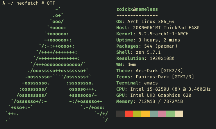
@tonsky I do not believe the problem is with Emacs. Let me provide some details, as I am experiencing the exact same problem.
- Arch Linux x86_64 5.2.2-arch1-1-ARCH (also tested on Alpine 3.10.01, but not as extensively)
- TTF files. With OTF files the problem does not occur.
- Tried installing as a package. Tried copying to
/usr/share/fontsmanually, updating withfc-cacheafterwards. The problem occurs in both cases. - Only tested GTK on X11. Some applications (firefox, thunar) work fine, displaying monospaced ligatures and all. Others (emacs, dwm, st, dmenu) have the weird whitespace between letters.
- In Emacs the font is set via
(set-default-font "Fira Code") - No dark magic at all, an init file with a single declaration for the default font is sufficient to reproduce the problem.

Edit:
$ uname --all
Linux nameless 5.2.2-arch1-1-ARCH #1 SMP PREEMPT Sun Jul 21 19:18:34 UTC 2019 x86_64 GNU/Linux

$ fc-cache; fc-list
/usr/share/fonts/TTF/FiraCode-Retina.ttf: Fira Code,Fira Code Retina:style=Retina,Regular
/usr/share/fonts/TTF/FiraCode-Bold.ttf: Fira Code:style=Bold
/usr/share/fonts/TTF/FiraCode-Light.ttf: Fira Code,Fira Code Light:style=Light,Regular
/usr/share/fonts/TTF/FiraCode-Medium.ttf: Fira Code,Fira Code Medium:style=Medium,Regular
/usr/share/fonts/TTF/FiraCode-Regular.ttf: Fira Code:style=Regular
/home/zoickx/.local/share/fonts/FiraSans-Bold.ttf: Fira Sans:style=Bold
/home/zoickx/.local/share/fonts/FiraSans-BoldItalic.ttf: Fira Sans:style=Bold Italic
/home/zoickx/.local/share/fonts/FiraSans-Italic.ttf: Fira Sans:style=Italic
/home/zoickx/.local/share/fonts/FiraSans-Regular.ttf: Fira Sans:style=Regular

$ pacman -Q ttf-fira-code
ttf-fira-code 1.207-1
I'm having the same issue as @AidanGG. The font is blurry on 1.207 to an unacceptable level. I am open to how to fix this like if there is a font config change to make. I have not tried OTF files yet.
Tatsh
on 23 Jul 2019
@Tatsh AidanGG problem was not about bluriness. What exactly your problem and what’s your setup?
tonsky
on 23 Jul 2019
There is also slight bluriness in my first comparison, which is probably due to the change in metrics.
AidanGG
on 23 Jul 2019
Did you use otf or ttf for 1.206? TTF has hinting, that might be the issue
tonsky
on 23 Jul 2019
I used otf in those screenshots. My fontconfig is the default on Arch: hintslight+antialias.
AidanGG
on 23 Jul 2019
Im getting the same issue with Emacs and 1.207. Downgrading to 1.206 solves the problem. Used TTF for both.
 kayew
on 23 Jul 2019
kayew
on 23 Jul 2019
Which font files are you using (ttf/otf?)
ttf, but as @zoickx mentioned, switching to otf "fixes" the issue
How are you getting them?
Initially through pacman, but before creating this issue I manually downloaded the 1.207 zip archive and installed it in ~/.local/share/fonts, I thought maybe the Arch repositories messed something up?
What GUI toolkit (GTK/what else)?
Only GTK
How are you setting Fira Code to be a emacs font?
(set-frame-font "Fira Code 12" nil t)
Are you doing any of the dark magic to enable ligatures?
I used to, but again, for the purpose of testing everything with default settings before making this issue, I renamed my .emacs.d
sooqua
on 23 Jul 2019
On Gentoo, the Fira Code package installs OTF files and I am still getting my issue with 1.207 but not 1.206. Gentoo fetches the archive file from GitHub.
https://github.com/gentoo/gentoo/blob/master/media-fonts/fira-code/fira-code-1.207.ebuild#L10
(resolves to https://github.com/tonsky/FiraCode/archive/1.207.tar.gz)
Tatsh
on 23 Jul 2019
I have made this GIF to demonstrate the differences. Version 1.206 is when the text is taller and without a blur at some edges such as the top in the letter M. 1.206 (good) is shown first.

Here's the images separately:
1.206 (good)

1.207 (bad)

Tatsh
on 24 Jul 2019
Just to recap the issues for 1.207 in this thread:
- Emacs (and others such as dmenu, st) have a horizontal spacing issue, which appears to be fixed by using the 1.207 otfs.
- A pervasive vertical scaling issue where things end up looking blurrier. This occurs in 1.207 ttfs and otfs, with the only known workaround downgrading to 1.206. This appears to have been introduced in https://github.com/tonsky/FiraCode/commit/2202877946b191b88f41a01b018958015fbfe64c.
AidanGG
on 24 Jul 2019
I have this problem on Windows as well in Visual Studio. I downloaded directly from the GitHub release assets and installed the .otf files. 1.207 looks really off compared to 1.206, I can't use it. I think 1.207 is stretched to be taller, look at the e characters to compare. In 1.206 the center line of the e is horizontal as it should be, but it's slanted in 1.207.
1.206 (looks great)

1.207 (not so great)

 vaindil
on 25 Jul 2019
vaindil
on 25 Jul 2019
I'm not so sure about everyone else, but my main issue is that everything seems a little more... spaced out? In 1.206, everything felt tighter and now the text seems farther apart in 1.207. I'm seeing this in both Emacs (on the Mac Port by Mitsuharu Yamamoto) as well as iTerm2.
@tonsky Is this likely to be fixed or should I just downgrade to 1.206?
 ylluminarious
on 26 Jul 2019
ylluminarious
on 26 Jul 2019
rxvt-unicode (Arch linux) completely fails to calculate character width with fira-code 1.207:
urxvt: unable to calculate font width for 'FiraCode-11:slant=0:weight=100:minspace=True', ignoring.
The arch-linux package urxvt-unicode-patched which uses Xft's xOff instead of width attribute, shows same problem as emacs.
 larsch
on 27 Jul 2019
larsch
on 27 Jul 2019
To Arch Linux users suffering wide spacing, has pango been upgraded recently to 1.44, see https://gitlab.gnome.org/GNOME/pango/issues/386
 RalphCorderoy
on 28 Jul 2019
RalphCorderoy
on 28 Jul 2019
Can everyone in this thread please try these files and let me know if they fix the problem? Thanks!
tonsky
on 1 Aug 2019
Did not fix it for me (in Emacs).
sooqua
on 2 Aug 2019
Thank you @tonsky, that looks like it has fixed the bluriness issues I was facing. Haven't been able to test the wide spacing in Emacs though.
AidanGG
on 2 Aug 2019
That fixes my issue @tonsky.
Tatsh
on 2 Aug 2019
Did not fix the super-wide spacing in Emacs and other apps @tonsky.
zoickx
on 2 Aug 2019
@tonsky Your new files fixed the problem I was seeing! Thanks so much!
ylluminarious
on 2 Aug 2019
@sooqua @zoickx what about these and emacs issue?
FiraCode-Glyphs-export.zip
tonsky
on 3 Aug 2019
Seems to be fixed, but it looks bolder compared to otf package.
sooqua
on 3 Aug 2019
@sooqua Can you screenshot both versions?
tonsky
on 3 Aug 2019
otf

FiraCode-Glyphs-export.zip

I'm not sure which one looks better, but they do look different.
sooqua
on 3 Aug 2019
@sooqua @zoickx what about these and emacs issue?
FiraCode-Glyphs-export.zip
Tried these, can report a result similar to @sooqua's.
Comparison in Emacs:
Comparison in st:
The suggested TTF files (regular variation) are:
- More vertically spaced out and bolder in Emacs.
- More vertically spaced out and _not bolder_ in st.
Original files just in case: screenshots.zip
zoickx
on 3 Aug 2019
FiraCode-Glyphs-export.zip looks 100% identical to v1.206 in rxvt-unicode on Arch Linux.
larsch
on 4 Aug 2019
@tonsky
The original issue by @sooqua with emacs skipping every other char is really strange. Anyone has any guess what might’ve caused this? Fonts should not behave that way. Maybe glyph proportions are somehow hardcoded in emacs?
Emacs isn’t skipping characters — it’s increasing the spacing between them. Emacs requires that every glyph in a monospaced font actually has the same advance width. If a non-monospaced glyph is included in the font — even if it’s not used on screen — it will throw off the display in the manner shown.
Okay font metrics might have changed due to Google Fonts normalization process.
🤔
 mbutterick
on 8 Aug 2019
mbutterick
on 8 Aug 2019
Can everyone in this thread please try these files and let me know if they fix the problem? Thanks!
Came to post about two issues on Win10 LTSC 1809;
- Line spacing issues in NP++ v7.7.1, excessive spacing.
- Font size issues in SecureCRT v8.5.4, font really small.
Both issues are resolved by using the files in the restored-metrics.zip.
 derek-shnosh
on 13 Aug 2019
derek-shnosh
on 13 Aug 2019
New build. Please try files from this commit: https://github.com/tonsky/FiraCode/tree/b32369cb03ad3c0fe43fd30fd19427169e9592dc/distr/ttf
The main change are:
- I slightly tuned UPM (2000->1950) so that Fira Code 13px would match pixel grid perfectly. This should be almost indistinguishable from the last version, but I want to make sure.
- I also moved both ascender and descender down a bit, which should hopefully fix #552 without causing anybody else any trouble.
- Last, I used default Glyphs export instead of google fonts scripts.
Let me know how it all works for you. Thanks!
tonsky
on 30 Aug 2019
Chars seem a hair _taller_ now (not bothersome) on W10-LTSC (build 17763.720)... I'm wondering if this is intentional as the Fira Sans font is a _taller_ font.
Edit: I prefer this taller typeface to the previous more compact one.
GIF showing SecureCRT difference while installing from the latest commit...

**GIF showing diff between Fira Medium files..."

derek-shnosh
on 30 Aug 2019
New build. Please try files from this commit: https://github.com/tonsky/FiraCode/tree/b32369cb03ad3c0fe43fd30fd19427169e9592dc/distr/ttf
Tried these, the change seems pretty minor compared to this version.
Here is a gif comparing OTF v1.207 and the two versions I just referenced:

zoickx
on 2 Sep 2019
@tonsky I am also seeing a noticeable increase in height and/or vertical spacing in your new build. Here are some screenshots to demonstrate.
This is what FiraCode-restored-metrics.zip looks like:

This is what your new build on b32369c looks like:

For now, I am going to continue using the former version (i.e., FiraCode-restored-metrics.zip) because I like the text to be more compact. I dislike the height / spacing increase in the new build.
ylluminarious
on 3 Sep 2019
Yes there’s 2.5% increase to fit into pixel grid at 13px size
tonsky
on 4 Sep 2019
I also prefer the former version FiraCode-restored-metrics.zip, but rather because it doesn't have issues with the chevrons as in my post https://github.com/tonsky/FiraCode/issues/798#issuecomment-513727504.
AidanGG
on 4 Sep 2019
@AidanGG that is pretty easy to fix. Try this version: https://github.com/tonsky/FiraCode/tree/294902a4014d43d76a1e5337ca63f113cbeaaebf/distr/ttf

tonsky
on 5 Sep 2019
Thanks again @tonsky that seems to have fixed it for me, but I will be sure to test it more thoroughly.
AidanGG
on 6 Sep 2019
@tonsky I have been trying to use 2 but I have found an issue with certain letters at font size 13px or less. This is all taken from VS Code on Linux:
Fira Code 1.206:

Fira Code 2:

The straight line in the f character is blurry in 2. And this is the same for the underline. The font size in the screenshot is 13px. If there is a fontconfig change to make, I am happy to do that.
I have my fontconfig hinting set to hintfull (3), lcdfilter = lcddefault, subpixel rgb = rgba.
On Windows I am not experiencing this issue (the only difference there is that I am probably using TTF files instead of OTF (which the Gentoo package installs)).
Also I can open a new issue if you prefer.
Tatsh
on 20 Oct 2019
Fira Code is not optimized for any specific pt size (and if it was, it would only be possible to optimize for one specific size, not all of them). So some lines will always be blurry. The only thing changed from 1.206 to 2 is which lines those are. Underscore got unlucky.
tonsky
on 20 Oct 2019
@tonsky I switched to the TTF files on Linux and now things look normal (at least the underline is 1px in height at ~13px size). Is there a reason TTF would work better than OTF?
For whatever reason, Gentoo maintainers tend to prefer installing OTF files over TTF.
Tatsh
on 21 Oct 2019
TTF has hinting, OTF has not. If your OS relies on it, use TTF (Windows, Linux probably too). On macOS hinting is ignored, so both TTF and OTF should work the same.
On 21. Oct 2019, at 02:58, Tatsh notifications@github.com wrote:
@tonsky https://github.com/tonsky I switched to the TTF files on Linux and now things look normal (at least the underline is 1px in height at ~13px size). Is there a reason TTF would work better than OTF?
For whatever reason, Gentoo packages tend to prefer installing OTF files over TTF.
—
You are receiving this because you were mentioned.
Reply to this email directly, view it on GitHub https://github.com/tonsky/FiraCode/issues/798?email_source=notifications&email_token=AACFU3G4T3IKU65YOS2DATTQPT5C3A5CNFSM4IFWWWMKYY3PNVWWK3TUL52HS4DFVREXG43VMVBW63LNMVXHJKTDN5WW2ZLOORPWSZGOEBYYWLA#issuecomment-544312108, or unsubscribe https://github.com/notifications/unsubscribe-auth/AACFU3F6WNQWFPQQB5VWB33QPT5C3ANCNFSM4IFWWWMA.
tonsky
on 21 Oct 2019
TTF has hinting, OTF has not. If your OS relies on it, use TTF (Windows, Linux probably too). On macOS hinting is ignored, so both TTF and OTF should work the same.
@tonsky --- I just did a fresh install of linux and was struggling to get the font rendering right in vscode. After several hours of meddling with system, searching in my linux forms, I finally found the above point. And this resolved the issue --- I had installed OTF version.
So, I would suggest putting this point (TTF for linux, windows and OTF for macOS) somewhere in the home page or help section so that users can easily find it.
And thanks for this beautiful font!
 werunom
on 28 Jan 2020
werunom
on 28 Jan 2020
Instruction mentions ttf already https://github.com/tonsky/FiraCode/wiki/Installing
tonsky
on 28 Jan 2020
@tonsky --- I had not noticed it. Thanks for pointing out.
If I may suggest, I think the wiki can be made more clear. The instructions does not state a crucial info: if OTF is used in linux, text might be hinted. It is important to clarify this because saying "use TTF in linux" does not imply that "do not use OTF". By mentioning the symptoms, the ambiguity can be removed.
werunom
on 29 Jan 2020
Added it to troubleshooting page too. Maybe I should just remove OTF at all, afaik TTF works just fine on macOS too.
tonsky
on 30 Jan 2020
@sooqua @Tatsh @zoickx or anyone with the double-width issue, can you please test this build for me? Thanks!
tonsky
on 8 Oct 2020
zoickx
on 27 Oct 2020
Related issues
 Jhonyrod
·
4Comments
Jhonyrod
·
4Comments
 hatched
·
3Comments
hatched
·
3Comments
 RustemB
·
4Comments
RustemB
·
4Comments
 pedrowebcomum
·
4Comments
pedrowebcomum
·
4Comments
 tomByrer
·
4Comments
tomByrer
·
4Comments
Most helpful comment
Can everyone in this thread please try these files and let me know if they fix the problem? Thanks!
FiraCode-restored-metrics.zip