Files: The tabview scroll buttons aren't properly aligned
Describe the bug
The scroll buttons in tabview aren't properly aligned.
To Reproduce
Steps to reproduce the behavior:
- Launch files-uwp app.
- Go to a folder with sufficiently large path.
- Right click on it and open it in new tab.
- Open the vertical tabview flyout.
Expected behavior
The scroll buttons should be centered.
Screenshots

Desktop (please complete the following information):
- OS Version : Windows 10 1903 18362.239
- App version: v0.12.0
Additional context
Also the the style of button should match the style of rest of buttons in the app.
 soumyamahunt
All 6 comments
In this case, there shouldn't be any scroll buttons, the expected behavior would be for a tool tip to show the full path or name.
 yaichenbaum
on 23 Jul 2020
yaichenbaum
on 23 Jul 2020
In this case, there shouldn't be any scroll buttons, the expected behavior would be for a tool tip to show the full path or name.
In that case I will implement that, also I am thinking of disabling horizontal scrolling here entirely, since with tooltip it's not needed, also it interferes with vertical scrolling.
soumyamahunt
on 23 Jul 2020
I'm on 0.12.0 but don't see that tab flyout - I just have the 3-dots and the search (which doesn't work - clicking on it does nothing). Am I missing something?
 Talisman39ar
on 24 Jul 2020
Talisman39ar
on 24 Jul 2020
I'm on 0.12.0 but don't see that tab flyout - I just have the 3-dots and the search (which doesn't work - clicking on it does nothing). Am I missing something?
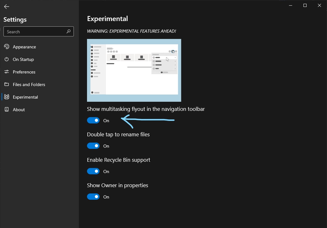
You mean you don't have that button?? Have you enabled this:
soumyamahunt
on 24 Jul 2020
At least on my 0.12.0.0 that toggle isn't in Settings.
Though upon further reading about how this supersedes horizontal tabs along the top, I'd actually want to stay with horizontal 😉 - fewer clicks, less information hidden. This may make sense in an overflow situation with loads of tabs (though that seems like a super edge case), but otherwise definitely a worse UX.
Talisman39ar
on 24 Jul 2020
At least on my 0.12.0.0 that toggle isn't in Settings.
Though upon further reading about how this supersedes horizontal tabs along the top, I'd actually want to stay with horizontal 😉 - fewer clicks, less information hidden. This may make sense in an overflow situation with loads of tabs (though that seems like a super edge case), but otherwise definitely a worse UX.
The new tab layout is only in the beta builds right now, hovering over the flyout button will automatically expand the flyout so there is no need for extra clicks. We are still exploring the options and we will continue to improve the new experience before rolling out the changes to everyone else.
yaichenbaum
on 24 Jul 2020
Related issues
 crashmit
·
3Comments
crashmit
·
3Comments
 generalguy41
·
3Comments
generalguy41
·
3Comments
 Cyberdroid1
·
3Comments
Cyberdroid1
·
3Comments
 DeDaMrAzR
·
3Comments
DeDaMrAzR
·
3Comments
 SinGuLaRiTy2001
·
3Comments
SinGuLaRiTy2001
·
3Comments