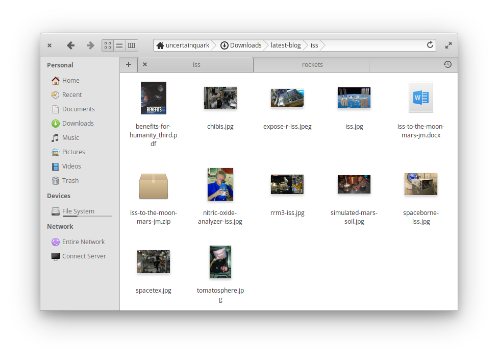
Describe the bug
Can't open new tabs.
To Reproduce
Steps to reproduce the behavior:
- Go to 'More options'
- Click on 'New Tab'
- Nothing happens.
Expected behavior
It should open a new tab, but it doesn't.
Desktop (please complete the following information):
- OS Version: Windows 10 Insider (Dev Channel) 20170.1000
- App version: v0.12.2.0
Additional context
Restarting won't fix it, neither reparing/reseting the app via Apps & features.
 rdrtnk
All 12 comments
@rdrtnk Hello there.
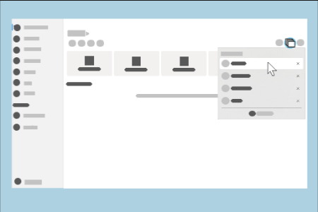
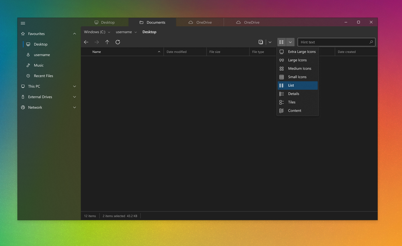
We recently changed the default behavior of the tabs to be in a Vertical tab flyout.
Can you try accessing the vertical tabs flyout after creating a new tab?
 duke7553
on 22 Jul 2020
duke7553
on 22 Jul 2020
@rdrtnk Hello there.
We recently changed the default behavior of the tabs to be in a Vertical tab flyout.
Can you try accessing the vertical tabs flyout after creating a new tab?
Hello duke7553, thanks for answering promptly.
Thanks, now I've just figured out how it works.
Is there any keyboard shortcut to create a new tab instead of creating them by the menu?
Thanks again!
rdrtnk
on 22 Jul 2020
@rdrtnk Have you tried ctrl + t?
 yaichenbaum
on 22 Jul 2020
yaichenbaum
on 22 Jul 2020
@rdrtnk Have you tried
ctrl + t?
@yaichenbaum yes. I just noticed that it indeed creates the new tab, but you're not automatically redirected to it, creating the feeling that it didn't work - unless you know you have to go to the menu and select it.
Will this be the default behavior from now on?
Thanks!
rdrtnk
on 22 Jul 2020
The expected behavior is for the app to switch to the new tab.
yaichenbaum
on 22 Jul 2020
@rdrtnk Hello there.
We recently changed the default behavior of the tabs to be in a Vertical tab flyout.
Can you try accessing the vertical tabs flyout after creating a new tab?
Please, tell me that's optional and there's a toggle to bring back the horizontal tabs layout
 SOI7
on 24 Jul 2020
SOI7
on 24 Jul 2020
@rdrtnk Hello there.
We recently changed the default behavior of the tabs to be in a Vertical tab flyout.
Can you try accessing the vertical tabs flyout after creating a new tab?
Please, tell me that's optional and there's a toggle to bring back the horizontal tabs layout
Not at the moment
 mdtauk
on 24 Jul 2020
mdtauk
on 24 Jul 2020
Vertical flyout tabs is very inconvenient, not only you don't see what tabs are open without any clicks, interacting with tabs is hassle.
It would be great if horizontal tabs would be brought back.
Vertical tabs save space when there is a lot of open tabs, but I think Files UWP use case differs from let's say browser. People usually don't have more than 4 open File Explorer windows (noticed from co-workers and myself) and that kind of beats the purpose of having vertical tabs.
 TailyFair
on 24 Jul 2020
TailyFair
on 24 Jul 2020
Vertical flyout tabs is very inconvenient, not only you don't see what tabs are open without any clicks, interacting with tabs is hassle.
It would be great if horizontal tabs would be brought back.
Vertical tabs save space when there is a lot of open tabs, but I think Files UWP use case differs from let's say browser. People usually don't have more than 4 open File Explorer tabs (noticed from co-workers and myself).
There is no good visual indicator when a new tab has been created. You have no good visual way to just see what tabs are open at a glance, when doing file system manipulations.
Vertical tab display itself is not a bad idea, and would be useful as an option, but hiding them within a flyout is bad UX in my opinion.
I am not sure what is being solved by moving the Tabs out of a clearly visible region.
mdtauk
on 24 Jul 2020
Vertical flyout tabs is very inconvenient, not only you don't see what tabs are open without any clicks, interacting with tabs is hassle.
It would be great if horizontal tabs would be brought back.
Vertical tabs save space when there is a lot of open tabs, but I think Files UWP use case differs from let's say browser. People usually don't have more than 4 open File Explorer windows (noticed from co-workers and myself) and that kind of beats the purpose of having vertical tabs.
This is one of the many reasons we removed the horizontal tabstrip, because it took up far too much space for one/two tabs open at once.
duke7553
on 24 Jul 2020
There is no good visual indicator when a new tab has been created. You have no good visual way to just see what tabs are open at a glance, when doing file system manipulations.
Improvements in this area are coming soon, but we prefer to keep it separate from the tabs area.
Vertical tab display itself is not a bad idea, and would be useful as an option, but hiding them within a flyout is bad UX in my opinion.
Maybe we could promote the flyout more?
I am not sure what is being solved by moving the Tabs out of a clearly visible region.
See https://github.com/files-community/files-uwp/issues/1193
duke7553
on 24 Jul 2020
There is no good visual indicator when a new tab has been created. You have no good visual way to just see what tabs are open at a glance, when doing file system manipulations.
Improvements in this area are coming soon, but we prefer to keep it separate from the tabs area.
I will remain hopeful this solution is functional.
Vertical tab display itself is not a bad idea, and would be useful as an option, but hiding them within a flyout is bad UX in my opinion.
Maybe we could promote the flyout more?
At this stage, I predict users would probably prefer to keep the tabs, and change the sidebar implementation. I remain convinced the flyout is a poor substitute for visible tabs. Promoting it is not going to substitute for an always present UX.
I am not sure what is being solved by moving the Tabs out of a clearly visible region.
See #1193
You seem to have decided to sacrifice the TabView, to maintain an sidebar being separate from the content view. I am not sure the usefulness of the NavigationView sidebar equals that of the tabs.
There are examples of other file exploring interfaces that may be useful to explore.
The tab metaphor does not always require the components to be contained to an area.
In the Discord server I posted a couple of images of an app design using visible tabs.
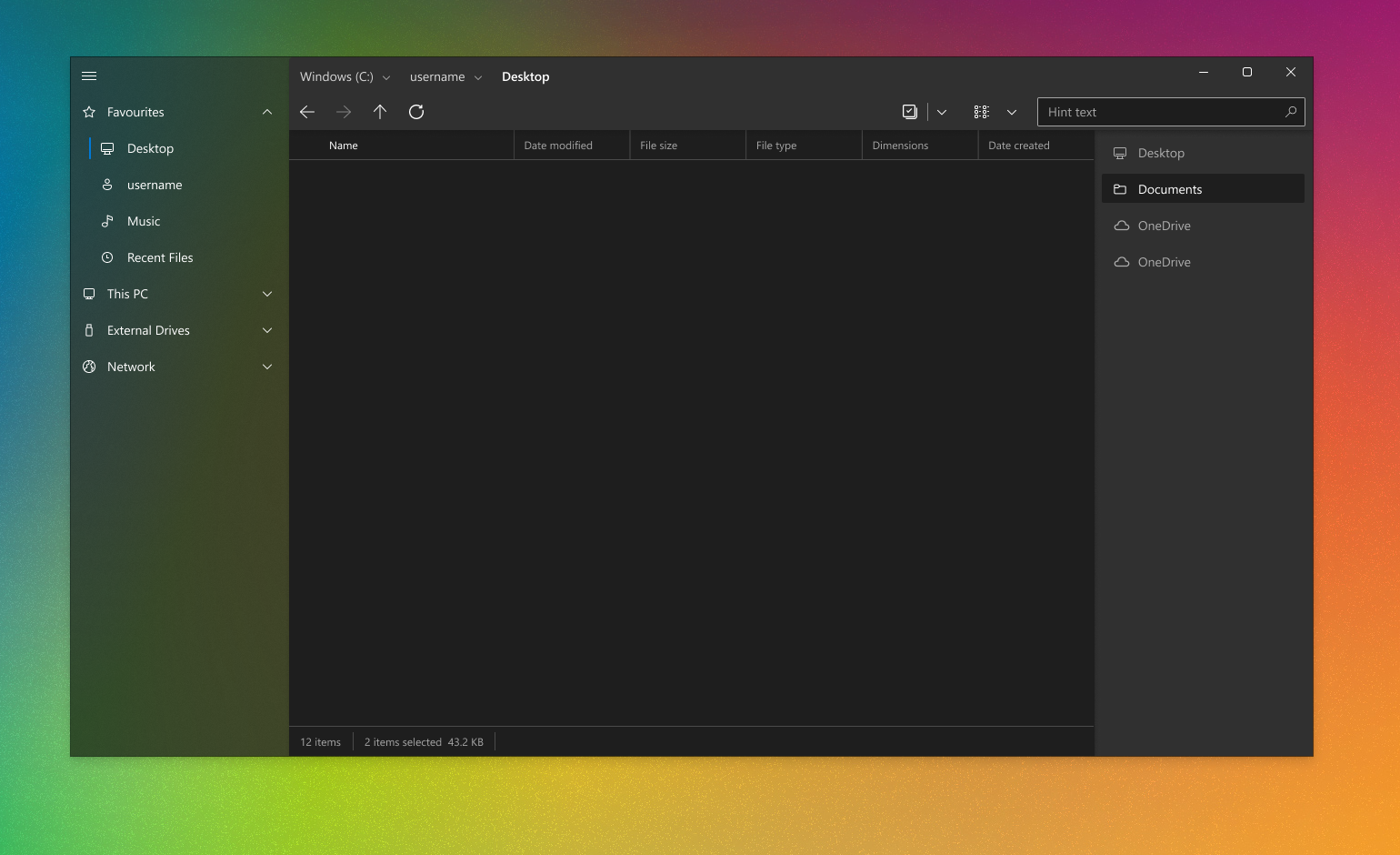
I am not for a moment suggesting these layouts are better than what you are currently using. But I would ask that you consider if a flyout is really necessary to be set as the only option (as opposed to an option to "Hide tab views" in the settings).
And if you really feel the sidebar can lead to some degree of confusion over hidden tabs - would you consider changing the visual approach of the sidebar, to "correct" the grouping of elements within a tab?
mdtauk
on 24 Jul 2020
Related issues
 rashil2000
·
24Comments
SOI7
·
22Comments
rashil2000
·
24Comments
SOI7
·
22Comments
 szaimen
·
18Comments
szaimen
·
18Comments
 BuraChuhadar
·
23Comments
BuraChuhadar
·
23Comments
 Jaiganeshkumaran
·
24Comments
Jaiganeshkumaran
·
24Comments
Most helpful comment
There is no good visual indicator when a new tab has been created. You have no good visual way to just see what tabs are open at a glance, when doing file system manipulations.
Vertical tab display itself is not a bad idea, and would be useful as an option, but hiding them within a flyout is bad UX in my opinion.
I am not sure what is being solved by moving the Tabs out of a clearly visible region.