Files: UI improvement for file properties in list view / tile view
Is your feature request related to a problem? Please describe.
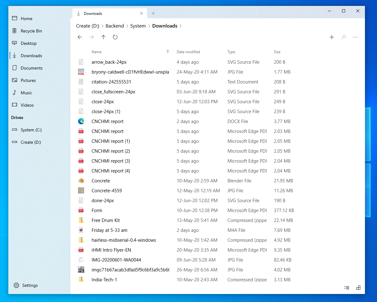
When a user browses through the files in a file explorer, they try to identify the file based on two things:
- Name of the file
- Icon/thumbnail of the file
In the current app, all the properties shown are of the same importance (name, size, file type...)
While yes, the information is helpful and is displayed at all times, they are only necessary when the user wants to know it.
Describe the solution you'd like
Except for the name, other properties can be of a lesser opacity, so that the name and icon/thumbnail stand out better.
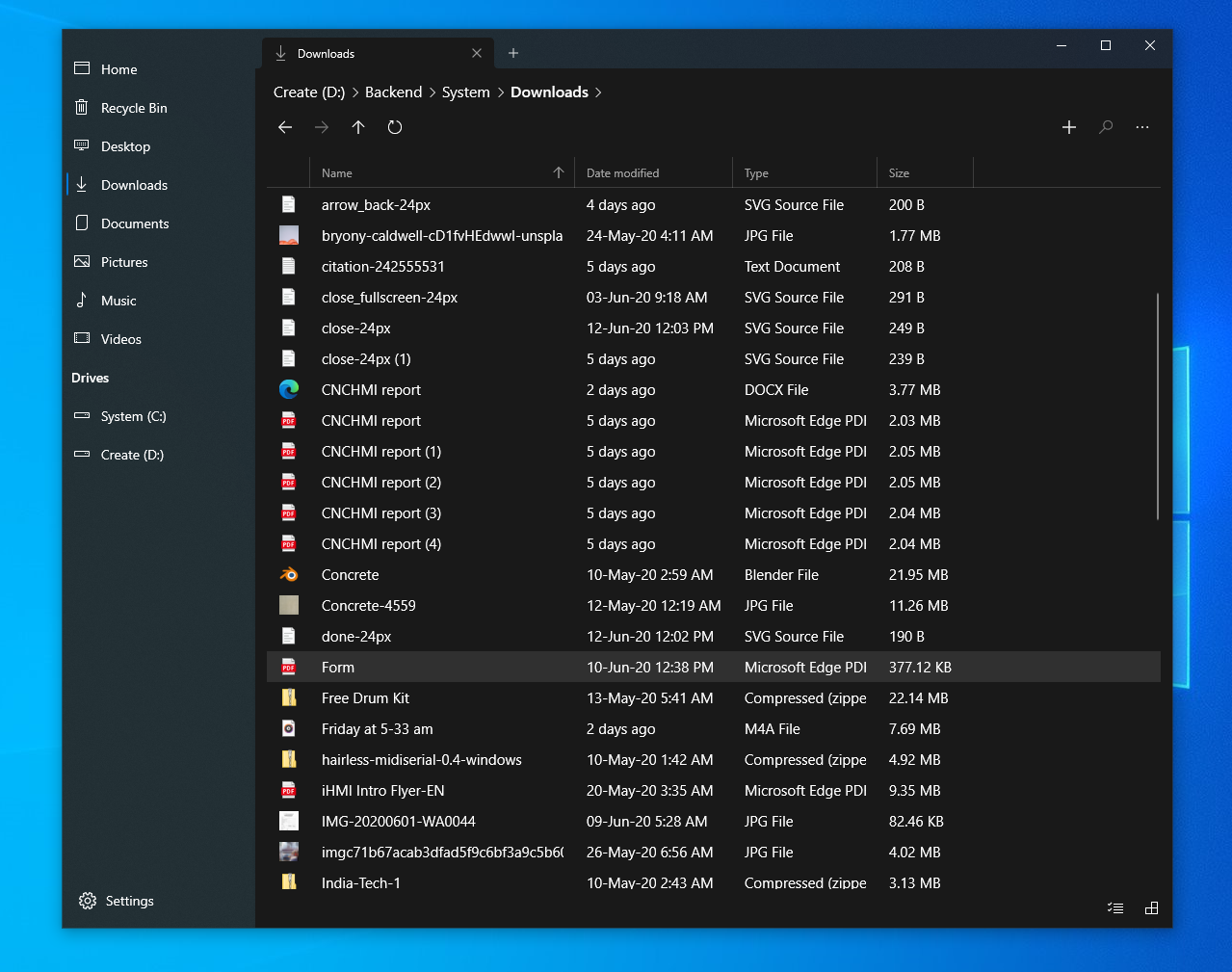
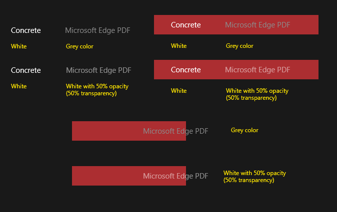
Current implementation
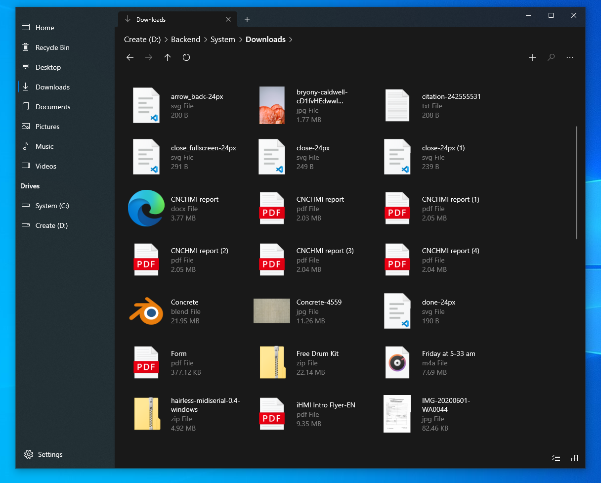
Proposed implementation
While the exact color values are up for further discussion, I immediately notice that there is a huge improvement in the visual quality of the screen.

Current implementation
Proposed implementation
The same applies to the light theme as well, though the difference it makes seems lesser compared to the dark theme.
Current implementation
Proposed implementation
Describe alternatives you've considered
This is a generic UI improvement and there are no alternatives I could think of.
Instead of making secondary information less prominent (reducing opacity/grey out), the primary information can be made more prominent (by making the name bolder/bigger) but that doesn't seem visually elegant and results in unnecessarily complicated UI.
 jayasio
All 9 comments
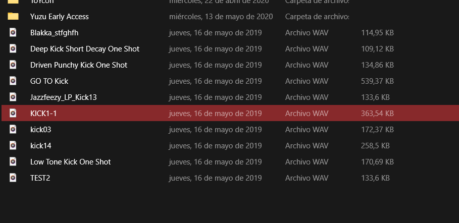
I had already tested with a darker color, the problem was that depending on the accent color, when selecting a file it did not look very good:

but if anyone can solve that it would be great
 XPoppyX
on 21 Jun 2020
XPoppyX
on 21 Jun 2020
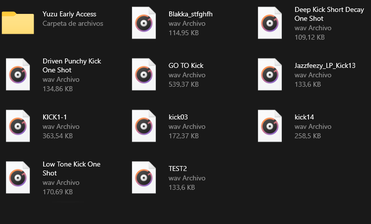
I think this issue is because the text is just 'grey'. If you change the opacity (transparency) instead, the background color bleeds through the text and gives a pinkish tint instead.
This is an approximate recreation, and the opacity percentage is up for discussion and accessibility tests.
Again, I don't know if the code implementation allows for this, but this is a very common UI pattern.
EDIT: Added better image
jayasio
on 21 Jun 2020
Test
XPoppyX
on 21 Jun 2020
LGTM, thanks :)
I'd prefer a little less opacity, but I think this should be good, considering accessibility.
jayasio
on 21 Jun 2020
after more testing:
White 50% looks good in dark mode
Black 50% looks good in light mode
XPoppyX
on 21 Jun 2020
So, I ran some rough accessibility tests with given percentages and the app's colors. Slight change to 54% or 55% opacity for white passes WCAG AA requirements (it's a standard metric, but yeah +4% doesn't seem a lot).. since white is too bright on a screen, the text opacity needs to be a bit higher. I think 54% for both dark and light modes is good.
jayasio
on 21 Jun 2020
I am now working on this issue, instead of changing opacity or color I am looking at changing the font weight.
 yaichenbaum
on 21 Jun 2020
yaichenbaum
on 21 Jun 2020
After spending some time on this and testing changes to the font weight, I have come to the conclusion that changing the font weight is not the correct path here.
yaichenbaum
on 21 Jun 2020
I would suggest using a 60% opacity to try to improve the Color Contrast for accessibility
 mdtauk
on 22 Jun 2020
mdtauk
on 22 Jun 2020
Related issues
 calloncampbell
·
28Comments
calloncampbell
·
28Comments
 duke7553
·
75Comments
duke7553
·
75Comments
 ghost
·
50Comments
ghost
·
50Comments
 Jaiganeshkumaran
·
24Comments
Jaiganeshkumaran
·
24Comments
 Crocodile73
·
84Comments
Crocodile73
·
84Comments
Most helpful comment
after more testing:
White 50% looks good in dark mode
Black 50% looks good in light mode