Fightpandemics: fix layout on landing view
flow
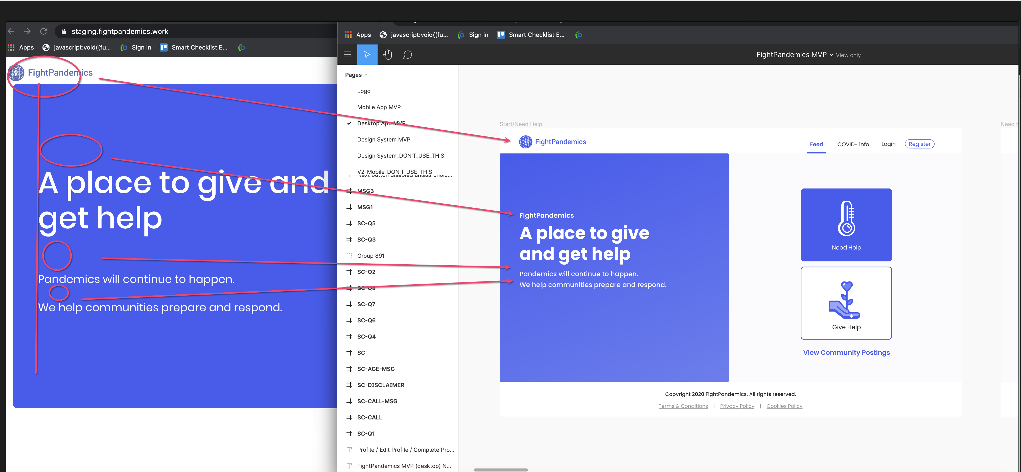
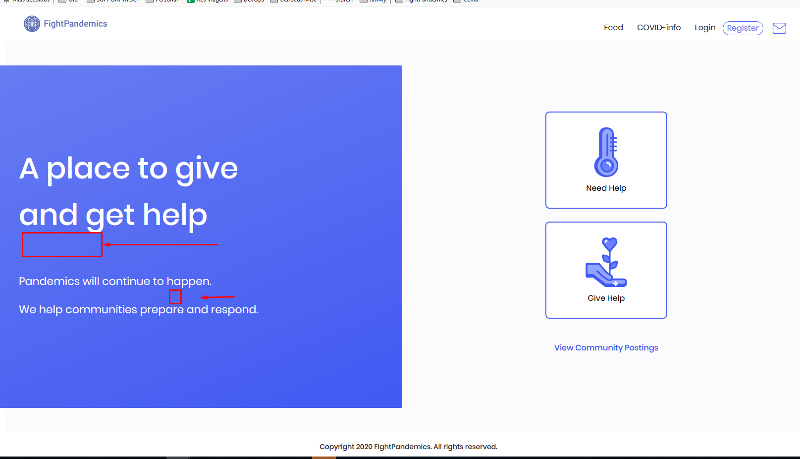
layout issues
1 - logo is not aligned on the left with the title (may be a navbar problem)
2 - spacing below logo
2 - missing title
3 - spacing between title and subtitle
4 - spacing on lines on subtitle
5 - no rounded borders in the blue box
6 - no left margin
7 - incorrect font styles used in the blue box
Styles should be pixel perfect:
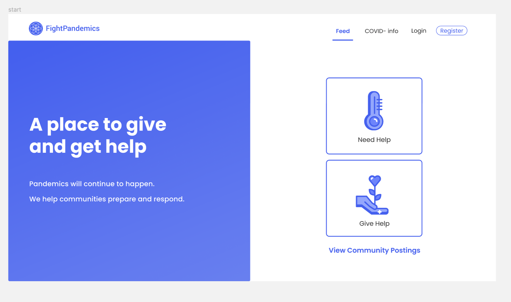
iMac, Chrome
Reference:
https://www.figma.com/file/4cV84H1jyMo0rJEAl3HNnJ/FightPandemics-landing-page?node-id=1377%3A8027
 stavares843
All 12 comments
So the padding for the header / navigation bar has to be changed? That will change it for all pages. Just want to make sure that's alright before I start working on this!
 nadinejuraschek
on 11 May 2020
nadinejuraschek
on 11 May 2020
cc @anniegiang
stavares843
on 11 May 2020
So the padding for the header / navigation bar has to be changed? That will change it for all pages. Just want to make sure that's alright before I start working on this!
Not sure... But for this issue specifically it looks like there's some padding/margin on the left of the blue box. Maybe we could set either of them to be 0 so that it's right next to the left side.
 anniegiang
on 11 May 2020
anniegiang
on 11 May 2020
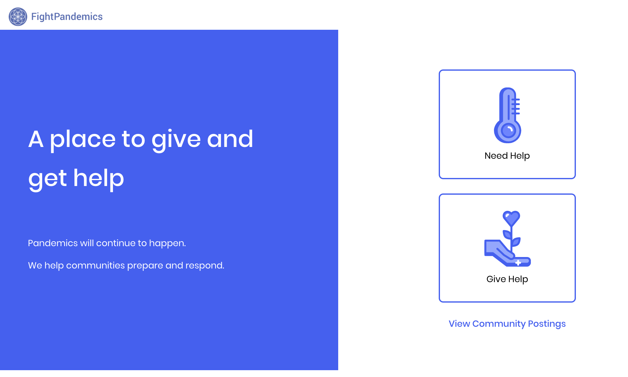
Ah ok so I just played with the styles in the console and removed the margin added on the right and left side of <main> (probably not a good idea since it'll affect all pages). I also removed the unnessccary rounded borders to the box:
anniegiang
on 11 May 2020
Hello Team,
this issue is still not complete. Please check the below image. The text is still missing:
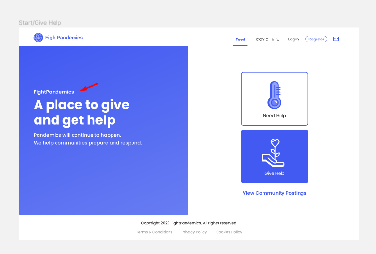
Also comparing to Figma the spacing between texts is still too big:
Thanks,
Tiago
 tiagocostasilva
on 29 May 2020
tiagocostasilva
on 29 May 2020
@TiagoaTavares Ok good to know. We actually discussed about this in the previous PR because there were conflicting designs showing different things. If I remember correctly some of the things you point out this time did not exist the last time we worked on this. I think engineers need to be better updated on design changes such as this to prevent possible regression.
anniegiang
on 29 May 2020
Hello @anniegiang. My user would be @tiagocostasilva instead of @TiagoaTavares (this is the other Tiago :D ) but not worries
From what i see when @stavares843 oppened this issue, the things i mention here were already identified, so i think this details were missed. This should not be skipped from the MVP.
tiagocostasilva
on 30 May 2020
@tiagocostasilva this page is updated, its in staging now
 snowiesuet
on 30 May 2020
snowiesuet
on 30 May 2020
@snowiesuet is there something missing on this issue?
tiagocostasilva
on 7 Jun 2020
@tiagocostasilva @snowiesuet is this still not fixed?
 robinv85
on 12 Jun 2020
robinv85
on 12 Jun 2020
@robinv85 I believe that this is fixed with better UI. @idjevm has made the changes as per the design. We need to close it without impacting the changes @idjevm has made.
 ppagarawal
on 12 Jun 2020
ppagarawal
on 12 Jun 2020
This issue seems to be fixed. Closing this for now.
 idjevm
on 20 Jun 2020
idjevm
on 20 Jun 2020
Related issues
 adorapham
·
4Comments
tiagocostasilva
·
10Comments
adorapham
·
4Comments
tiagocostasilva
·
10Comments
 rabbi08
·
6Comments
rabbi08
·
6Comments
 joshmorel
·
7Comments
joshmorel
·
7Comments
 dfrancks
·
10Comments
dfrancks
·
10Comments
Most helpful comment
@TiagoaTavares Ok good to know. We actually discussed about this in the previous PR because there were conflicting designs showing different things. If I remember correctly some of the things you point out this time did not exist the last time we worked on this. I think engineers need to be better updated on design changes such as this to prevent possible regression.