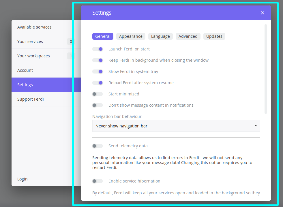
The "pop out" effect in the settings window is confusing.
It feels like it is actually two windows.
So for navigating to different entries in the sidebar, I instinctively click on the close button.
Ideally, the sidebar and the settings window should be of same elevation.
 happycoder97
All 7 comments
Issue-Label Bot is automatically applying the label enhancement to this issue, with a confidence of 0.87. Please mark this comment with :thumbsup: or :thumbsdown: to give our bot feedback!
Links: app homepage, dashboard and code for this bot.
![issue-label-bot[bot] picture](https://avatars2.githubusercontent.com/in/27079?v=4&s=40) issue-label-bot[bot]
on 24 Sep 2020
issue-label-bot[bot]
on 24 Sep 2020
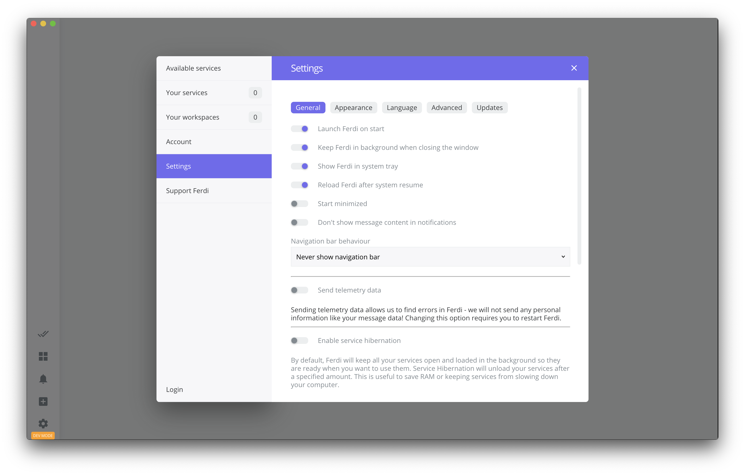
Is this the layout you were thinking about?
 vantezzen
on 24 Sep 2020
vantezzen
on 24 Sep 2020
Yes! Exactly this.
happycoder97
on 24 Sep 2020
One minor thing, I guess it would look nicer if the blue title bar was white as well.
happycoder97
on 25 Sep 2020
You can change the color of the title bar by changing the accent color on Settings > Appearance
vantezzen
on 26 Sep 2020
Ohh I didn't mean to get rid of the accent color.
The problem is giving the titlebar color without extending to the sidebar, makes it look like the close button only applies to the center pane. It is a less pronounced version of the effect caused by the elevation in the current ui.
So we can either extend the titlebar over the sidebar too, or make it the same color as the background.
Sent from ProtonMail mobile
-------- Original Message --------
On Sep 26, 2020, 3:59 PM, Bennett wrote:
You can change the color of the title bar by changing the accent color on Settings > Appearance
—
You are receiving this because you authored the thread.
Reply to this email directly, view it on GitHub, or unsubscribe.
happycoder97
on 26 Sep 2020
I think this should be closed since #977 is merged now.
 Ahmeed2m
on 11 Oct 2020
Ahmeed2m
on 11 Oct 2020
Related issues
 alegiglio
·
3Comments
alegiglio
·
3Comments
 AP-Hunt
·
3Comments
AP-Hunt
·
3Comments
 adithshenoy
·
3Comments
adithshenoy
·
3Comments
 ammarmalhas
·
3Comments
ammarmalhas
·
3Comments
 Jendker
·
3Comments
Jendker
·
3Comments
Most helpful comment
Is this the layout you were thinking about?