Fenix: Too much padding in address bar
Steps to reproduce
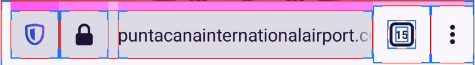
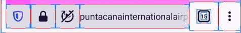
Open any site such as twitter which has videos and shows the autoblock option in address bar
Expected behavior
There should not be much padding between security lock icon and the URL or between lock icon and block icon
Actual behavior
There is too much padding between security lock icon and the website URL.. This feels like https/www/http was removed but the space left!
This is more prominent with the autoblock media icon
Device information
- Android device: ? Rog3
- Fenix version: ? Latest nightly
 sheikh-azharuddin
All 7 comments
I dislike the fact that the url gets displaced to the right when the autoplay icon is present. It feels unpolished. I think I would prefer the url position to be same with/without autoplay icon. But I agree with OP there is too much padding.
(this is probably a nit)
 Cheap-Skate
on 15 Dec 2020
Cheap-Skate
on 15 Dec 2020
I would suggest it's now time to merge security lock icon with the tracking protection similar to Microsoft edge.. Then the tracking protection button location can be used to add another button for site specific settings control like autoplay, cookies, etc
@Amejia481
What do you say?
sheikh-azharuddin
on 16 Dec 2020
My thought was to keep the padlock "secure" icon and to merge the autoplay (etc) icon with the shield tracking protection icon.
Then there will always be two easily understood icons to the left of the URL:-
- the padlock says "Firefox thinks this site is secure and therefore safe to use"
- the shield says "Firefox is shielding you from this site's default behavior for your privacy and/or convenience" by eg
- blocking trackers
- preventing geolocation
- stopping autoplay
- etc etc
The two icons will always be present so the URL won't move left and right; there will be more space in the toolbar for the URL; and the user won't have so many different icons to understand.
I guess the shield TP icon is a strong bit of Firefox branding so I can understand you might be reluctant. Just my 2c worth
Cheap-Skate
on 16 Dec 2020
We are going to investigate why the extra space is showing even if the icon is hidden. You can see more info about the new icon and its propose https://github.com/mozilla-mobile/fenix/issues/17047#issuecomment-745403415
 Amejia481
on 16 Dec 2020
Amejia481
on 16 Dec 2020
I dislike the fact that the url gets displaced to the right when the autoplay icon is present. It feels unpolished. I think I would prefer the url position to be same with/without autoplay icon. But I agree with OP there is too much padding.
(this is probably a nit)
The feature is only active on nightly to gather feedback, thanks for the input we are going to correct the extra space.
Amejia481
on 16 Dec 2020
@sheikh-azharuddin and @Cheap-Skate I'm going to chat with the UI/UX team
Amejia481
on 16 Dec 2020
Meantime we opened a pr for reducing the space, I have pending chat with the UI/UX team to discuss about what will be the final solution.
https://github.com/mozilla-mobile/android-components/pull/9262#issuecomment-747683375
Amejia481
on 17 Dec 2020
Related issues
 csadilek
·
3Comments
csadilek
·
3Comments
 Chris01277
·
3Comments
Chris01277
·
3Comments
 robsmith11
·
3Comments
robsmith11
·
3Comments
 abodea
·
3Comments
abodea
·
3Comments
 andreicristianpetcu
·
3Comments
andreicristianpetcu
·
3Comments
Most helpful comment
@sheikh-azharuddin and @Cheap-Skate I'm going to chat with the UI/UX team