Fenix: Settings: Section headers are inconsistent
What is the user problem or growth opportunity you want to see solved?
The section headers in settings sub-pages like Customize and Search differ from the ones in the top settings screen. They are indented and not separated by horizontal lines.
This makes them visually more difficult to distinguish. Instead, they should be not indented and have separation lines.
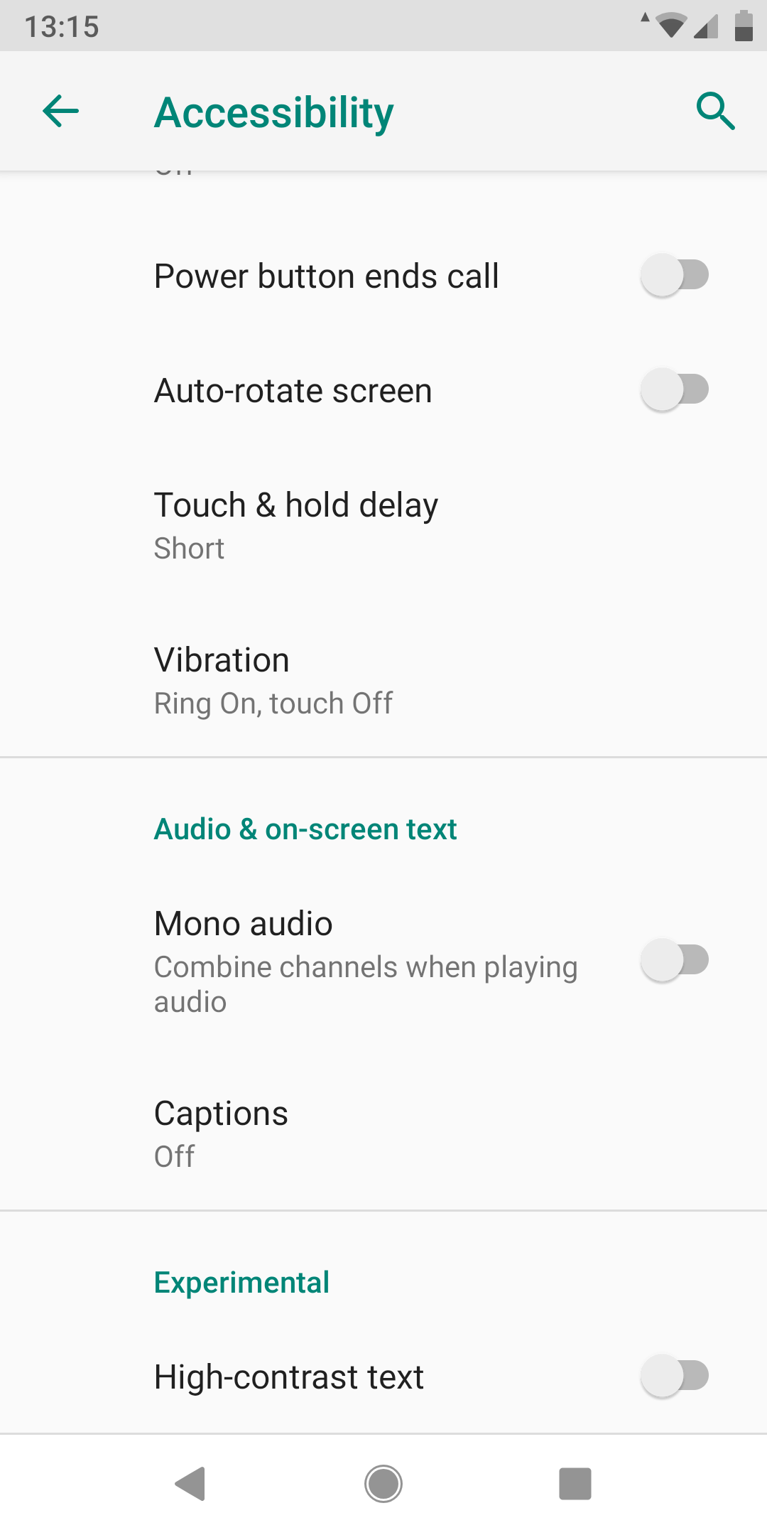
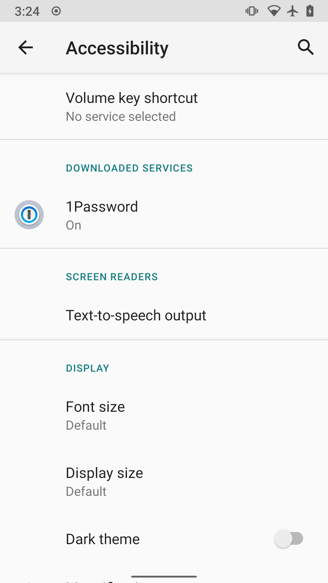
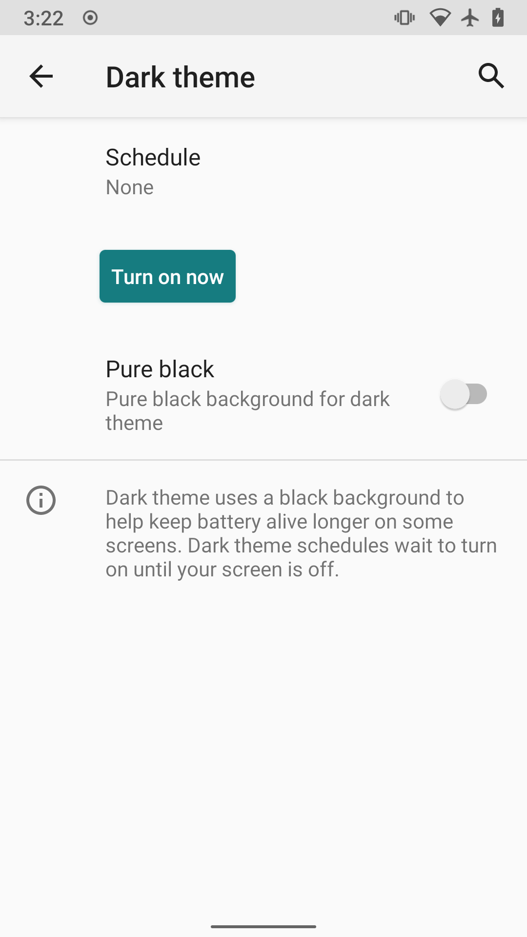
On horizontal lines: They are the norm for separating Android settings categories, as can be seen in the Android settings > Accessibility:
How do you know that this problem exists today? Why is this important?
Top settings screen:
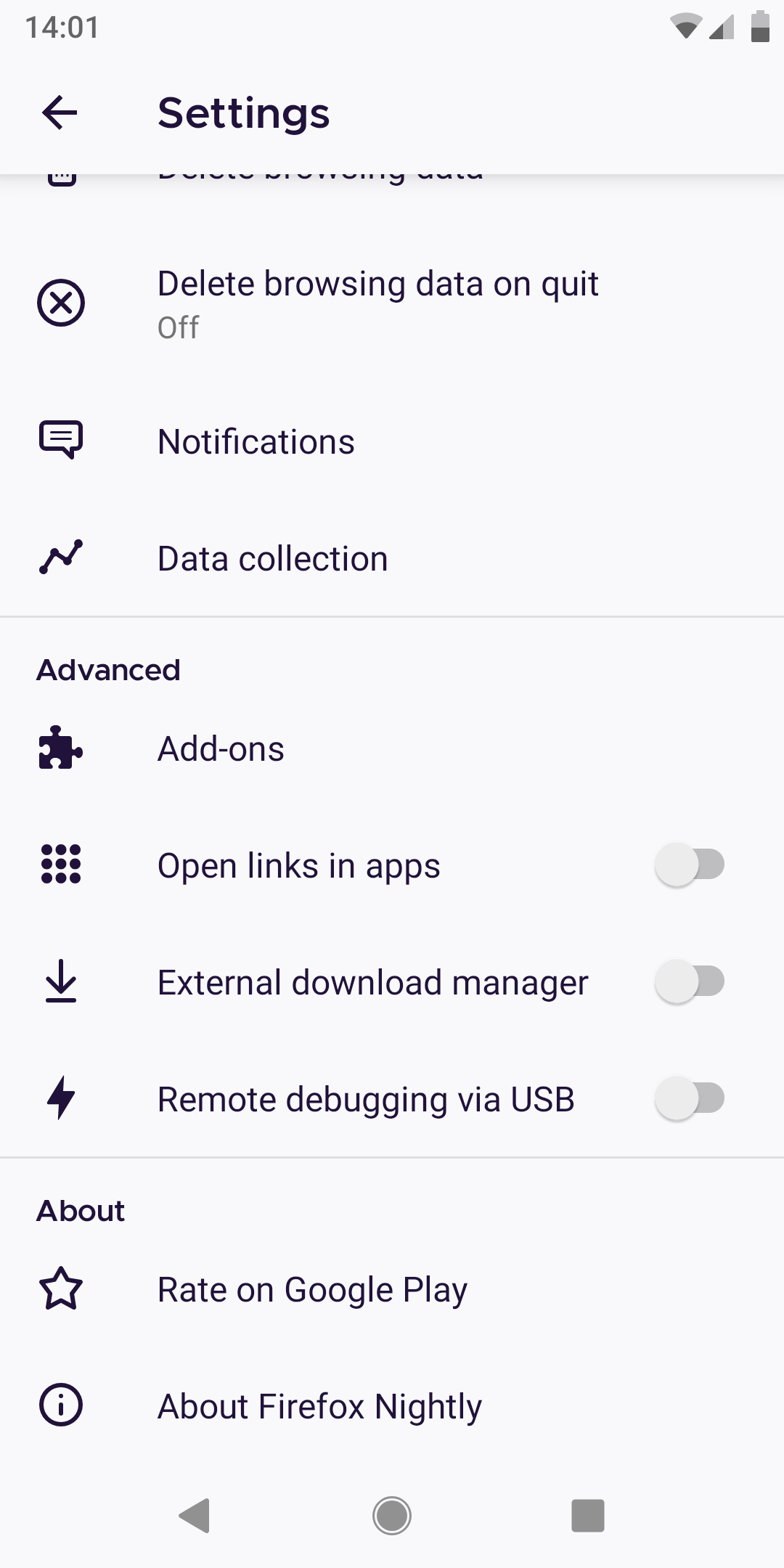
Note how Advanced and About are not indented and are separated by horizontal lines, making it easy to identify the different sections.
Customize settings (this also happens in the Search settings):
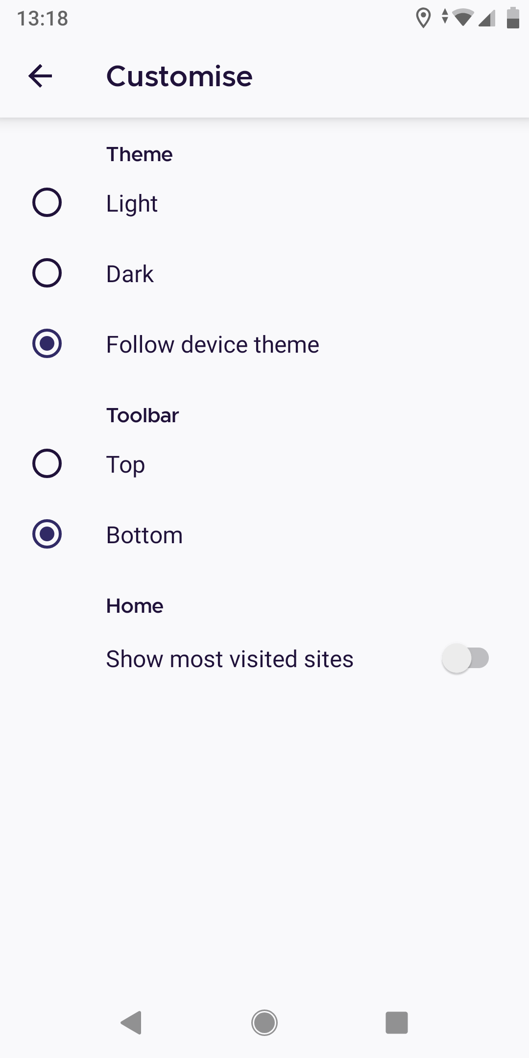
Clearly, in Customize, the different categories (theme, toolbar and home) are more difficult to distinguish.
Also, it is inconsistent.
Who will benefit from it?
Users navigating around the settings.
 dglttr
All 8 comments
This inconsistency was intentionally introduced in #12533. /cc @brampitoyo
 cadeyrn
on 6 Sep 2020
cadeyrn
on 6 Sep 2020
The points made in https://github.com/mozilla-mobile/fenix/issues/12533#issuecomment-666091940 seem valid in that indentation is done inconsistently in Android and various Google apps.
However, at least category separation lines are pretty common (see the screenshot from settings above, or the Google Play Store settings).
Also, the category headers usually have a color that differs more from the other fonts (again, see screenshot from the Accessibility settings above), which already makes a huge different for visibility.
So I guess what I really would propose as a solution to @brampitoyo's goal:
a policy for all headings, that can serve as a guide for making future choices, and that will result in good layouts 100% of the time
would be:
- Horizontal line separations in all settings screens
- Category headers using a stronger accent color
- 72dp indentation everywhere
--> basically what it looks like in the screenshot from the Android accessibility settings above (with a different accent color, of course).
dglttr
on 6 Sep 2020
@cadeyrn Yes. The inconsistency was intentionally introduced just as you wrote. I couldn’t find an indentation spec that would simultaneously make headers look good (at the root level), and at the same time, look like they belong with the rest of the menu items (in all other sub-pages).
It’s really cool to read @amkcpu’s proposal, that we can apply to all settings screen without exception:
- Horizontal line separations in all settings screens
- Category headers using a stronger accent color
- 72dp indentation everywhere
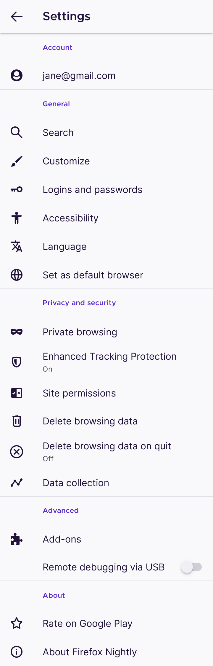
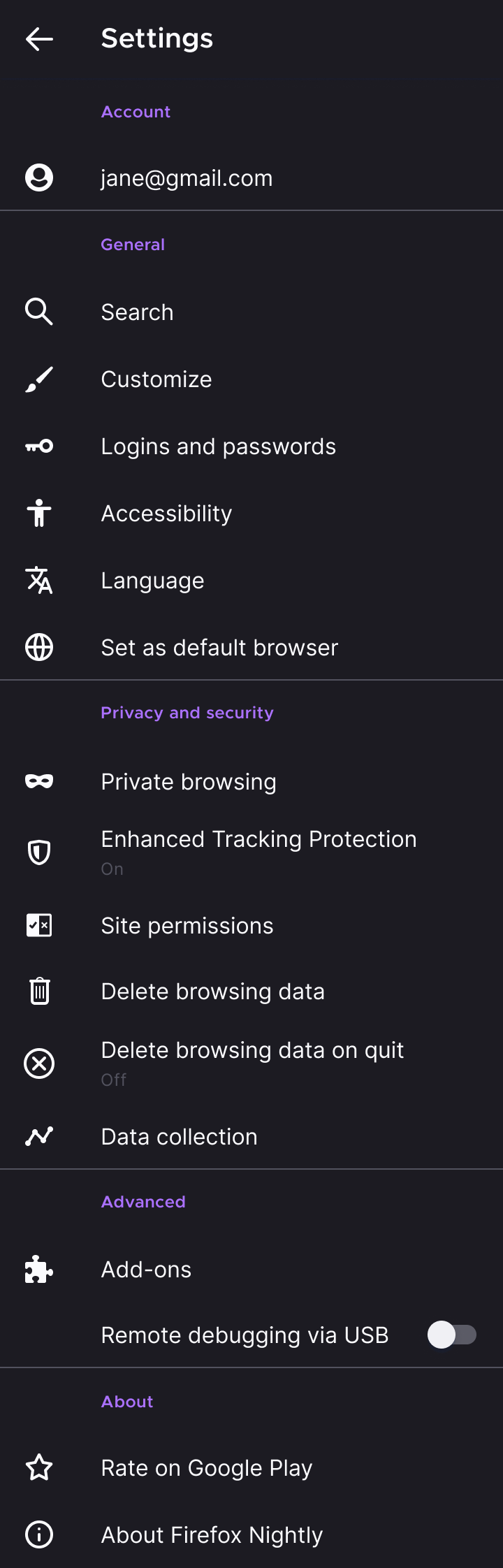
We do have an accent colour for both themes:
- Light theme:
violet 70#592acb - Dark and Private themes:
violet 40#ab71ff
We’d normally use this accent colour exclusively for text links and text-only buttons, but never for headers and items that aren’t tappable.
However, in Android System Settings, we see Google using the same accent colour for category headers and buttons:
| Category headers | Buttons |
| --- | --- |
|  |
|  |
|
So, perhaps it makes sense for us to use an accent colour in our headings, too?
See these examples below:
| Light theme | Dark theme |
| --- | --- |
|  |
|  |
|
Thoughts?
 brampitoyo
on 9 Sep 2020
brampitoyo
on 9 Sep 2020
@brampitoyo This is exacy what I had in mind!
And the same thing can then be applied to all settings screens (it's pretty self-explanatory, so I don't think additional mockups are needed). From my perspective, this is ready for engineering.
dglttr
on 9 Sep 2020
We're addressing this in #14636. Is this the next step for settings, or would these be explorations @apbitner ?
 liuche
on 17 Sep 2020
liuche
on 17 Sep 2020
I'll have to defer to @brampitoyo since he created the mocks above.
@brampitoyo - we're fixing the spacing to match our existing specs in #14636. The accent colors for headers look good IMO, so you could include it as part of that work or keep this ticket separate.
 apbitner
on 17 Sep 2020
apbitner
on 17 Sep 2020
@apbitner Let’s go with @liuche’s suggestion.
On #14636, in addition to fixing the spacing, let’s also set section headings to use the same colour and ruler above.
brampitoyo
on 21 Sep 2020
@amkcpu @cadeyrn You can subscribe to #14636 for implementation. This issue can now be closed. Thanks!
brampitoyo
on 21 Sep 2020
Related issues
 csadilek
·
3Comments
csadilek
·
3Comments
 vesta0
·
3Comments
csadilek
·
3Comments
vesta0
·
3Comments
csadilek
·
3Comments
 thelazyoxymoron
·
3Comments
thelazyoxymoron
·
3Comments
 ekager
·
3Comments
ekager
·
3Comments
Most helpful comment
@cadeyrn Yes. The inconsistency was intentionally introduced just as you wrote. I couldn’t find an indentation spec that would simultaneously make headers look good (at the root level), and at the same time, look like they belong with the rest of the menu items (in all other sub-pages).
It’s really cool to read @amkcpu’s proposal, that we can apply to all settings screen without exception:
We do have an accent colour for both themes:
violet 70#592acbviolet 40#ab71ffWe’d normally use this accent colour exclusively for text links and text-only buttons, but never for headers and items that aren’t tappable.
However, in Android System Settings, we see Google using the same accent colour for category headers and buttons:
| Category headers | Buttons | |
|  |
|
| --- | --- |
|
So, perhaps it makes sense for us to use an accent colour in our headings, too?
See these examples below:
| Light theme | Dark theme | |
|  |
|
| --- | --- |
|
Thoughts?