Fenix: [Bug] Spacing, colours and rulers for section headers in Settings and subpages are incorrect
Steps to reproduce
- View Settings, or a Setting subsection such as Search
Expected behavior
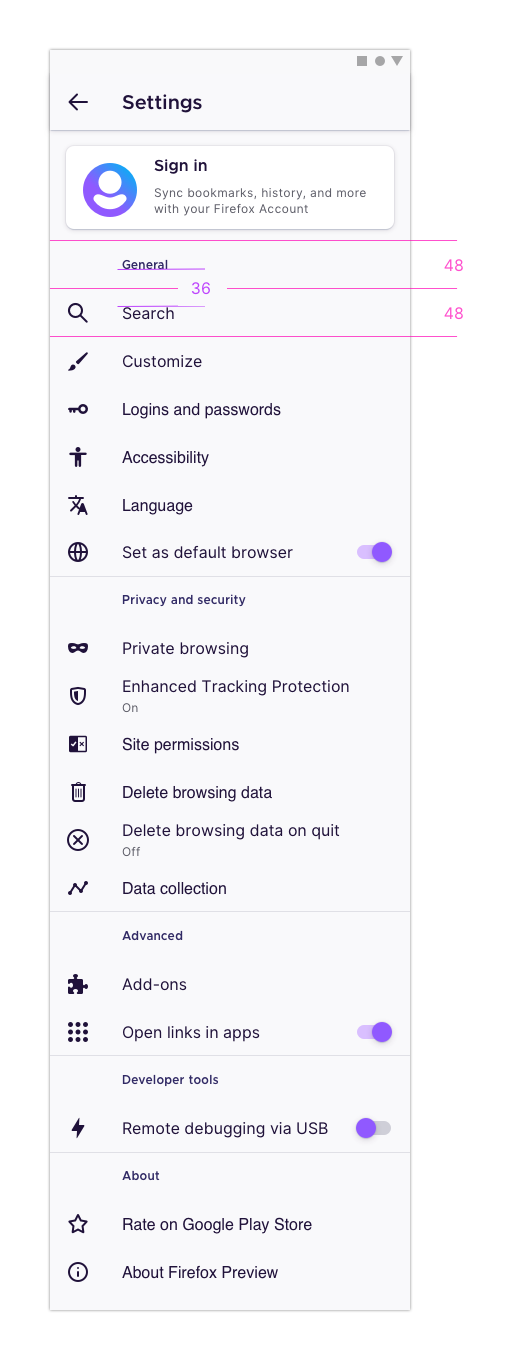
Section headers (Account, General, etc.) should have additional spacing as shown in specs. Screenshot w/ expected spacing shown below.
Actual behavior
Section headers do not have much spacing, making the screen difficult to scan
Device information
- Android device: Pixel 4
- Fenix version: Nightly 200902 06:01
UX specs
- Each menu row (for headers and menu items) should be 48px tall, with the content vertically centered in the middle
- This would mean there should be 36px between the bottom of a header and the top of the text in the proceeding menu item
- This applies to the main Settings screen as well as subpages that have section headers, such as Search
 apbitner
All 8 comments
@apbitner could you link to the mocks for settings?
 liuche
on 10 Sep 2020
liuche
on 10 Sep 2020
Let's timebox this.
liuche
on 10 Sep 2020
@apbitner could you link to the mocks for settings?
@liuche there's a mock / UX specs above in comment 0. The spacing specs should apply to applicable subpages in settings as well.
apbitner
on 10 Sep 2020
Mirroring https://github.com/mozilla-mobile/fenix/issues/14784#issuecomment-695867799, let’s also fix section heading colour and rulers on this issue.
Section heading colours
- Light theme: Violet 70
#592acb - Dark and Private themes: Violet 40
#ab71ff
Section heading rulers
To help separate each sub-section within settings and other sub-pages, section headings that aren’t the first on the page should be shown with a ruler above them.
For example:
- Search → above heading “Address bar”
- Customise → above headings “Toolbar”, “Home” and “Gestures”
- Add-ons → above headings “Disabled” and “Recommended”
 brampitoyo
on 21 Sep 2020
brampitoyo
on 21 Sep 2020
@apbitner I'd like to work on this.
 dglttr
on 22 Sep 2020
dglttr
on 22 Sep 2020
Thanks for the help @amkcpu! Please tag me for a review once you open a PR 😄
 eliserichards
on 23 Sep 2020
eliserichards
on 23 Sep 2020
I had tested this issue on Nightly 201103 05:01 (Build #2015773417) GV 84 from 11/3 with
- Motorola Moto G6 (Android 8);
- Pixel 2 (Android 9);
- Samsung Galaxy Tab S3 (Android 8)
and I will leave the qa:needed label on until receiving an answer to the below questions.
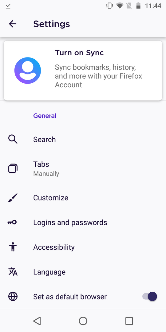
@brampitoyo The ruler above the General section from Settings page, is not visible when Turn on Sync is displayed, please see the screenshot. Is this expected? Also, when logged in and the Account section is displayed, the ruler is visible above the General section.
Please observe the color for the light theme: Violet 70 #592acb, from the screenshot. Is it the expected color?
 ebalazs-sv
on 3 Nov 2020
ebalazs-sv
on 3 Nov 2020
I had filed a new issue for the ruler above the General section issue: https://github.com/mozilla-mobile/fenix/issues/16393.
Also verified the colors and they are the expected ones:


Due to these findings, I will close this issue and remove the qa:needed label.
ebalazs-sv
on 5 Nov 2020
Related issues
 bbinto
·
3Comments
bbinto
·
3Comments
 csadilek
·
3Comments
csadilek
·
3Comments
 lindongbin
·
3Comments
lindongbin
·
3Comments
 andreicristianpetcu
·
3Comments
andreicristianpetcu
·
3Comments
 abodea
·
3Comments
abodea
·
3Comments
Most helpful comment
@apbitner I'd like to work on this.