Fenix: [UX] 3-dot toolbar menus should all be consistent across browser vs homescreen
User Story
- As a user, I want to see the same options in the same order (when applicable) in the toolbar so it is easy for me to get used to them and be able to quickly interact with them.
Acceptance Criteria
- I see the same toolbar options when I am on different screens (homescreen, tab, etc)
- I find it easy to find what I am looking for regardless of what screen I am on (measured through user testing)
 vesta0
All 38 comments
Also see #14394 for addons menu item, or possibly "Quit" for clear on quit feature #12230
 liuche
on 29 Aug 2020
liuche
on 29 Aug 2020
cc @violasong bc I think you're working on this this sprint!
liuche
on 29 Aug 2020
Issues:
- Improve the ordering of Android menu items
- Consider trade-off of reachability with thumb vs. ease of reading top-to-bottom
- Consider Desktop Firefox's menu ordering
- Feedback: Some people look at the top of the menu for important actions
- Feedback: 'Bookmark' and 'Bookmarks' are easily missed or hard to find
- Which options would also be appropriate for the 3 dot menu on tabs tray? (Settings?) UX work is happening as part of #10344.
- Concern: The bottom toolbar menu being a completely reversed version about the top could be confusing
- Should that menu be the same as the top toolbar menu?
- What about a hybrid approach: Each section stays in a logical order (e.g. Bookmarks should always be at the top of its section), but the sections could be reversed?
Other considerations:
- ‘Add to Home screen’ changes to ‘Install’ when visiting a PWA site.
- Right now when you visit a site for which you have the native app installed we show ‘Open in app’ in the menu.
- ‘Report Site Issue’ can be found in the Add-ons submenu, and no one seems to know how that happened, so we think it’s a bug and should be moved back to the top level. #11631
- Quit #12230 and Addons #14394
- What about screen readers?
- New tab in main menu? #9871
Next steps:
- Wait for: Data on most used menu items from release (meeting next Wednesday, file intake form)
- Wait for: Data Science telemetry ticket (menu items sorted by most-accessed)
- Wait for: Gesture research (one-hand vs 2-hand)
- Investigate: Previous work on Save Panel and Share Panel, usability study
- Make wireframes
- Launch pilot user test
 violasong
on 2 Sep 2020
violasong
on 2 Sep 2020
"Consider trade-off of reachability with thumb vs. ease of reading top-to-bottom" please can u guys keep this as an option, one thing I like about fenix is that everything can be reached at thumbs length (if your toolbar Is at the bottom)
 TheRealOsas
on 3 Sep 2020
TheRealOsas
on 3 Sep 2020
@violasong https://github.com/mozilla-mobile/fenix/issues/9871 is worth a look here.
 yoasif
on 3 Sep 2020
yoasif
on 3 Sep 2020
Wouldn't the different honescreen and tab toolbar look more consistent if the background color of the additional tab toolbar options be slightly lighter/darker than the basic options (which appear in the honescreen)
 axeltrinidade
on 3 Sep 2020
axeltrinidade
on 3 Sep 2020
Hi. I was just wondering: is the "remote debugging by USB" needed where it is now, given that's a very advanced setting that is unlikely to be used by a regular user? Maybe in the "about Firefox" section near "Support" entry? Or permanently behind the "Secret Settings"? :)
 klint
on 4 Sep 2020
klint
on 4 Sep 2020
"About Firefox" or the "Secret Settings" are totally wrong for this setting. In fact it's a very important setting for a very large target audience: millions of people develop websites, either professional or as hobby. And to be honest I doubt that really _every_ other option in the settings has more users and if these don't get removed from the main settings screen…
But I can't see how this issue is about settings. It's about the menues, no?
 cadeyrn
on 4 Sep 2020
cadeyrn
on 4 Sep 2020
"About Firefox" or the "Secret Settings" are totally wrong for this setting. In fact it's a very important setting for a very large target audience: millions of people develop websites, either professional or as hobby. And to be honest I doubt that really _every_ other option in the settings has more users and if these don't get removed from the main settings screen…
Ok, got it, thanks for the explanation
But I can't see how this issue is about settings. It's about the menues, no?
yes, it seems to be only about the level 1 menu actually. My bad.
So here is one thing for the level 1 menu: regarding "Install" vs "Add to homescreen" entries.
The code is ready to have both entries displayed at the same time instead of only one of them. Yet, only one is displayed currently, per design. Just asking whether having both displayed could be considered in this ticket ? (as a reminder, the use case is for instance when a news site like lemonde.fr is available as a PWA but when you would like to add a specific article to the homepage. This is not possible currently, as you can only install the site as a PWA that leads to the homepage, not to the article itself).
klint
on 4 Sep 2020
Related issue: #10344 involves changes to the tab tray menu. @topotropic is investigating a "Tab Settings" menu item which leads to a new page in Settings.
violasong
on 8 Sep 2020
Update: Working on a survey based on the following mockup, and requesting meta-feedback from Firefox mobile UX, twitter, reddit.

violasong
on 11 Sep 2020
Will the synced tabs entry be removed once #14117 lands?
For now, it's needed, but afterwards, a separate menu entry seems redundant to me.
 dglttr
on 11 Sep 2020
dglttr
on 11 Sep 2020
Where will the "Open in application" and "Exit" menu entries be placed ? These entries are displayed or hidden depending on the context, but where will they be displayed when activated?
klint
on 11 Sep 2020
Where will the "Open in application" and "Exit" menu entries be placed ?
Same question for the Appearance option that appears when you open a site in reader mode.
If this menu is moved into Settings > Customize (see #11282), then this consideration is not necessary.
dglttr
on 11 Sep 2020
just wanna be able to drag to open and select a menu item
 Poopooracoocoo
on 12 Sep 2020
Poopooracoocoo
on 12 Sep 2020
Speaking for myself, the problem is that menu items appear (or disappear) depending on what's open. I know some UI genius says that UI elements should just be hidden entirely if you can't use them, but the problem is that menu items move up and down on the menu depending on whether I'm on the home page or an actual site. This is a problem for very frequently sed hings because I get used to where they are 90% of the time and use them on muscle memory instead of reading, and end up selecting the wrong one the other 10% of the time because the one I want has moved.
Menu items should either gray out if unavailable, or the ones that never go away should be at the top (assuming a top menu bar) so they don't move around.
 gtg947h
on 13 Sep 2020
gtg947h
on 13 Sep 2020
I will make some observations:
- Why not hide some options that are usually used only once? (Hide them like the "addons" menu does).
- Remember possible new features such as "Save in PDF" (Feature requested by users)
- Important: Remember the "Quit" option.
- I forgot the option "Install", in the same way it would be hidden in the menu.
https://twitter.com/JoGarWeb/status/1305402817968996353?s=19
 JoGarWeb
on 14 Sep 2020
JoGarWeb
on 14 Sep 2020
for an explanation of what I said, check out Flutter's issue. (sorry for the cross-link!) https://github.com/flutter/flutter/issues/5064
https://github.com/mozilla-mobile/android-components/issues/3587
https://github.com/mozilla-mobile/reference-browser/issues/420 all the way from Jan 2019
People use this a lot in Chrome because it's even faster than native menus. This behaviour is also found in iOS/iPadOS and most desktop operating systems too.
Poopooracoocoo
on 14 Sep 2020
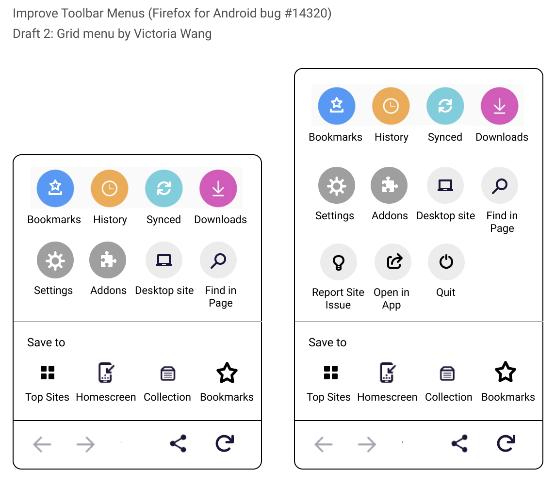
Rough wireframe that shows a different approach: grid menus, similar to those of Edge & Samsung Internet.
Sounds like this could be a version 2, whereas the basic list reordering could be the MVP.
violasong
on 16 Sep 2020
Love this, I guess we have found the one.
TheRealOsas
on 16 Sep 2020
@violasong The latest image you just shared - do you picture it as a overlay-like item (like the tab tray) or more of a GNOME style popover/menu?
yoasif
on 16 Sep 2020
Will there be a setting to hide the labels and keep the icon only in a minimal size menu?
klint
on 16 Sep 2020
Somewhat related: #14728 for changing the bookmark icon fill color to be more distinctive (Fennec has a bookmarked icon as blue).
liuche
on 17 Sep 2020
Some questions for the new wireframe:
- Do the colors used for the first four icons have any meaning associated with them? I know they are used on iOS, but is there an original intention or a way for the user to make sense of them?
- Is there a reason for the synced tabs icon to be different from the currently used one?
- A more general issue with icons. There are different actions associated with them: Some are simple links (bookmarks, history), some point to an action (find in page, save to collection), some a toggle (desktop mode), and some sub-menus (add-ons). With the old menu, those intentions are pretty clear (e.g. desktop mode has a toggle on the right), but icons are the same for everything. How can the user be made aware of that?
- A note on i18n: In some languages, the label names will be longer than in English and will be ellipsized. This is something to keep in mind, because it can influence the usability. Currently, the toolbar menu is a lot wider in some languages than in English to accommodate the longer labels. Can something similar be done for an icon grid? Maybe Multi-Line/2-line labels?
dglttr
on 17 Sep 2020
i was thinking bout that menu and ya know what it reminded me of? the old firefox for desktop!
Poopooracoocoo
on 17 Sep 2020
@violasong
Rough wireframe that shows a different approach
If you're looking for a different approach you could also have a look at the menu of Firefox Lite:
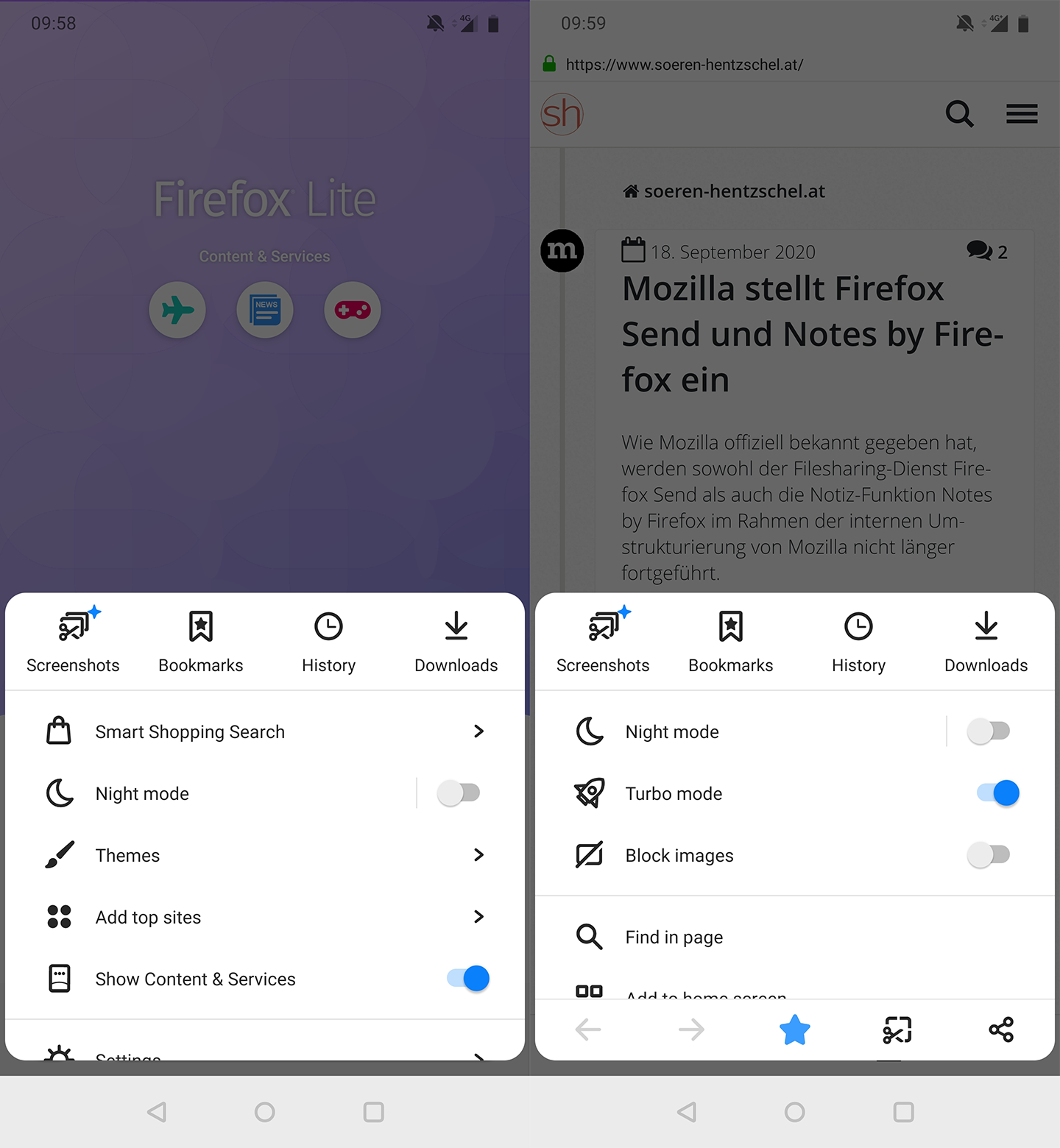
It has the big advantage that you can reach really _every_ menu item with only one hand. I don't say it should be used 1:1 (and in fact it can't be used 1:1 because Firefox Lite has a very different feature set) but it could be an additional source for inspiration.
cadeyrn
on 19 Sep 2020
Could the 1 or 2 mostly used share targets be added to the page menu at the 1st level? This was the case in Fennec if I remember correctly and was quite useful
klint
on 19 Sep 2020
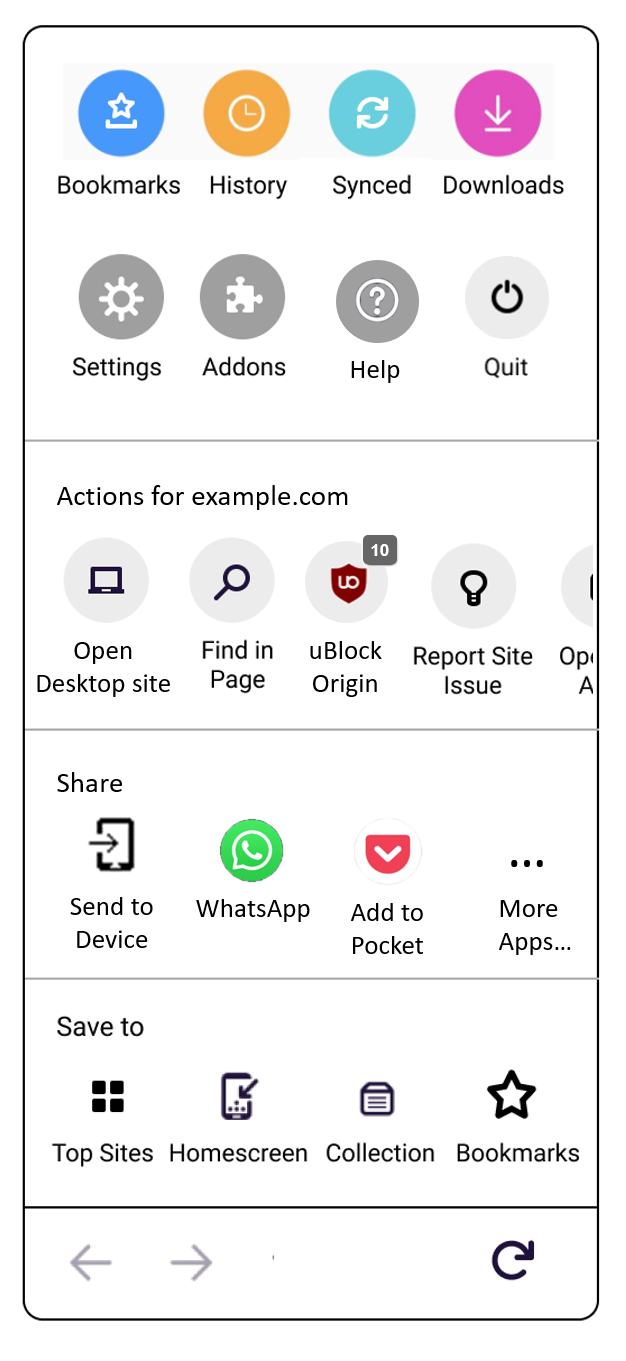
, I commented that in the original mockup, the same type of icon is used to convey different actions. To address this, I drew up the following three mockups that try to separate the different actions.
Intro
The idea is that the icons can be separated into three types:
Shortcuts, that take you to specified areas in the app (e. g. downloads or history page)Page actions, that let you interact with the site (e. g. toggle desktop mode, find in page)Save/share, that let you take the site content elsewhere, e.g. saving it to the homescreen or sharing it in other apps.
Please note that the mockups are _very_ unfinished and not polished at all, it's more about a rough visualization. Also, the strings would probably need to be changed.
Alternative 1
The mockup pulls page actions out of the icon grid and puts them in a separate row. Add-on pages are included in the page action row, and the row would be scrollable for overflowing content.
To address #14926, the share and send to device icons are moved to the "Share or save to" row.
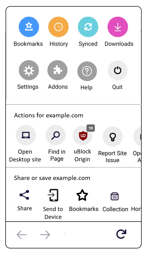
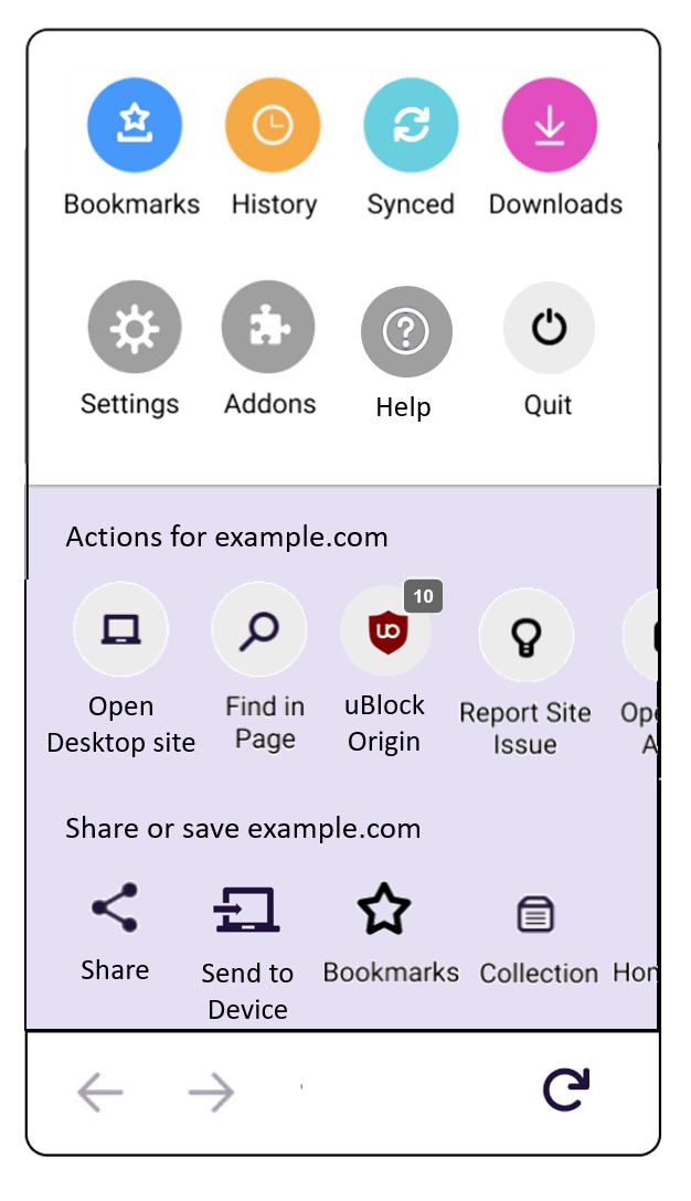
Alternative 2
This further splits up the menu, moving share into a separate row. The advantage is that apps recently used for sharing can be shown (as it used to be in Fennec)
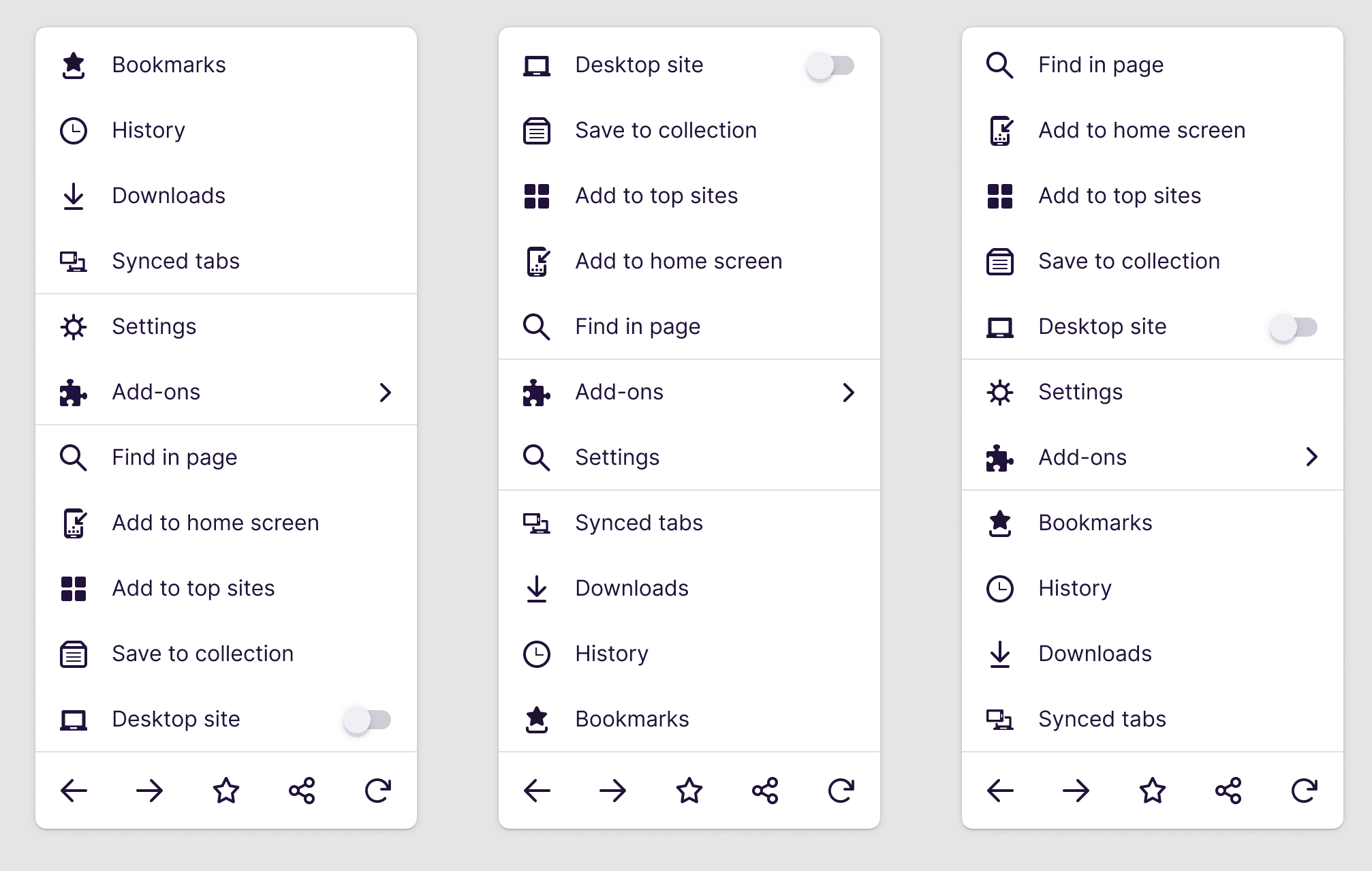
Alternative 3
Because fundamentally, the upper menu shortcuts correspond to actions within the browser/app, and the lower ones correspond to site actions, one could add color to distinguish the two. IMO, color should be on the site-specific parts, because when the user is on the home screen, only the upper icon grid will be visible.
I used the same color as the one on the tab tray for the currently selected tab, but this could of course be a different color.
Open questions/concerns
- Alternative 2 might be to high/large for small devices.
- Which icons should be round and with a background color, and which ones not filled?
Quitis an action, not a shortcut, but I still placed it on the upper row because it belongs to the browser-wide actions. This might not be optimal.
dglttr
on 19 Sep 2020
Thanks @amkcpu.
I really like the way features are separated here. Again my preference goes to option 2 as a basis.
By the way, a setting to remove all strings (titles and legends) could be useful to get a compact menu, which would make sense once the user is used to all features.
klint
on 19 Sep 2020
Just launched a user test for the MVP menu sorting options. (As mentioned, this will be for the next sprint starting Thurs. The grid-style menu needs more time.)
violasong
on 22 Sep 2020
Thanks for everyone's comments so far. I'll respond about grid menu concepts after I get this first MVP completed.
violasong
on 22 Sep 2020
Related issue: #11987
violasong
on 23 Sep 2020
My preference on the grid design would be number 1 or 3, as they would best facilitate a possible switch to the native share sheet (more details on what I mean in #14926).
 rileyinman
on 24 Sep 2020
rileyinman
on 24 Sep 2020
@violasong
How about using the design of Firefox Light? (@cadeyrn 's suggestion)
- Easy one-handed operation
- Neat design
- Look and fill similar to PC and current UI
- Code reusability
I have set a few criteria.
Rule
- One-handed operation should be easy
- The lower the depth, the better
- Important features should always be accessible
- Must be well distinguished
- Satisfy other existing issues
Group
I referred to Grouping of @amkcpu
- Essential: Forward, Backward, Refresh
- Page Action: Open in app, Find in page, Desktop site, Screenshot, Text size
- Save: Add to Bookmark, Add to top Site, Add to home Screen, Save to collection
- Share: Send to Device, Share to app(Recently App, More App)
- Library: Bookmark, History, Sync Tabs, Downloads
- About: Settings, Addons, Helps, Quit
Component
- List
- Familiarity: Portability of the current UX, Similar to desktop
- Easy to operate: Only need to move your finger vertically
- Icon
- Stand out: The icon is large
- Space Utilization: Left and right swipe is possible
- Icon(
Fixed)
- Accessibility: Always accessible
- No Caption: It always exists, Users remember their position.
- No Space: It's the most accessible and should be used to the fullest.
Order - Considerations
- Frequency
- High: Fixed or visible.
- Nomal: Relatively, the position can be changed or hidden.
- Time
- Immediately: Must return to or reflect the page. || Information is processed inside the browser.
- Slowly: Menu is deep or needs thinking like settings, || Information may go out of the browser.
Result Table
I made it assuming it's a long list.
|Group |Component |Frequency|Time |Order|
|---------------|---------------|-------------|------------|:-------:|
|Library | Icon | High | Slowly | 1 |
|Page Action| List | Normal | Immediately| 2 |
|Save | List | Normal | Immediately| 3 |
|Share | Icon | Normal | Slowly | 4 |
|About | List | Normal | Very Slowly| 5 |
|Essential | Icon(Fixed) | High | Immediately| 0 |
Aboutis the last one, but it's not as slow as you think. (Fitts' Law)
Result Sample
I am not a designer. It's a concept.
Grids and sizes can be weird...
- Personally, I don't like the color icons, and I want to follow the photon design.
- I used text scaling as an example of easily setting a deeper setting. #14923 #15445
Synced tabsof Library is more consistently integrated withTab menu. https://github.com/mozilla-mobile/fenix/issues/12065#issuecomment-700920652
- The add-on is like a symbol of Firefox, and it's a marketing advantage when you first see it. Reddit's comments
- It's also easier to solve sharing problems. #14926
- I want to keep the current shared design.
- Sent to device(
1 Line), Send to App(2 Line)
F&A: It seems difficult to escape the menu
- Spacing from the bottom.
You can press out enough empty space. (Samsung Internet) - Close button
Make the place of the menu a Close button. (Dolphin, UC Browser) - Swipe down
Scroll down to exit the modal sheet. (Fenix's Tab, Edge)
Improved: If it is not at the top, it is designed to stop by ignoring inertia, and you have to swipe it again to turn it off.
 black7375
on 27 Sep 2020
black7375
on 27 Sep 2020
Again, I am here to ask you to hide the options that are usually not used. In the last updates of Firefox "Report Site Issue..." was moved to the main menu and now the menu is too big.
Just a menu similar to the one with Add-ons for the options that are not often used for sites. I think users don't Report Site Issue, either add to the top sites, or make a shortcut on the homescreen to each site you visit.

JoGarWeb
on 22 Oct 2020
tbh i wish addons weren't in that menu as it's an extra tap. it's especially annoying for an add-on i use frequently to open videos externally.
Poopooracoocoo
on 22 Oct 2020
Some addons have page-related settings, it makes sense to be able to reach them from the 3 dot menu as it has the other page-related options (add to bookmark, search in page, etc.).
 Dunexus
on 22 Oct 2020
Dunexus
on 22 Oct 2020
Quick little update: I had to take a step back from this because of learning about new factors that need to be researched and analyzed. We're having a lot of discussions around balancing priorities right now.
Thanks @black7375 and @JoGarWeb for the mockups/proposals! I hope to have more feedback/info to share soon.
violasong
on 23 Oct 2020
Related issues
 softvision-miralobontiu
·
3Comments
softvision-miralobontiu
·
3Comments
 andreicristianpetcu
·
3Comments
andreicristianpetcu
·
3Comments
 abodea
·
3Comments
andreicristianpetcu
·
3Comments
abodea
·
3Comments
abodea
·
3Comments
andreicristianpetcu
·
3Comments
abodea
·
3Comments
Most helpful comment
@violasong
How about using the design of Firefox Light? (@cadeyrn 's suggestion)
I have set a few criteria.
Rule
Group
I referred to Grouping of @amkcpu
Component
Fixed)Order - Considerations
Result Table
I made it assuming it's a long list.
|Group |Component |Frequency|Time |Order|
|---------------|---------------|-------------|------------|:-------:|
|Library | Icon | High | Slowly | 1 |
|Page Action| List | Normal | Immediately| 2 |
|Save | List | Normal | Immediately| 3 |
|Share | Icon | Normal | Slowly | 4 |
|About | List | Normal | Very Slowly| 5 |
|Essential | Icon(
Fixed) | High | Immediately| 0 |Aboutis the last one, but it's not as slow as you think. (Fitts' Law)Result Sample
I am not a designer. It's a concept.
Grids and sizes can be weird...
Synced tabsof Library is more consistently integrated withTab menu. https://github.com/mozilla-mobile/fenix/issues/12065#issuecomment-7009206521 Line), Send to App(2 Line)F&A: It seems difficult to escape the menu
You can press out enough empty space. (Samsung Internet)
Make the place of the menu a Close button. (Dolphin, UC Browser)
Scroll down to exit the modal sheet. (Fenix's Tab, Edge)
Improved: If it is not at the top, it is designed to stop by ignoring inertia, and you have to swipe it again to turn it off.