What is the user problem or growth opportunity you want to see solved?
Instead of dedicating just 2 rows for each item like top sites, bookmark, synced tab, collection etc why not implement a tabbed menu like Microsoft edge??this way all these items can get the full screen and user can add more items in a single view
How do you know that this problem exists today? Why is this important?
Currently top site is limited to just 2 rows with max 8 items and adding another step to access items on 2nd slide.
Other items added in future will face the same issue.. Limited view!
Who will benefit from it?
All users
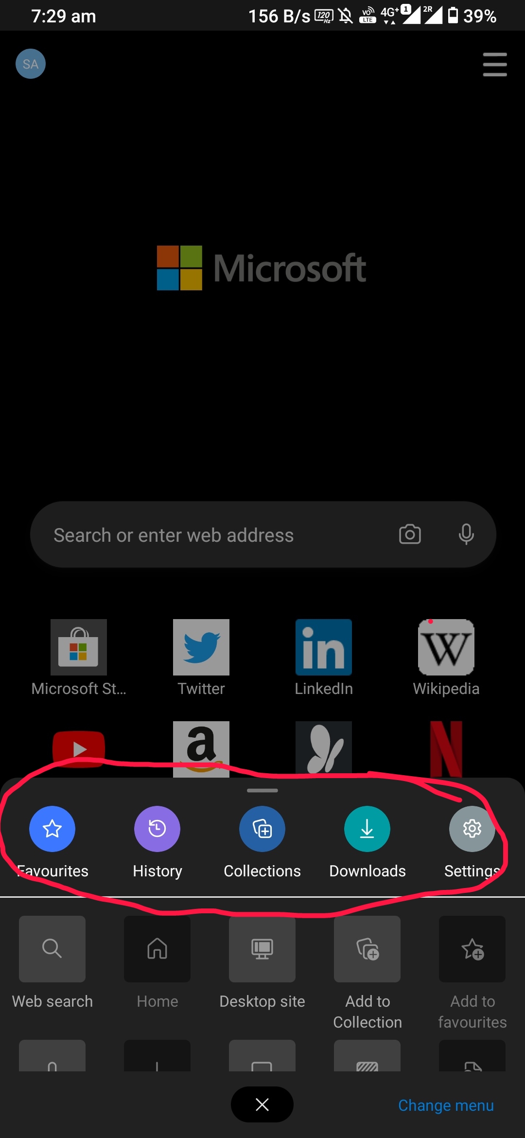
PFB the screenshot from edge


 sheikh-azharuddin
All 3 comments
This is actually an excellent idea. Since the synced tab will be added as another tab in tab tray, it would be wonderful if collections can also be added there. Moreover, since it is in a tab which does not bother non users, it would probably remove the need for "disable collections" option
 s-ankur
on 27 Aug 2020
s-ankur
on 27 Aug 2020
This is actually an excellent idea. Since the synced tab will be added as another tab in tab tray, it would be wonderful if collections can also be added there. Moreover, since it is in a tab which does not bother non users, it would probably remove the need for "disable collections" option
No bro 😊... Actually i am not requesting to add collection to tab tray...The home screen can contain 5 icons like edge as per as 1st screenshot... On clicking anyone it will open a new tab style menu like Microsoft edge...
This way collection can be utilized fully... And top site content can be dedicated to frequently accessed site only
So homepage will have below items in below order---
1.Firefox logo
2.Top sites(frequently visited sites)
- 5 icons like Ms edge (1st screenshot)-- fav, history, bookmarks, collection, synced tabs
- Top articles like desktop version or maybe news( Google news for you)
sheikh-azharuddin
on 27 Aug 2020
@s-ankur see https://github.com/mozilla-mobile/fenix/issues/10372
 yoasif
on 28 Aug 2020
yoasif
on 28 Aug 2020
Related issues
 andreicristianpetcu
·
3Comments
andreicristianpetcu
·
3Comments
 lindongbin
·
3Comments
lindongbin
·
3Comments
 topotropic
·
3Comments
topotropic
·
3Comments
 csadilek
·
3Comments
csadilek
·
3Comments
 bbinto
·
3Comments
bbinto
·
3Comments
Most helpful comment
This is actually an excellent idea. Since the synced tab will be added as another tab in tab tray, it would be wonderful if collections can also be added there. Moreover, since it is in a tab which does not bother non users, it would probably remove the need for "disable collections" option