Fenix: Address bar on the bottom is obscuring the bottom part of pages.

Steps to reproduce
1) Load intervals.icu (probably needs a Strava account to do anything useful)
2) Load an activity with heart rate data
3) Visit the "heart" page
Expected behavior
Can read text on the page.
Actual behavior
Text on the bottom of the page is obscured by the address bar. Swapping the address bar to the top reveals the text.
Device information
- Android device: Pixel 2 XL
- Fenix version: Nightly
 gcp
gcp
All 47 comments
We should investigate this, since there are lots of issues being filed about these: #14377 #14386 #14361
Sites mentioned are:
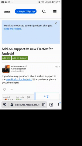
https://discourse.mozilla.org/t/add-on-support-in-new-firefox-for-android/53488/25
https://www.homedepot.com
proton mail
 liuche
on 29 Aug 2020
liuche
on 29 Aug 2020
Just a note that I too have observed the buttons/content being cut off at the bottom of the page, in contexts where position: sticky is used (#14421) and in contexts where I could not identify any use of position: sticky. For example, this happened to me for personal data consent message on https://www.thetimes.co.uk/
 mattok
on 29 Aug 2020
mattok
on 29 Aug 2020
Thank you, we'll investigate.
 Mugurell
on 31 Aug 2020
Mugurell
on 31 Aug 2020
I think most of the issues here should have been resolved in the latest Nightly by https://bugzilla.mozilla.org/show_bug.cgi?id=1633322
Now on all sites a swipe up when the page is at the bottom should hide the toolbar and show the bottom of the page.
I see the issues being resolved for the above discourse link and no issue for the consent dialog from thetimes.co.uk
Could not access homedepot, offerup to test.
@ QA Have you seen this still reproducing in latest nightly?
If the issue is still encountered please post the exact page url and we'll investigate.
Mugurell
on 1 Sep 2020
@Mugurell FYI Offerup is still not working correctly.
 yoasif
on 2 Sep 2020
yoasif
on 2 Sep 2020
@Mugurell The scrolling does indeed hide it, but in some cases it's not possible to scroll. E.g. if I'm on a responsive web app on a page that doesn't have any content that extends outside the view. Then I'm stuck, potentially with UI elements at the bottom of the page being blocked by the address bar.
 ffxsam
on 2 Sep 2020
ffxsam
on 2 Sep 2020
@Mugurell The scrolling does indeed hide it, but in some cases it's not possible to scroll. E.g. if I'm on a responsive web app on a page that doesn't have any content that extends outside the view. Then I'm stuck, potentially with UI elements at the bottom of the page being blocked by the address bar.
cc @hiikezoe
I feel like in this situation we should be sizing the app to fit into the space above the address bar.
 theres-waldo
on 2 Sep 2020
theres-waldo
on 2 Sep 2020
I feel like in this situation we should be sizing the app to fit into the space above the address bar.
I was thinking.. would this then make the page a bit scrollable? Which could trigger a INPUT_RESULT_HANDLED based on which we'd try to animate the toolbar?
Mugurell
on 2 Sep 2020
As an update for this, regarding edgecases in which the toolbar might not be animated:
- pages use iframes/scrollable divs to display content
- pages have their own scroll listeners
- pages have a height bigger than (window - toolbar) but smaller than window (ending underneath the toolbar), like I think is the case here - https://github.com/mozilla-mobile/fenix/issues/10477
@theres-waldo should we file individual GV tickets for these?
Mugurell
on 2 Sep 2020
As an update for this, regarding edgecases in which the toolbar might not be animated:
- pages use iframes/scrollable divs to display content
This is only a problem if we're in the third case "pages have a height bigger than (window - toolbar) but smaller than window (ending underneath the toolbar)", and the solutions for that will apply to this case as well.
- pages have their own scroll listeners
First a small clarification: the listeners that are of interest to us are listeners for input events for which the default browser action is to scroll. These are generally wheel, touch, and pointer events. They are interesting because they can be preventDefault()ed by web content in which case the browser does not scroll. (There are also scroll events, which are more like a notification to web content that scrolling _has_ been performed. They cannot be preventDefault()ed (the scrolling has already happened) and are not interesting for this discussion.)
In most cases, when a web app has a listener which preventDefault()s these events, the page does not actually have scrollable content (that is, the page's content size does not exceed the viewport size). For example, a mapping application will typically react to such an event by drawing new content onto a fixed-size map canvas. In these cases, there should be no problem related to the toolbar (as of bug 1633322).
It's possible that a page _has_ scrollable content (content size exceeds viewport size), _and_ preventDefault()s these events, _and_ performs scrolling manually (e.g. via window.scrollTo() in response to these events). I think such pages are (very) rare and I would consider them badly designed, but for these we would run into the "content obscured by toolbar" problem. It's worth filing a GV bug about this, though I don't have a great solution in mind for it :/ (But again, it may be rare enough that it doesn't matter.)
- pages have a height bigger than (window - toolbar) but smaller than window (ending underneath the toolbar), like I think is the case here - #10477
Yep, I believe this covers almost all of the problematic scenarios remaining now that bug 1633322 is fixed, and it would be good to have a GV ticket on file for this.
My suggestion for how to handle this case, as mentioned, is to size the viewport to the (window - toolbar) height. The resulting behaviour would depend on the page:
- If the page has a fixed content height (e.g. a GitHub issues list with a fixed number of issues to display) that just happens to fall into this small range, then the page would become a bit scrollable, like you said.
- If the page has content height == viewport height, then the content height would shrink. This covers cases like the ublock settings page (where an iframe's viewport takes up the page viewport; the iframe would remain scrollable with the smaller viewport, as desired), as well as cases like a mapping or drawing application where the canvas size would simply be reduced by the height of the toolbar.
theres-waldo
on 2 Sep 2020
I think most of the issues here should have been resolved in the latest Nightly by https://bugzilla.mozilla.org/show_bug.cgi?id=1633322
...
@ QA Have you seen this still reproducing in latest nightly?
- Issue #14421 persists.
- With regards to thetimes.co.uk, I found that I could reproduce this on standard release firefox, but only when I do the following. Zoom, and then unzoom. It is not possible to fully unzoom, so the bottom of the page and associated buttons are inaccessible, and you are stuck. On Firefox Nightly, it is sometimes possible to fully unzoom, but zoom is extremely buggy almost to the point of being unusable: Very slow, parts of the screen go black, sometimes nothing seems to happen at all when you try to zoom, rotating the screen only makes matters worse etc.
mattok
on 3 Sep 2020
* With regards to thetimes.co.uk, I found that I could reproduce this on standard release firefox, but only when I do the following. Zoom, and then unzoom. It is not possible to fully unzoom, so the bottom of the page and associated buttons are inaccessible, and you are stuck. On Firefox Nightly, it is sometimes possible to fully unzoom, but zoom is extremely buggy almost to the point of being unusable: Very slow, parts of the screen go black, sometimes nothing seems to happen at all when you try to zoom, rotating the screen only makes matters worse etc.
I wanted to send you a screenshot of the blacking out of parts of the screen on Firefox nightly on zoom/unzoom - but the screen appears to repaint and fix itself when I take a screenshot - so I can't do that! Anyway, perhaps the zooming problem is a separate issue.
mattok
on 3 Sep 2020
Here is a minimal example to demonstrate issue #14421. If you can't see the yellow sticky bottom zone at the bottom because it's hidden under the address bar, there's a problem.
mattok
on 3 Sep 2020
Thank you all for providing more details about this issue!
For the issue regarding pages that are just a bit smaller than the window I created - https://bugzilla.mozilla.org/show_bug.cgi?id=1663000
@mattok for the issue with zooming let's create another ticket.
@yoasif I cannot access offerup.com, getting "Error 1020" on all devices / platforms I've tried. Will ask for help from other colleagues.
Mugurell
on 3 Sep 2020
@Mugurell Please correct me if I'm wrong, but I think that the sticky-bottom issue (#14421) and associated minimal test case, for which the pages could be longer than viewport and you would still expect the position sticky items to be placed relative to the bottom of the _visible_ viewport (i.e. relative to the top of the address bar when it is placed at the bottom), is distinct from the scroll problem, which sounds like it only affects pages that are larger than the visible window but less than (visible window + toolbar). I don't know enough about how things work under-the-hood to know whether a single change would fix both (e.g. it's just that the visible viewport isn't being defined properly when the address bar is at the bottom and fixing this would fix both problems.)
mattok
on 3 Sep 2020
@mattok I'm not sure also but this can be triaged in GeckoView - whether there is a single fix or separate issues to be resolved.
Mugurell
on 3 Sep 2020
OK. I've created #14691 for the zoom issue.
mattok
on 3 Sep 2020
Based on https://github.com/mozilla-mobile/fenix/issues/14377#issuecomment-683061025 the offerup issue is probably the same as the one reported by mattok in https://github.com/mozilla-mobile/fenix/issues/13797#issuecomment-686329820 so it will probably be resolved by the same https://bugzilla.mozilla.org/show_bug.cgi?id=1663000.
Looks like this ^^ is the common issue for the reports here.
Mugurell
on 9 Sep 2020
* With regards to thetimes.co.uk, I found that I could reproduce this on standard release firefox, but only when I do the following. Zoom, and then unzoom. It is not possible to fully unzoom, so the bottom of the page and associated buttons are inaccessible, and you are stuck. On Firefox Nightly, it is sometimes possible to fully unzoom, but zoom is extremely buggy almost to the point of being unusable: Very slow, parts of the screen go black, sometimes nothing seems to happen at all when you try to zoom, rotating the screen only makes matters worse etc.I wanted to send you a screenshot of the blacking out of parts of the screen on Firefox nightly on zoom/unzoom - but the screen appears to repaint and fix itself when I take a screenshot - so I can't do that! Anyway, perhaps the zooming problem is a separate issue.
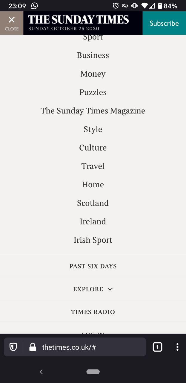
On thetimes.co.uk this problem occurs when I try to log into my account:
- Go to www.thetimes.co.uk
- Tap the hamburger 'Menu' in the top-left corner
- Scroll all the way to the bottom (with bottom bar enabled)
The link titled 'LOGIN' is partially obscured by the address bar: see screenshot.
This is happening with Stable v81.1.5
 ShintoPlasm
on 26 Oct 2020
ShintoPlasm
on 26 Oct 2020
The issue on thetimes.co.uk and some other websites has been fixed for me on Stable 82.1.1 as of today.
ShintoPlasm
on 27 Oct 2020
So with this I think we have all the issues here fixed, thank you all!
If you're still encountering any of these please leave a comment, if not I'll close this in a few days.
Mugurell
on 30 Oct 2020
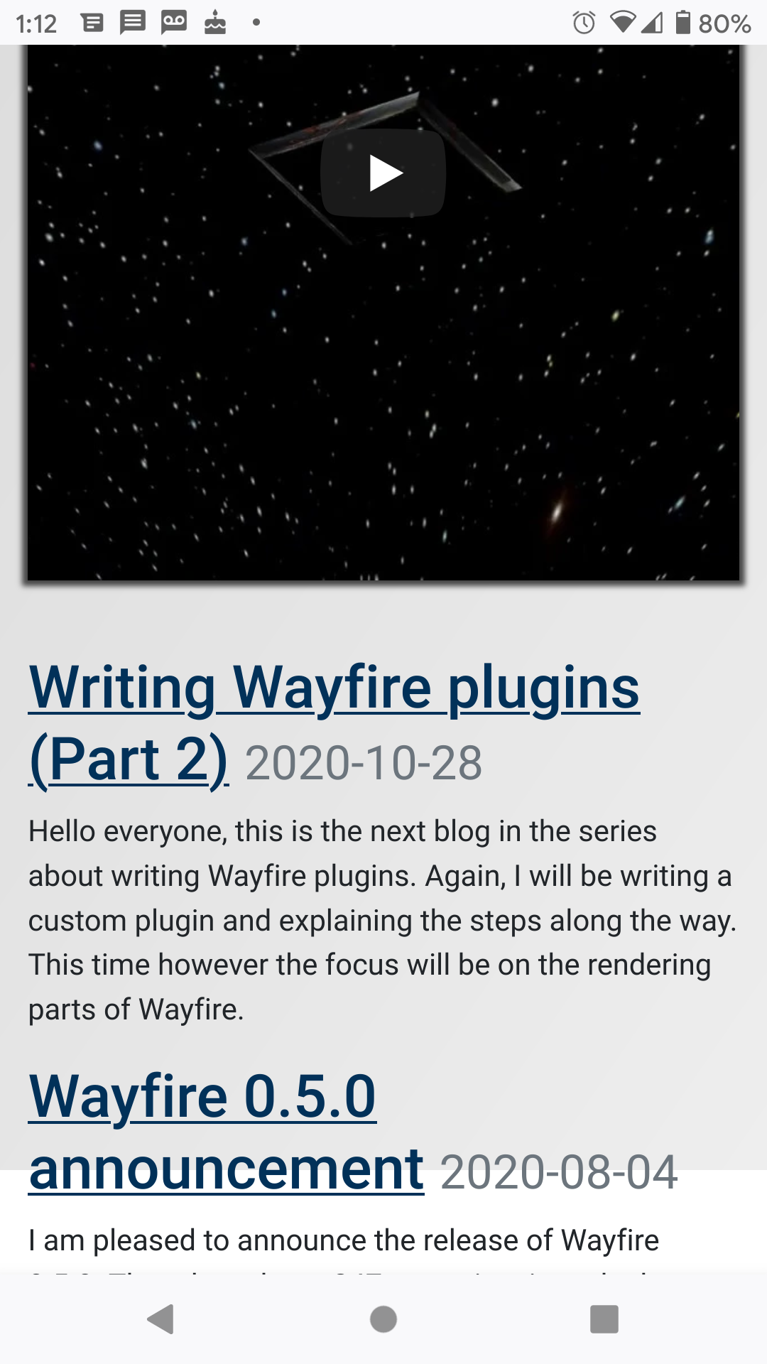
https://wayfire.org shows that the bottom of the page doesn't have the correct background color.
yoasif
on 30 Oct 2020
i still have the issue with firefox 82.1.1 on https://hugodoko.org/fr/, which is a simple static html page. the last line of text is hidden, and the page cannot be scrolled.

 huguesdk
on 30 Oct 2020
huguesdk
on 30 Oct 2020
Issue #14421 has not been addressed by the latest nightly. Its associated minimal example https://codepen.io/mattok/full/XWdeQZY shows that position: sticky is still not being calculated relative to the visible viewport when the address bar is on the bottom. (See my previous comment about this: https://github.com/mozilla-mobile/fenix/issues/13797#issuecomment-686544599) Thanks.
mattok
on 30 Oct 2020
@mattok #14421 is one of the cases of https://github.com/w3c/csswg-drafts/issues/5646, it's quite unclear whether overflow:hidden on the root element clips to 100% height or 100vh height. (And to me clipping to 100vh is weird) Anyway, I don't recommend using overflow:hidden on the root element with 100vh height elements.
 hiikezoe
on 30 Oct 2020
hiikezoe
on 30 Oct 2020
@mattok #14421 is one of the cases of w3c/csswg-drafts#5646, it's quite unclear whether overflow:hidden on the root element clips to 100% height or 100vh height. (And to me clipping to 100vh is weird) Anyway, I don't recommend using overflow:hidden on the root element with 100vh height elements.
Thank you @hiikezoe, but unless I have missed something, you are mistaken. The minimal example does not make use of overflow: hidden at all. Therefore, I don't believe this categorisation is correct. The only CSS required is:
.sticky-bottom
{
  position: sticky;
  bottom: 0;
}
The position: sticky applies to elements that should be offset relative to the nearest scrolling ancestor - which in this case, is the root and it is the visible viewport which should be being scrolled here. Therefore, the element should get stuck to the bottom of the visible window on scroll. This is what happens if top: 0 is used and what happens on the desktop version of Firefox, which has consistent behaviour for top: 0 and bottom: 0.
I think the fundamental issue here is that behaviour at the bottom of the screen (and its interaction with the address bar) should be completely symmetrically with behaviour at the bottom of the screen (and its interaction with the address bar). From a user's perspective, the viewport is what can be seen and should never be considered to be under the address bar. Why should position:sticky; top: 0 position the sticky elements with respect to the top of the visible viewport when scrolling down the page, whereas position:sticky; bottom: 0positions the sticky elements underneath the address bar when scrolling down the page?
See the following additional variant example I've just made, which includes a sticky top and a sticky bottom element. Note that this example fails on the latest Firefox nightly whether or not the address bar is configured to be at the top or the bottom:
https://codepen.io/mattok/full/ExyEJRp
(Select 'Change View' and select 'Editor View' to be able to see the HTML and CSS.) On Firefox for Android, the bottom of the page is always cut off, whether or not the address bar is at the top or the bottom, so the sticky bottom element is never visible at the bottom of the screen. Whereas, on desktop Firefox, it is always visible on screen until the point at which you have scrolled past it completely, which I believe should be the correct behaviour. (Hopefully the fact that codepen places it within an iframe is not confusing matters... but nevertheless, behaviour is different across mobile and desktop - which is a hint that something is amiss.)
I hope that helps.
mattok
on 31 Oct 2020
(Hopefully the fact that codepen places it within an iframe is not confusing matters... but nevertheless, behaviour is different across mobile and desktop - which is a hint that something is amiss.)
That iframe is exactly the problem I mentioned. In the iframe the sticky target is the iframe's viewport, not the root viewport.
hiikezoe
on 31 Oct 2020
Okay. So I stand corrected on that. Thanks. My minimal example was a red herring, which was affected by the iframe codepen put it in. I put the example html code below in a file on my mobile device and loaded it locally using the file protocol and confirm that it behaves as I would expect a) on the current version of Firefox and b) with Firefox nightly:
<!doctype html>
<html>
  <head>
    <meta charset="utf-8">
    <title>test sticky</title>
    <style>
.content { height: 100vh; }
.sticky { position: sticky; }
.top { top: 0; background-color: red; }
.bottom { bottom: 0; background-color: green; }
    </style>
  </head>
  <body>
    <div class="content">Content</div>
    <div class="sticky top">Sticky top (Red)</div>
    <div class="content">Content</div>
    <div class="sticky bottom">Sticky bottom (Green)</div>
    <div class="content">Content</div>
  </body>
</html>
For me at least, this then leaves me with two outstanding issues:
- The minimal example was an attempt to distil the core issue that was making the website shown in the screenshot at the top of #14421 be broken. While the minimal example does in fact work fine after all, that website is still broken even in FF Nightly, so I've clearly missed some complexity in the CSS that is in fact necessary to provoke the problem when doing the distilling. I'll investigate and get back to you on that, hopefully with a better minimal example.
- To me at least, I can't believe that the codepen situation is right as it stands. While I accept that I perhaps need to look more closely at the CSS codepen are using to understand why this is happening, the problem I have is that it leaves a discrepancy between behaviour on FF for desktop and mobile that I don't think developers should have to worry about. Why is the bottom of the page, and so the bottom of the iframe hidden on FF for Android regardless of scrolling (and regardless of address bar position, I think), whereas on desktop, scrolling will expose all content?
mattok
on 1 Nov 2020
I've done some further analysis of the website affected by #14421. While I haven't been able to distil a minimal example yet, I observe the following:
- Chrome for desktop and Chrome for Android behave differently.
- On desktop, a footer is always visible at the bottom of the page and 'position: sticky' items within a central scrollable pane are always visible at the bottom of that pane. This is true even if you put the website into responsive mode via the developer tools.
- On Android, the bottom of the page (footer and bottom part of the middle pane) are initially cut off, but once the middle pane is fully scrolled, the scroll continues to expose the footer and correctly positioned sticky items.
- Firefox for desktop and Firefox for Android behave differently.
- On desktop, a footer is always visible at the bottom of the page and 'position: sticky' items within a central scrollable pane are always visible at the bottom of that pane. This is true even if you put the website into responsive mode via the developer tools.
- On Android, the bottom of the page is simply always cut off. It is not possible to expose it by scrolling. This occurs whether the address bar is at the top or the bottom of the page. I believe that this is a regression of some kind, and that FF was behaving correctly with no cut off content, and with the same behaviour across both desktop and mobile for this site in Sep 2019.
To me, both browsers are broken in the sense that both ought to behave consistently across the desktop and mobile versions, whereas they don't. However, the behaviour in FF in this situation is worse because it results in inaccessible content on Firefox for Android only. It is possible that the CSS on this site is somehow invalid/non-standard, and that both browsers are doing their best in the circumstances. Regardless Chrome is doing better from the perspective of a user that just needs to be able access the content.
mattok
on 1 Nov 2020
I've managed to create a minimal example. It turns out that the position sticky issue was a distraction and not the root cause. The actual problem appears to be related to height: 100vh; in combination with flex box. The situation in this example across FF and Chrome, desktop and Android is exactly as described in my previous post:
<!doctype html>
<html>
  <head>
    <meta charset="utf-8">
    <title>test flex</title>
    <style>
* { margin: 0; }
body { height: 100vh; flex-direction: column; display: flex; }
main { overflow-y: scroll; background-color: grey; }
    </style>
  </head>
  <body>
    <header>Header</header>
    <main>
      <ol>
        <li>First item</li><li>Item</li><li>Item</li><li>Item</li><li>Item</li><li>Item</li><li>Item</li><li>Item</li><li>Item</li><li>Item</li><li>Item</li><li>Item</li><li>Item</li><li>Item</li><li>Item</li><li>Item</li><li>Item</li><li>Item</li><li>Item</li><li>Item</li><li>Item</li><li>Item</li><li>Item</li><li>Item</li><li>Item</li><li>Item</li><li>Item</li><li>Item</li><li>Item</li><li>Item</li><li>Item</li><li>Item</li><li>Item</li><li>Item</li><li>Item</li><li>Item</li><li>Item</li><li>Item</li><li>Item</li><li>Item</li><li>Item</li><li>Item</li><li>Item</li><li>Item</li><li>Item</li><li>Item</li><li>Item</li><li>Item</li><li>Item</li><li>Item</li><li>Item</li><li>Item</li><li>Item</li><li>Item</li><li>Item</li><li>Item</li><li>Item</li><li>Item</li><li>Last item</li>
      </ol>
    </main>
    <footer>Footer</footer>
  </body>
</html>
The key thing is that on FF for Android the footer and the bottom of the main scrolling region are cut off in a way that is inaccessible, regardless of scroll.
mattok
on 1 Nov 2020
The case is one of cases that https://bugzilla.mozilla.org/show_bug.cgi?id=1663000 will handle.
hiikezoe
on 1 Nov 2020
First of all: Thank you for building such a nice browser, I really enjoy firefox mobile <3
It seems like I am late to the party, but I encountered the same problem (100vh in combination with CSS grid and then the bottom toolbar will overlap the content). Here's a small example:
https://cdpn.io/juroth/debug/BaKJpXE/VJrxxOvywxZr
https://codepen.io/juroth/pen/BaKJpXE
Happens in 82.1.1 (Build #2015770923)
 judylovesruby
on 1 Nov 2020
judylovesruby
on 1 Nov 2020
@juroth codepen is not a good place to upload contents related to the dynamic toolbar.
Anyway the case will be also fixed by https://bugzilla.mozilla.org/show_bug.cgi?id=1663000 .
hiikezoe
on 5 Nov 2020
hey @hiikezoe. is this issue related to https://github.com/uBlockOrigin/uBlock-issues/issues/1304? if not, do you know which one is?
 Poopooracoocoo
on 16 Nov 2020
Poopooracoocoo
on 16 Nov 2020
@Poopooracoocoo Yes, that's what I supposed. Does the uBlockOrigin still persist on latest Fenix nightly? If it's still there, can you please open a new bug on bugzilla.mozilla.org and attach an html to reproduce it?
Thanks!
hiikezoe
on 16 Nov 2020
@hiikezoe Yeah the issue still persists in Nightly. I thought that the issue only applied to add-on pages. I don't think an html would help. I don't even know what it'd be. I've seen the same issue in uBO reported across Firefox repos like AC: https://github.com/mozilla-mobile/android-components/issues/6933. I don't know if its worth making a bug on BMO.
Poopooracoocoo
on 17 Nov 2020
@Poopooracoocoo thanks for the info. It looks like the uBlockOrigin case is "height: 100vh; overflow: hidden;" on the root element, which is https://bugzilla.mozilla.org/show_bug.cgi?id=1663634, not yet fixed unfortunately.
hiikezoe
on 17 Nov 2020
thanks hiro. just went and edited my other comments to include a link to that bug
Poopooracoocoo
on 17 Nov 2020
I'd like to point out it affects an application of mine written in Qt/WASM. Even when the bar is on top, the bottom of the page is not visible and if the bar is swiped it goes away, but the bottom of the page is cut and shows the theme background color. It was working fine with the old toolbar.
 Raffarti
on 9 Dec 2020
Raffarti
on 9 Dec 2020
@Raffarti Issues happening with dynamic toolbar moving are caused by various reasons, also it depends on the toolbar position. So for the top toolbar case, you will see more problems rather than the bottom case because of https://github.com/mozilla-mobile/android-components/issues/7718.
Anyway, it's hard to tell what the underlying problem is in your case without seeing it.
hiikezoe
on 10 Dec 2020
Could this be a form of #15337? It is currently tracking as bug 1650644 and is reported as "Fixed" around 1 month ago.
 yookoala
on 10 Dec 2020
yookoala
on 10 Dec 2020
@yookoala what do you mean? I believe the case of #15337 has been already fixed. You mean this issue has been already fixed? To be honest I haven't tried the original site so I am not sure.
hiikezoe
on 10 Dec 2020
Anyway, it's hard to tell what the underlying problem is in your case without seeing it.
Here the page https://raffarti.gitlab.io/simpleadvancedmetronome/SimpleAdvancedMetronome.html
Raffarti
on 10 Dec 2020
@Raffarti by old toolbar were you referring to Fennec's toolbar?
Poopooracoocoo
on 10 Dec 2020
@Raffarti by old toolbar were you referring to Fennec's toolbar?
The one that was in use before this, I believe it was the same currently used by firefox focus.
Raffarti
on 10 Dec 2020
Anyway, it's hard to tell what the underlying problem is in your case without seeing it.
Here the page https://raffarti.gitlab.io/simpleadvancedmetronome/SimpleAdvancedMetronome.html
At first glance, that's exactly same case in https://github.com/mozilla-mobile/fenix/issues/13797#issuecomment-728719819 that means it's related to a spec issue.
hiikezoe
on 10 Dec 2020
See also https://github.com/w3c/csswg-drafts/issues/5777 and https://mind-bending-forks.github.io/css-viewport-percentage-length-units/, which makes a case that this is more of a browser design issue related to details of the the implementation of hide/reveal feature for toolbars on mobile devices than it is a CSS specification issue.
 mind-bending-forks
on 10 Dec 2020
mind-bending-forks
on 10 Dec 2020
Related issues
 andreicristianpetcu
·
3Comments
andreicristianpetcu
·
3Comments
 robsmith11
·
3Comments
robsmith11
·
3Comments
 AndiAJ
·
3Comments
andreicristianpetcu
·
3Comments
AndiAJ
·
3Comments
andreicristianpetcu
·
3Comments
 topotropic
·
3Comments
topotropic
·
3Comments
Most helpful comment
Just a note that I too have observed the buttons/content being cut off at the bottom of the page, in contexts where
position: stickyis used (#14421) and in contexts where I could not identify any use ofposition: sticky. For example, this happened to me for personal data consent message on https://www.thetimes.co.uk/