Fenix: Compact tabs (like Fennec)
What is the user problem or growth opportunity you want to see solved?
User feedback; people miss this (see Play Store reviews).
How do you know that this problem exists today? Why is this important?
Play store reviews, other bugs: https://github.com/mozilla-mobile/fenix/issues/955#issuecomment-597324854, https://github.com/mozilla-mobile/fenix/issues/5805#issuecomment-625417740
Who will benefit from it?
People who prefer a compact tab layout.
All 17 comments
Yes please!!!
Support that Request, please realise that.
Tab view tile option is missed.
As is the ability to sort tabs.
And 'recently closed tabs' in History

This I a very good implementation of compact tabs in fenix UI. This is the fork iceweasle
If this is ever implemented pls leave it as an option cause I slightly prefer the current one than compact tabs
This I a very good implementation of compact tabs in fenix UI. This is the fork iceweasle
This is not compact all. It shows less (!) tabs than the current implementation in Firefox and this will be even more true if Mozilla decides to allow two lines for the page title. And this would be important for this not-really-compact view as well because at the moment it has even less (!) space for the page title than the current implementation in Firefox. But to allow more lines in this view also means that this not-really-compact view will be even less compact. So I can't agree, that's not a "very good implementation of compact tabs", it's just another view, but it totally misses the "compact" aspect.
It's not perfect but I think it is a starting point
Hi all,
Compact tabs in Fennec could show 8 tabs in the tab switcher (on my phone) whereas Fenix can only show 7. One tab difference doesn't sound like much, but it is about 15% more, which is a lot.
If the tabs list actually extended to the top of the screen I think we could actually see 8 in Fenix.
Cheers 🙂
IMHO tab tray should use all screen and homepage should be a third tab like the list of private tabs.
So we would have : homepage / tabs / private tabs.
What is the user problem or growth opportunity you want to see solved?
User feedback; people miss this (see Play Store reviews).
How do you know that this problem exists today? Why is this important?
Play store reviews, other bugs: #955 (comment), #5805 (comment)
Who will benefit from it?
People who prefer a compact tab layout.
My suggestion was to give us the option to have it like it is or to have other ways to use it, including a compact one like you mentioned.
@TheRealOsas thank you for the shout out! I implemented the "compact tabs" layout in the forked version of Fenix. In fact I made a lot more tweaks to it since then, and here is my latest changes: https://github.com/interfect/fenix/pull/65
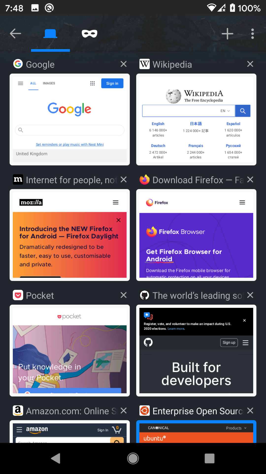
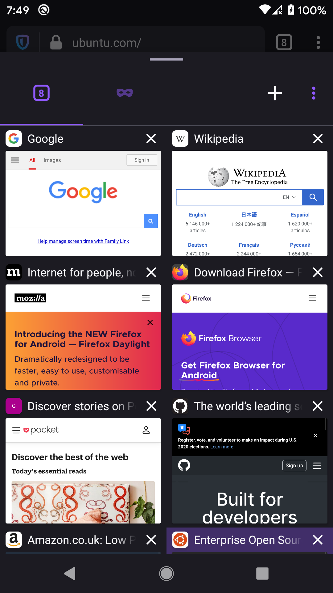
I tried to make it as compact as feasible without being too small and weird. My layout seems to be about as compact as the old Fennec style layout, at least on my 1080p Pixel 2 phone screen. I have some screenshots of the old browser and my fork for comparison, with the same websites open. I still use the old Fennec browser due to its tab layout and add-ons support, but I am happy with the forked Fenix as well as it fills the holes I felt.
Here are the screenshots:
Old Fennec
Forked Fenix with compact tabs
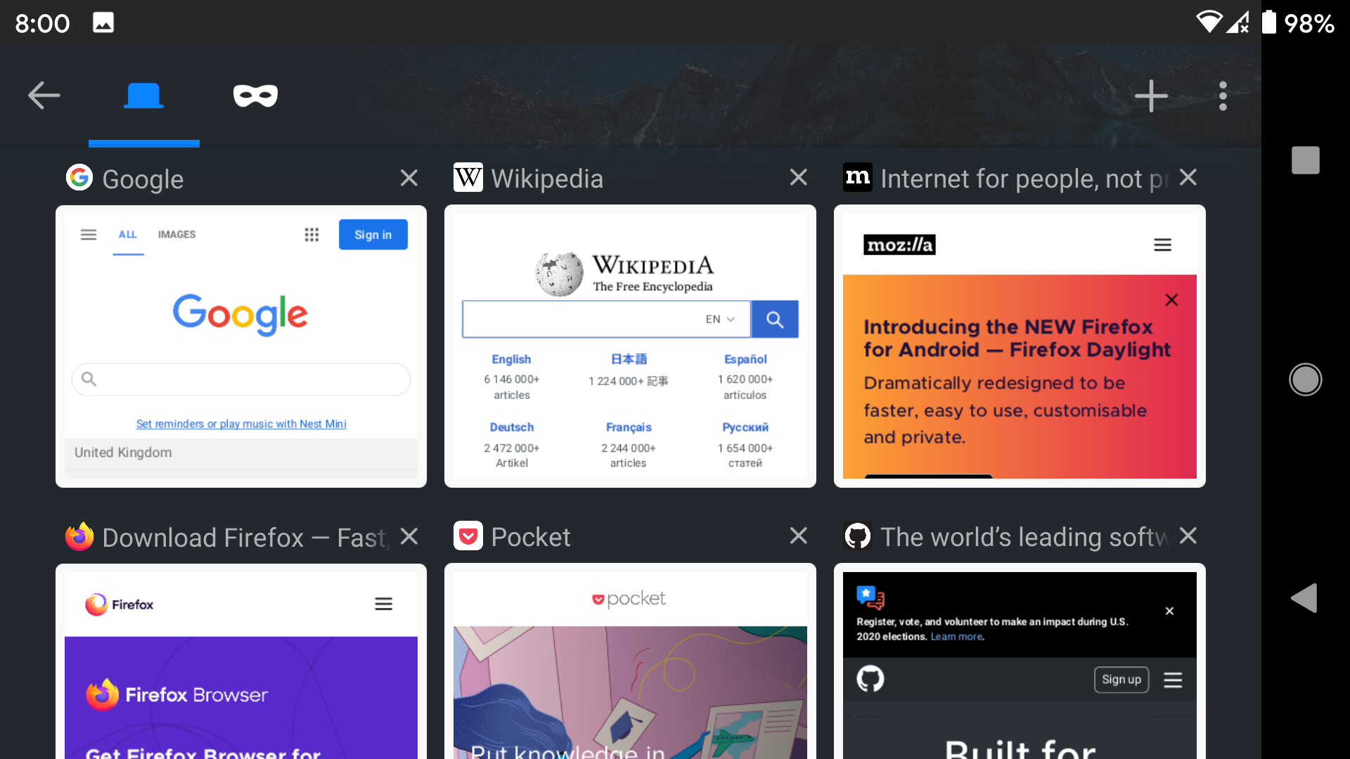
Forked Fenix with (mostly) unmodified layout

As you can see, the old Fennec could show 6 full tabs + 2 partial tabs. The forked Fenix with my compact tabs layout can also show 6 full + 2 partial tabs. It could show even more if the BottomSheet popup could occupy more screen space. The (mostly) unmodified Fenix layout can only show 6 tabs.
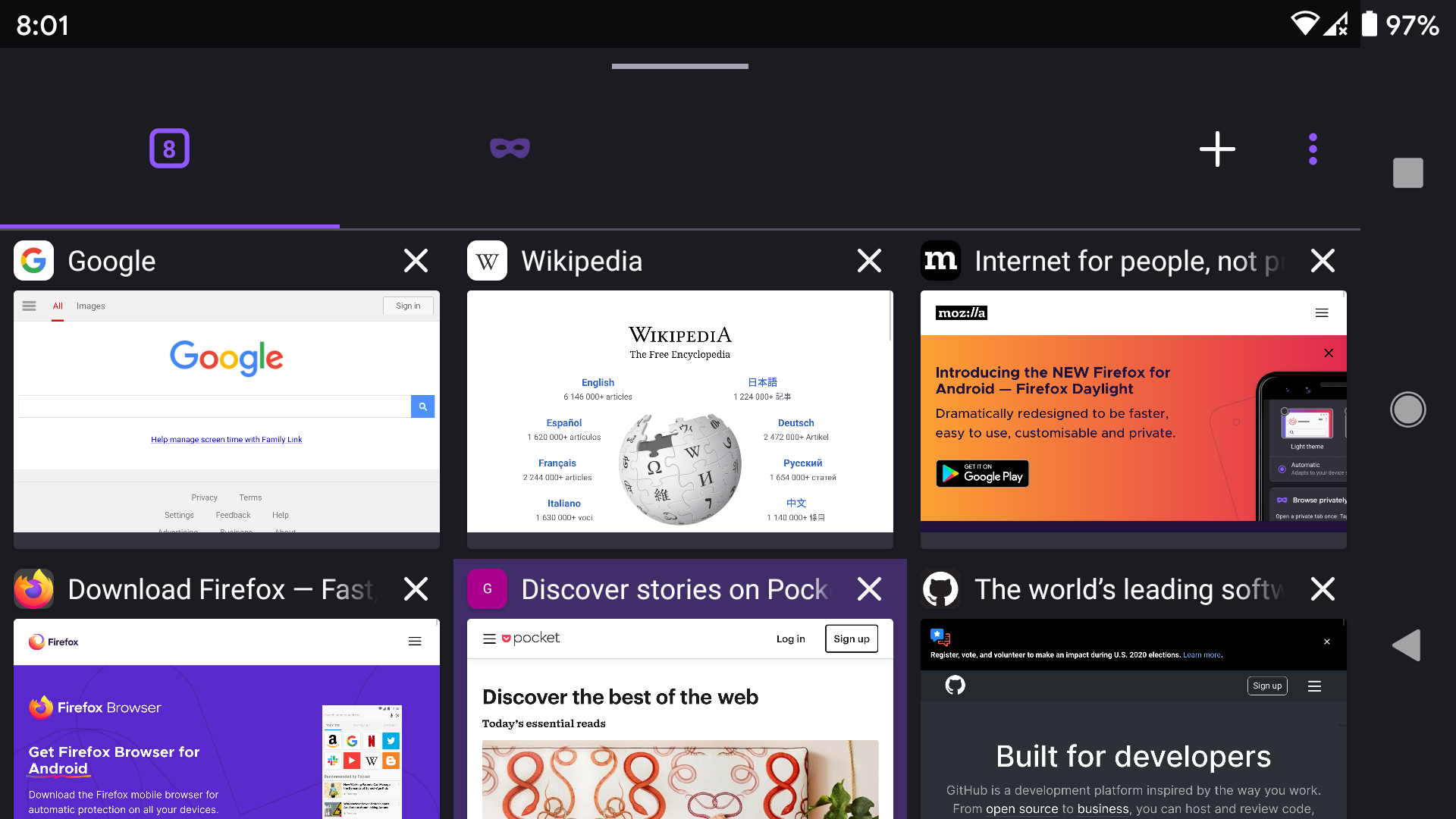
The advantage of this compact layout is even more prominent in large screens which can show more than 2 tabs in a row, and also in landscape mode. As you can see the old Fennec can show 6 tabs in landscape mode, and similarly the forked Fenix with the compact tabs layout can also show 6 tabs. The Fenix without compact tabs can only show 3 and a very tiny portion of the 4th.
Old Fennec
Forked Fenix with compact tabs
Forked Fenix with (mostly) unmodified layout

@abhijitvalluri thanks for all your hard work. I and others like me appreciate your efforts 😘.
Keep up the good work 👍
and for any jealous fenix dev. we appriciate your efforts too 👍
one thing - fenix uses a sheet so you cant quickly open a new tab by double tapping on the tab switcher
@abhijitvalluri would you be willing to upstream this to Fenix?
Also the latest screenshots show that it's not compact at all and misses the point of this issue. It shows less tabs than the default layout. If it's not about a compact layout the issue should be renamed to avoid confusion.
To clarify my point of view: Adding an alternative tab view adds complexity to the product. It's not only about the one-time implementation effort, really every future change of this component has to be added and tested in both configurations and therefore binds resources and affects the whole product. It doesn't make sense to pay these costs if there are no advantages. The last proposal looks different, but that's not an advantage or disadvantage, it's just a matter of taste. But it has clear disadvantages - less tabs and less space for page titles. If you want that Mozilla implements an alternative layout it should really have advantages. This is what you should focus about in any proposals.
We've added grid view as an option. Closing
Most helpful comment
Yes please!!!