Fenix: [Feature Request] Flow layout for search suggestions as in fennec
What is the user problem or growth opportunity you want to see solved?
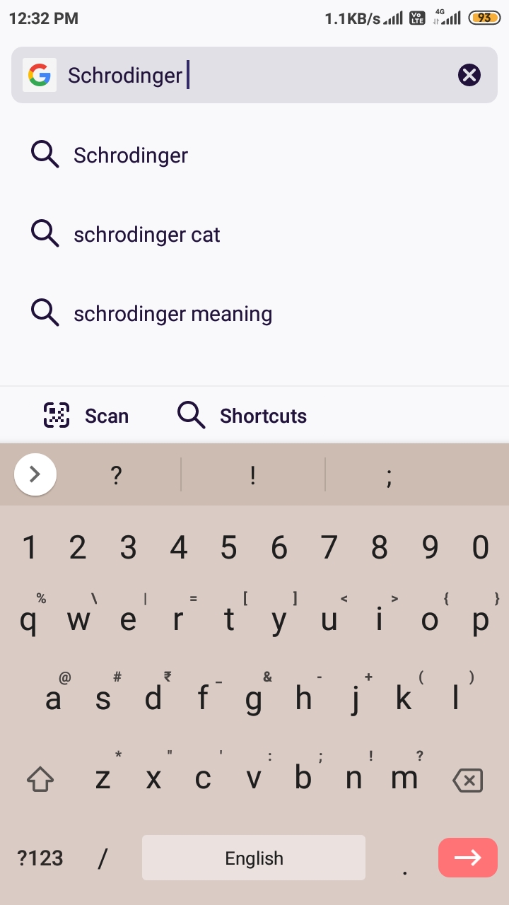
Current implementation of search suggestions is not as helpful as in fennec. On small screen devices (4" or less) it is very difficult to see all suggestions without scrolling or hiding keyboard moreover history and Bookmark suggestions are always hidden behind keyboard and so these suggestions are useless as these are not shown at first glance. Flow layout like as in fennec can solve this problem as this will save some space to show some other suggestions
Fenix implementation
 UNITO-UNDERSCORE!2020-07-26-12-32-14-166!UNITO-UNDERSCORE!org mozilla fenix!
fennec implementation
 UNITO-UNDERSCORE!2020-07-26-12-34-16-560!UNITO-UNDERSCORE!org mozilla firefox!
All 4 comments
Duplicate of and WONTFIX via #3105:
User research shows that the chips are very small touch targets and it was an deliberate decision to not use them.
chips are very small touch targets and it was an deliberate decision to not use them.
What was stopping fenix team from making chips size larger?
Or deliberately copying chrome design.
Chips are larger than Shield button so remove this sheild icon "Deliberately" 😀
I can confirm that this issue is a wonfix for us.
Most helpful comment
Chips are larger than Shield button so remove this sheild icon "Deliberately" 😀