Fenix: Add 🔍 search icon to the address bar if something has been typed
What is the user problem or growth opportunity you want to see solved?
People may not understand that the address bar is useful not only to enter URLs, but also to search for keywords. People may not know that they can enter keywords into the address bar.
By adding a :mag: icon that serves a “Go to this site”/“Search for this keyword” function in the same place where URL/keyword is entered, we might encourage people to use the address bar for all their search needs.
Behaviour
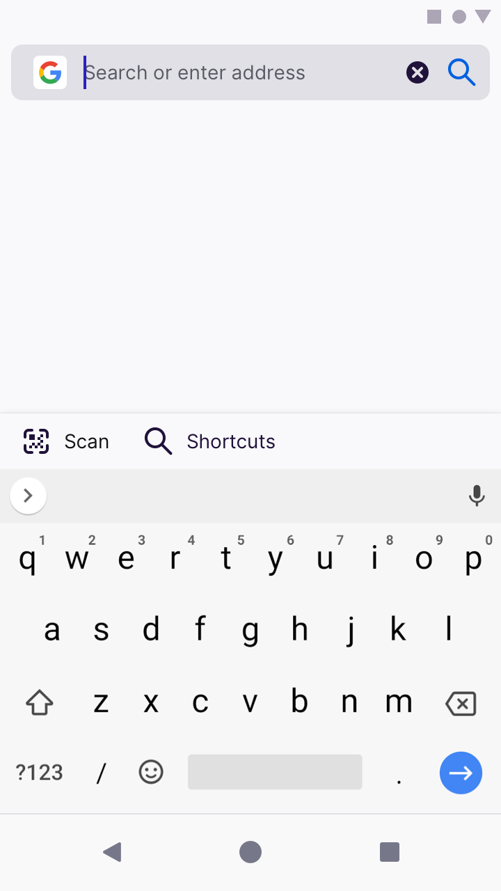
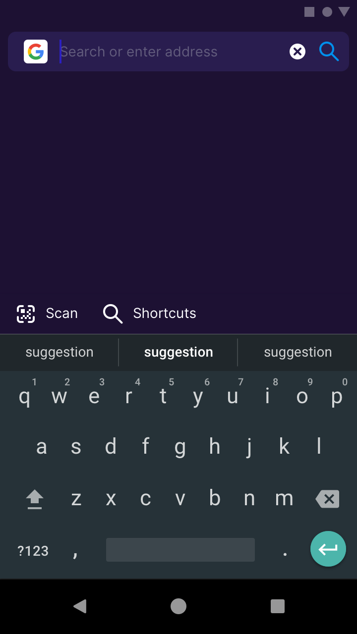
Before text entry
Don’t show a :mag: icon on the address bar

After text entry
Show a :mag: icon, and hide the voice search button. We hypothesise that users who would like to voice search, will do it _only before they enter_ characters into the address bar. The “clear text” icon remains as usual.
(Note: we can experiment with the colour of this enabled state. In this example, I’ve set it to Blue 50 #0060df on light theme, and Blue 40 #0090ed on dark and private themes).

 brampitoyo
All 14 comments
They'll be hard to touch. I think this search icon is unnecessary. My recommendation is dynamically swap clear and mic icon and don't add search icon #12657.
@brampitoyo What do you think about this?
 hakkikaancaliskan
on 20 Jul 2020
hakkikaancaliskan
on 20 Jul 2020
@hakkikaancaliskan This suggestion was made before I was made aware of #12657
I now think that the search bar should have two separate states:
- When nothing is entered (placeholder text reads: Search or enter address):
- Show Mic icon
- Don’t show Magnifying Glass icon
- When a character has been entered
- Hide Mic icon
- Show Magnifying Glass icon
- Show Clear/x icon
As for showing the Magnifying Glass icon, I want to test and see whether having it there will make more people understand that they can use the address bar to search (instead of entering URL).
We will know that we’re successful if more people are entering keywords into the address bar, or if they start typing on the Magnifying Glass icon.
brampitoyo
on 21 Jul 2020
I’ve updated comment 0 with a slightly different behaviour spec.
brampitoyo
on 21 Jul 2020
@hakkikaancaliskan Are you working on this?
 mcarare
on 30 Jul 2020
mcarare
on 30 Jul 2020
@hakkikaancaliskan Are you working on this?
Nope. It's all yours.
hakkikaancaliskan
on 30 Jul 2020
@brampitoyo Quick question... is the order of icons negotiable? :)
Currently our toolbar component uses static items (that can be shown or hidden) and fixed "containers" where additional items can be added.
In edit mode that roughly looks like this:
 | icon |           url             | actions | clear |
 +------+---------------------------+---------+-------+
The "actions" section is where we can add custom toolbar items, like the "search" icon. But that would mean that the order is reversed compared to your mock. Would that be okay for that experiment?
I guess eventually we could refactor the toolbar to maybe not make the "clear" button a special case but instead an "action" itself, which makes it easier to position it differently.
For reference the display mode uses the following layout:
| navigation  | indicators | url       [ page    ] | browser  | menu |
|   actions   |            |           [ actions ] | actions  |      |
+-------------+------------+-----------------------+----------+------+
+------------------------progress------------------------------------+
 pocmo
on 7 Aug 2020
pocmo
on 7 Aug 2020
@pocmo I designed the change search engine interface in a particular way, so that “the search engine icon” itself becomes “the thing you select to change search engine”.
I wonder whether it’s possible to make our icon + upwards/downwards arrowhead part of the navigation actions? This would involve “divorcing” it from the URL bar.

This state should only be true on two conditions:
- When the address bar appears on the New Tab Page
- When the address bar is selected
- In other words, when the address bar appears on a website, we won’t show the separate icon + arrowhead
By doing this, we may be able to make the icon selectable?
brampitoyo
on 11 Aug 2020
From an engineering perspective the changes here are possible but waiting for @pocmo 's directions whether to change the toolbar structure in regards to what is desired for this AC component.
Maybe if just for a Fenix experiment we could have our own EditToolbar?.. though AC offering full support for custom toolbars is another big decision and the changes needed would probably be substantial.
 Mugurell
on 21 Aug 2020
Mugurell
on 21 Aug 2020
I wonder whether it’s possible to make our icon + upwards/downwards arrowhead part of the navigation actions? This would involve “divorcing” it from the URL bar.
@brampitoyo Yes, that should be possible. What is placed into the navigation actions is quite flexible and such a button could be placed there. The icon is optional and in this case Fenix would just display none.
From an engineering perspective the changes here are possible but waiting for @pocmo 's directions whether to change the toolbar structure in regards to what is desired for this AC component.
@Mugurell I think we could get away with not changing the structure and displaying a navigation action for this search engine switcher?
Maybe if just for a Fenix experiment we could have our own EditToolbar?.. though AC offering full support for custom toolbars is another big decision and the changes needed would probably be substantial.
No, no, let's not go there. The point of AC is to have centralized components for such cases. If we build something custom in Fenix then we will have a hard time getting this back into AC and end up maintaining a version in AC that is not used by anyone. We took such shortcuts in the past and it always caused more issues then helped us in the long term.
pocmo
on 27 Aug 2020
Thank you Sebastian!
@brampitoyo based on https://github.com/mozilla-mobile/fenix/issues/12617#issuecomment-670451234 should we add a new 🔍 to the left of the ✖ button, would that be okay for the experiment?
Regarding the ⏷⏶ selector should we also add a cool animation?
Mugurell
on 28 Aug 2020
I think this search icon is unnecessary.
Here's another use for it. At present, it's impossible to search for foo.bar, since pressing enter on the keyboard causes the browser to navigate to http://foo.bar/ instead.
 mavit
on 4 Sep 2020
mavit
on 4 Sep 2020
@Mugurell Sorry for the overdue reply.
- Yes. Let’s add a 🔍 icon next to the ✖ icon.
- I prefer for the 🔍 to be displayed to the right of the ✖. If not possible, we can show it to the left.
- The 🔍 works identically to the Enter/Return key. It’s a visual indicator that helps people who may not know that they can enter keywords into the address bar.
This feature should only run as an experiment for now. Ultimately, we want to know whether people will search more with (ie. enter more keywords into) the address bar, if we show the 🔍 icon.
If there’s no meaningful difference between showing/hiding the 🔍, then it’s just taking up space and we shouldn’t ship it in product.
brampitoyo
on 9 Sep 2020
Thank you @brampitoyo !
Regarding the A/B experiment, should users be split 50/50 or do you have another split in mind?
@liuche I now understand the goal of this ticket is to add an A/B experiment.
I don't see Fretboard being used anymore because of startup performance implications - https://github.com/mozilla-mobile/fenix/issues/5182.
Should we add it again to Fenix? And if so it should use a local json or Kinto as experiments source?
Mugurell
on 9 Sep 2020
@Mugurell I think 50/50 sounds reasonable. I’d be happy to be put in queue for experimentation, as well. I know that we tend to have a few going on at any one time, and this shouldn’t block any other effort.
Besides, having the keyboard up by default may already do a great job at increasing the volume of search keywords entered – so I don’t feel any rush launching this as an experiment.
brampitoyo
on 9 Sep 2020
Related issues
 robsmith11
·
3Comments
robsmith11
·
3Comments
 AndiAJ
·
3Comments
AndiAJ
·
3Comments
 abodea
·
3Comments
abodea
·
3Comments
abodea
·
3Comments
abodea
·
3Comments
 phileastv
·
3Comments
phileastv
·
3Comments
Most helpful comment
@pocmo I designed the change search engine interface in a particular way, so that “the search engine icon” itself becomes “the thing you select to change search engine”.
I wonder whether it’s possible to make our icon + upwards/downwards arrowhead part of the navigation actions? This would involve “divorcing” it from the URL bar.
This state should only be true on two conditions:
By doing this, we may be able to make the icon selectable?