Fenix: add some quick action items on home screen
What is the user problem or growth opportunity you want to see solved?
Currently to access history, bookmarks, add ons, synced tabs,quit browser we have to click the 3 dot menu and then the items...how about the adding the icons to home screen in a single row...
The Firefox branding could be moved a bit to the top which will align with private tab button and then utilize a single row between the branding logo and top sites to place icons of history, bookmarks, add ons synced tabs and quit browser.
How do you know that this problem exists today? Why is this important?
This will avoid multiple clicks and easily accessible from home screen itself.
Who will benefit from it?
All users
 UNITO-UNDERSCORE!20200704-123549~2!
 sheikh-azharuddin
All 23 comments
I would love this feature, making accessing these menu items faster and more discoverable.
Though I personally don't mind where the icons should be placed, could also be below the top sites or even below collections - I guess that is something UX has to figure out.
 dglttr
on 4 Jul 2020
dglttr
on 4 Jul 2020
It should be placed between the branding and top sites...reason is I have seen some screenshots in various cases where people have add too many top sites 3-4 rows and collections too...in those cases the quick access feature may hide and an additional scrolll will be required since top sites and collection are dynamic and users are free to add as many as they want....
Since this will a single fix row it should be placed on top for true easy access and easily noticeable
sheikh-azharuddin
on 4 Jul 2020
Btw I am good in html coding ....so is it possible to get the html code of the homepage so that I can modify and share mock screenshot?
@caderyn any help pls.....
sheikh-azharuddin
on 4 Jul 2020
This could be such an useful feature. I never thought about it! Great work @sheikh-azharuddin. I'm thinking developers will consider it. Let's see.
I think shortcuts for Bookmarks, history, add-ons, and synced tabs coud be placed on the top of Top Sites and below the Firefox Browser logo as you are already saying since to access them frequently they need a permanent place as if we go on adding top sites the shortcuts the place of Bookmarks, history, add-ons the shortcuts row will move further to the bottom.
We also need to make sure that they fit in a single row otherwise it'll affect the Top Sites place.
Edit: and also you don't need anybody's help to push feature requests, if they are really useful then I think the developers will definitely consider those. Otherwise users like us will like what you have requested and push it for you so it gains the developers' attention. Just browse through various GitHub feature requests issues and you'll know what I'm talking about.
So just let the new feature requests begin... :)
 ghost
on 5 Jul 2020
ghost
on 5 Jul 2020
Home screen currently has 5 icons in a row for top sites
Quick feature row will have 5 icons aligned with top sites icon...
History, bookmark, synced tabs, add-ons and quit browser
The quit browser icon feels weird... It should be a power button icon
sheikh-azharuddin
on 5 Jul 2020
hello saipan
can i get html version of the homepage to create some mock pages....
sheikh-azharuddin
on 5 Jul 2020
Just imagine if you accidentally clicked the Quit button while selecting others shortcuts. I don't think a Quit button should be added. Perhaps any new shortcut could take its place. Or just the spacing could be increased between them to match with the Top Sites margin.
ghost
on 5 Jul 2020
@sheikh-azharuddin
can i get html version of the homepage to create some mock pages....
I don't think the homescreen is an HTML document. I'm not a developer so I could be wrong. Though I do have some basic knowledge about several programming language including HTML, Java, C++ etc... But I cannot comment on what homescreen is made of.
I have heard one of the developers say that it is made of native code or so and it cannot be customised by extension like Firefox browser on desktop a few years ago used to do before Quantum release.
I do have an idea where you can browse the code of Fenix. I think you can browse the code in the master branch of Fenix. Give it a try. It should be the front and center on Fenix repository home page. I'll also try to browse it.
ghost
on 5 Jul 2020
In that case maybe settings icon....master branch link please....
sheikh-azharuddin
on 5 Jul 2020
Here @sheikh-azharuddin this is what I found. I think it is written in Kotlin language (a language based on JAVA, IIRC and AFAIK). Most of the apps are now switching to Kotlin language, it's no surprise that Fenix is also written in that language.
ghost
on 5 Jul 2020
master branch link please....
It should be at the front
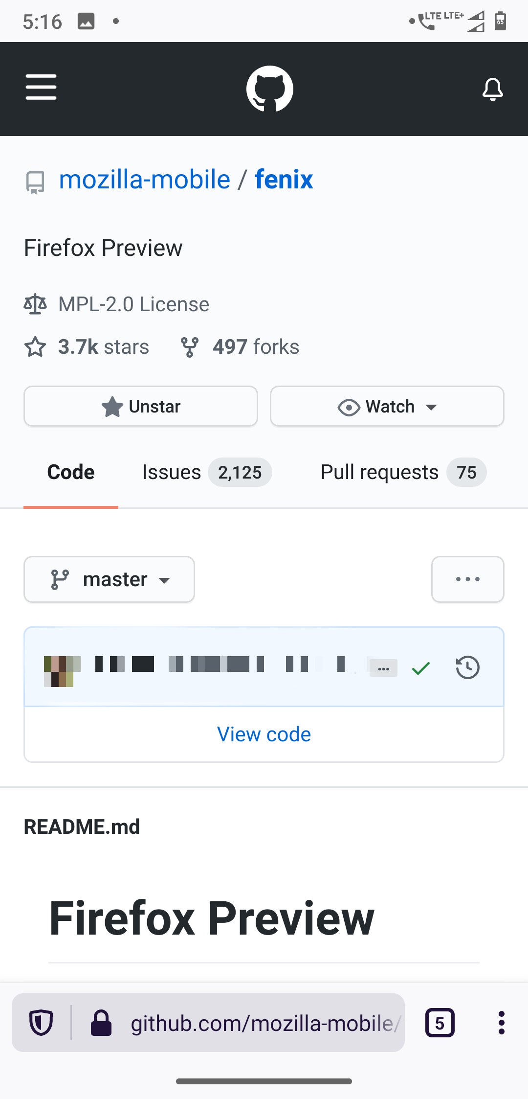
Go here: https://github.com/mozilla-mobile/fenix
And click View code and master branch is the selected by default.
ghost
on 5 Jul 2020
In that case maybe settings icon...
Yeah, this could definitely work!
ghost
on 5 Jul 2020
Thanks saipan... 🙂
sheikh-azharuddin
on 5 Jul 2020
@sheikh-azharuddin Fenix is based on Android Components. So perhaps, if you couldn't find anything in Fenix you may find something in a-c repo: https://github.com/mozilla-mobile/android-components.
ghost
on 5 Jul 2020
Thanks saipan again.. During my school and college days i learned c, c++, java,. Net, html... Then i got a job in support related work and lost all my development skills... Only html is being used here and there so I know that but don't remember those programming languages... Guess i have to learn again 😅
No problem I love challenges👻😈
sheikh-azharuddin
on 5 Jul 2020
I'm tagging one of the developers from the UX team: @brampitoyo can you help us? Do you think that having a row containing Bookmarks, history, add-ons, synced tabs, etc. At above the Top Sites could be an useful feature? For context, please see the issue description and its below following comments.
ghost
on 5 Jul 2020
@sheikh-azharuddin
Guess i have to learn again
Yeah, let's go! Best of luck with it!
ghost
on 5 Jul 2020
@SS1113 @sheikh-azharuddin Yes. Those information could potentially be helpful.
In this sprint and the next, my colleague @apbitner is looking to make the most useful and frequently-accessed types of content easily accessible on the homescreen.
 brampitoyo
on 8 Jul 2020
brampitoyo
on 8 Jul 2020
 yoasif
on 11 Jul 2020
yoasif
on 11 Jul 2020
I am glad you are back....
sheikh-azharuddin
on 16 Jul 2020
I must confess I like a lot current Firefox home screen with it's tab-like access to bookmarks. It's easy and intuitive!
 maverick74
on 24 Jul 2020
maverick74
on 24 Jul 2020
#12941 is the better option I don't want to access my bookmarks from the home page, I want my bookmarks to be the home page.
I don't use firefox for android as my main way to browse the web, I use it when have my phone but not my pc. So for me bookmarks are critical and collections are useless.
 Imold
on 2 Sep 2020
Imold
on 2 Sep 2020
Duplicate of #12065.
 cadeyrn
on 19 Sep 2020
cadeyrn
on 19 Sep 2020
Related issues
 bbinto
·
3Comments
bbinto
·
3Comments
 abodea
·
3Comments
abodea
·
3Comments
 Chris01277
·
3Comments
Chris01277
·
3Comments
 robsmith11
·
3Comments
robsmith11
·
3Comments
 andreicristianpetcu
·
3Comments
andreicristianpetcu
·
3Comments
Most helpful comment
I would love this feature, making accessing these menu items faster and more discoverable.
Though I personally don't mind where the icons should be placed, could also be below the top sites or even below collections - I guess that is something UX has to figure out.