Fenix: change download notification progress color
What is the user problem or growth opportunity you want to see solved?
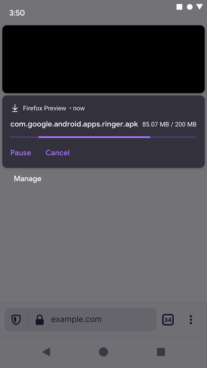
Please change the download progress and buttons color to purple to match with Firefox theme... Currently it shows green.
How do you know that this problem exists today? Why is this important?
It should match Firefox theme
Who will benefit from it?
All users.. aesthetically pleasing.
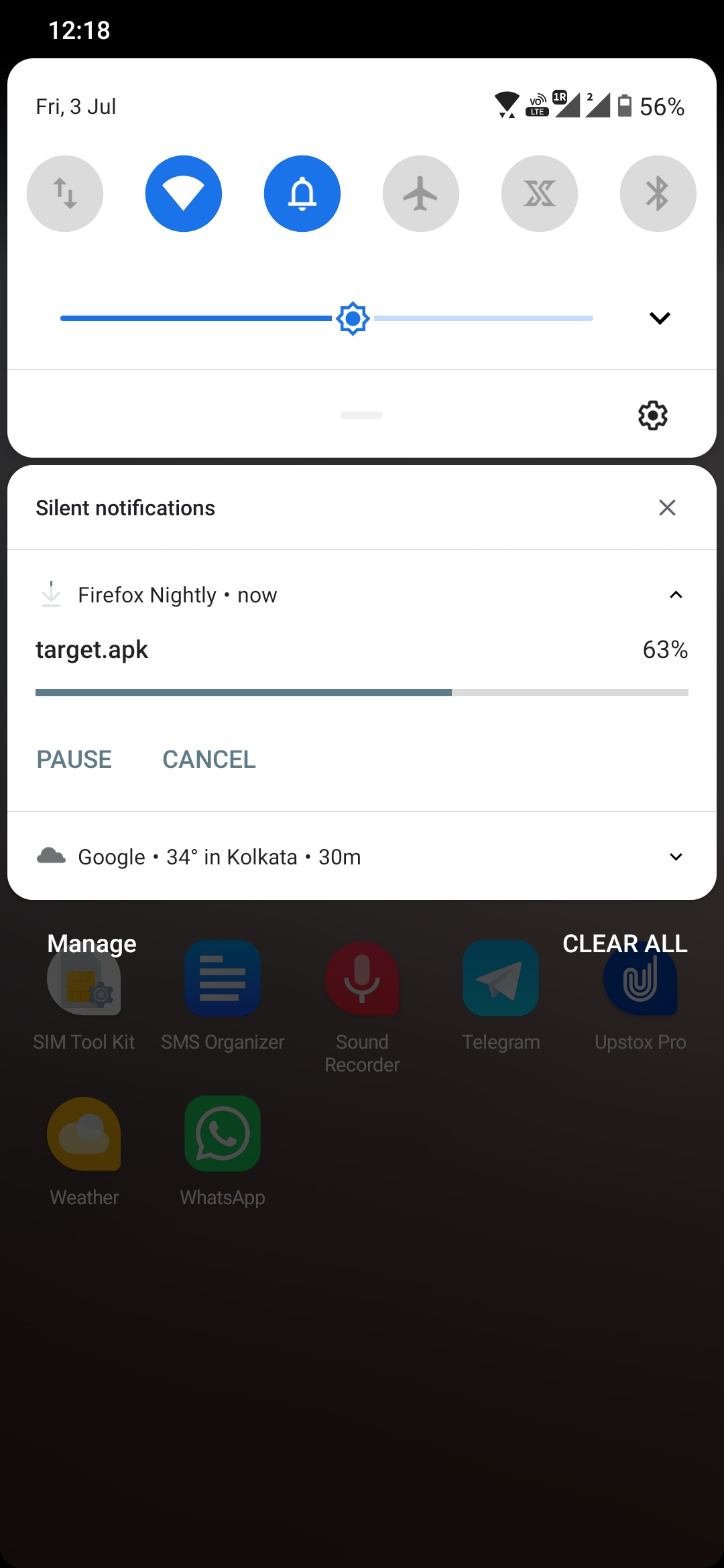 UNITO-UNDERSCORE!20200703-121802!
 sheikh-azharuddin
All 28 comments
I agree we should be using Fenix colours. @brampitoyo for confirmation.
Light Theme Color: Violet 70 (#592ACB)
Dark Theme Color: Violet 40 (#AB71FF)
 AmyYLee
on 5 Jul 2020
AmyYLee
on 5 Jul 2020
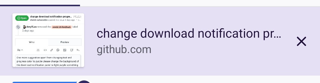
One more suggestion apart from changing text and progress color to purple is it possible to change the background of the download notification panel to light purple something like tab tray selected tab background color as per as below screenshot ... It looks really good in other apps and also notification will stand out from others..
What I mean text and progress color will be dark purple, download notification background color will be light purple like selected tab...
sheikh-azharuddin
on 7 Jul 2020
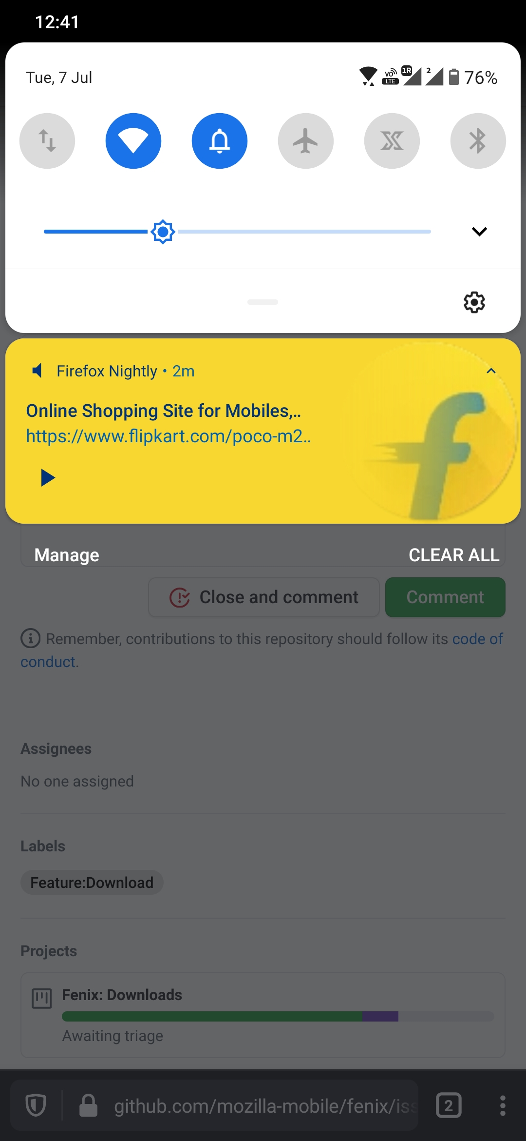
@AmyYLee I agree that we should use Fenix’s colour scheme, on light and dark theme.
As far as I know, we only have limited control over the colour of our notification shade. It’s controlled by Android System. If the System theme is set to dark, then I think that we have to follow that.
So in these mockups below, I have posted both the light and dark variant.
Light theme:
- Surface: White
#ffffff - Text and icon: Ink 80
#20123a(if possible – it seems like it might not be possible; can we confirm?) - Accent (for text buttons and progress bar): Violet 70
#592acb
Dark theme:
- Surface: Dark Grey 50
#32313c - Text and icon: Light Grey 5
#fbfbfe - Accent: Violet 40
#ab71ff
I tried @sheikh-azharuddin’s suggestions of changing the background colour of our notification (thanks for this idea – it’s sensible!), but couldn’t find a lighter coloured background that still maintains good accessibility contrast (WCAG 2.0) with our violet, and that fits our user interface visual style (which is quite neutral).
So in the end, I don’t recommend changing the colour to any value other than the above.
 brampitoyo
on 8 Jul 2020
brampitoyo
on 8 Jul 2020
This is good and looks better👍
sheikh-azharuddin
on 8 Jul 2020
@AmyYLee I agree that we should use Fenix’s colour scheme, on light and dark theme.
As far as I know, we only have limited control over the colour of our notification shade. It’s controlled by Android System. If the System theme is set to dark, then I think that we have to follow that.
So in these mockups below, I have posted both the light and dark variant.
Light theme:
* Surface: White `#ffffff`

* Text and icon: Ink 80 `#20123a` (if possible – it seems like it might not be possible; can we confirm?)

* Accent (for text buttons and progress bar): Violet 70 `#592acb`
Dark theme:
* Surface: Dark Grey 50 `#32313c`

* Text and icon: Light Grey 5 `#fbfbfe`

* Accent: Violet 40 `#ab71ff`
I tried @sheikh-azharuddin’s suggestions of changing the background colour of our notification (thanks for this idea – it’s sensible!), but couldn’t find a lighter coloured background that still maintains good accessibility contrast (WCAG 2.0) with our violet, and that fits our user interface visual style (which is quite neutral).
So in the end, I don’t recommend changing the colour to any value other than the above.
Looks good! Thanks
AmyYLee
on 10 Jul 2020
This looks really beautiful and match perfectly with Firefox theme... Please implement as soon as you can😊
Thanks for bringing my imagination to life 😅
sheikh-azharuddin
on 10 Jul 2020
Hi all
Any news about the implementation?
sheikh-azharuddin
on 15 Jul 2020
Sorry @sheikh-azharuddin we haven't had time to pick this bug as we are still working on issues with higher priority. If you want to give it a try I can help up throughout the needed changes :)
 Amejia481
on 15 Jul 2020
Amejia481
on 15 Jul 2020
Sorry @sheikh-azharuddin we haven't had time to pick this bug as we are still working on issues with higher priority. If you want to give it a try I can help up throughout the needed changes :)
Hi Arturo thanks for the update
Actually i am a normal end user which some background of coding and scripting (powershell)😅
If you still feel I can do it please guide me...
sheikh-azharuddin
on 15 Jul 2020
Sorry @sheikh-azharuddin we haven't had time to pick this bug as we are still working on issues with higher priority. If you want to give it a try I can help up throughout the needed changes :)
Hi Arturo thanks for the update
Actually i am a normal end user which some background of coding and scripting (powershell)😅If you still feel I can do it please guide me...
Sorry for the late reply. If you are new to Android it will be a bit challenging but not impossible to achieve :)
- If new first download Android studio.
- Take a look to the contributing section on the android components website .
- For changing the style colour on the notification, we need to expose an styling object from AC that Fenix can pass to the AbstractFetchDownloadService similar to what we are doing on AddonsManagerAdapter#Style.
- Pass the style to DownloadNotification each notification type.
- On DownloadNotification we are using the default Android notifications, I'm not completely sure if the super that level of customization described above, I see we can customize the colour, I not sure about the other properties, if the default android notification doesn't allow all that customization then it will be more complicated as we will have to create our own download notification.
Do not feel forced to take on the challenge, but if you do I'm happy to help you along the way :)
Amejia481
on 16 Jul 2020
Sorry @sheikh-azharuddin we haven't had time to pick this bug as we are still working on issues with higher priority. If you want to give it a try I can help up throughout the needed changes :)
Hi Arturo thanks for the update
Actually i am a normal end user which some background of coding and scripting (powershell)😅
If you still feel I can do it please guide me...Sorry for the late reply. If you are new to Android it will be a bit challenging but not impossible to achieve :)
1. If new first download [Android studio](https://developer.android.com/studio).

2. Take a look to the contributing section on the [android components website ](https://mozac.org/contributing/).

3. For changing the style colour on the notification, we need to expose an styling object from AC that Fenix can pass to the [AbstractFetchDownloadService](https://github.com/mozilla-mobile/android-components/blob/84d7a0f74ffda33b169d8f258f926b3314219576/components/feature/downloads/src/main/java/mozilla/components/feature/downloads/AbstractFetchDownloadService.kt#L84) similar to what we are doing on [AddonsManagerAdapter#Style](https://github.com/mozilla-mobile/android-components/blob/84d7a0f74ffda33b169d8f258f926b3314219576/components/feature/addons/src/main/java/mozilla/components/feature/addons/ui/AddonsManagerAdapter.kt#L328).

4. Pass the style to [DownloadNotification](https://github.com/mozilla-mobile/android-components/blob/84d7a0f74ffda33b169d8f258f926b3314219576/components/feature/downloads/src/main/java/mozilla/components/feature/downloads/AbstractFetchDownloadService.kt#L317) each notification type.

5. On [DownloadNotification](https://github.com/mozilla-mobile/android-components/blob/84d7a0f74ffda33b169d8f258f926b3314219576/components/feature/downloads/src/main/java/mozilla/components/feature/downloads/DownloadNotification.kt#L36) we are using the default Android notifications, I'm not completely sure if the super that level of customization [described above](https://github.com/mozilla-mobile/fenix/issues/12226#issuecomment-656771900), I see [we can customize the colour](https://github.com/mozilla-mobile/android-components/blob/84d7a0f74ffda33b169d8f258f926b3314219576/components/feature/downloads/src/main/java/mozilla/components/feature/downloads/DownloadNotification.kt#L63), I not sure about the other properties, if the default android notification doesn't allow all that customization then it will be more complicated as we will have to [create our own download notification](https://developer.android.com/training/notify-user/custom-notification).
Do not feel forced to take on the challenge, but if you do I'm happy to help you along the way :)
I really want this and want to work on this :)
I'm absolutely unsure I can handle this lol
 hakkikaancaliskan
on 17 Jul 2020
hakkikaancaliskan
on 17 Jul 2020
Ok, we're getting closer, looks like it's possible to design however we want but there will be layout inconsistencies? I really don't know.
hakkikaancaliskan
on 18 Jul 2020
I've worked on this (https://github.com/mozilla-mobile/android-components/pull/7763) but after a second thought, maybe we "should" use Android's default.
Because look to the caution at the end of the page https://developer.android.com/training/notify-user/custom-notification.
Chrome also using default without "any" modification.
@Amejia481 we shouldn't take this risk, this could cause layout inconsistencies. What do you guys think?
hakkikaancaliskan
on 18 Jul 2020
Wouldn't this be a part of the android-components repo?
 shahsurajk
on 19 Jul 2020
shahsurajk
on 19 Jul 2020
Wouldn't this be a part of the android-components repo?
Yes this is part of ac. Already there is pr for this in ac. https://github.com/mozilla-mobile/android-components/pull/7763
hakkikaancaliskan
on 19 Jul 2020
@hakkikaancaliskan I am worried about layout inconsistencies, and the fact that we’re not following Android System standard. It means that we will need to keep maintaining our custom component in case of system-wide changes, instead of focusing on other important problems.
The risk of designing our own notification useful to restate:
…your notification will not match the rest of the notifications and it can cause significant layout compatibility issues on different devices that apply different styling to the notification area.
It seems like Android wants different devices to handle the styling, and as an app, our policy should be to “follow device”. I’d like to follow the official platform recommendation.
Then, is there no element that can be customised? For example, accent colour must always follow device and not manually selected by the app.
If there’s no further customisation possible, then I recommend closing this issue.
brampitoyo
on 20 Jul 2020
@brampitoyo We could follow accent color based on fenix's theme but android theme could be different and could cause contrast issues.
hakkikaancaliskan
on 20 Jul 2020
@brampitoyo Wait I don't understand what's wrong with the earlier implementation of purple color?? The one which you gave earlier? No offense but that hakki guy is a noobie.Inspired by amejia android guide tried with few implementation and when cannot gave a proper design highlighted the risk....
Even youtube is changing the notification color and background in Firefox here no one has any problem...the download notification is part of Firefox and I seriously believe you should design to match with Firefox theme... Purple and white/gray.
sheikh-azharuddin
on 20 Jul 2020
sheikh-azharuddin
on 20 Jul 2020
@brampitoyo Wait I don't understand what's wrong with the earlier implementation of purple color?? The one which you gave earlier? No offense but that hakki guy is a noobie.Inspired by amejia android guide tried with few implementation and when cannot gave a proper design highlighted the risk....
Even youtube is changing the notification color and background in Firefox here no one has any problem...the download notification is part of Firefox and I seriously believe you should design to match with Firefox theme... Purple and white/gray.
Vaov, noobie? Look at the pr i made. I did but i and Google don't recommend using custom notifications. For example on my device, grey notification looks awful because all notifications black, and Fenix grey.
We're talking about engineering side. If you don't know, please don't talk.
hakkikaancaliskan
on 20 Jul 2020
That's "media" notification and android controlling it.
That's not custom, same on all apps, that's provided by android.
hakkikaancaliskan
on 20 Jul 2020
@Amejia481 what do you think from engineering side, there is layout inconsistencies even on my device, (grey notification while others black). If wanna work on this further I'll continue but i really don't recommend this. Let Android handle this as other all apps do.
hakkikaancaliskan
on 20 Jul 2020
We should think how will look this on Xiaomi, Poco, Samsung, Huawei... Nearly all of them using different look on notifications. We can't adopt all of them. Think about what will happen on reddit lol.
Yes I'm noobie. Do better and eng guys wil be happy to merge. Don't even know media notification is provided by android, you think all devs doing same layout and colors etc? Poor.
hakkikaancaliskan
on 20 Jul 2020
That's "media" notification and android controlling manually.
That's not custom, same on all apps, that's provided by android.Nope then tell me when I am playing same video in chrome and Firefox why the color is different...if it's android it should show the same color but I strongly believe this is how the website treating and changing the notification color and background....
Because looks like Fenix can't provide correct thumbnail.
Fenix provided tab thumbnail (YouTube thumbnail) and chrome provided video thumbnail.
But notice that notification color is based on thumbnail.
hakkikaancaliskan
on 20 Jul 2020
Look to this, https://developer.android.com/training/notify-user/expanded#media-style, does this look like custom or devs using Android provided one. Even if you know nothing, just look to the code, just a bunch of line.
hakkikaancaliskan
on 20 Jul 2020
@hakkikaancaliskan Just question out of curiosity...
Will it still be considered as a custom notification even if we just the colour of the "Progress bar" and "Pause" and "Cancel" button to something like suggested in the https://github.com/mozilla-mobile/fenix/issues/12226#issuecomment-655276128 (arguments aside, but I have to say that it _does_ look really nice!)?
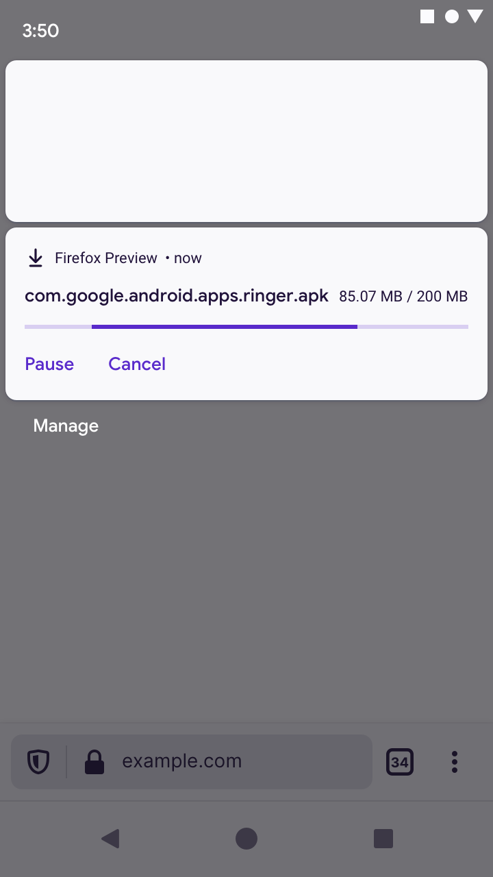
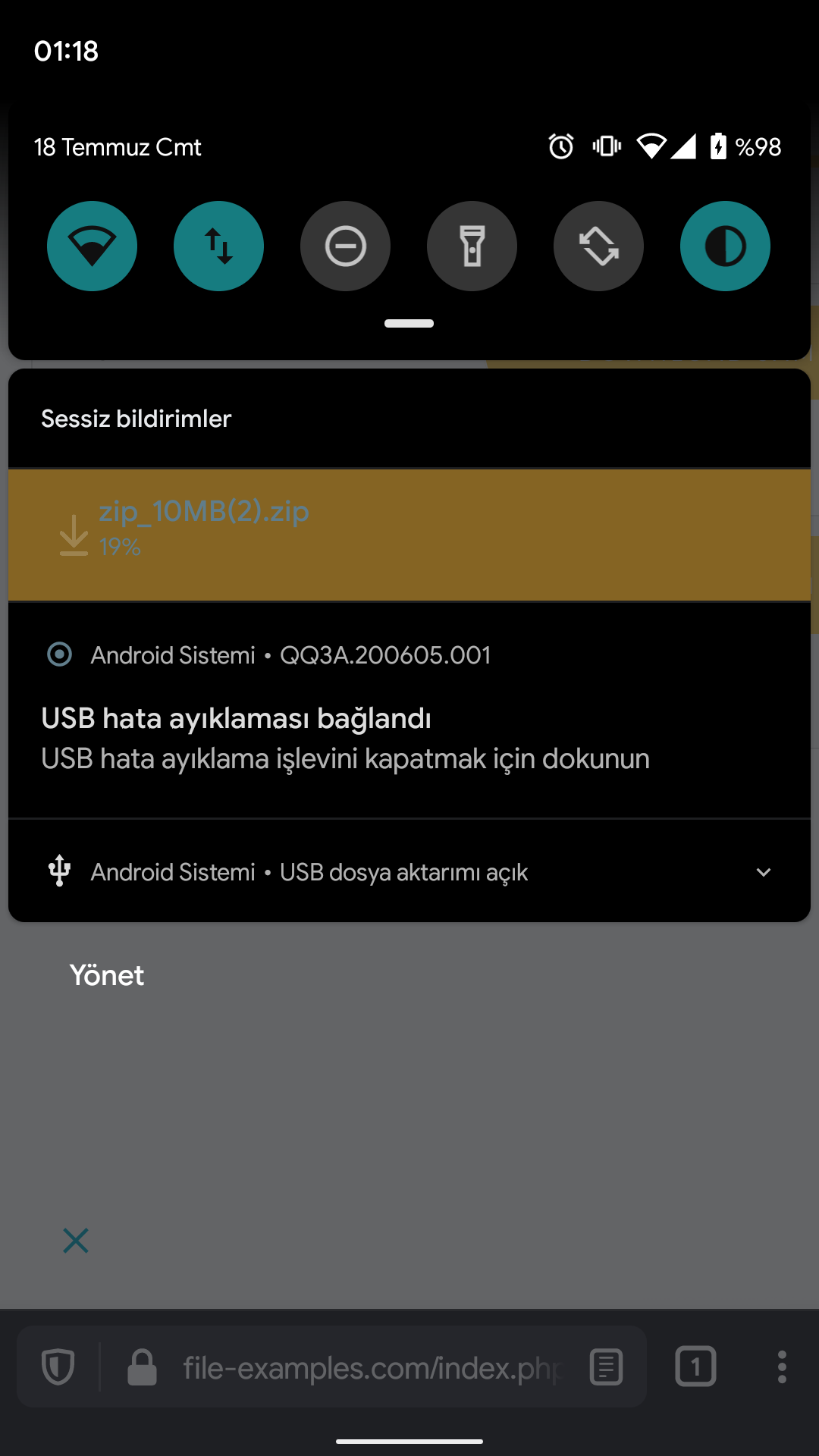
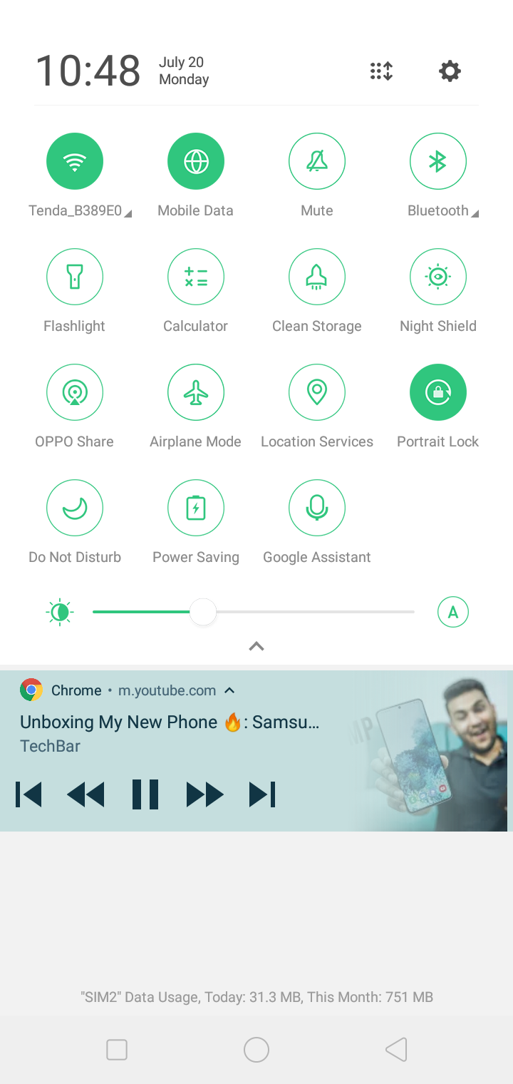
Also, as you can see, on my device, the progress bar of most apps on my device is green coloured (so I think, the default colour accent or whatever... for this is green on my device):
On Chrome browser the progress bar is green on my device:
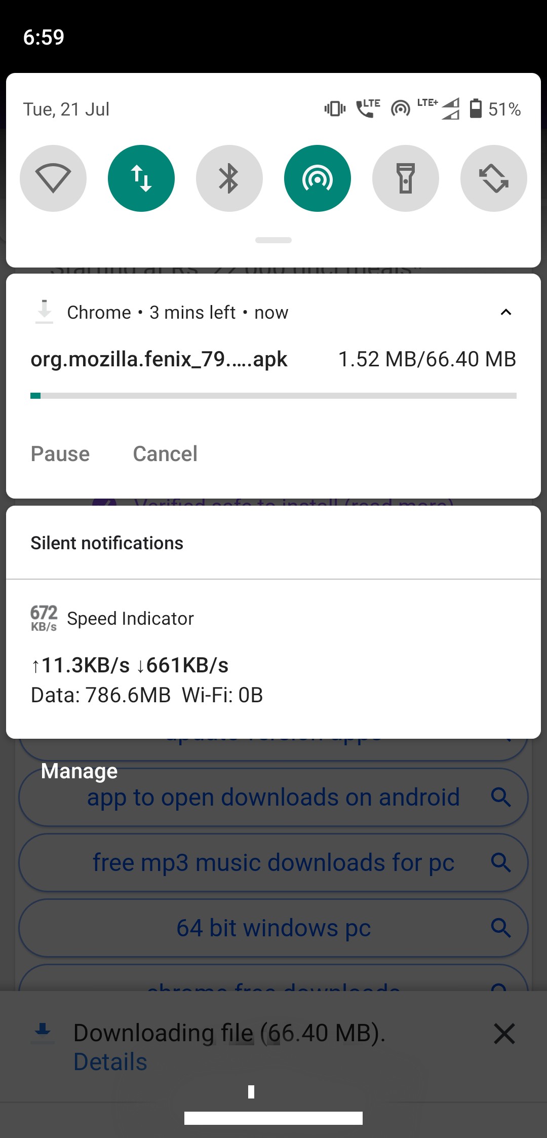
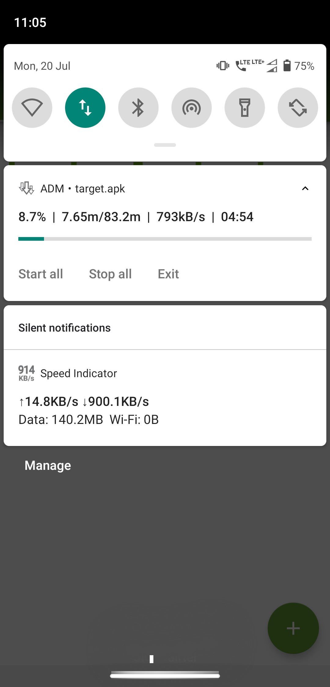
On ADM download manager the progress bar is again green on my device:
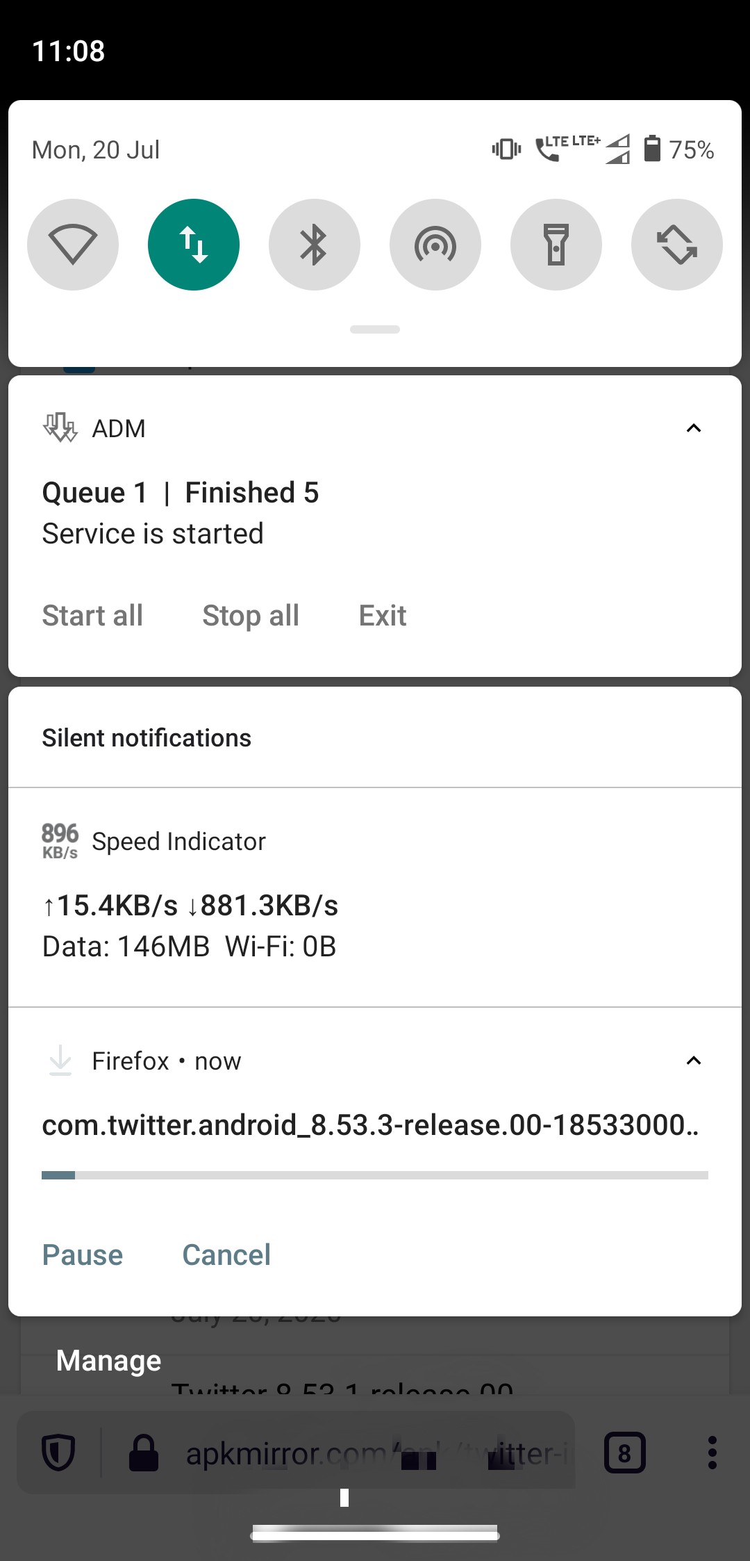
But on Fenix the progress bar is of some other colour, and the button for Pause and Cancel seem to be of other colour as well:
I don't understand the engineering aspect of this ( as I am not a developer) but as a general Android user who loves stock AOSP Android's UI and UX, I can say that the custom notification style of the apps does do interfere with the OEM implemented notification style, as I have seen it on some devices like Xiaomi, Samsung, Oppo, Vivo, etc. they do have notification style something that feels very different from AOSP Android. And if they clash the result is something that I don't want to talk about! and designing for each OEM will take considerable amount of engineering efforts/resources and it's also seems to be not practical as the nature of AOSP Android stands, any OEM could modify any aspect of the OS and it will be impossible to track down every device implementation out there (yes, I know there's CDD but I don't think _every_ Android OEM out there is strictly following it).
And the custom notification style of Fenix is causing several issues, as you are already saying, and I also think it shouldn't be implemented if the benefits are not outweighing the negatives we are getting in return.
but as you can see in the screenshots I attached, at least the current behavior is something that could/should be matched with how the other apps are behaving as otherwise Fenix's behavior would feel inconsistent with how the rest of the apps are behaving.
Thanks for listening to me. :)
What do you think?
 ghost
on 20 Jul 2020
ghost
on 20 Jul 2020
@ShatteredPixel Agreed. As you said we're using different accent color, we could use default one for consistency. My preference is to use all default theme on notifications because we should match other notifications and os.
That's not custom notification, we can provide this with removing one line :)
@brampitoyo what do you think about this?
hakkikaancaliskan
on 20 Jul 2020
I've worked on this (mozilla-mobile/android-components#7763) but after a second thought, maybe we "should" use Android's default.
Because look to the caution at the end of the page https://developer.android.com/training/notify-user/custom-notification.Chrome also using default without "any" modification.
@Amejia481 we shouldn't take this risk, this could cause layout inconsistencies. What do you guys think?
First of all, thanks @hakkikaancaliskan for doing all these great work 🥇 .
…your notification will not match the rest of the notifications and it can cause significant layout compatibility issues on different devices that apply different styling to the notification area.
That's an important consideration, as we prefer to keep notifications compatibility to avoid fragmentation issues, as we are relying on default behaviours for Notification grouping. Let's not not go the custom route for now, maybe we can re-explore that alternative in the future. One thing that we could try to make Fenix notification more closer to its theme is changing the accent colour to the Fenix one or just using the default, depending on @brampitoyo feedbacks, as you mentioned @hakkikaancaliskan.
Amejia481
on 20 Jul 2020
Related issues
 robsmith11
·
3Comments
robsmith11
·
3Comments
 bbinto
·
3Comments
bbinto
·
3Comments
 AndiAJ
·
3Comments
AndiAJ
·
3Comments
 clitetailor
·
3Comments
clitetailor
·
3Comments
 topotropic
·
3Comments
topotropic
·
3Comments
Most helpful comment
@AmyYLee I agree that we should use Fenix’s colour scheme, on light and dark theme.
As far as I know, we only have limited control over the colour of our notification shade. It’s controlled by Android System. If the System theme is set to dark, then I think that we have to follow that.
So in these mockups below, I have posted both the light and dark variant.
Light theme:
#ffffff#20123a(if possible – it seems like it might not be possible; can we confirm?)#592acbDark theme:
#32313c#fbfbfe#ab71ffI tried @sheikh-azharuddin’s suggestions of changing the background colour of our notification (thanks for this idea – it’s sensible!), but couldn’t find a lighter coloured background that still maintains good accessibility contrast (WCAG 2.0) with our violet, and that fits our user interface visual style (which is quite neutral).
So in the end, I don’t recommend changing the colour to any value other than the above.