Fenix: FNX2-12993 ⁃ [Design] Follow ux mock on Settings --> Accessibility screen
Breakdown from issue #7065
 hakkikaancaliskan
All 9 comments
I'm working on this.
hakkikaancaliskan
on 29 Jun 2020
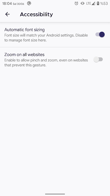
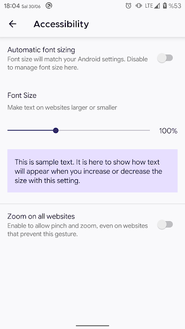
@hakkikaancaliskan In the third image 'Zoom on all websites' should be aligned with 'Automatic Font sizing' 'Font size' position.
The mockup image seems to not match with the issue you have linked. Hope you're aware of this.
 ghost
on 30 Jun 2020
ghost
on 30 Jun 2020
@brampitoyo what do you think about this?
hakkikaancaliskan
on 30 Jun 2020
@hakkikaancaliskan I’d love to see a screenshot of this screen? I’ll see it first thing tomorrow, and will provide a feedback.
 brampitoyo
on 30 Jun 2020
brampitoyo
on 30 Jun 2020
@brampitoyo
hakkikaancaliskan
on 30 Jun 2020
To mockup image seems to not match with the issue you have linked. Hope you're aware of this.
Look to the comment of @brampitoyo on that issue. That's the latest.
hakkikaancaliskan
on 30 Jun 2020
@hakkikaancaliskan The only two tweaks I would make to this page:
- Change all the font family value from Metropolis to our default font (Inter/Roboto).
- Make sure that the margin between “Font size” and “Make text on websites larger or smaller”, matches the margin between other label heading and label text. At the moment, the margin is larger than it’s supposed to.
brampitoyo
on 1 Jul 2020
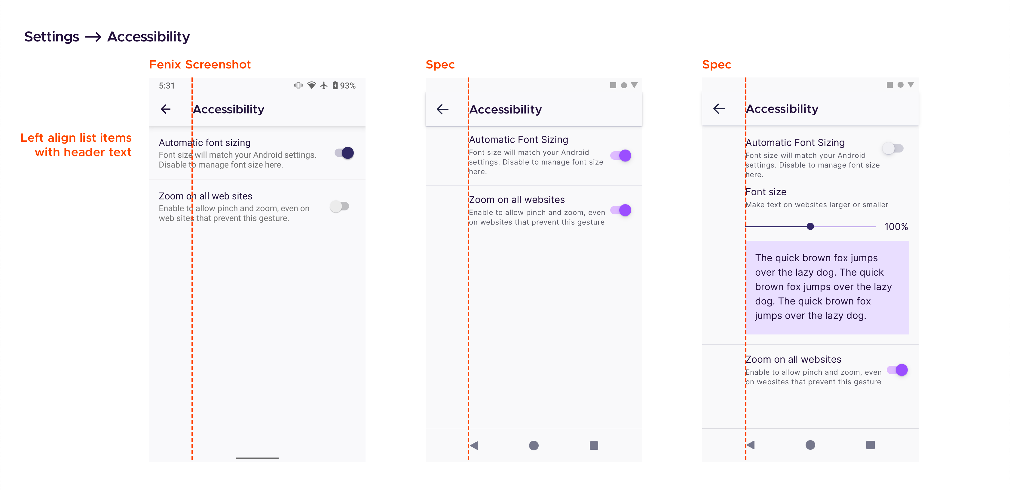
@hakkikaancaliskan The screenshot you provided on https://github.com/mozilla-mobile/fenix/pull/12478#issue-447800156 was already correct in terms of font family and margin between list items, but I totally forgot about the 72dp keyline gap. This was totally my mistake – sorry!
The correct spec is as follows (you can replace comment 0 with this spec if you like):
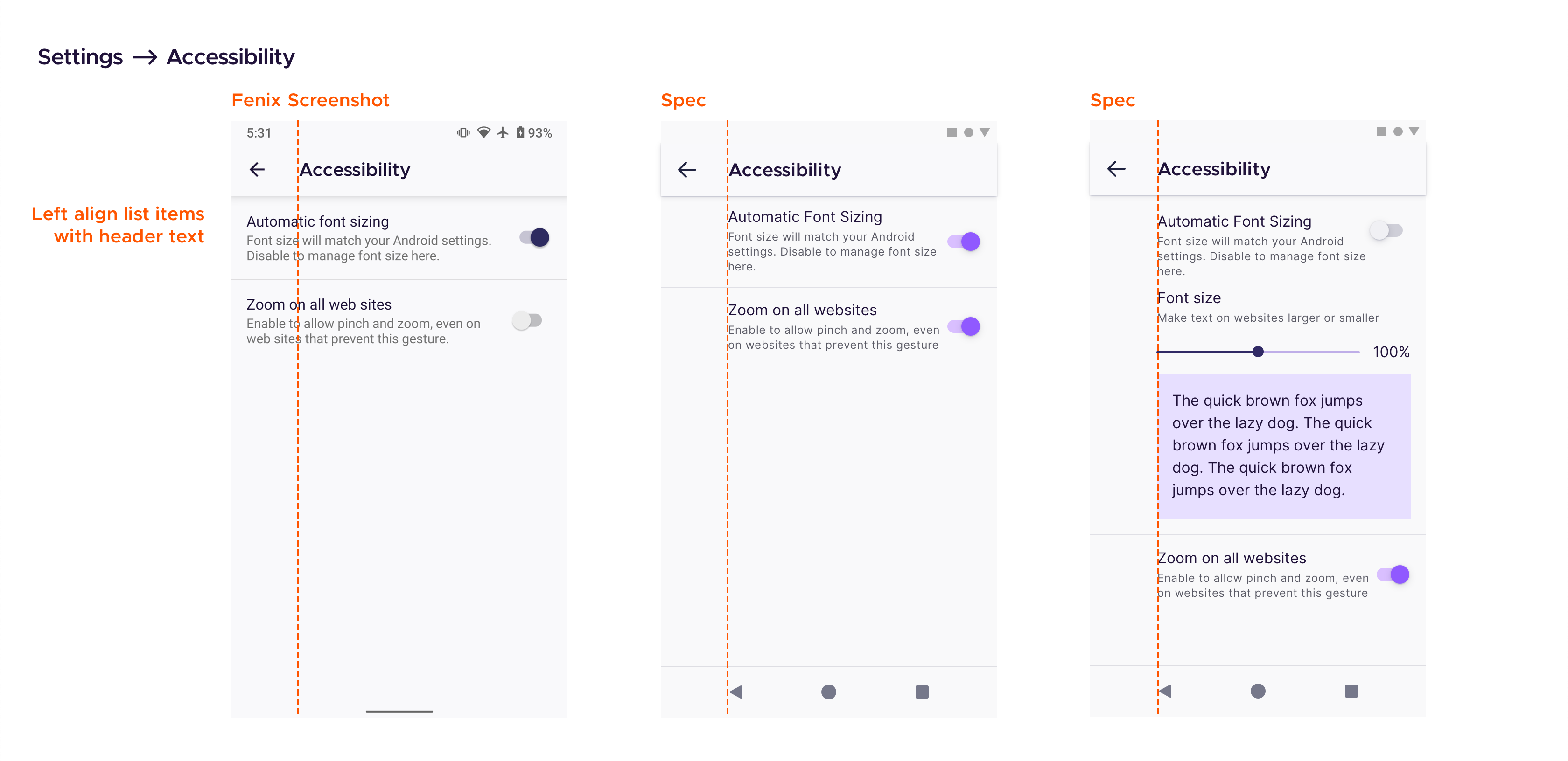
You’ll observe that all the list items and elements (sliders, preview text box) on this page now follows the same 72dp keyline gap, as the rest of Settings.
Full credit to @cadeyrn for pointing out this inconsistency!
brampitoyo
on 13 Jul 2020
Verified as fixed on the latest Nightly from 7/20 with Google Pixel 4 XL (Android 11).
 abodea
on 20 Jul 2020
abodea
on 20 Jul 2020
Related issues
 bbinto
·
3Comments
bbinto
·
3Comments
 topotropic
·
3Comments
topotropic
·
3Comments
 vesta0
·
3Comments
vesta0
·
3Comments
 phileastv
·
3Comments
phileastv
·
3Comments
 csadilek
·
3Comments
csadilek
·
3Comments
Most helpful comment
@hakkikaancaliskan The screenshot you provided on https://github.com/mozilla-mobile/fenix/pull/12478#issue-447800156 was already correct in terms of font family and margin between list items, but I totally forgot about the 72dp keyline gap. This was totally my mistake – sorry!
The correct spec is as follows (you can replace comment 0 with this spec if you like):
You’ll observe that all the list items and elements (sliders, preview text box) on this page now follows the same 72dp keyline gap, as the rest of Settings.
Full credit to @cadeyrn for pointing out this inconsistency!