Fenix: [Bug] error page button outline
5.2.0
 532910
All 11 comments
What's your android version?
No problem on nightly.
 hakkikaancaliskan
on 29 Jun 2020
hakkikaancaliskan
on 29 Jun 2020
LineageOS 16 / Android 9
The same issue on nightly!
532910
on 29 Jun 2020
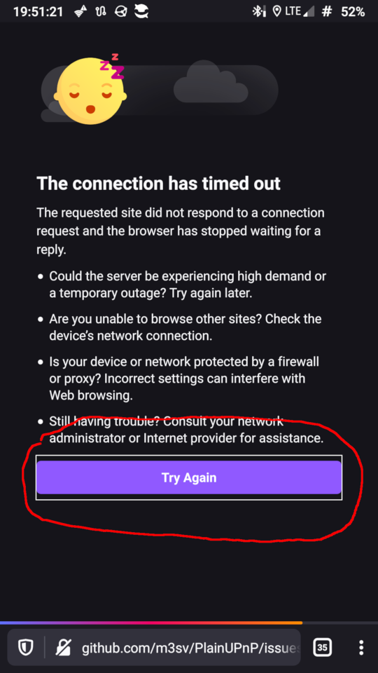
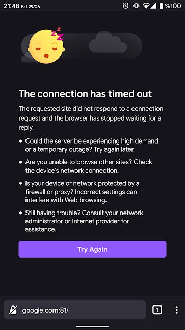
This outline shown on all error screens and just when you tap the reload button.
hakkikaancaliskan
on 29 Jun 2020
Yep, and when reload takes long time you'll see it all this time.
532910
on 30 Jun 2020
Yep, and when reload takes long time you'll see it all this time.
That long time normal because retrying to connect to server and waits for timeout.
hakkikaancaliskan
on 30 Jun 2020
Any time is normal, but the outline is not. It must not be shown at all.
532910
on 30 Jun 2020
In this type of pages it is custom to keep a button outline (focus rectangle) as a way to help the user know that the button click was registered and the action the button triggers is ongoing, and prevent him from repeatedly clicking the button. IMO from this should be left alone, but I'm leaving the decision to UX.
 mcarare
on 30 Jun 2020
mcarare
on 30 Jun 2020
There are a lot of other ways to show the user the response, besides of ugly outline.
532910
on 1 Jul 2020
I agree there shouldn't be a white outline here. Since we already have the loading bar providing feedback to the user that something is happening, I don't think it's necessary to highlight the button. @brampitoyo Do you have an opinion?
 AmyYLee
on 5 Jul 2020
AmyYLee
on 5 Jul 2020
@mcarare Having a 1px outline to acknowledge focus is ok (Chrome also does this. For maximum compatibility, we can even make this colour controlled by the system.
But we should definitely make this outline match our button height (36dp) and border radius value (4dp). Can we do that?
So it would look like this:
Just one thing to note: when the theme is set to dark, the white outline has good contrast. But when the theme is light, the black outline doesn’t. There’s nothing I can do there.
 brampitoyo
on 8 Jul 2020
brampitoyo
on 8 Jul 2020
Chrome is not a role model, but I completely agree with Bram, the main problem with current outline that it's ugly. Making it shaped solves this issue.
532910
on 8 Jul 2020
Related issues
 csadilek
·
3Comments
csadilek
·
3Comments
csadilek
·
3Comments
csadilek
·
3Comments
 phileastv
·
3Comments
phileastv
·
3Comments
 ekager
·
3Comments
ekager
·
3Comments
 abodea
·
3Comments
abodea
·
3Comments
Most helpful comment
@mcarare Having a 1px outline to acknowledge focus is ok (Chrome also does this. For maximum compatibility, we can even make this colour controlled by the system.
But we should definitely make this outline match our button height (36dp) and border radius value (4dp). Can we do that?
So it would look like this:
Just one thing to note: when the theme is set to dark, the white outline has good contrast. But when the theme is light, the black outline doesn’t. There’s nothing I can do there.