Fenix: [Bug] Top Sites borders are superfluous and look messy
Steps to reproduce
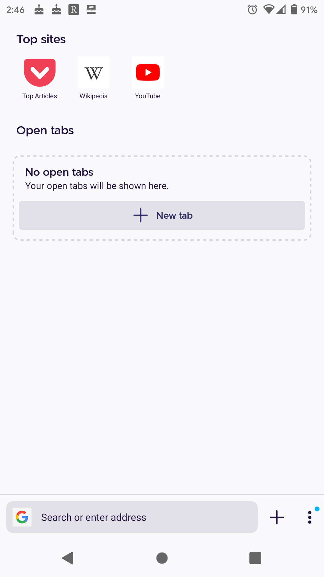
Open Fenix, show home and see top sites.
Expected behavior
Clean icons without adornment.
Actual behavior
Borders around icons that make it harder to see icon content (smaller) and add virtually nothing to the experience.
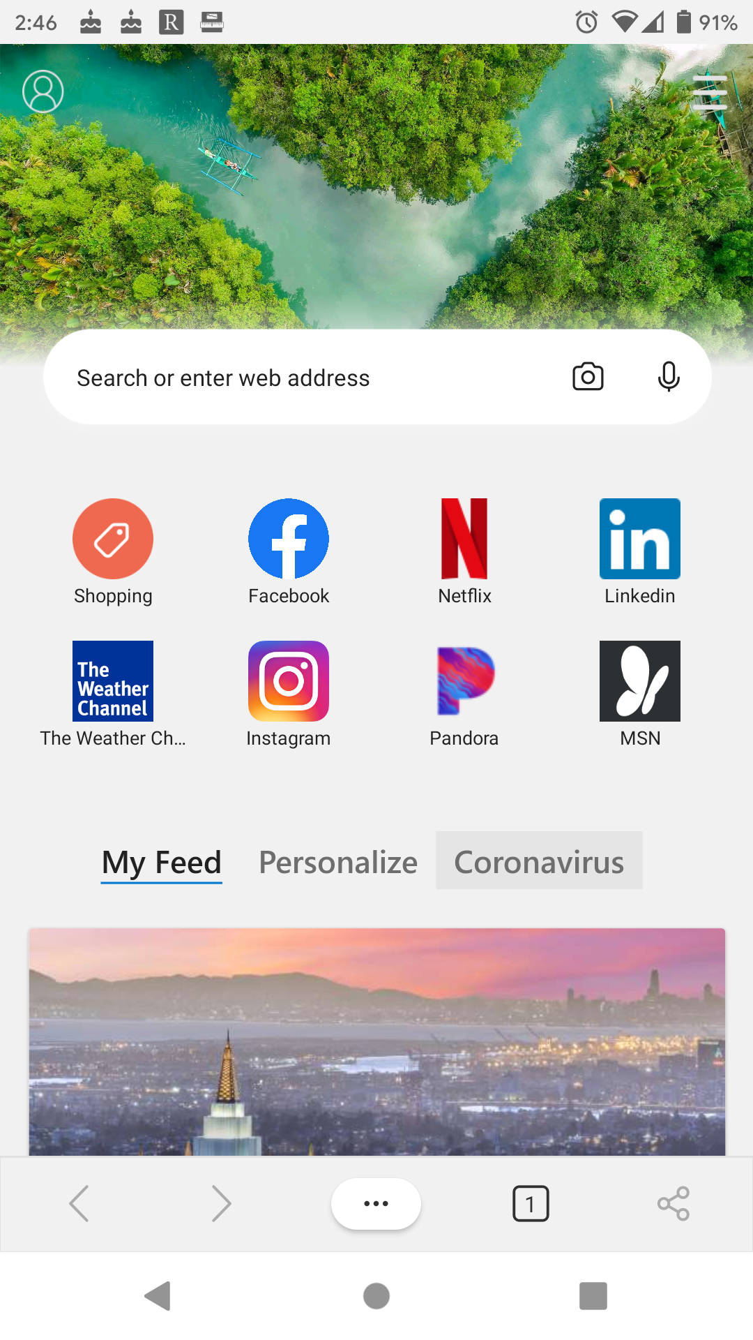
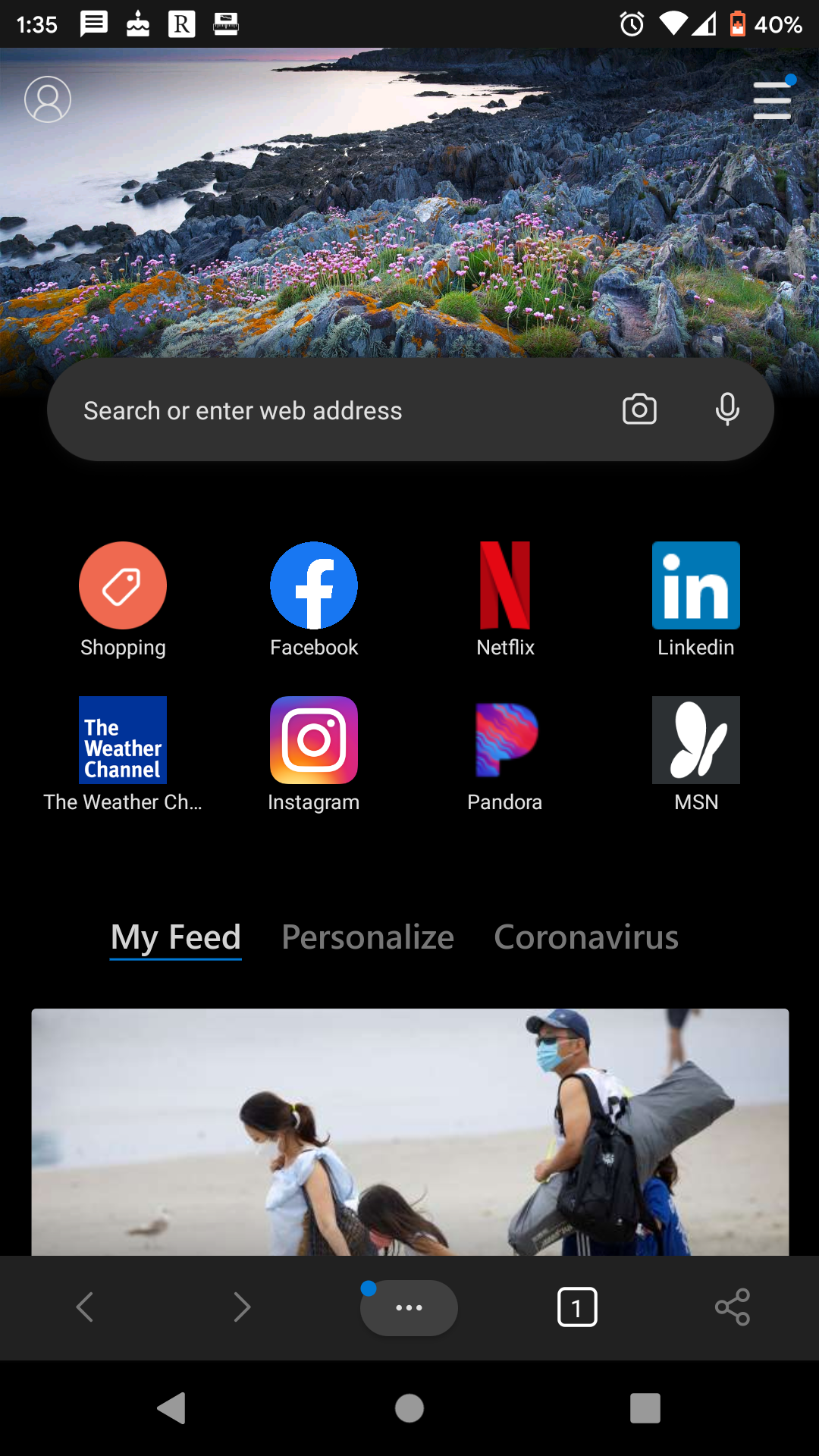
Both Edge and previous versions of Fenix do better here.
Edge:
 UNITO-UNDERSCORE!002!
older Fenix:
 UNITO-UNDERSCORE!001!
Device information
- Android device: Pixel 2
- Fenix version: Nightly 200618 06:01 (Build #21700609)
AC: 47.0.20200617190137, 9fe469d33
GV: 79.0a1-20200617093637
AS: 61.0.2
All 3 comments
The intent of the border is to safeguard against contrast issues between light/dark themes since we cannot predict the colour of the site icon.
@AmyYLee Edge seems to handle the dark mode without issues on my device:

The intent of the border is to safeguard against contrast issues between light/dark themes since we cannot predict the colour of the site icon.
It's true that the colour of the site icon can not be predicted. But I don't see how the border is supposed to give any benefit, the border doesn't help with that. And all icons are clearly enough separated by the large space between them. To be honest _my_ biggest concern is the look and feel. I think it would look much more modern without a border. The new Firefox is a modern app with a modern design but the top sites look outmoded in my opinion, especially with the padding between the border and the icon itself.
I vote for re-adding the "needs:UX-feedback" label at least to investigate if there are better solutions. Since top sites have a very prominent placement it's at least not completely unimportant for the perception of the browser.
Most helpful comment
It's true that the colour of the site icon can not be predicted. But I don't see how the border is supposed to give any benefit, the border doesn't help with that. And all icons are clearly enough separated by the large space between them. To be honest _my_ biggest concern is the look and feel. I think it would look much more modern without a border. The new Firefox is a modern app with a modern design but the top sites look outmoded in my opinion, especially with the padding between the border and the icon itself.
I vote for re-adding the "needs:UX-feedback" label at least to investigate if there are better solutions. Since top sites have a very prominent placement it's at least not completely unimportant for the perception of the browser.