Fenix: FNX2-13574 ⁃ [Bug] Top sites are not centered properly on some screen sizes
On some screen sizes, the top sites have more padding on the right than on the left due to wrapping of the top sites row.

Here is the original spec: https://github.com/mozilla-mobile/fenix/issues/11081#issuecomment-644509917
Related Issue: #10281
Device information
- Android device: Google Pixel 2 XL
- Fenix version: Nightly 6/17
 person808
All 11 comments
Quoting @brampitoyo https://github.com/mozilla-mobile/fenix/issues/11651#issuecomment-645775196 on landscape mode:
@person808 Just for reference, I know that landscape orientation will be an issue in the near future.
I’m not sure what Top Sites will look like on a landscape layout – whether it will contain 4 icons in a row, or 6, or 8. I think it’s something that @topotropic have thought of.
She can respond to it after returning to PTO, and we can then file a new issue.
person808
on 18 Jun 2020
Another solution to the spacing problem that would behave correctly regardless of aspect ratio or top sites number could be to split the space left at the end of the row (or the space that would be left at the end if the row was full) as extra padding between the element.
It will stay left align and the extra padding can't be more than the width of one element and its padding divided but the number of elements that can fit in one row, so really small even in worst case scenario.
 Dunexus
on 18 Jun 2020
Dunexus
on 18 Jun 2020
@gabrielluong Have we resolved this by having the grid flexible?
 AmyYLee
on 10 Jul 2020
AmyYLee
on 10 Jul 2020
@gabrielluong Have we resolved this by having the grid flexible?
Not necessarily. I think we are essentially trying to do justify-content: center as seen in the BLUE row in https://codepen.io/team/css-tricks/pen/zzJMGJ. Right now, it is behaving as the first row.
 gabrielluong
on 13 Jul 2020
gabrielluong
on 13 Jul 2020
@gabrielluong Do you still need UX feedback?
AmyYLee
on 23 Jul 2020
Hi all,
I also have this issue on Nokia 8 which has a 1440 pixel width display in portrait mode. I only have 5 top sites icons on the top row and the space at the right hand side is large enough to easily fit another icon.
I know it's easy for me to suggest things that might be technically difficult, but why not just justify these rows centre rather than to the left?
Cheers 🙂
 madb1lly
on 18 Aug 2020
madb1lly
on 18 Aug 2020
@madb1lly Thanks for your report. Because Android has such differing screen sizes and pixel density, it’s helpful for us to get more screenshots and anecdotes to be able to create a sensible policy that’s “set once, works everywhere”.
 brampitoyo
on 20 Aug 2020
brampitoyo
on 20 Aug 2020
Hi @brampitoyo,
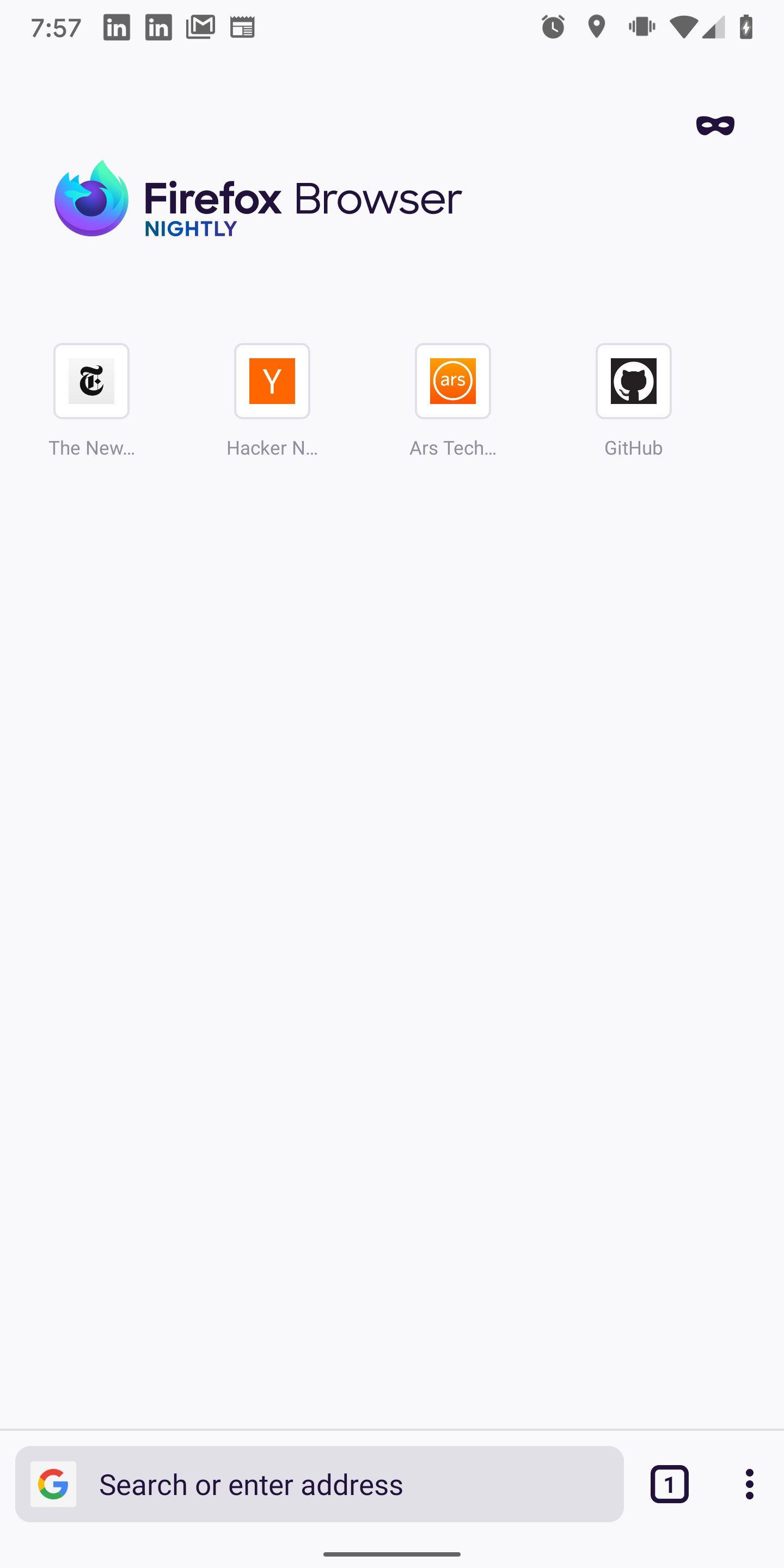
Here's a screenshot:

Cheers 🙂
madb1lly
on 20 Aug 2020
Updated screenshot with new top site layout. Still an issue unfortunately. It looks worse in landscape mode.
person808
on 25 Aug 2020
Hi all,
Yes, I agree that the top sites icons are still off-centred with with new 4x2 x2 pages layout.
Cheers 🙂
madb1lly
on 27 Aug 2020
This should be addressed here - https://github.com/mozilla-mobile/fenix/issues/13765
 apbitner
on 27 Aug 2020
apbitner
on 27 Aug 2020
Related issues
 Chris01277
·
3Comments
Chris01277
·
3Comments
 andreicristianpetcu
·
3Comments
andreicristianpetcu
·
3Comments
 vesta0
·
3Comments
vesta0
·
3Comments
 lindongbin
·
3Comments
lindongbin
·
3Comments
 abodea
·
3Comments
abodea
·
3Comments
Most helpful comment
Updated screenshot with new top site layout. Still an issue unfortunately. It looks worse in landscape mode.
