Fenix: [Bug] Dynamic top toolbar does not respect embedded content scroll events
Steps to reproduce
- Go to a github new issue
- Scroll a bit INSIDE the github issue box
Expected behavior
- Toolbar stays put
Actual behavior
- Toolbar flings about.
First reported here: https://github.com/mozilla-mobile/fenix/issues/10073#issuecomment-638934779
 sblatz
All 19 comments
This is happening because we do not have a custom behavior that properly handles CONTENT_HANDLED presses differently than any scroll. It's just an app bar. Unfortunately since GV doesn't let use use setVerticalClipping on the top of the toolbar, I'm not sure we have many options here.
We also can't make this a MotionLayout due to performance reasons. This is why we have this bug. Kind of stuck.
sblatz
on 9 Jun 2020
This looks to actually be the same issue as https://github.com/mozilla-mobile/fenix/issues/11388 and is similarly blocked by the above comment 😞

sblatz
on 9 Jun 2020
@liuche what're your thoughts here?
sblatz
on 9 Jun 2020
I talked to snorp and mcomella, and I think the 3 of you (or maybe just you and snorp) should meet to figure this out.
Worst case, can we pin top toolbar? Not make it dynamic?
mcomella said perf has regressed enough (120ms) that he's not comfortable taking on more perf hits, but he might have some alternative Androidy suggestion.
 liuche
on 10 Jun 2020
liuche
on 10 Jun 2020
Worst case, can we pin top toolbar? Not make it dynamic?
Just from a user perspective, I would not like this since chromium-based browsers manage these situations perfectly fine with a dynamic toolbar, and I don't see a reason why Firefox should not.
 serovar
on 11 Jun 2020
serovar
on 11 Jun 2020
I was able to reproduce the issue on twitter.com, having the toolbar set to the bottom, but only in private mode.
Fenix: 6/24 Nightly build
Device: HTC 10 (Android 8)
 softvision-miralobontiu
on 24 Jun 2020
softvision-miralobontiu
on 24 Jun 2020
I've encountered somewhat similar behavior on my own site. The white space isn't added to the bottom of the site, but just under the first viewport (the site itself is about 7 viewports long; each section has "min-height: 100vh;").
When I scroll down (swipe up), the addressbar disappears and the whitespace is added. When scrolling up (swiping down), as soon as the addressbar is completely visible, the whitespace disappears.
On Chrome mobile, the whitespace is always visible, whether I'm scrolling up or down.
Link to example
 jasongoossens
on 6 Jul 2020
jasongoossens
on 6 Jul 2020
Here is an interesting comment in issue 13444 that will hopefully lead to final solution.
 jakefleming156
on 10 Aug 2020
jakefleming156
on 10 Aug 2020
More and more I believe the whole CSS and positioning is broken in firefox 79.
Trying to make my page accessible on mobile devices I tried to change a lot. My observations so far:
- "position fixed, bottom 0" positions the element about 20/30pixels above the bottom.
- links and buttons placed in the approx. 20 most bottom pixels of a 100vh page are not touchable. They work, when I position them a bit more up, e.g. "position fixed or absolute, bottom 0": link/button not touchable; "position fixed or absolute, bottom 20px"; link/button work
- it looks as if sometimes (especially at first load) CSS 100vh includes the toolbar height, so that the page is longer than the screen for the amount of the toolbar (I have now set it to appear on top). If I then scroll the page up the value seems to be corrected and contain the number of pixels without the toolbar. (My page reloads on resize and then correctly fills the screen and not more, so obviously scrolling the 100vh div triggers an "internal screen resize" (sorry that I cannot explain it better/more technically...)
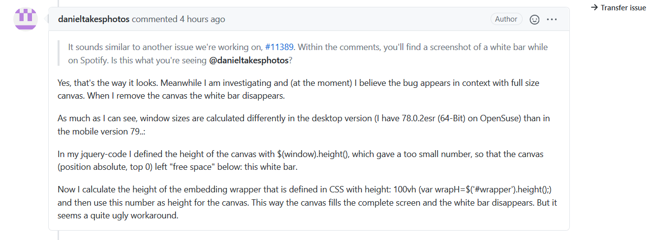
 danieltakesphotos
on 11 Aug 2020
danieltakesphotos
on 11 Aug 2020
I wrote a simple html page to illustrate the problem (please note that behavior is different if the page is freshly loaded or after some interaction, explanations below of the code):
<!DOCTYPE HTML>
<html lang="en">
<head>
    <meta charset="UTF-8">
    <title>FF 79 test</title>
    <meta http-equiv="content-type" content="text/html; charset=utf-8">
    <meta http-equiv="content-language" content="en">
    <meta name="viewport" content="width=device-width, initial-scale=1.0">
    <script>
        function toggle_text_visible() {
            if (document.getElementById("abs").style.display === "none") {
                document.getElementById("abs").style.display = "block";
            } else {
                document.getElementById("abs").style.display = "none";
            }
        }
    </script>

    <style>
        html, body {
            width: 100%;
            min-height: 100%;
            margin: 0;
            padding: 0;
        }
        body {
            font-size: 1em;
            font-family: sans-serif;
            background-color: white;
            color: gray;
        }
        #wrapper {
            position: relative;
            box-sizing: border-box;
            min-height: 100vh;
            margin: 0;
            padding: 0;
            background-color: black;
        }
        #abs {
            position: absolute; bottom: 0; left: 0;
            background-color: gray;
            color: white;
        }
        #fix {
            position: fixed; bottom: 0; right: 0;
            background-color: green;
            color: white;
        }
    </style>
</head>

<body>
<div id="wrapper">

<div id="abs">
    <p>This is some text positioned absolute at bottom 0, and the link that follows illustrates that a link within the most bottom pixels does not work. You can change the style to bottom: 30, and you'll see that the link works:<br /><a target="_blank" href="https://www.mozilla.org/">Link not working</a></p>
</div>

<div id="fix">
    <button id="mybutton" onclick="toggle_text_visible()">toggle text visible</button>
</div>

</div> <!-- end wrapper !-->

</body>
</html>
- when you load the page for the first time, the div "fix" with the button (position fixed, bottom 0) is positioned at the bottom of the screen, but not at the bottom of the page
the div "abs" with the text (position absolute, bottom 0) goes beyound the screen
when you then tap to scroll up, all of the div "abs" becomes visible and it seems that the CSS sizes get adjusted: the black "wrapper" div with CSS height/width 100vw/100vh now fills the screen as it should and is no more scrollable
- the div "fix" (position fixed, bottom 0) is now some 20 pixels up from the bottom and not on the bottom where it should be.
- The link on the bottom is not working
Now you can change the styles:
- change "abs" from "bottom: 0" to "bottom: 30px": now the link works
- change "fix" from "position: fixed" to "position: absolute": now the button doesn't work anymore.
When you now close the browser and start it again and load the page again (with above changes), the button (now positioned absolute) isn't visible, it's below the screen.
Scroll up and touch the button: it scrolls down again and disappears... do it again, and nothing happens.
I am sorry for the length of this post, but I hope the sample and the explanations help to find the bugs.
danieltakesphotos
on 11 Aug 2020
One thing I should call out is "100vh" is always including the dynamic toolbar height regardless of whether toolbar is visible or not. So for example, if the browser height is 600px and the toolbar height is 100px, then 100vh is 600px, 100% of the root element is 500px.
 hiikezoe
on 12 Aug 2020
hiikezoe
on 12 Aug 2020
in the sample html above, when you change CSS for #wrapper from min-height 100vh to 100% neither #wrapper nor #abs is displayed because #wrapper has no content and #abs is positioned on the bottom of the empty #wrapper, thus above the screen and invisible...
What makes a difference is if you make #wrapper relative or not. When not, position absolute and fixed place the elements on the same height and links/buttons are touchable also at the bottom. But then you can't position other elements relative to the #wrapper...
This problem doesn't exist in the desktop version, nor in the previous mobile version.
danieltakesphotos
on 12 Aug 2020
Adding height:100% in html and body, and adding height:100% in #wrapper wouldn't work?
This problem doesn't exist in the desktop version, nor in the previous mobile version.
On desktop version of browsers, there is no __dynamic__ toolbar, as far as I know. Also, if the previous mobile version means Fennec, we didn't include the toolbar height at all, but now we include the height in Fenix, this was a web compatibility issue, we had no choice. All other major mobile browsers, Safari and Chrome include the height in vh units.
There is an on-going discussion to add another unit to represent the height which is __not__ including the dynamic toolbar height. See https://github.com/w3c/csswg-drafts/issues/4329
That said, in Fenix there are still other issues related to the top dynamic toolbar, I haven't quite followed them though.
hiikezoe
on 12 Aug 2020
When changing body from min-height to height 100% and #wrapper height 100%, it kind of works:
This applies to toolbar set to be displayed on top:
The first time you load the page it displays correct (fills the complete screen from below of the toolbar to the end of the screen, link and button work).
When you reload the page _after you tapped the screen_ it is resized so that the white bar (free space of approx. 20 px) appears at the bottom. The absolute and fixed positioned elements appear at the bottom of the resized #wrapper, link and button work. Actually the space that the toolbar would occupy when at bottom is kept free as if it would be there.
Interesting is that on first load it works correct, but on reload the bug occurs, and only when you tap the screen. (If you reload the page without touching anything of the page, it still displays correct, i.e. without the white bar).
When toolbar is set to bottom, display is correct.
danieltakesphotos
on 12 Aug 2020
With 1633322 now being resolved I think this can be verified if it's fixed.
The issue was that the toolbar was animated away when it shouldn't.
 Mugurell
on 7 Sep 2020
Mugurell
on 7 Sep 2020
Hi, issue does not reproduce on Nightly 9/8 with
- Samsung Galaxy S9 (Android 8)
- Google Pixel 3XL (Android 9)
Samsung GIF
Testing sites
- https://open.spotify.com/artist/2fbUQIKSBTohTK6tHaFGYV?nd=1
- signed in on github.com
 Diana-Rus
on 8 Sep 2020
Diana-Rus
on 8 Sep 2020
I can confirm that it's still not working in nightly, just checked my website and the problem is still there.
 lukaberdeen
on 8 Oct 2020
lukaberdeen
on 8 Oct 2020
I can confirm that it's still not working in nightly, just checked my website and the problem is still there.
I think this issue is separate from the embedded scrolls one here.
Please open a new ticket with more details, especially curious if this is happening with using the bottom toolbar.
Also I see the website mentioned seems to request a "registration code" that we'll probably need to have provided to actually test.
Mugurell
on 8 Oct 2020
I think this issue is separate from the embedded scrolls one here.
Please open a new ticket with more details, especially curious if this is happening with using the bottom toolbar.
Also I see the website mentioned seems to request a "registration code" that we'll probably need to have provided to actually test.
@Mugurell You don't have to be inside the application, this problem also exist on other pages (including login page) - just open the keyboard and you will see it. It doesn't happen with bottom bar, problem only occurs when the address bar is at the top.
lukaberdeen
on 8 Oct 2020
Related issues
 andreicristianpetcu
·
3Comments
andreicristianpetcu
·
3Comments
 AndiAJ
·
3Comments
AndiAJ
·
3Comments
 robsmith11
·
3Comments
softvision-miralobontiu
·
3Comments
robsmith11
·
3Comments
softvision-miralobontiu
·
3Comments
 Chris01277
·
3Comments
Chris01277
·
3Comments
Most helpful comment
Just from a user perspective, I would not like this since chromium-based browsers manage these situations perfectly fine with a dynamic toolbar, and I don't see a reason why Firefox should not.