Fenix: FNX2-16327 ⁃ [Bug] top icons have an ugly white border on dark theme
Update from UX:
Please use the following colors:
- light_grey_90 (#80808E) for the title
- dark_grey_50 (#32313C) for favicon bg and border

_Original request:_
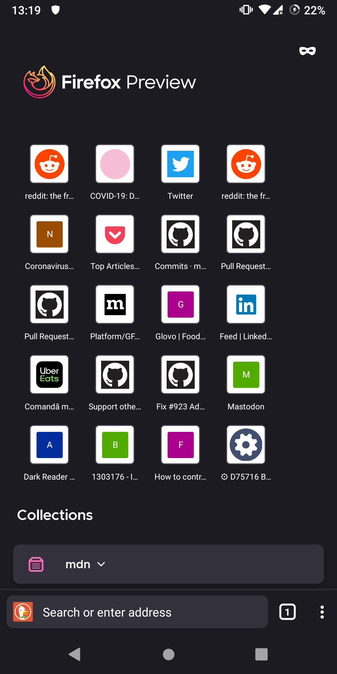
Steps to reproduce
add top sites
Expected behavior
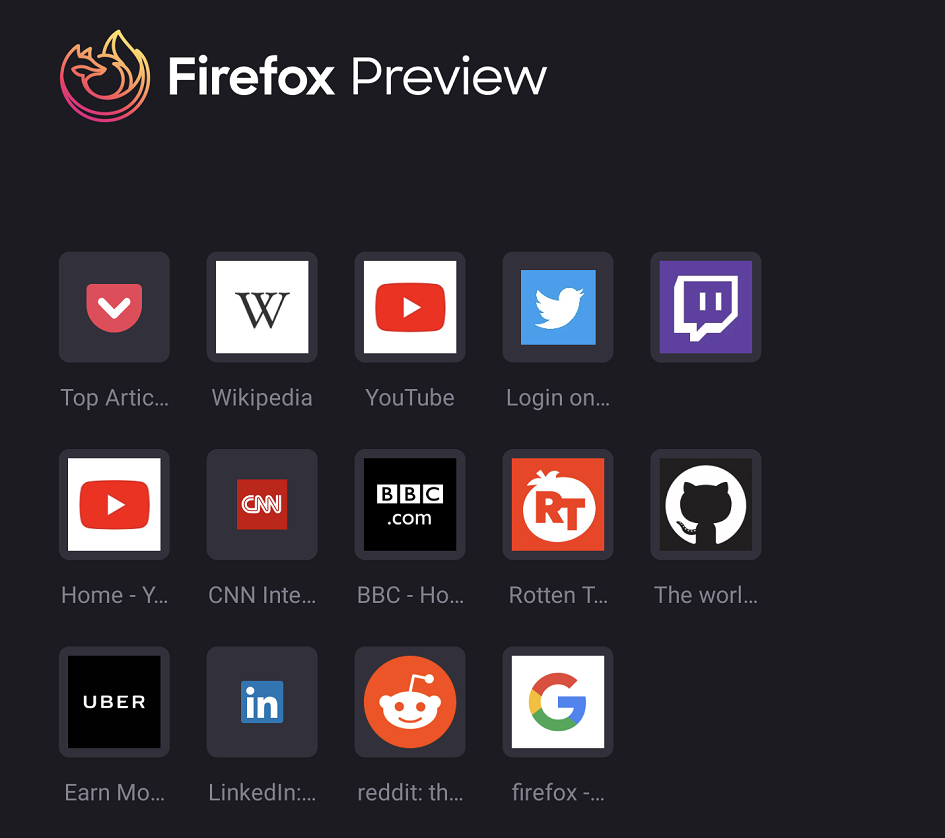
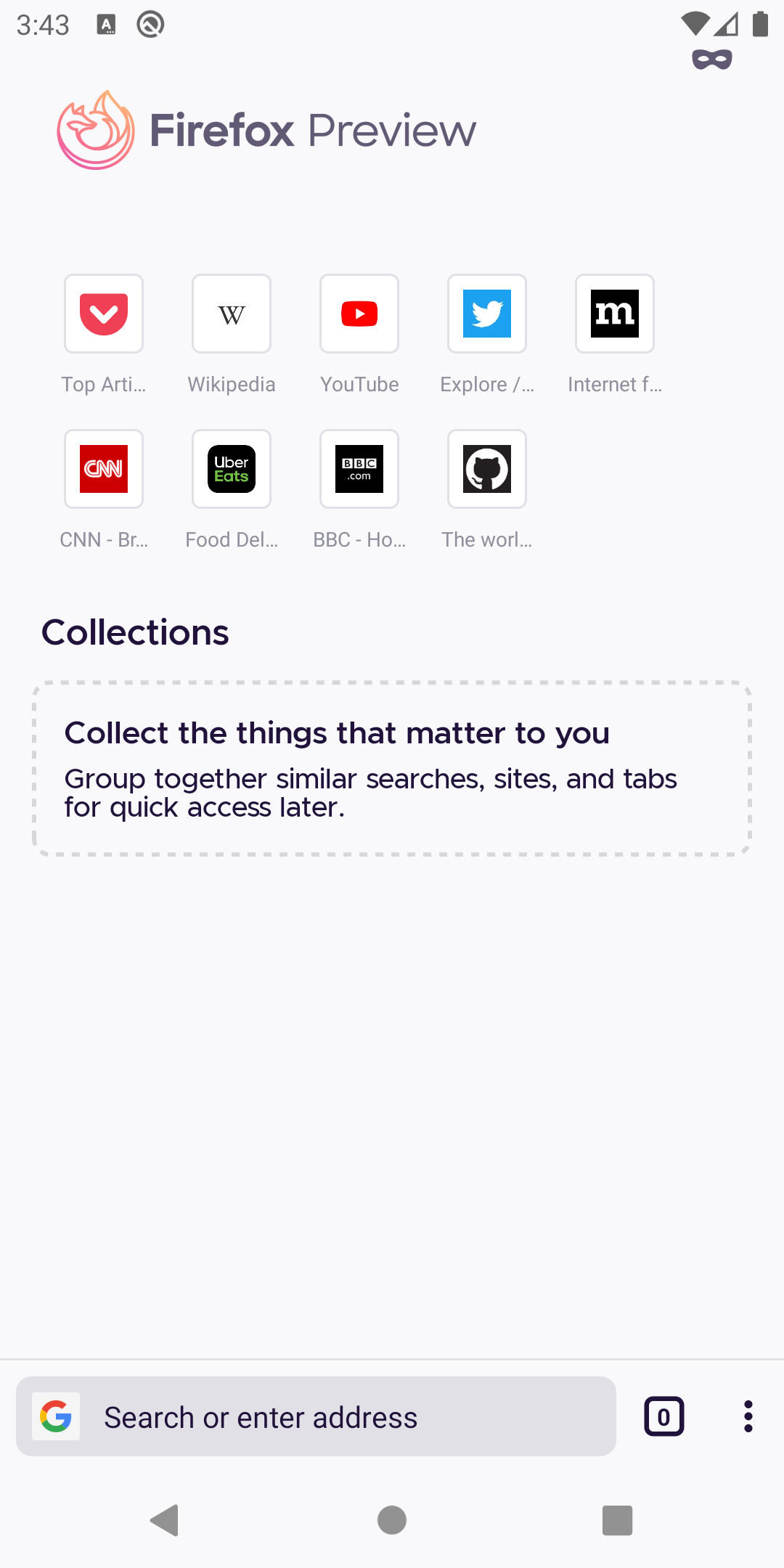
 UNITO-UNDERSCORE!20200530-131957!UNITO-UNDERSCORE!Firefox!UNITO-UNDERSCORE!Nightly!
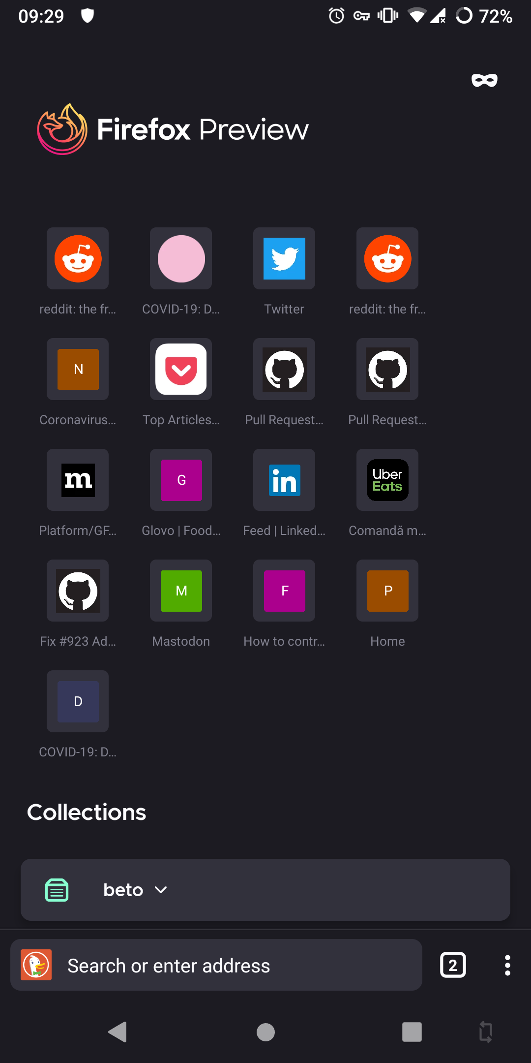
Actual behavior
 UNITO-UNDERSCORE!20200530-131950!UNITO-UNDERSCORE!Firefox!UNITO-UNDERSCORE!Nightly!
Device information
- Android device: one plus 5t
- Fenix version: nightly
 andreicristianpetcu
All 27 comments
They should reduce the width of the white border..overall it looks too big...and there is space left after 4th icon...so they easily fit 5 icons in one row
 sheikh-azharuddin
on 30 May 2020
sheikh-azharuddin
on 30 May 2020
Steps to reproduce
add top sites
Expected behavior
Actual behavior
Device information
* Android device: one plus 5t

* Fenix version: nightly
How did you remove the big ugly new tab button between top sites and collections?
sheikh-azharuddin
on 30 May 2020
@sheikh-azharuddin the user may be using the new tabs tray layout. To activate it you need to go to settings > About Firefox Nightly > click 3 times on the Firefox Preview logo and press back button now you can see the Secret settings click it and turn on new tab tray.
 ghost
on 30 May 2020
ghost
on 30 May 2020
@sheikh-azharuddin the user may be using the new tabs tray layout. To activate it you need to go to settings > About Firefox Nightly > click 3 times on the Firefox Preview logo and press back button now you can see the Secrete settings click it and turn on new tab tray.
Thanks bro....it worked👍
Actually the setting is reverse... turning off should hide instead turning on is hiding🤣
We already have a plus button beside address bar in home page not sure why mozilla added this big new tab bar ...
sheikh-azharuddin
on 30 May 2020
The new tab tray menu is too buggy😓
sheikh-azharuddin
on 30 May 2020
Actually the setting is reverse... turning off should hide instead turning on is hiding🤣
Nope. The option _enables_ the new tabs tray.
The new tab tray menu is too buggy😓
There is a reason why it's not yet enabled by default but hidden in a secret menu instead.
 cadeyrn
on 30 May 2020
cadeyrn
on 30 May 2020
Actually the setting is reverse... turning off should hide instead turning on is hiding🤣
Nope. The option _enables_ the new tabs tray.
The new tab tray menu is too buggy😓
There is a reason why it's not yet enabled by default but hidden in a secret menu instead.
Looks beautiful though🤩 once refined and issues fixed it will be one of the top striking feature ...
Keep up 👍
sheikh-azharuddin
on 30 May 2020
If the border would have the URL bar color I think it would look a lot better in dark mode
andreicristianpetcu
on 2 Jun 2020
@gabrielluong I updated the colors for dark them in comment 0, forgot to add them in the original design. Might be a good task for @person808. Thanks!
 topotropic
on 5 Jun 2020
topotropic
on 5 Jun 2020
@topotropic Could you also provide an update for the light theme? In your mockup in comment 0 it looks like there is only a background color and no border at all. The light theme has a white background and a grey border. Your mockup of the dark theme without the border looks much more modern than the light theme with the border. Maybe we could do something similar for the light theme?
Maybe we can reduce the padding around the icons and accomodate 5 icons in a row like old layout.just a suggestion...there is still space left after 4th icon
sheikh-azharuddin
on 5 Jun 2020
@sheikh-azharuddin It's a different topic. This issue is about the background and border color of the icons not about the number of icons per row.
cadeyrn
on 5 Jun 2020
@sheikh-azharuddin I have already filed an issue #10281 for the Top Sites rows containing only 4 icons instead of 5.
ghost
on 5 Jun 2020
@sheikh-azharuddin I have already filed an issue #10281 for the Top Sites rows containing only 4 icons instead of 5.
Thanks 😊
sheikh-azharuddin
on 5 Jun 2020
the mockup looks sooooooo nice!
andreicristianpetcu
on 5 Jun 2020
@topotropic Could you confirm what the colors for the light theme are? Right now the favicon bg and border is set to white (@android:color:white) and the text is set to the primaryText color (#20123A).
 person808
on 9 Jun 2020
person808
on 9 Jun 2020
looks cool. should I close it?
andreicristianpetcu
on 11 Jun 2020
@andreicristianpetcu it has eng:qa:needed label that means someone from Mozilla's QA team will verify if it's working as intended then if it's working as expected they'll close it.
ghost
on 11 Jun 2020
@topotropic Could you confirm what the colors for the light theme are? Right now the favicon bg and border is set to white (
@android:color:white) and the text is set to theprimaryTextcolor (#20123A).
@person808 Can you please update
- favicon border to light_grey_30
- text to light_grey_80 (#8F8F9D)
Thanks!
topotropic
on 12 Jun 2020
This is how the top sites look in the mockup in comment 0:
This is how it looks in reality:
- In the mockup the background of the icon is smaller than the width of the label, with the current implementation the opposite is true, so the dimensions are wrong.
- In the mockup the favicons don't have a background, but in reality there is a white background. Maybe the white background is part of the favicon images but it looks really ugly and should be solved.
Let me know if I should file new issues for one or both of these things. /cc @topotropic
cadeyrn
on 14 Jun 2020
hmmmm.... same here for youtube and wiki
andreicristianpetcu
on 14 Jun 2020
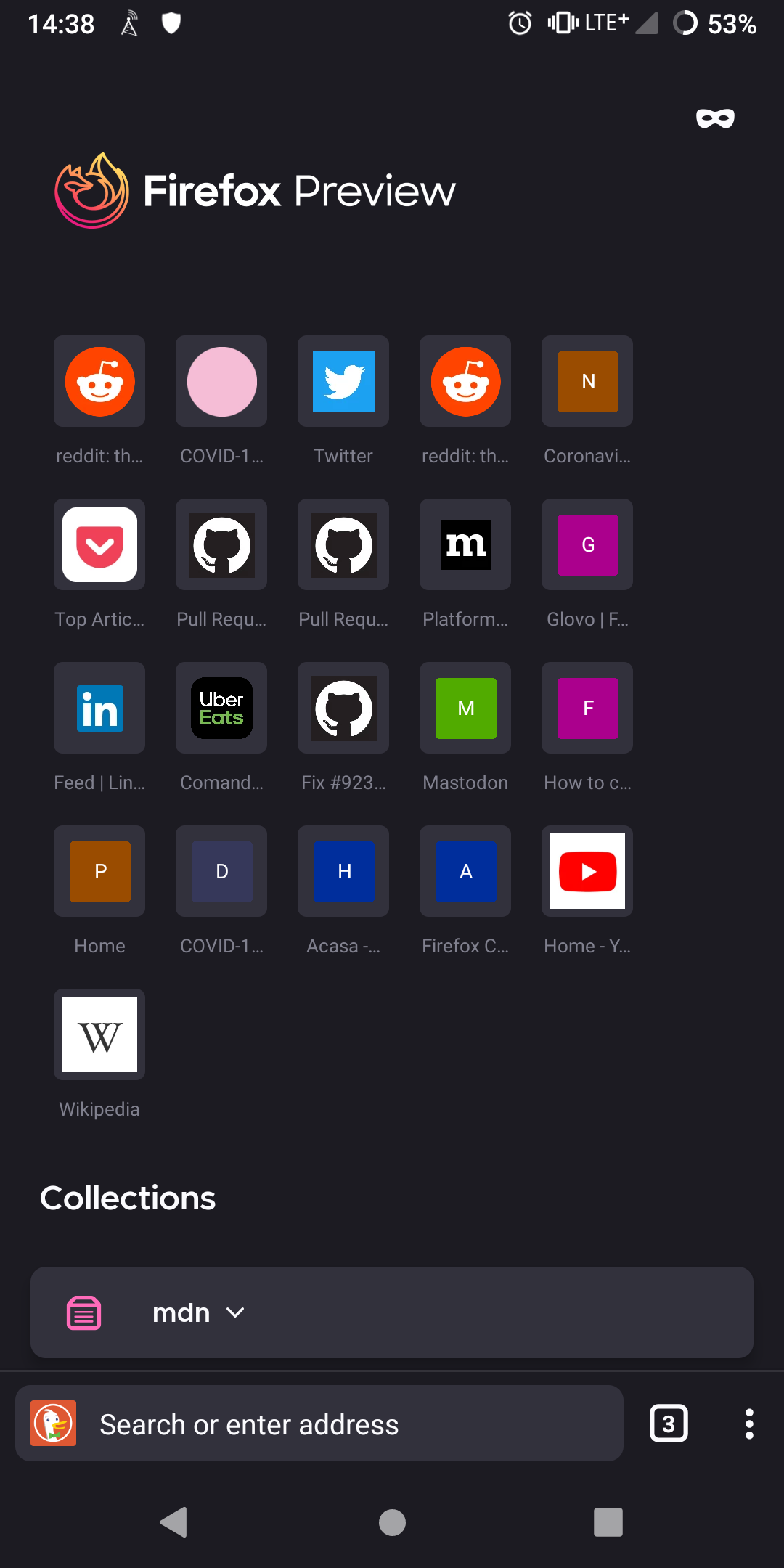
I re-checked this issue on the latest nightly from 6/15 with Google Pixel 4 XL (10).
Please note that the top icon's border is inconsistent for many websites.
@topotropic @person808 @brampitoyo as @cadeyrn said in his comment, will those still be modified?
I will remove the eng:qa:needed until further notice.
 abodea
on 15 Jun 2020
abodea
on 15 Jun 2020
Hi @abodea, I wonder why the top icon isn’t sized consistently inside the border?
I seem to find three different icon sizes:
- Smallest: Mozilla, LinkedIn & CNN
- Slightly larger: Pocket, Twitter, Uber Eats, default tile (with capital letters inside)
- Largest: BBC, GitHub, Twitch, Wikipedia, Reddit, Google
Is it because we prioritise fetching apple-touch-icon (180×180 or 192×192 – will fill up the whole box) and when we can’t, we fetch favicon.ico (16×16 or 32×32 – won’t fill up the box)?
In the spec, the box has a size of 40×40, and the icon inside it is always sized 24×24. Is it possible to follow this rule consistently, even for the default tile with capital letters?
 brampitoyo
on 15 Jun 2020
brampitoyo
on 15 Jun 2020
@brampitoyo Do you mean like this? Youtube and Wikipedia appear smaller because the favicons have a white background
Unfortunately it seems like there is some uneven padding on the sides of the top sites although thats present on nightly as well (on my Pixel 2 XL). Does the spec say that the top sites should be centered?
In the mockup the favicons don't have a background, but in reality there is a white background. Maybe the white background is part of the favicon images but it looks really ugly and should be solved.
@cadeyrn The white border is a part of the favicon image as far as I know. You could definitely file an issue for it so someone more familiar with the favicon loading can take a look. I noticed Chrome seems to not have the white background when Youtube is in its top sites.
person808
on 16 Jun 2020
@person808 Yes. What you posted looks great in terms of container and icon sizes.
Re: padding – this is the measurement I got from @topotropic’s original design:

The measurements seem to indicate that there should be:
- 4 items in a row
- 24dp side paddings between the Top site section and the page
- 8dp spacing between each Top site item.
Re: background colour – referring back to the original design, it seems that the background colour value we have today is already correct, with only one addition required.
- Light theme
- Background: White
- Border: Light Grey 30
#e0e0e6
- Dark theme
- Background: Dark Grey 50
#32313c - Border: Dark Grey 10
#52525e← We don’t have this yet, and will need to add it
- Background: Dark Grey 50
brampitoyo
on 16 Jun 2020
@brampitoyo I will go ahead and fix the border color and icon size now. For the padding, I see different dimensions in #10505, so I will not touch that right now. We might have be flexible with the padding if we want the top sites to be properly centered on all screen sizes.
person808
on 16 Jun 2020
@brampitoyo @person808 can you please take a look at this issue #10281 and what's going on and will that issue be solved by this issue?
ghost
on 17 Jun 2020
Since the original issue (dark theme background and text color) is verified as fixed I will close the issue. I'll open another issue for the uneven padding of the top sites on certain screen sizes.
person808
on 17 Jun 2020
Related issues
 ekager
·
3Comments
ekager
·
3Comments
 vesta0
·
3Comments
abodea
·
3Comments
abodea
·
3Comments
andreicristianpetcu
·
3Comments
vesta0
·
3Comments
abodea
·
3Comments
abodea
·
3Comments
andreicristianpetcu
·
3Comments
Most helpful comment
Looks beautiful though🤩 once refined and issues fixed it will be one of the top striking feature ...
Keep up 👍