Fenix: FNX2-16291 ⁃ [Bug] Re-arrange the elements on the just added screen for addons
Steps to reproduce
- Launch Fenix.
- Access settings and then the addons section.
- Select and add any addon.
- Observe the elements from the just added screen.
- Expected behavior
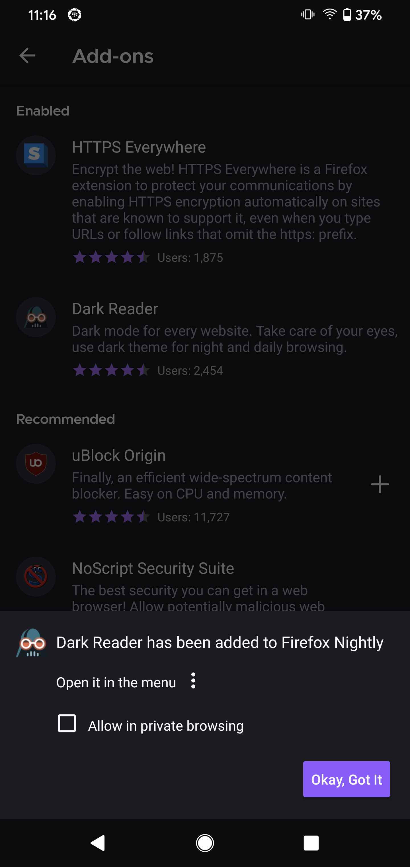
The elements on the just added screen should have a better arrangement. - Actual behavior
The elements on the just added screen are not correctly aligned. - Device information
- Expected behavior
- Android device: Google Pixel 4 XL (10).
- Fenix version: Nightly 5/29
 UNITO-UNDERSCORE!20200529-111651!
 abodea
All 13 comments
@abodea what do you mean by better arrangement?
 psymoon
on 1 Jun 2020
psymoon
on 1 Jun 2020
I think he's talking about the dialog and how the elements on each line aren't vertically aligned - ie the checkbox and "Allow in Private Browsing" should be vertically aligned
 ekager
on 1 Jun 2020
ekager
on 1 Jun 2020
looks like could be a good first bug for @person808 ?
 liuche
on 2 Jun 2020
liuche
on 2 Jun 2020
Looks like a bug in Android Components
 person808
on 4 Jun 2020
person808
on 4 Jun 2020
Opened mozilla-mobile/android-components#7234 for now
person808
on 4 Jun 2020
Closing since this is an A-C issue
person808
on 4 Jun 2020
@brampitoyo Can you verify if this is viable? I think we chatted about prompt dialog alignments in the past, the add-on installation confirmation matches those of other prompt dialogs in a-c (i.e. logins and permissions, etc).
@person808 I think we generally leave fenix tickets open until a-c changes are merged then we label this qa-needed :) (@liuche can confirm)
psymoon
on 5 Jun 2020
@psymoon Yes. You’re right. We prefer the add-on installation/permission/confirmation dialogs to match other dialogs in the app.
Comparing permission and add-on dialogs side by side:
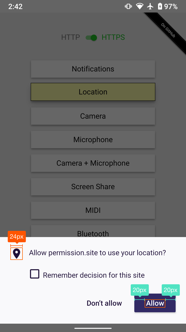
The add-on dialog will need these tweaks:
- Icon size scaled down to 24dp
- “Allow in private browsing” label colour should match the rest of the text (
#20123a) - “Okay, Got It” should be sentence case: “Okay, Got it”, and its button paddings should match the paddings used on the “Allow” button
Our dialog’s heading size (16dp) is actually correct. In fact, the heading of permission dialog needs to follow ours.
Do you think that this style-matching will be tricky to do in the short-term?
 brampitoyo
on 8 Jun 2020
brampitoyo
on 8 Jun 2020
@brampitoyo Shouldn't be much trouble. I'll take care of it.
person808
on 8 Jun 2020
@person808 Sorry, I’ve forgotten to include the actual add-on dialog for comparison! It’s been reposted above.
brampitoyo
on 8 Jun 2020
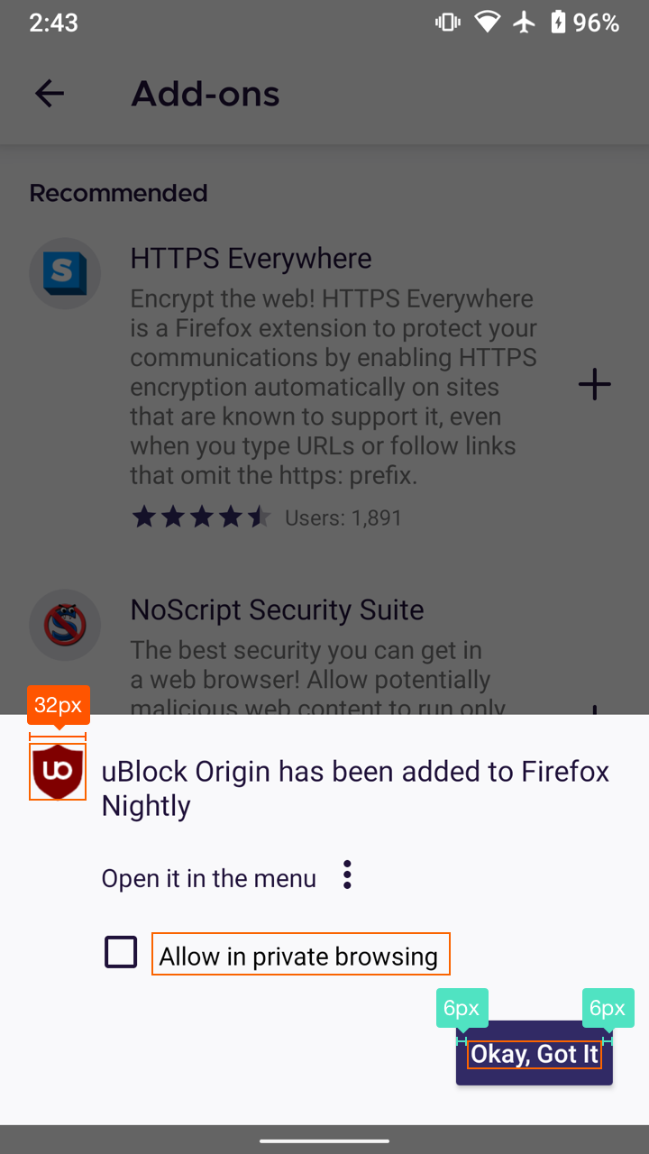
Hi, is this how it should look? Checked with Google Pixel 3 XL (Android 9) and Samsung Galaxy S9 (Android 8) and Sony Xperia Z5 (Android 7) on Nightly 6/12
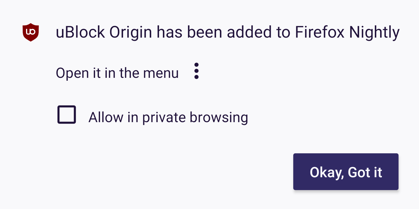
- The icon size of the add-on seems to be scaled down
- “Allow in private browsing” label color matches with the rest on the text
- “Okay, Got it”-is now sentence case and extra space on the sides of the text
I'll remove the qa needed until you check 😊.
 Diana-Rus
on 12 Jun 2020
Diana-Rus
on 12 Jun 2020
Yup! That looks correct.
person808
on 12 Jun 2020
This is QA and UX verified, closing :).
psymoon
on 12 Jun 2020
Related issues
abodea
·
3Comments
 vesta0
·
3Comments
vesta0
·
3Comments
 robsmith11
·
3Comments
robsmith11
·
3Comments
 clitetailor
·
3Comments
clitetailor
·
3Comments
 bbinto
·
3Comments
bbinto
·
3Comments