Fenix: Pull down to refresh throbber
What is the user problem or growth opportunity you want to see solved?
Pulling down to refresh tab is a feature that provides quick and easy usability. This feature is lacking in the app . Incorporating this feature would enhance user experience. Along with that the throbber should be customized accordingly.
How do you know that this problem exists today? Why is this important?
Please see link :-
(https://github.com/mozilla-mobile/outreachy-UX-2020/issues/80#issue-590559283)
Design Iterations:-


You can find the dark mode version to the light mode versions and vice versa along with the other requirements on this link :-
Outreachy-Advika
 adi-1999
All 11 comments
@Mugurell As discussed I have opened an issue. Also I have added the necessary links required.
Thanks!
adi-1999
on 22 May 2020
Love the cool branding here!
 yoasif
on 22 May 2020
yoasif
on 22 May 2020
Dependent on removing PTR feature flag (after resolving issues from #9766 )
 ekager
on 23 May 2020
ekager
on 23 May 2020
@Mugurell @adi-1999 It seems as if we already have a design for the throbber: rotating arrow. Is this issue meant for changing it to something else (e.g. rotating logo)?
We recommend against changing the current design, but I’d be curious on what @topotropic thinks.
 brampitoyo
on 28 May 2020
brampitoyo
on 28 May 2020
I would be hesitant to use something requiring a lot of animation. We have seen many times in desktop and mobile that animations can affect page load times significantly.
 kbrosnan
on 28 May 2020
kbrosnan
on 28 May 2020
Indeed, right now we'd use the default throbber slightly themed to respect the app's theme.
The design proposed here is an outreachy initiative which must be validated by UX.
 Mugurell
on 28 May 2020
Mugurell
on 28 May 2020
To add to the above, this design idea was an outreachy initiative also discusses on Riot where I worked on a simple POC just to see how it all would look like and what the implications from an engineering perspective are. Not sure if we want to change the default or if we'd want to support custom throbbers in a-c but it seemed like an interesting proposal.
Here is the apk poc - https://drive.google.com/file/d/1C0pkRlUgvQ_3ieOlWz5PUs0_J5NEYLdG/view
And here it is in action - 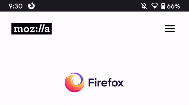
Some notes I took:
- using PNGs/GIFs as throbber resources might not be the best option → app size will increase considerably. Default throbber in Android is a simple rounded arrow drawn in code that is then rotated as needed.
- I used the same technique for our arrow - drawn it in code
- I used the provided GIF (still 2MB in size) for the "stage 2" - indefinite rotating throbber
- I also drawn in code the shadow
For the circle arrow (stage 1):
- Default behavior is for it to translate down, increase alpha from #4C to #FF, and rotate around 540 degrees. I kept this behavior but we can customize it if needed.
- Since I went with drawing the arrow myself I used colors picked with a drawing tool, will need the exact color codes. In the above poc I've used:
- start color: #FF7153
- end color: #FA1F6B
For the fenix logo used as indefinite throbber (stage 2):
- would need to reduce it's size
- it is very complex to be drawn in code, can't do the same as with the arrow from above
- first step would be to remove it's background (background can be easily added in code underneath the image)
- reduce it's padding (I've used "stage 2 / option 1 / lightmode.gif" which has a transparent padding. I think we'd ideally only want what is now the white padding.)
- for other complex animations we've used Lottie (https://github.com/airbnb/lottie-android). Maybe we could use the same here
- transitioning from the arrow to this logo might seem forced. To me it seems like is a big difference. We can think of transitions / fade effects? but these would take time that we do not have (hopefully).
User drags the throbber down and if there's enough slop when he releases it we change the throbber to show the fenix logo while the page is loading.
Ideally the page would load in a snap so there would be little time for users to see the fenix logo in action, even less if we are come up with some transitions.
Regarding performance concerns, I haven't profiled this but page loading would happen in GV asynchronously from this client animation so I think this shouldn't cause issues but should definitely be profiled to know exactly what the impact is.
Mugurell
on 28 May 2020
@topotropic Do you have feedback on this?
 AmyYLee
on 2 Jun 2020
AmyYLee
on 2 Jun 2020
Any update to add back this feature with bugs fixed? All major browsers have this...it's really inconvenient to click 3 buttons and click reload...a simple gesture will be good😓
 sheikh-azharuddin
on 12 Jun 2020
sheikh-azharuddin
on 12 Jun 2020
This issue is about the design of the throbber. Your question belongs to #9766.
 cadeyrn
on 12 Jun 2020
cadeyrn
on 12 Jun 2020
It's an interesting approach. Thanks for the effort everyone!
That said, there's too much uncertainty around the impact on (perceived) performance; also it's not clear if the brand alignment adds any benefit to the user experience; this would require some further investigation;
 topotropic
on 12 Jun 2020
topotropic
on 12 Jun 2020
Related issues
 vesta0
·
3Comments
vesta0
·
3Comments
 andreicristianpetcu
·
3Comments
andreicristianpetcu
·
3Comments
andreicristianpetcu
·
3Comments
andreicristianpetcu
·
3Comments
andreicristianpetcu
·
3Comments
andreicristianpetcu
·
3Comments
 softvision-miralobontiu
·
3Comments
softvision-miralobontiu
·
3Comments