Fenix: [Tab Tray] Show longer titles (on 2 rows)..., to match current Fenix Home Screen
Steps to reproduce
Activate new Tab Tray secret setting
Open some sites to feed the Tab Tray :grinning:
Move to Tab Tray
Expected behavior
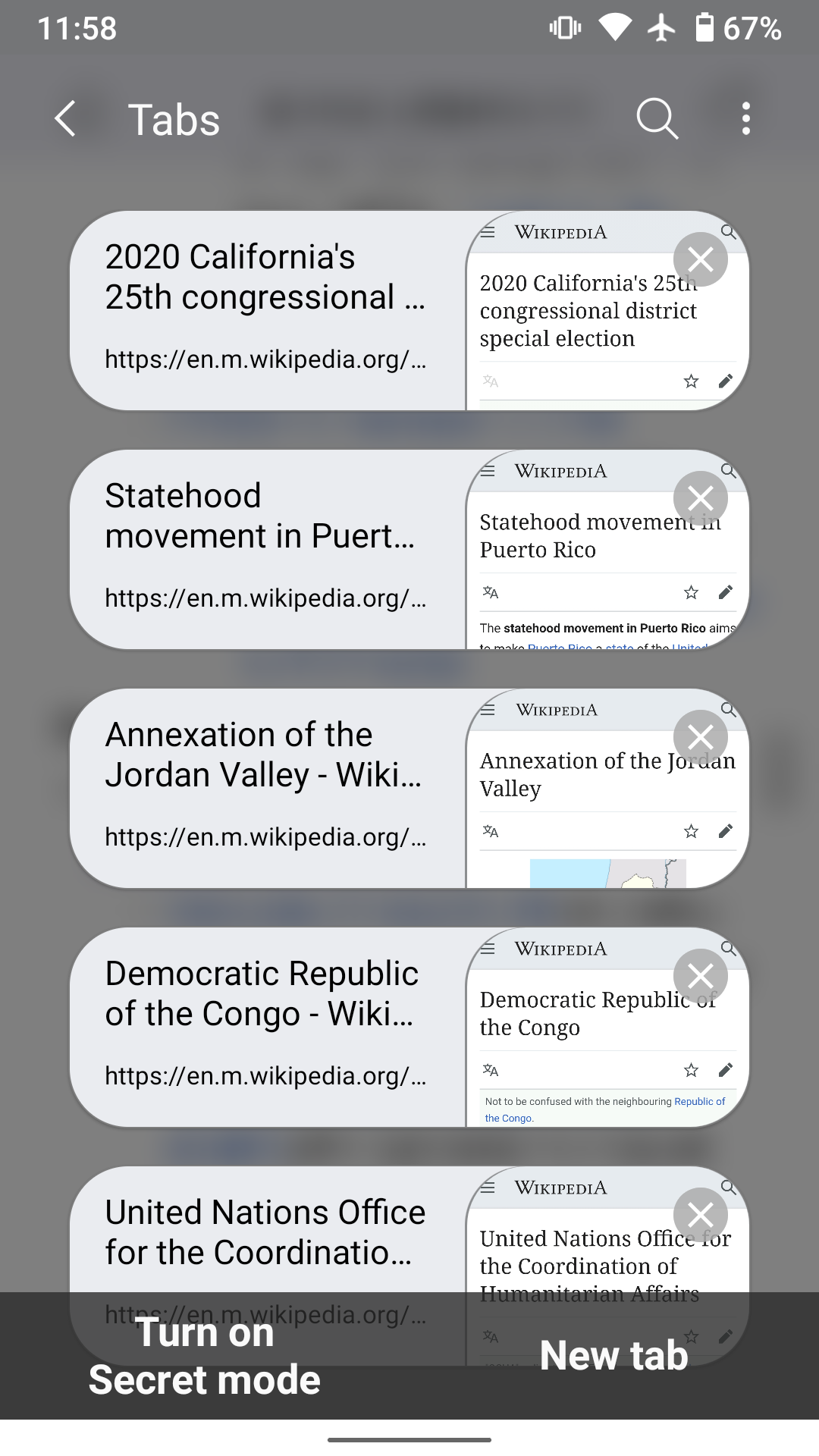
Titles displayed for sites should be long enough to be meaningful (note that I don't rely on Site Previews where the expected information could not present/readable).
IMHO, the current Fenix Home Page as shown below shows a good example of what the information density should be:
- number of rows (2 rows for the title), space between rows
- font size & color (contrast) differences between titles and URLs.
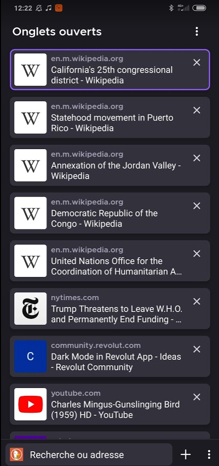
Actual behavior
Titles displayed for sites are truncated on 1 row each, therefore they are not meaningful at all, as you can see below (same sites as above, in reverse order)

Device information
- Android device: 9
- Fenix version: build #2015740403
Thank you and pardon my French :wink:
 klint
klint
All 12 comments
@topotropic Do you have any comment or opinion around longer titles on tab names?
For reference, here are examples of other browsers that display the tab’s page name and URLs in a list view:
Samsung Internet
UC Mini
Yandex Browser
 brampitoyo
on 19 May 2020
brampitoyo
on 19 May 2020
For the sake of good comparison, I have updated the initial screenshots to match the sites on the other browsers's examples.
(I hope this help clarify how useful the 3 lines (2 for the title + 1 for the URL) in the current/old Fenix home page can be... Site previews vs favicons debate put aside, of course). Thanks
klint
on 19 May 2020
Not really sure about three lines, but two lines is definitely an improvement over the current tab tray.
 yoasif
on 19 May 2020
yoasif
on 19 May 2020
Sorry I meant 3 lines including the url itself 😉
klint
on 19 May 2020
Back on this issue to stress the need of solving it, now that we can have a good experience of site previews in the nightly builds :)
As you can see from the Screenshots below, taken in both light and dark modes, the site previews are not sufficient on their own to easily identify tabs (particularly with numerous tabs in the list. I have 99+).

klint
on 18 Jun 2020
@topotropic for follow-up
 AmyYLee
on 24 Jun 2020
AmyYLee
on 24 Jun 2020
@betsymi @topotropic for follow-up
AmyYLee
on 10 Jul 2020
Following the PR for issue #11918 moved to nightly recently, it seems that the screenshots shown in the Tab Tray are now reflecting the current screen view of the page when the Tab Tray button was pressed, instead of the top of the page itself (maybe I'm wrong, but I think that before, the tops of pages would be shown in the Tab Tray). Which makes the pages less recognizable in the Tab Tray imho (the often proeminent title on the top the page being absent from the picture).
That is one more reason for displaying a longer and more explicit title :).
Note that this has also been requested on some comments on Google Play.
klint
on 24 Aug 2020
@topotropic Is it really necessary to have such a large gap between title and URL if the title has only one line? As I first saw the screenshot in the pull request for this issue I thought it's a bug in the implementation. I would expect that the spacing between the title and the URL doesn't depened on the number of lines for the title. The whole should be vertically centered so that it always looks good. What do you think?
 cadeyrn
on 14 Oct 2020
cadeyrn
on 14 Oct 2020
@topotropic Is it really necessary to have such a large gap between title and URL if the title has only one line? As I first saw the screenshot in the pull request for this issue I thought it's a bug in the implementation. I would expect that the spacing between the title and the URL doesn't depened on the number of lines for the title. The whole should be vertically centered so that it always looks good. What do you think?
Thanks for your feedback. The assumption is that most sites have longer titles and the 1-liner will be a rare case (I'll keep an eye on that). And another point is to keep things starting in the same place for better scan-ability, so all titles have the same top margin, instead of aligning them to the URL.
 topotropic
on 14 Oct 2020
topotropic
on 14 Oct 2020
Ok, I tested it on various screen sizes and realized quickly that the assumption that most titles will span over two lines doesn't hold true. Thanks for the pointer @cadeyrn
And apologies to this oversight @amkcpu – I'd appreciate it if you could update the implemented design to match the following (so center title and domain with 4dp spacing between them):
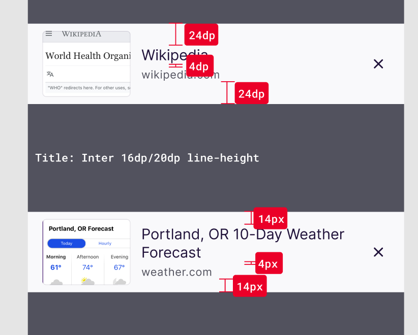
Thank you!
topotropic
on 15 Oct 2020
Hi, verified as fixed on the latest Nightly 201019 build using the following devices:
• Google Pixel 3a (Android 11)
• Huawei Mate 20 Lite (Android 9)
• OnePlus A3 (Android 6.0.1)
►Screenshot

 AndiAJ
on 19 Oct 2020
AndiAJ
on 19 Oct 2020
Related issues
 csadilek
·
3Comments
csadilek
·
3Comments
csadilek
·
3Comments
csadilek
·
3Comments
 bbinto
·
3Comments
bbinto
·
3Comments
 abodea
·
3Comments
abodea
·
3Comments
 ekager
·
3Comments
ekager
·
3Comments
Most helpful comment
Ok, I tested it on various screen sizes and realized quickly that the assumption that most titles will span over two lines doesn't hold true. Thanks for the pointer @cadeyrn
And apologies to this oversight @amkcpu – I'd appreciate it if you could update the implemented design to match the following (so center title and domain with 4dp spacing between them):
Thank you!