Fenix: FNX2-13191 ⁃ New three dot menu is too wide in preview nigthly
Steps to reproduce
Click on the three dot menu when browsing
Expected behavior
A can click outside the menu easly to close it
Actual behavior
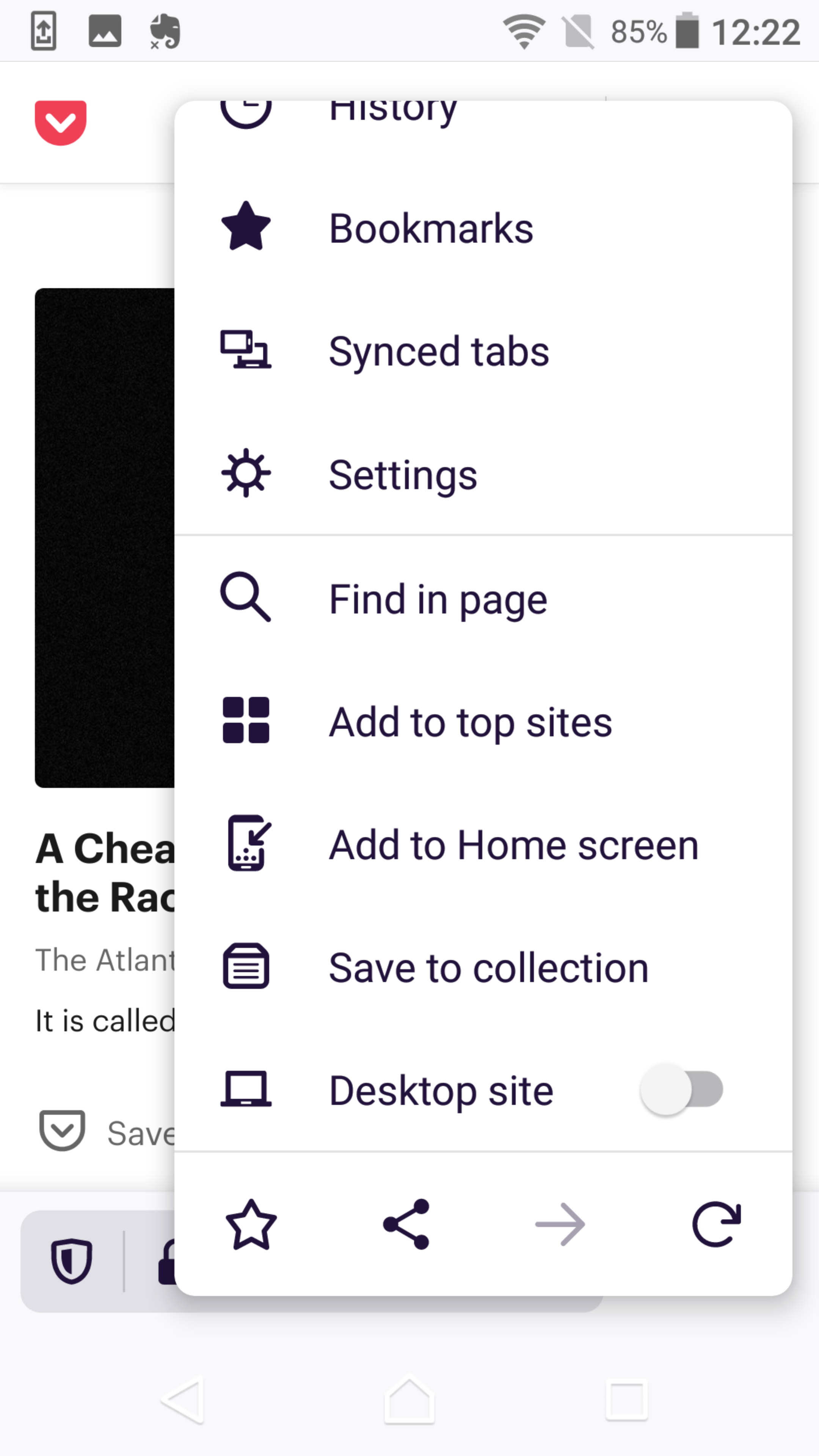
Since last update, the opened menu is too wide to click outside it for closing
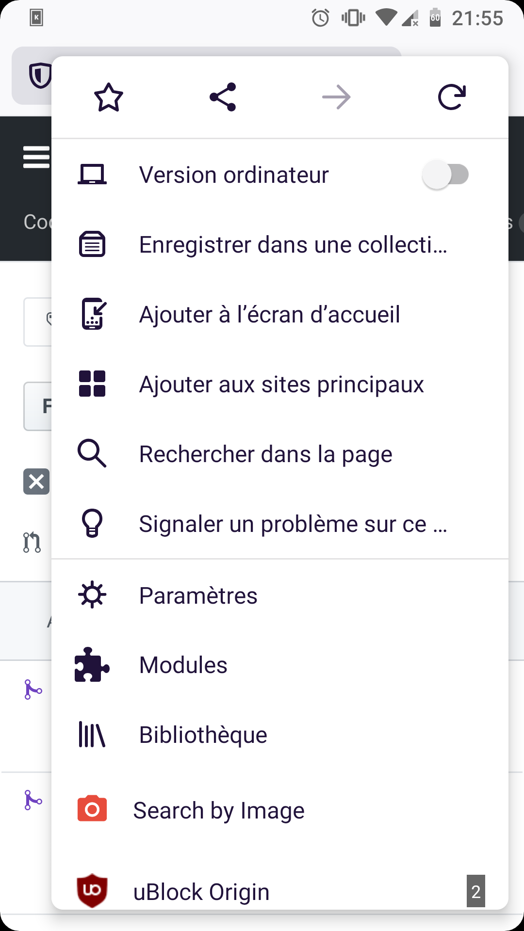
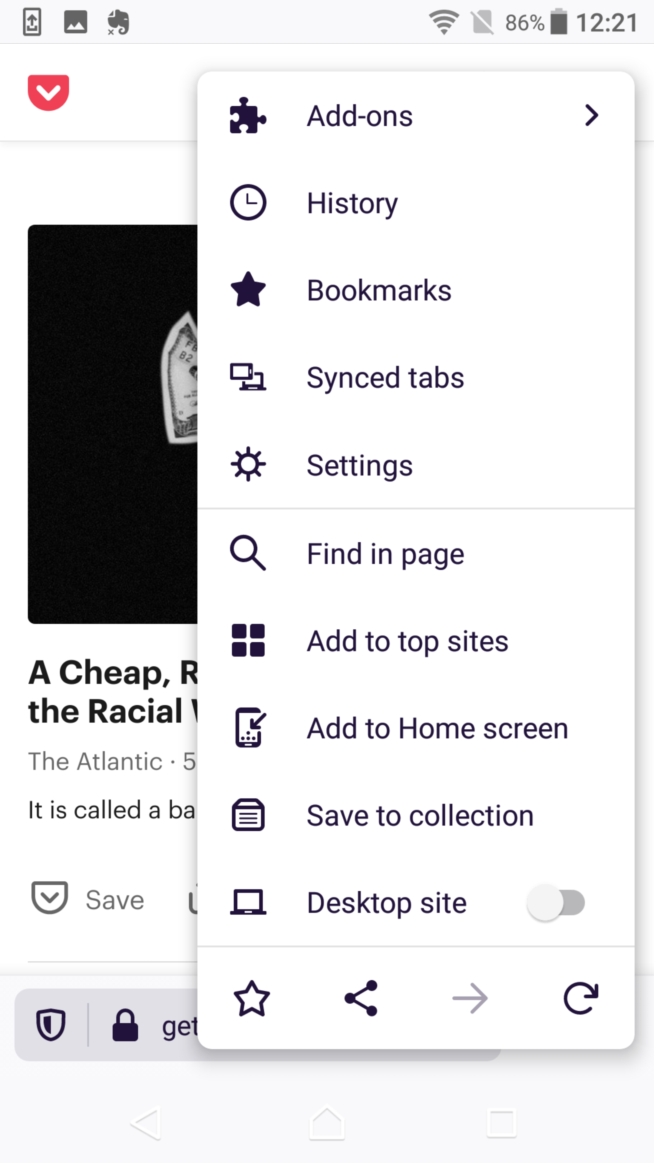
Before:
 UNITO-UNDERSCORE!20200509-215635!UNITO-UNDERSCORE!Firefox!UNITO-UNDERSCORE!Preview!
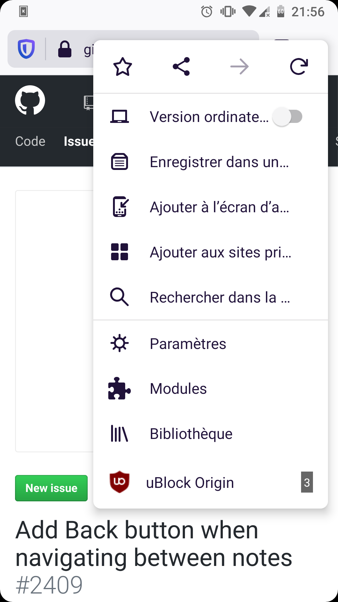
After:
 UNITO-UNDERSCORE!20200509-215541!UNITO-UNDERSCORE!Firefox!UNITO-UNDERSCORE!Nightly!
I understand that it was done to better read the text inside this menu but a find it difficult to exit this menu because of it.
Device information
- Android device: samsung a5 2017
- Fenix version: nigthly Nightly 200509 06:01 (Build #21300608)
 Octoton
All 11 comments
This is not a bug. It's the expected result from #7157.
 cadeyrn
on 9 May 2020
cadeyrn
on 9 May 2020
Well in that case, and for my point of view, the old menu was better
The truncated label where easier to read and now the four icon seems too far apart from each other, it feel disconnected
Octoton
on 9 May 2020
Yea... I feel the same way, the old one was better.
 theartifaktorq
on 10 May 2020
theartifaktorq
on 10 May 2020
I guess it's hard to find the right compromise between allowing enough text being displayed (ideally all) and the menu not taking the majority of the screen to do so.
As another improvement maybe we should set the menu to occupy at maximum a certain percent of the screen?
Looking forward for UX feedback here.
 Mugurell
on 11 May 2020
Mugurell
on 11 May 2020
For me the text is important but I would also like the menu not to be too big.
theartifaktorq
on 12 May 2020
Sorry. This is one of those issues where there’s not going to be a perfect solution (unfortunately!).
@Mugurell just checking: do we only widen the menu on non-English locales where the text don’t fit, or will the menu widen everywhere?
It seems wise to keep the menu as narrow as possible, unless the locale is particularly long (e.g. German).
 brampitoyo
on 28 May 2020
brampitoyo
on 28 May 2020
Sorry. This is one of those issues where there’s not going to be a perfect solution (unfortunately!).
@Mugurell just checking: do we only widen the menu on non-English locales where the text don’t fit, or will the menu widen everywhere?
It seems wise to keep the menu as narrow as possible, unless the locale is particularly long (e.g. German).
All menus were previously 250dp wide. After the change from https://github.com/mozilla-mobile/fenix/issues/7157 they will have at least 250dp and at most 314dp (or screen width, whichever is smaller) where needed to fit more text.
An improvement to this would be to maybe introduce a new screen percent width rule, something like _the menu can be at max 314dp / 80% of screen width_, whichever is smaller.
If I understand correctly, you are suggesting https://github.com/mozilla-mobile/fenix/issues/1871#issuecomment-629086633 which would indeed help in situations where the menus don't have to be 250dp wide.
Mugurell
on 28 May 2020
@Mugurell having a min-max value seems really sensible to me. And that max value should always be relative to screen width.
Why? To always allow enough area to tap away in case the menu run the whole height of the screen. Otherwise, there would be no way to close the menu.
I agree with you that we should try the value you proposed, and then measure it against Material Design’s recommended minimum tap area (at least 48dp wide, and stretching to the whole height of the screen). If your value isn’t enough, you might have to scale down to 75–78% of device width. The goal is to always ensure a minimum 48dp tappable “exit area” available whenever the menu is open.
brampitoyo
on 28 May 2020
@Mugurell This was fixed, right?
 hakkikaancaliskan
on 26 Jun 2020
hakkikaancaliskan
on 26 Jun 2020
@Mugurell This was fixed, right?
Thank you for tagging me.
We did add in https://github.com/mozilla-mobile/android-components/issues/7392 the safety check for a 48dp tappable “exit area” that Bram suggested.
Previously the menus would be able to extend to the entire width of the screen (though the max width of 314dp should be a too narrow width for that), now there will always be enough space for a "tappable exit area".
Not sure if QA had devices on which the previous menus width would mean screen wide menus but I think this should be verified to not be an issue.
Mugurell
on 26 Jun 2020
Hi, verified as fixed on Sony Xperia Z5 (Android 7) with Nightly 7/2
Sony Xperia Z5 (Android 7)-320 dp - German local
Sony Xperia Z5 (Android 7)-360 dp - German local
Sony Xperia Z5 (Android 7)-320 dp - English local
Sony Xperia Z5 (Android 7)-360 dp - English local
- the menu adjusts automatically, please check the first screenshot and the second one (German local) but for english local as well it can be seen that it adjusts based on the string's length
- it seems to be enough space so to exit the menu
- checked with the toolbar being set at the top as well
 Diana-Rus
on 2 Jul 2020
Diana-Rus
on 2 Jul 2020
Related issues
 Chris01277
·
3Comments
Chris01277
·
3Comments
 phileastv
·
3Comments
phileastv
·
3Comments
 abodea
·
3Comments
abodea
·
3Comments
abodea
·
3Comments
abodea
·
3Comments
 topotropic
·
3Comments
topotropic
·
3Comments
Most helpful comment
I guess it's hard to find the right compromise between allowing enough text being displayed (ideally all) and the menu not taking the majority of the screen to do so.
As another improvement maybe we should set the menu to occupy at maximum a certain percent of the screen?
Looking forward for UX feedback here.