Fenix: FNX2-15852 ⁃ [Bug] Top Site uses only 4 elements/sites spaces instead of 5.
Steps to reproduce
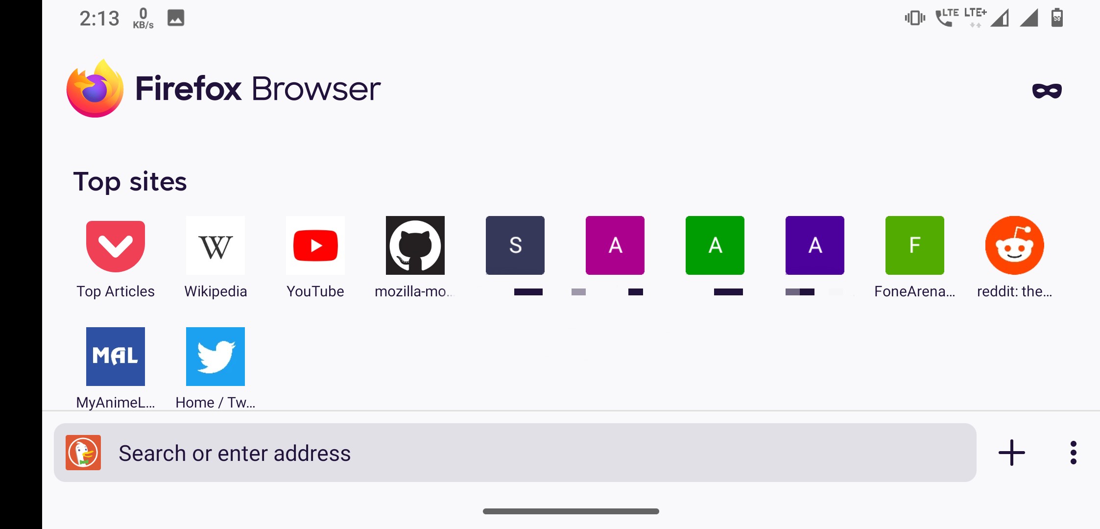
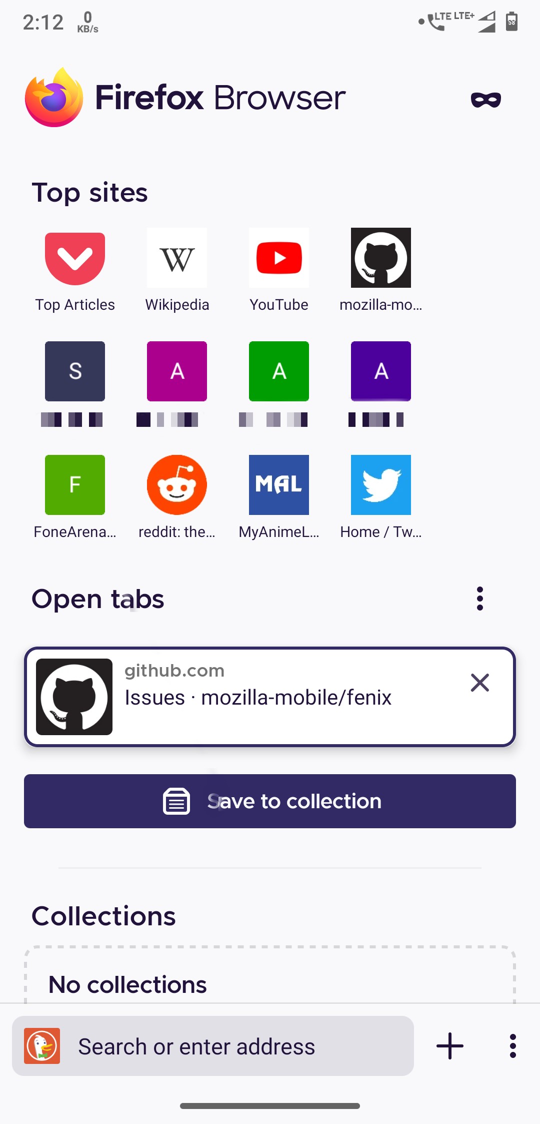
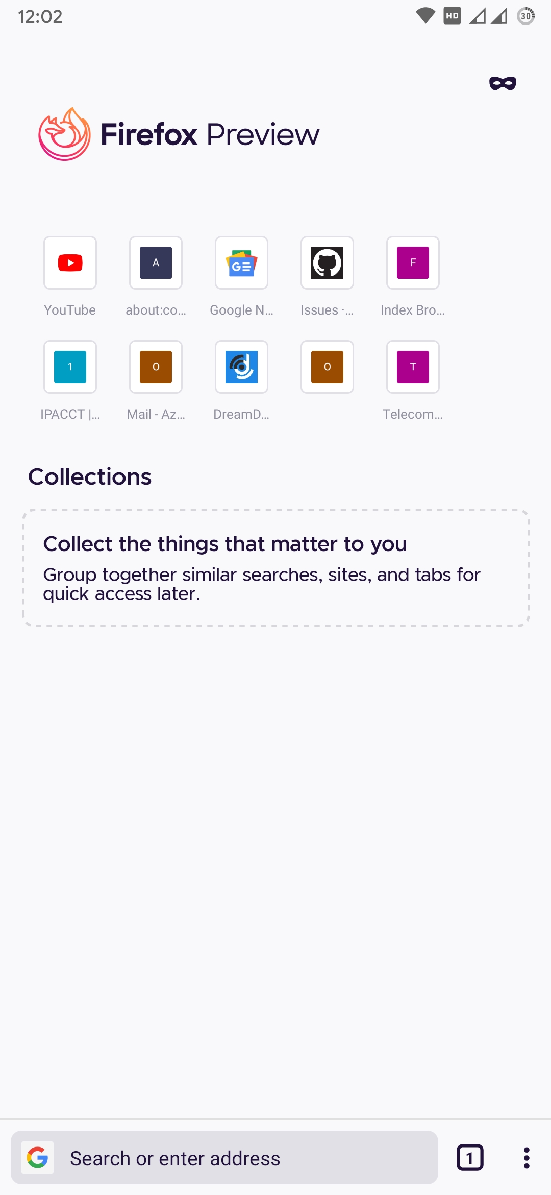
Top site row has only 4 elements/sites instead of 5 thereby leaving empty space. But it uses all elements/site spaces when device is rotated/in horizontal mode
Please see the screenshot for clarification.
Expected behavior
It should use all 5 element's/site spaces
Actual behavior
Only uses 4 spaces
Device information
- Android device: Motorola One Power, Android 10.
- Fenix version: Firefox Beta 5.0.0-beta.1 (Build #2015737283) and Nightly 200428 06:00 (Build #2015737139)
 UNITO-UNDERSCORE!158815002886584!
 UNITO-UNDERSCORE!158814998073416!
All 24 comments
Another thing to note is that it did use all 5 spaces before. I don't remember when it changed, but it surely did use all of the space when the device was held vertically.
Duplicate of #9123 I think
I have this issue too, the behavior changed a few weeks ago.
@Cheap-Skate I think the issue #9123 is talking about the increasing the spacing between individual top sites so that it acquires all of the space on individual rows. So that is different.
This issue talks about the number of elements each row is holding has reduced from before which was 5 on my device but is only 4 now.
Now #11065 has landed I now only get 3 favicons on each Top Sites row, down from 4 previously!
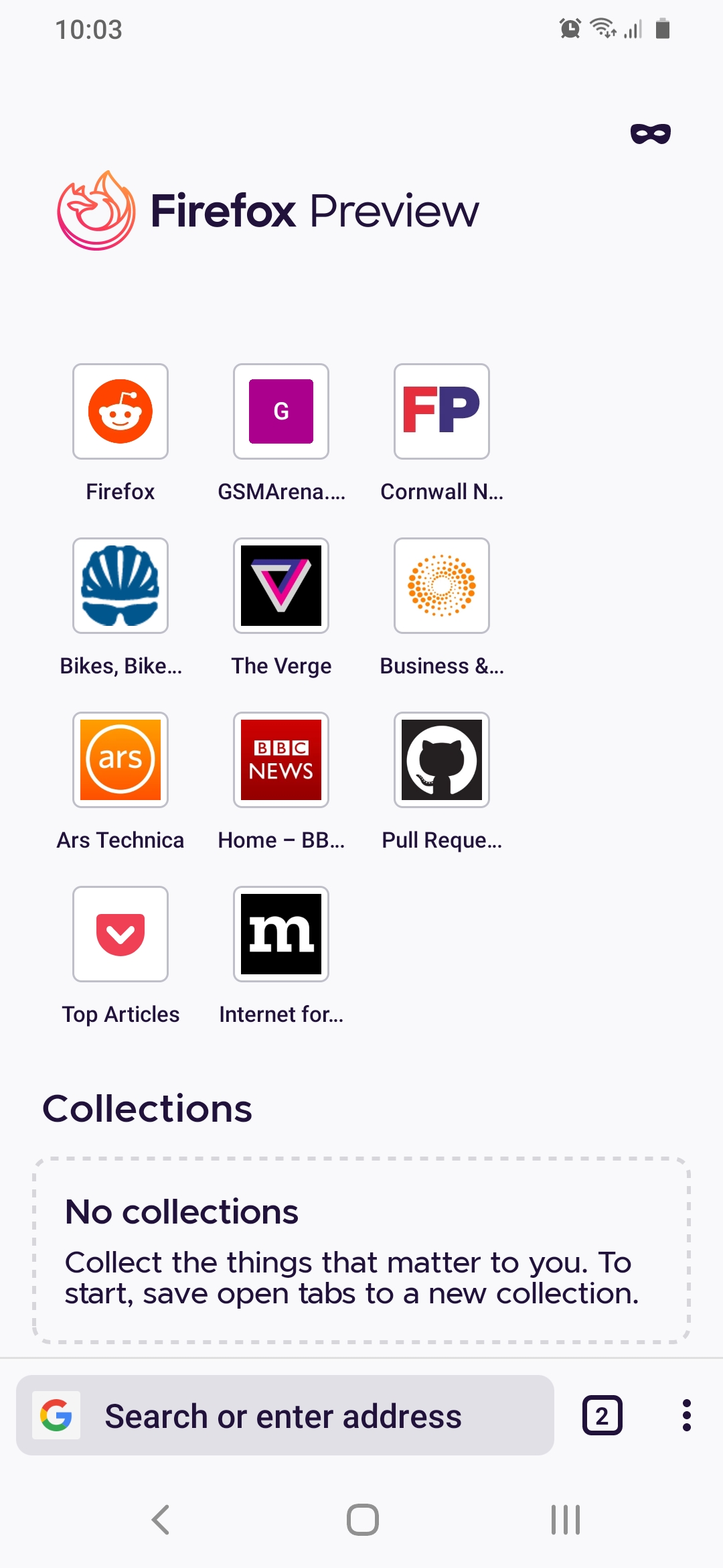
@Cheap-Skate Yes, you're right. I'm also seeing only 3 top sites elements now, don't know what's happening, first there were 5 and then 4 and now 3...😅
Device: Motorola One Power, Android 10.
Fenix: Nightly 200530 06:01.

I too am seeing three across in the latest Nightly, but the space on the right-hand side suggests there should be four across to make the page more balanced and also easier to use for people who hold a phone in the right hand using the device one-handed.
Let's limit to 8 top sites (2 rows a 4 sites)
https://github.com/mozilla-mobile/fenix/issues/8312#issuecomment-638825961
I think this issue is still valid since some user only have 3 sites per row and this should be fixed but the issue should be renamed to reflect that the goal are 4 sites per row.
Hi, now it seems that there are 4 top sites per row not 3, but not yet 5, checked on the Nightly 6/12 build with:
- Google Pixel 3 XL (Android 9)
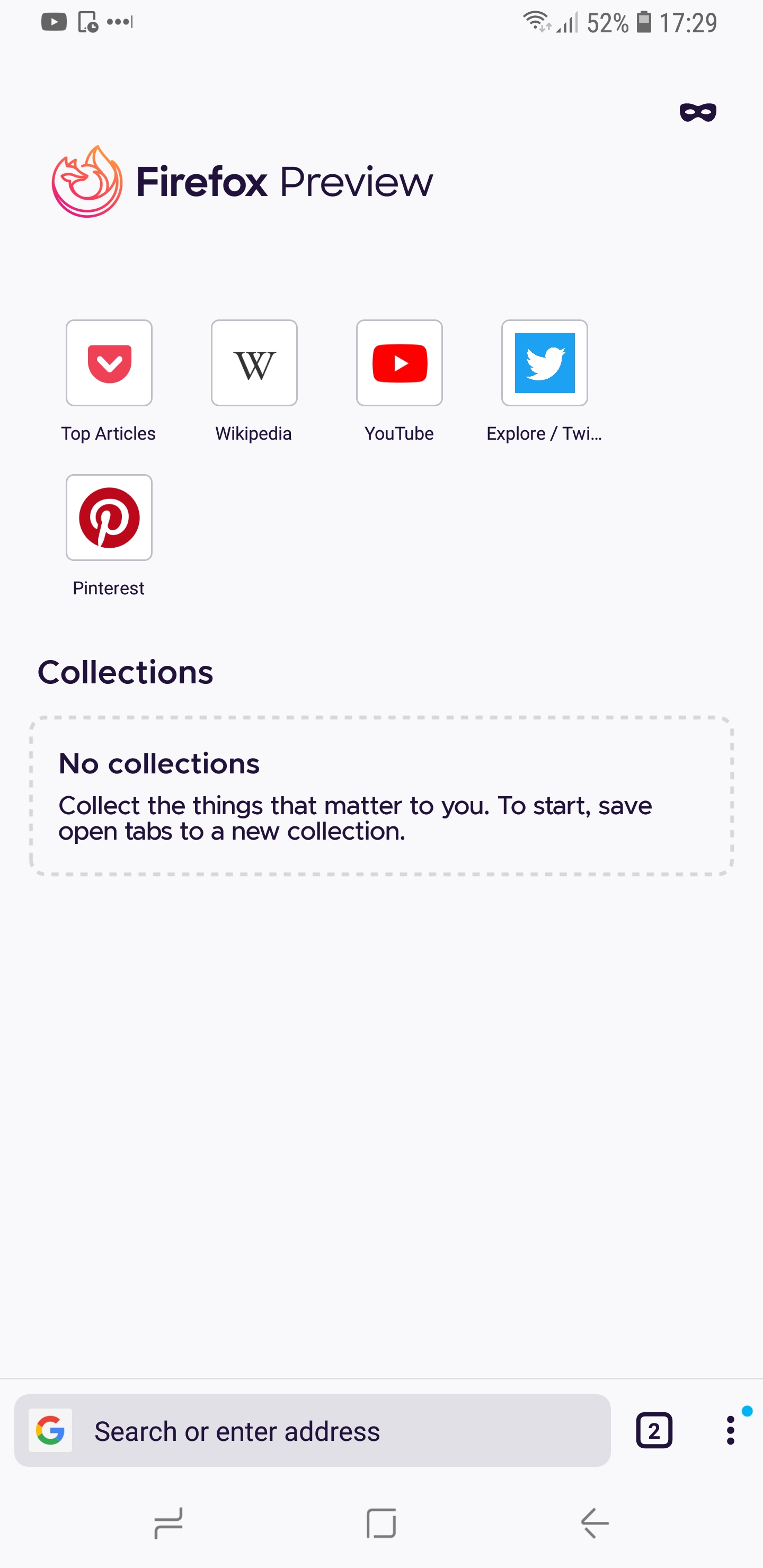
Samsung Galaxy S9 (Android 8)
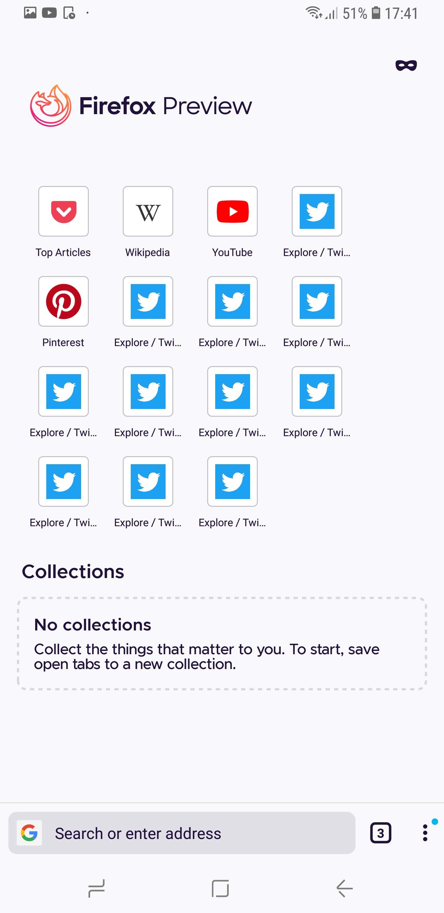
Sony Xperia Z5 (Android 7)
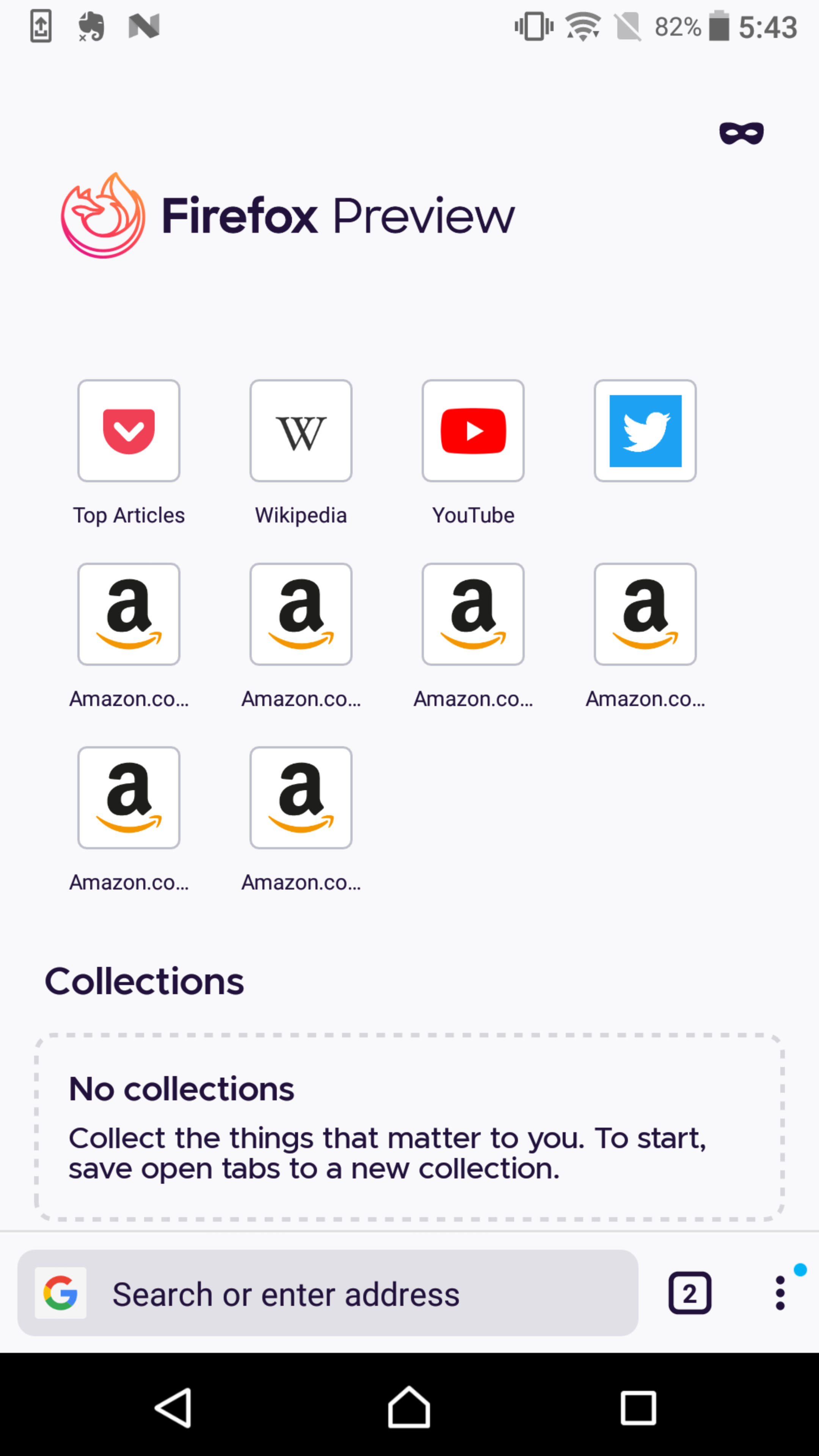
@mcarare - is there a way to have 5 top sites on a row?
Hi @SS1113 , it seems that the the build with the fix is not yet present in the latest nightly, i've mistaken the build.
I'm going to create in the meantime a build taken from master, that should contain the fix.
I'll post the results here after having it checked.
@mcarare , @SS1113 - Re-checked with same devices, the top sites favicons are displayed correctly.
They are multiple on a row - as reference for the left and right side boundary of the flexibox, you can take in consideration the Collections border:
Google Pixel 3 XL (Android 9)
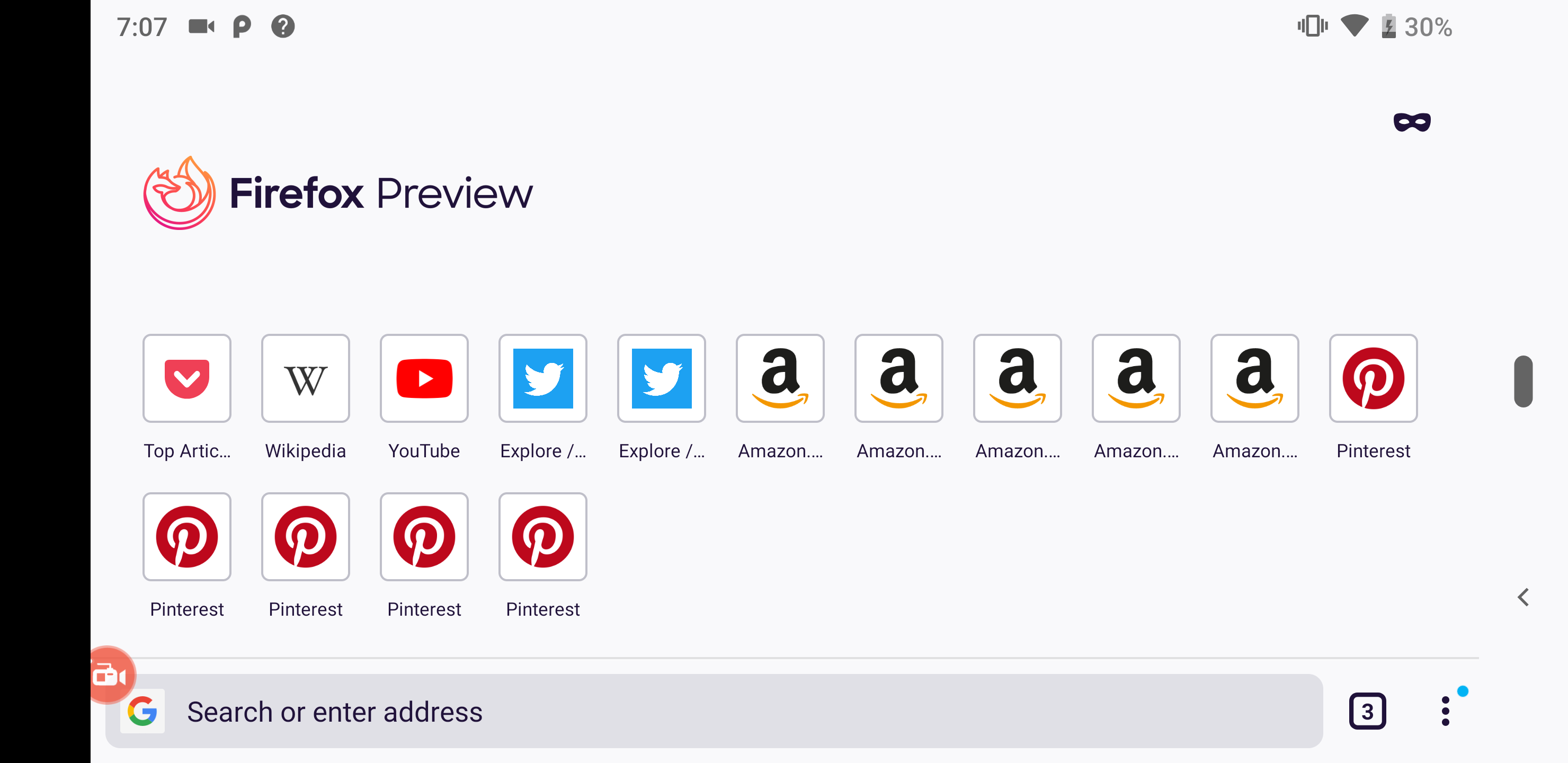
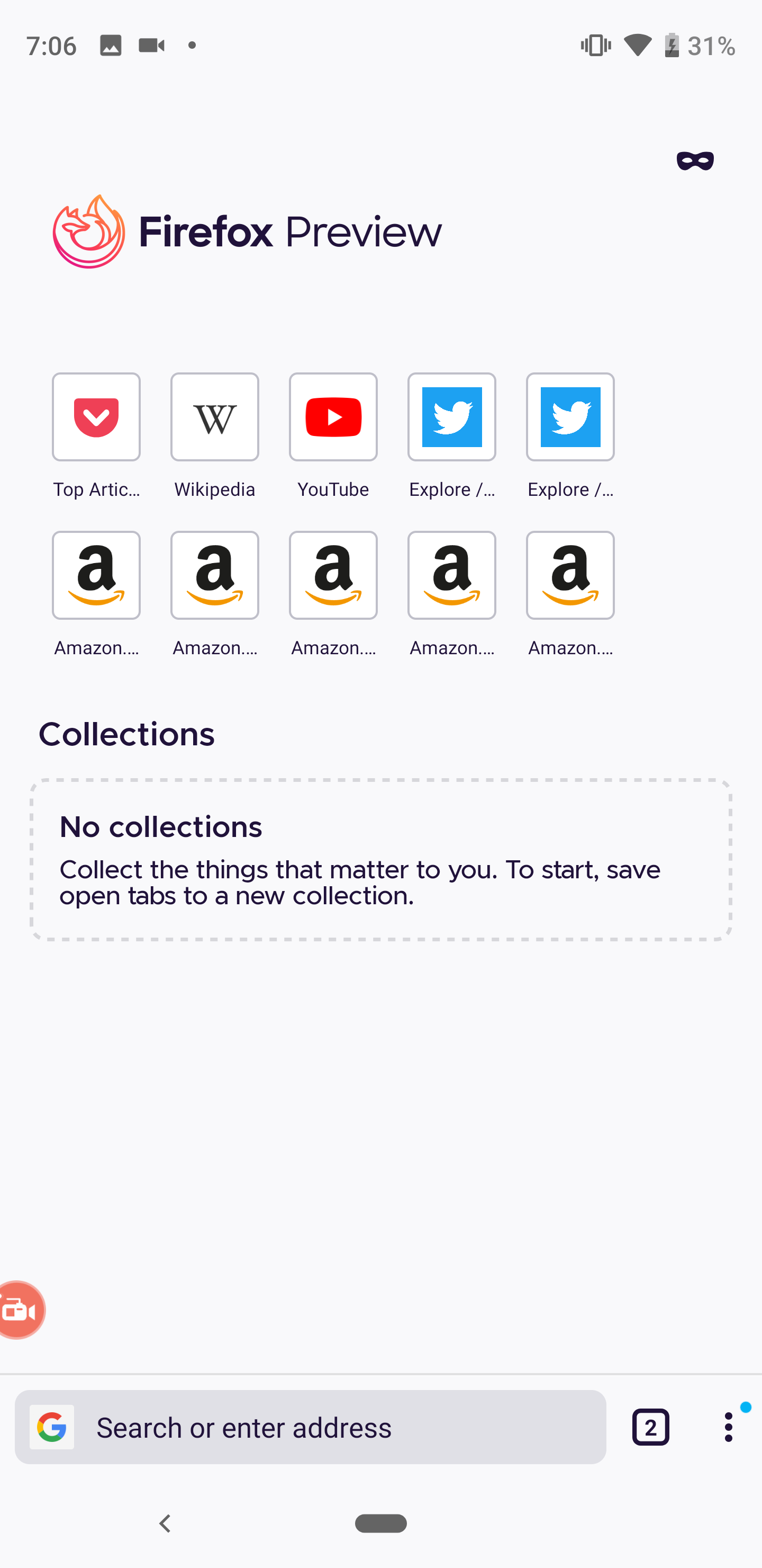
Samsung Galaxy S9 (Android 8)
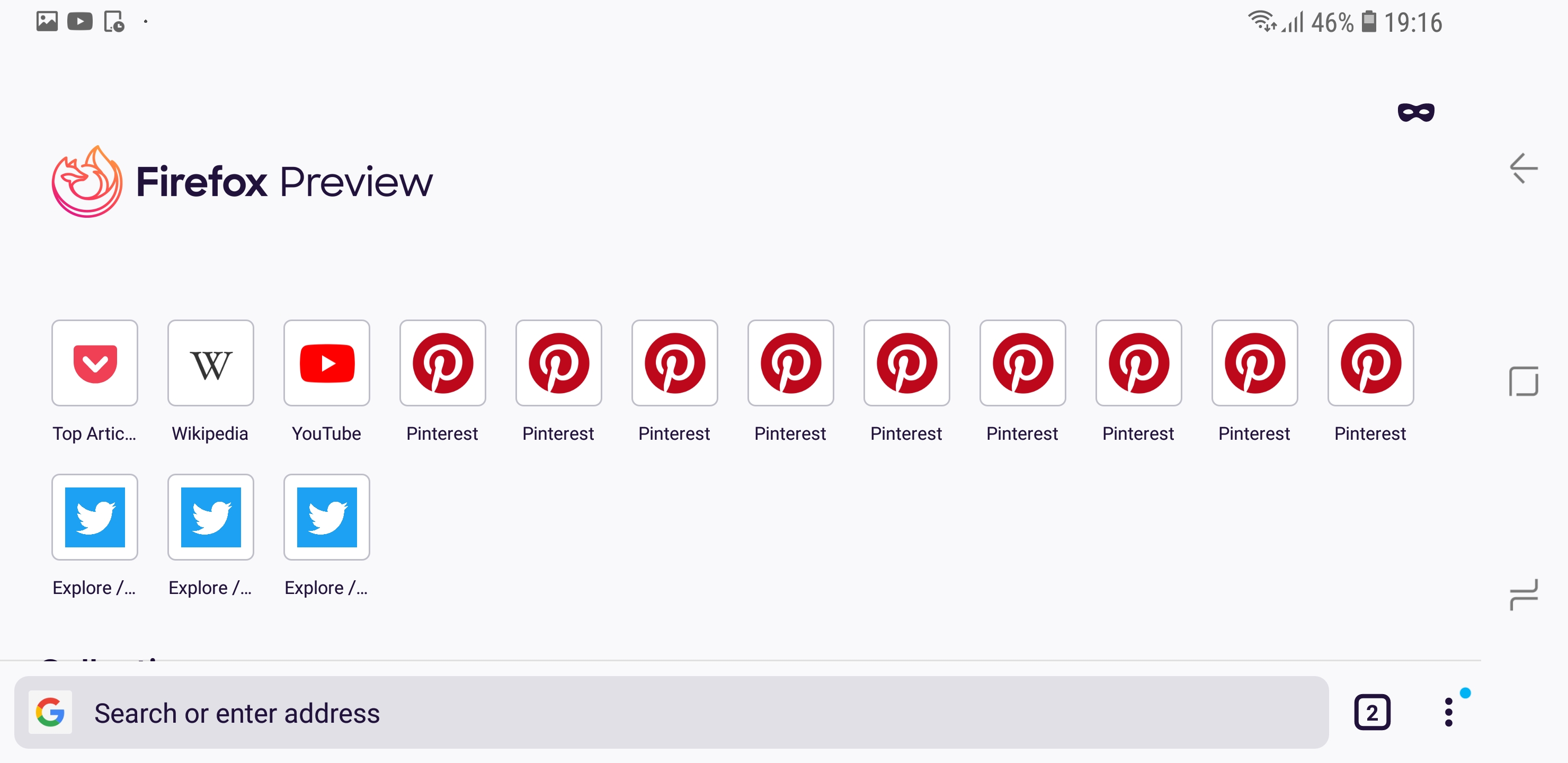
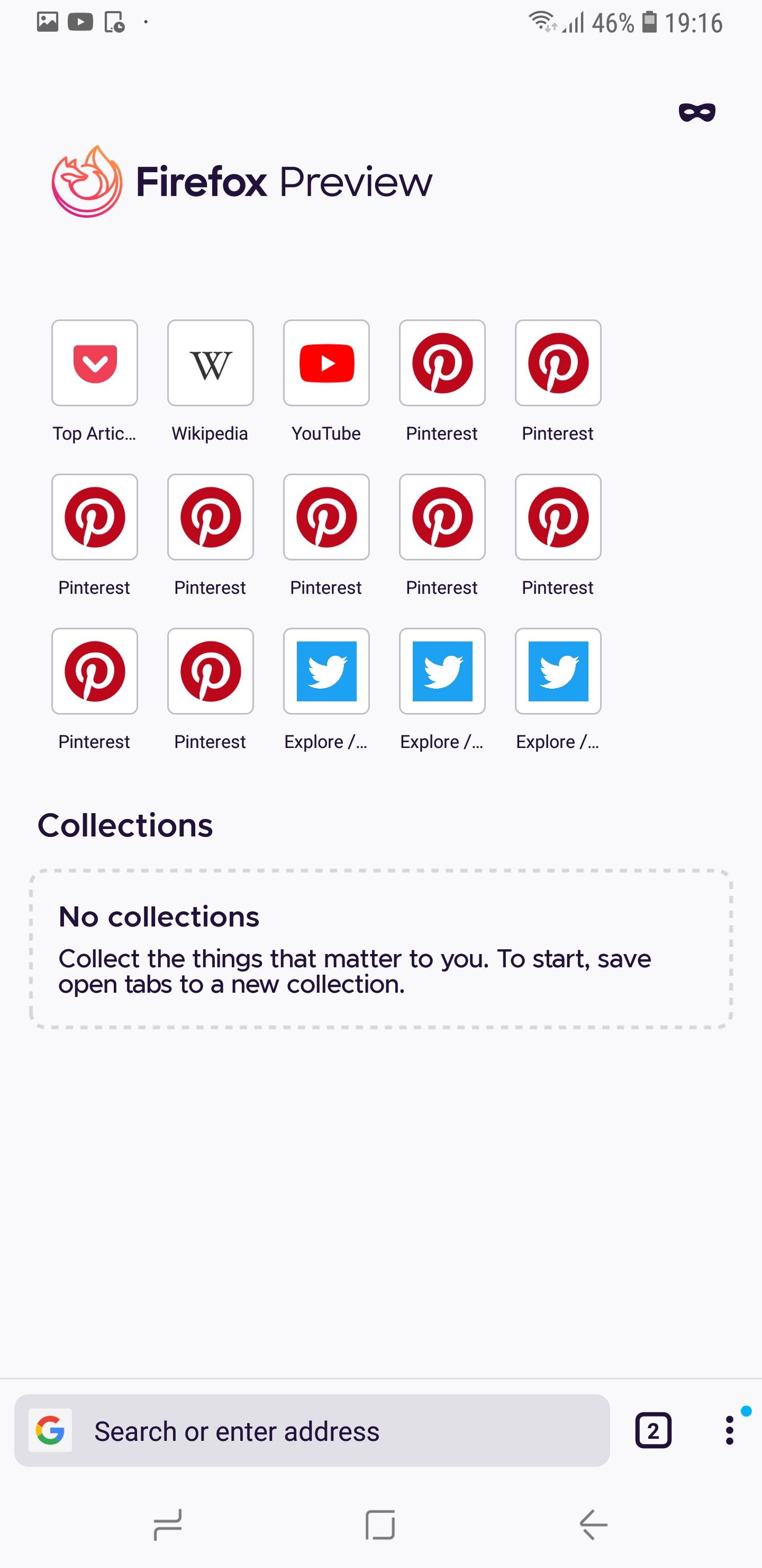
Sony Xperia Z5 (Android 7)
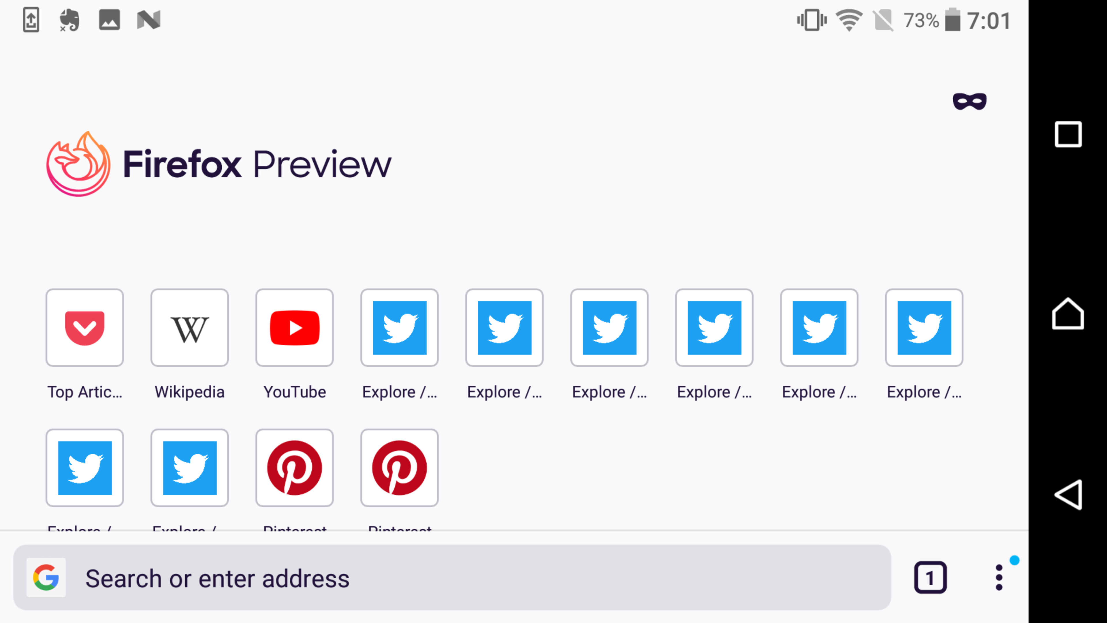
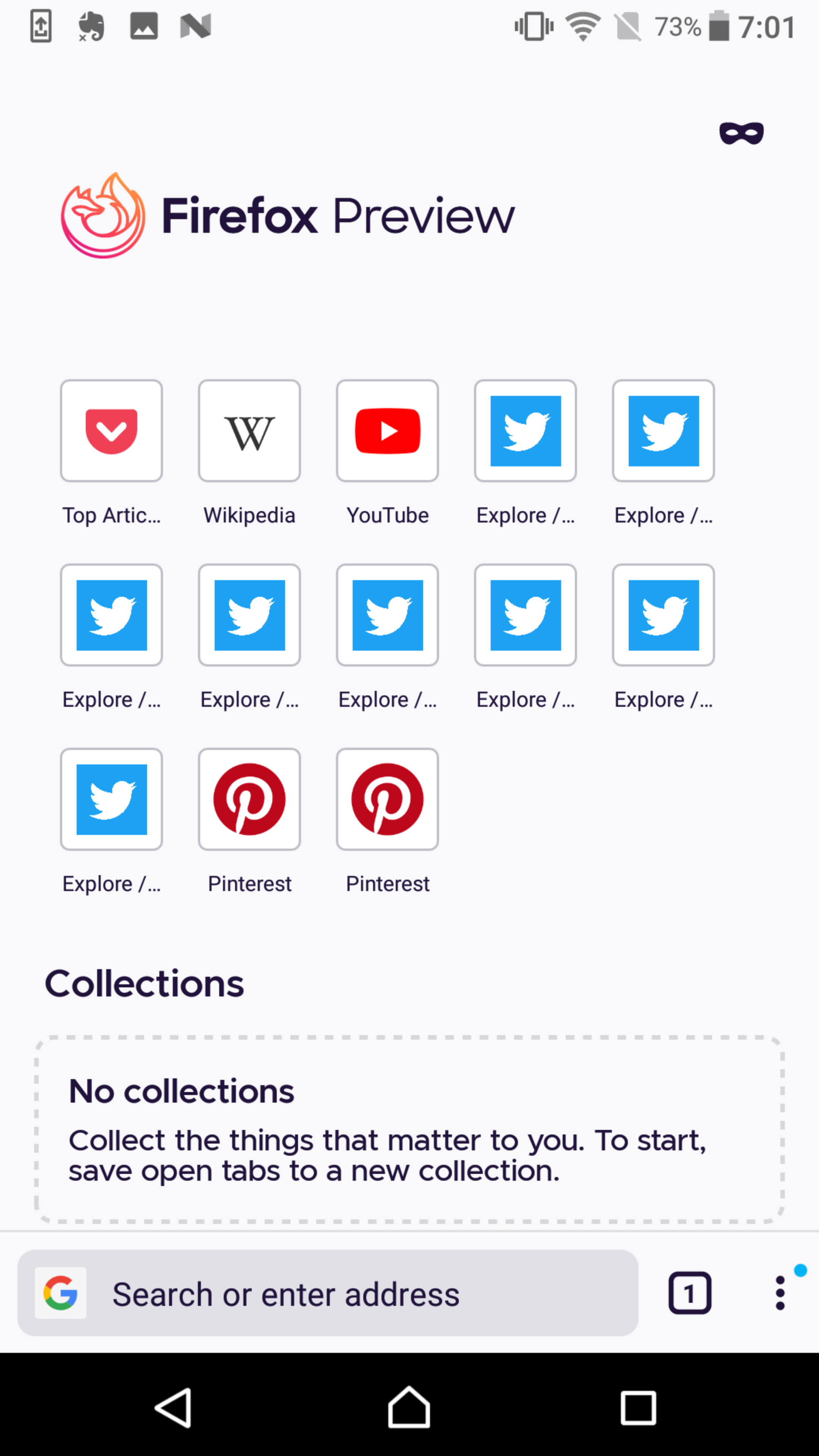
Note: To be taken in consideration that now the flexibox will adjust automatically and so it will depend on device used (phone/ tablet) and the width of the device.
Yes in new build this is fixed..you have added 5 icons per row but by reducing the size of the icon and placing them close... However there is still too much space left after the 5th icon..why not utilize the space to increase spacing between the icons or increase the size of the icon....any reason for not using the space? the space on the left of the 1st icon is not same as space after last icon....looks ugly...atleast for the sake of uniformity please utilize the space🙏
The vertical mode looks ugly in my phone..too much space left after the last icon....not sure why the difference in different phone maybe they are using fixed pixel instead of percentage.

@SS1113 i am using asus rog 2.
Sorry for the quotes....
I filed an issue previously that was rolled up into this one looking at the spacing of the top sites (irrespective of whether it was 3, 4 or 5 a row) as the spacing looked a bit odd. It always looked like there was space for another site in the row with a sizeable space on the right-hand side.
Having just updated (both Fenix Nightly and migrated Fennec Nightly), I can see that is no longer the case. Sure, the top sites now show five, but more importantly, visually it looked much more balanced.
Regardless of whether it is 3, 4, or 5 a row, that it looks more balanced and equally spaced makes the user experience much nicer.
Great work and thanks to the people that have worked to get this resolved.
I will open a new case....even though 5 icons added there is still space left after 5th icon looks ugly...probably this is related to large screen devices like mine...
@SS1113 for you it's still looks better...for me there is too much space left after 5th icon ...so the space before 1st icon and space after 5th icon is not consistent... probably because I have large screen device I have this but ideally the UI should adapt to the screen size and maybe they are using fixed size pixel instead of relative values or percentage.
Looks ugly in my device
@cadeyrn please help to push this😓
@cadeyrn please help to push this😓
How? I am still a user like you (and to be honest I don't need top sites at all - I only kept the two default top sites enabled for testing reasons).
@cadeyrn please help to push this😓
How? I am still a user like you (and to be honest I don't need top sites at all - I only kept the two default top sites enabled for testing reasons).
But people listens you ...I have posted several issues no one replied except you and in most cases closed with remark duplicate
@SS1113 true bro...they do what they think is right...🤣
No more reply after this...
And saying that you don't need need top sites and so you won't care about it is I think a bit rude to who has asked for help. You can deny them but be little more tactful. Please take what I'm saying as a request from your fellow community member.
That's… cheeky. And that for no reason. I said this senctence to explain why I won't advocating for a change. It doesn't make sense to advocate for a change if you don't care. Yes, sometimes I report a bug or share my thoughts even for this feature but that's all. Mozilla should consider the opinion of people who really care about this. I don't use this feature so my opinion about this is not in the same way relevant as the opinion of others. Do you advocate for features I care but you don't care? No, you don't. And if someone asks me to advocate for this feature I should explain why I won't do this, no? Again: I am a user as you or every other user. And I have my own opinions. There was nothing "rude" on my comment at all. To explain why I won't advocate is not rude. If anything, your comment to me was rude. "Be respectful in all interactions and communications" - https://www.mozilla.org/en-US/about/governance/policies/participation/
@sheikh-azharuddin We will revisit this issue once the changes in https://github.com/mozilla-mobile/fenix/issues/11081 are implemented.
Just a note until then: Given your screenshot, if you try to add another item in the remaining space, it will not fit as to allow for same padding at the end as the padding in the left. It might seem that another item could fit, but measuring all space and taking into consideration the item size, it will not. The issue could look better if the layout would be centered, but that is not in the specs.
@mcarare I think you tagged the wrong person here.
It's all good. But I guess one comment instead of three would have been enough. Remember that other people get notifications for each comment. Let's focus on the topic again. 😉
Still have this problem on Nokia 8
Most helpful comment
I filed an issue previously that was rolled up into this one looking at the spacing of the top sites (irrespective of whether it was 3, 4 or 5 a row) as the spacing looked a bit odd. It always looked like there was space for another site in the row with a sizeable space on the right-hand side.
Having just updated (both Fenix Nightly and migrated Fennec Nightly), I can see that is no longer the case. Sure, the top sites now show five, but more importantly, visually it looked much more balanced.
Regardless of whether it is 3, 4, or 5 a row, that it looks more balanced and equally spaced makes the user experience much nicer.
Great work and thanks to the people that have worked to get this resolved.