Fenix: [Bug][a11y] Site Permission-Touch target-Site permissions statuses need to have the touch target resized
Prerequisites
Have Google Accessibility Scanner installed.
Steps to reproduce
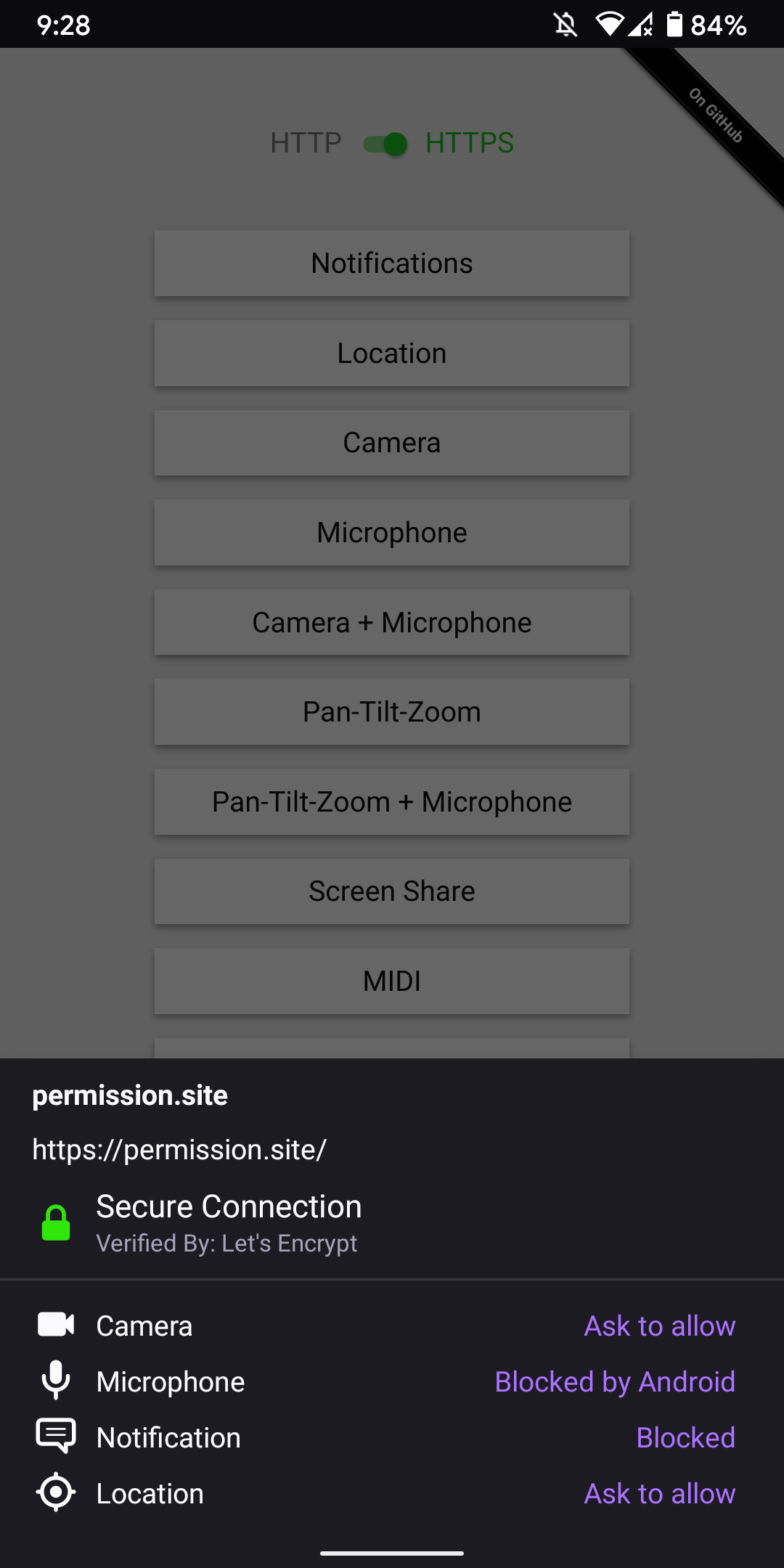
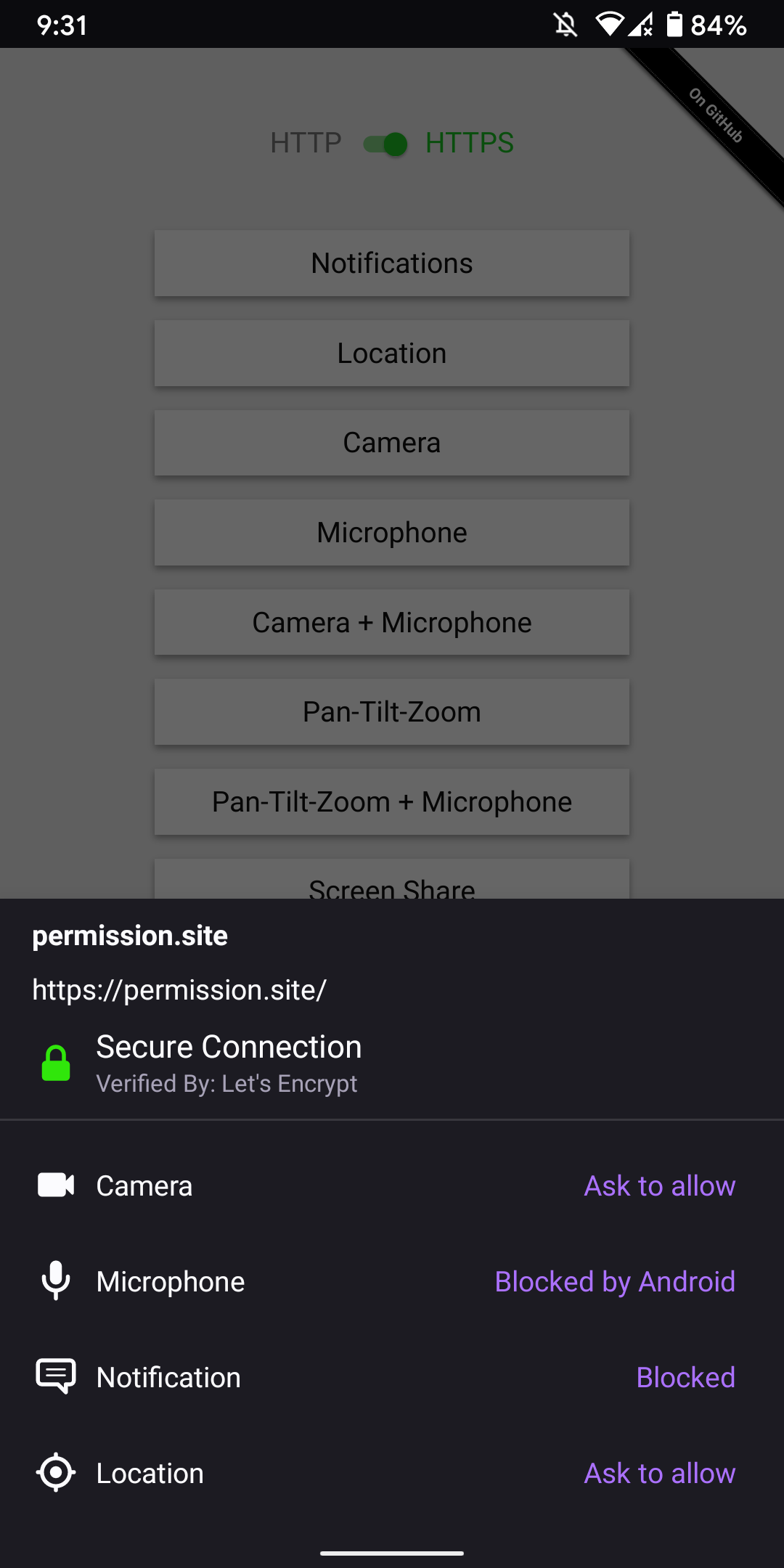
- Open app and navigate to "permission.site".
- Enable the "https" version.
- Tap on one of the options that generates the site permission pop up such as Location.
- Check the "Remember decision for this site" and tap on "allow".
- Tap the "Lock" icon for the site.
- Scan screen.
Expected behavior
There are no suggestions to make any changes.
Actual behavior
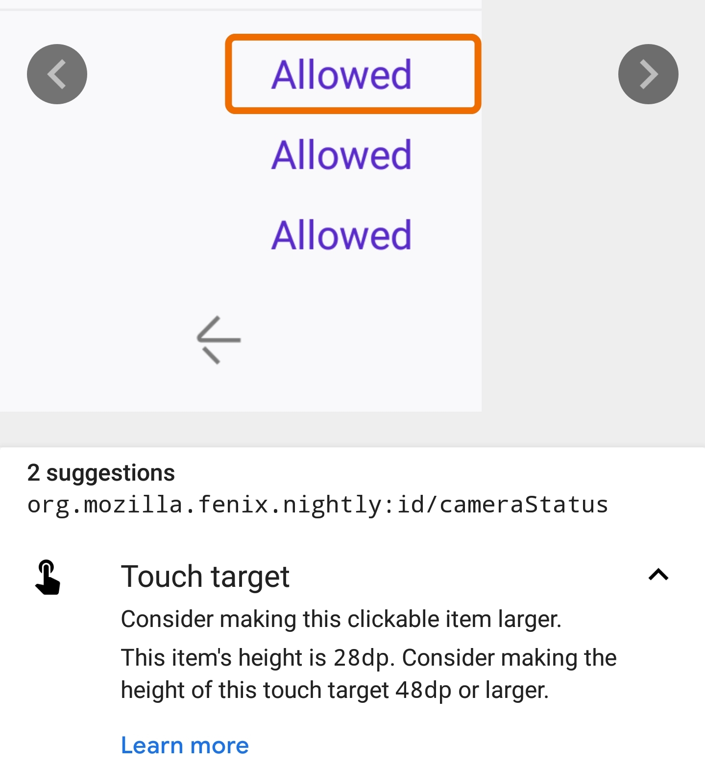
Site permission details - Location status
- org.mozilla.fenix.nightly:id/locationStatus
This item's height is 28dp. Consider making the height of this touch target 48dp or larger.
Device information
- Android device: Samsung Galaxy S9 (Android 8)
- Fenix version: Nightly 4/7 (Build #20980610)
Note:
- The same actual result is present for "Camera" or "Microphone" status field the height is 28 dp.
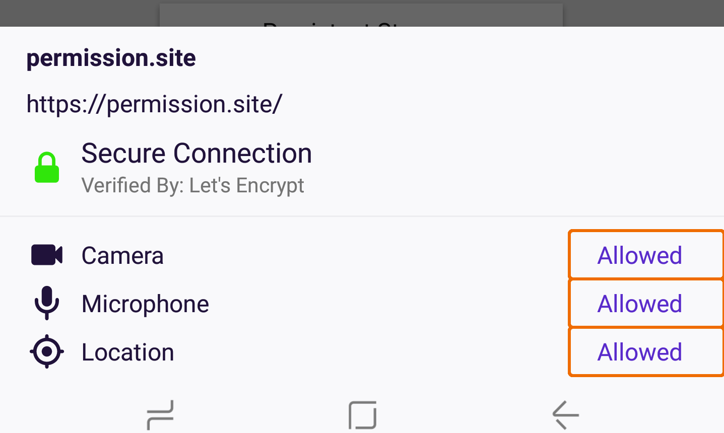
- It needs to be taken into consideration that when one site contains multiple permissions, the space between the saved permissions the height is limited please check last screen.
Screen:
Site permission details - "Location" status
Site permission details
 Diana-Rus
All 5 comments
Increasing touch target will mean increasing the size of the items so the layout will change.
Asking for UX feedback if this should be done or not.
 Mugurell
on 21 Jul 2020
Mugurell
on 21 Jul 2020
Assigning to @brampitoyo
 AmyYLee
on 23 Jul 2020
AmyYLee
on 23 Jul 2020
@Mugurell If we increase it to 48dp as recommended, would you be able to post a screenshot?
It’s likely going to be fine for the layout. We just need to double-check and make sure that it doesn’t break anything or introduce awkward empty spaces.
 brampitoyo
on 27 Jul 2020
brampitoyo
on 27 Jul 2020
@Mugurell If we increase it to 48dp as recommended, would you be able to post a screenshot?
It’s likely going to be fine for the layout. We just need to double-check and make sure that it doesn’t break anything or introduce awkward empty spaces.
It would indeed look better:
| Current | Proposed |
 |
 |
Mugurell
on 27 Jul 2020
@Mugurell Looks great to me!
brampitoyo
on 27 Jul 2020
Related issues
 phileastv
·
3Comments
phileastv
·
3Comments
 ekager
·
3Comments
ekager
·
3Comments
 csadilek
·
3Comments
csadilek
·
3Comments
 lindongbin
·
3Comments
lindongbin
·
3Comments
 abodea
·
3Comments
abodea
·
3Comments
Most helpful comment
@Mugurell Looks great to me!