Fenix: [Bug] consider increasing contrast of "search language" placeholder text
Steps to reproduce
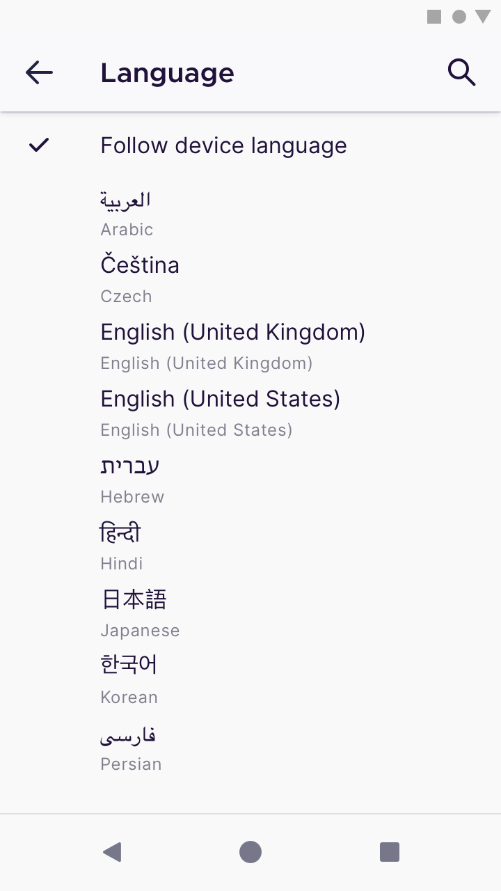
Navigate to Settings -> Language
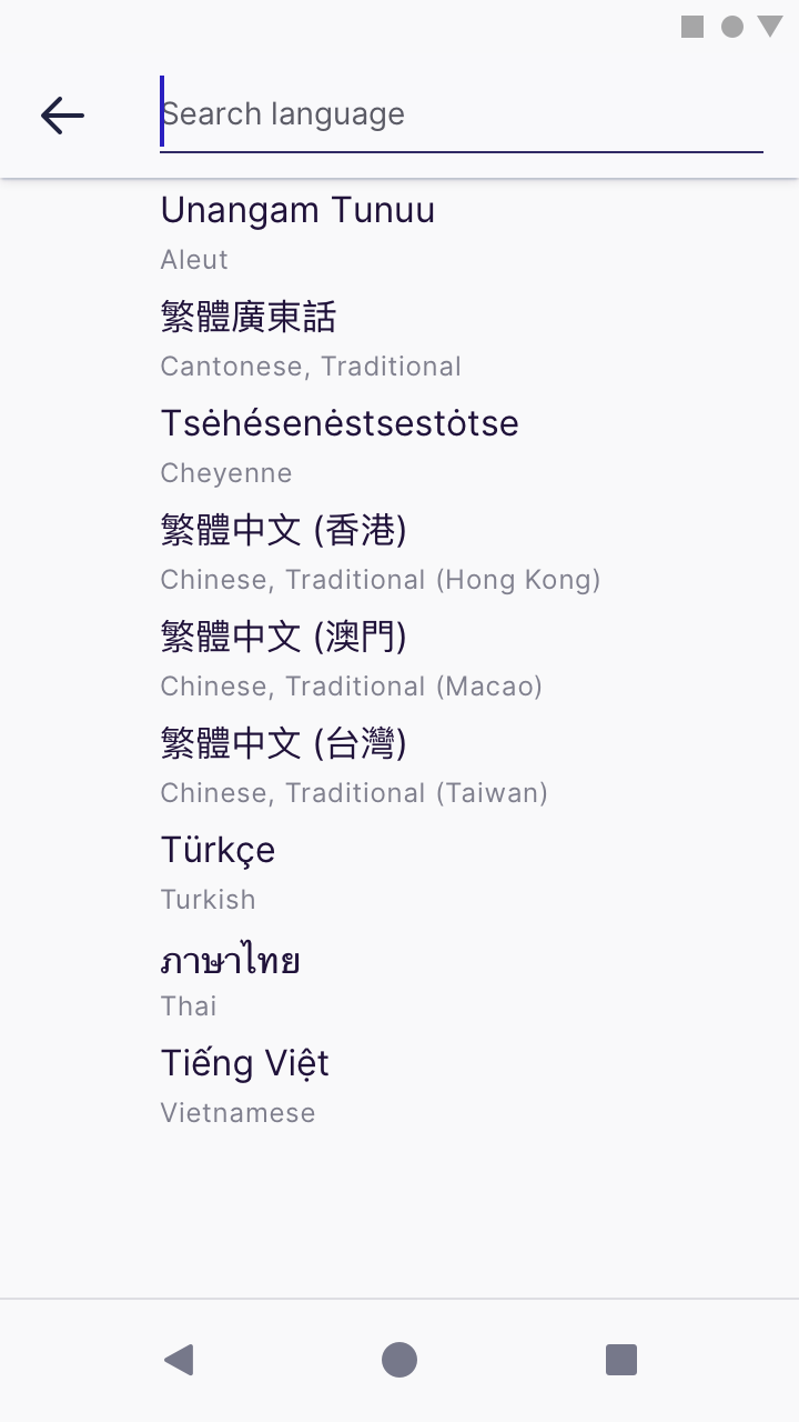
Inspect search field for "search language" placeholder text and notice low contrast gray text on gray background
Expected behavior
higher contrast text over background
Actual behavior
lower contrast text over background
Device information
- Android device: Galaxy S10e
- Fenix version: 4/3 Nightly
 asadotzler
All 7 comments
@brampitoyo does this text conform to AA or AAA for text contrast?
 kbrosnan
on 8 Apr 2020
kbrosnan
on 8 Apr 2020
@asadotzler @kbrosnan Unfortunately, our placeholder texts don’t pass WCAG 2.0 AA or AAA.
Changing the colour of this placeholder text will impact how the URL is displayed inside the address bar and search screen, so that’s a bigger conversation that we should have with @AmyYLee and @shorlander.
In the meantime, we have two options to fix the search box inside Language settings:
- Keep the box the same colour (fill Grey Light 30
#e0e0e6), but darken the placeholder text so it’s the same colour as the rest of the text (On-Light Ink 80#20123a)
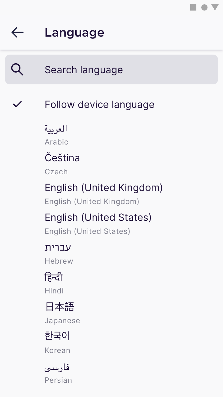
- Lighten the box (fill White
#ffffff, border Grey Light 30#e0e0e6), but keep the placeholder text the same colour (Grey Light 90#80808e)
Either way, let’s make sure that the placeholder text size is the same as the text size we use for labels (16dp).
Any thoughts?
 brampitoyo
on 8 Apr 2020
brampitoyo
on 8 Apr 2020
"Keep the box the same colour (fill Grey Light 30 #e0e0e6), but darken the placeholder text so it’s the same colour as the rest of the text (On-Light Ink 80 #20123a)"
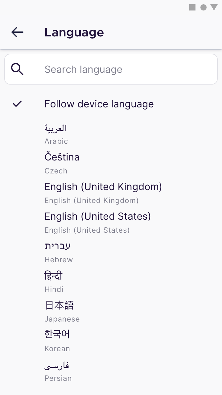
@brampitoyo My recommendation is for Option 1 so we keep the search bar colour consistent with the browser search bar. As for the placeholder text. Can we have this updated across the app to be Dark Grey 5 (#5B5B66). It's still a bit lighter than regular text but passes contrast test. I've updated this in the UI library.
 AmyYLee
on 14 Apr 2020
AmyYLee
on 14 Apr 2020
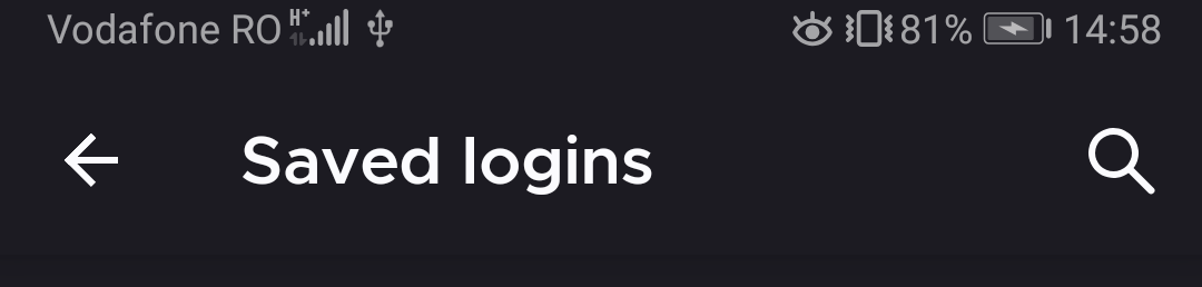
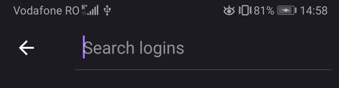
@AmyYLee For consistency, shouldn't we use the same search bar in all app searches? For example, in the saved logins there is another search field, in the "title bar" that expands.
As for the hint (placeholder) color Dark Grey 5 (#5B5B66) should be for all themes?
Also cc @vesta0: are we considering adding a search to history and bookmarks?
 mcarare
on 15 Apr 2020
mcarare
on 15 Apr 2020
@mcarare that's a good idea to consider for future, although history and bookmark items already get pulled when user starts typing in the search/url bar.
 vesta0
on 17 Apr 2020
vesta0
on 17 Apr 2020
@mcarare @AmyYLee Yes, I agree. For consistency, I think that we should use the same search bar as the one found on “Saved logins”.
The way to access this search UI is also the same: through a search magnifying glass icon on the top-right corner of the app bar.
By adopting this solution and Amy’s colour value, we’ll solve the placeholder text colour contrast issue.
brampitoyo
on 20 Apr 2020
Hi, I can confirm that the new Search field is displayed on the Language selection option.
Build:
- Firefox Preview Nightly 3/30 #21210606.
Devices:
- Google Pixel 3 (Android 10);
- Samsung Galaxy Note 8 (Android 9);
- LG G7 fit (Android 8.1).
 sv-sdeiac
on 30 Apr 2020
sv-sdeiac
on 30 Apr 2020
Related issues
 andreicristianpetcu
·
3Comments
andreicristianpetcu
·
3Comments
 csadilek
·
3Comments
csadilek
·
3Comments
 lindongbin
·
3Comments
lindongbin
·
3Comments
 robsmith11
·
3Comments
robsmith11
·
3Comments
 Chris01277
·
3Comments
Chris01277
·
3Comments