Fenix: [Bug] Find in page blocks tab switching
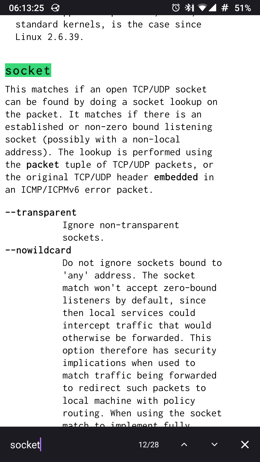
When you search something on the page tab switching becomes inaccessible. To switch to another tab you need to cancel and loose the current search that requires more actions and very inconvenient.

All 10 comments
This is currently the intended design.
So the intended design is very bad.
I'd prefer to loose vertical screen size for search bar, rather than loose time on tab switching.
Moreover, closing the search looses search position. So you can't search something, switch to another tab, switch back and continue to the current search result or a next one.
@532910 Would you prefer this behaviour?
- “Find in” bar sits above address bar (if address bar on bottom) or on bottom of screen (if address bar on top)
- When closed, page position is preserved
Really we shouldn't rely on my preferences, but on reasonable facts. The fist place should take the number of actions and amount of the finger movement. (For example, compare what you need to open a new tab in firefox and chrome mobile. Firefox wins here!)
“Find in” bar sits above address bar (if address bar on bottom) or on bottom of screen (if address bar on top)
Yes, it would be nice.
When closed, page position is preserved
Definitely!
@532910 Thanks for the confirmation!
I will just add two more behaviours:
- If toolbar is on bottom, the “Find in” bar sits above it

- If toolbar is on top, the “Find in” bar sits on the bottom of the screen

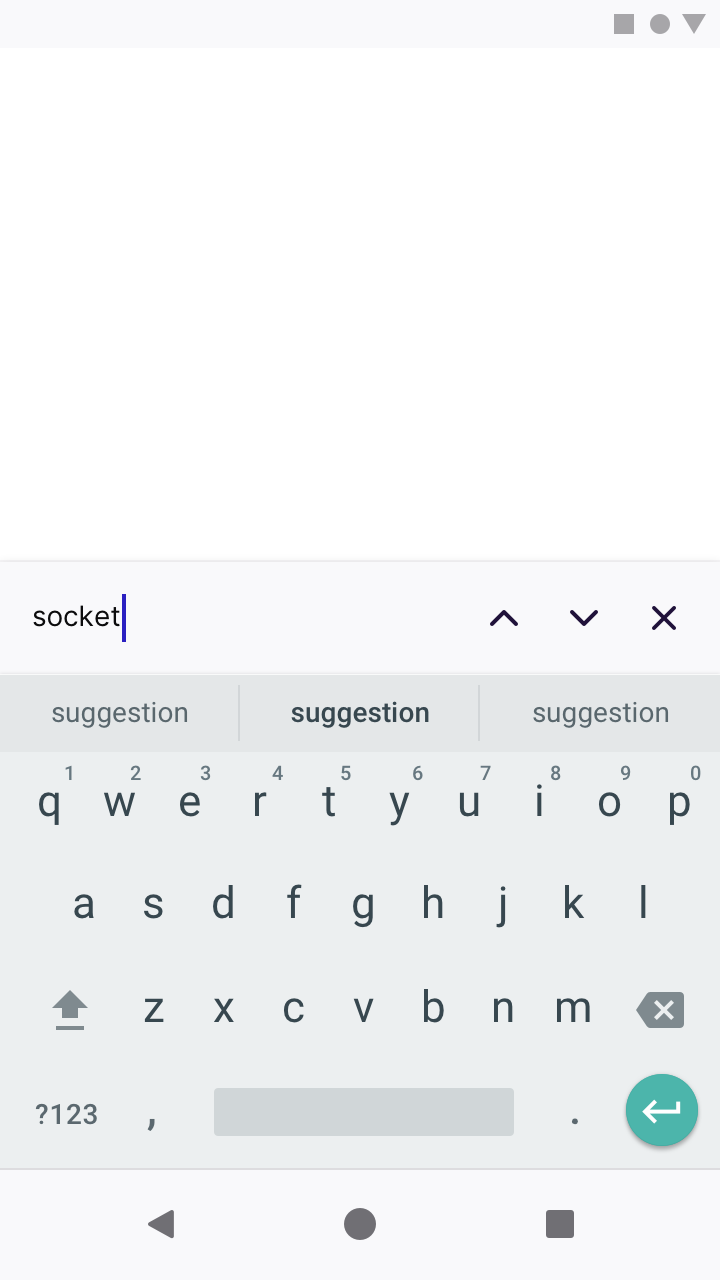
- When the “Find in” bar is selected and the keyboard is up, it should appear above the keyboard.
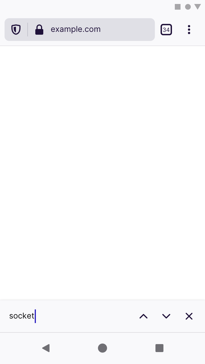
This means that we won’t show the toolbar when it’s positioned on bottom:

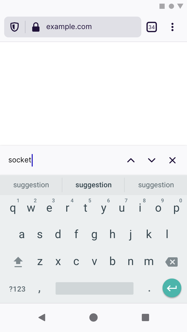
But we will show the toolbar if it’s positioned on top:

- The “Find in ” bar should be kept open until manually closed, even if toolbars are hidden (ie. when scrolling down the page).
- When closed, page position should be preserved.
This means that we won’t show the toolbar when it’s positioned on bottom:
Agree
But we will show the toolbar if it’s positioned on top:
Don't agree, what's wrong with hiding the addressbar in both cases?
@532910 wrote:
…what's wrong with hiding the addressbar in both cases?
If the address bar is hidden by default when the “Find in” bar is shown, then doing actions other than search would take an extra step.
Let’s take your scenario as an example:
…search something, switch to another tab…
If the address bar is hidden, then switching tabs would involve you having to scroll up the page to re-show the address bar.
But if the search bar is already shown, then you can simply tab the multi-tasking button.
Unfortunately, we must hide the bottom address bar because users would see two text boxes: one for the address bar, one for the “Find in” bar – but only the “Find in” text box is active. To prevent confusion, we can only show one.
But when the address bar sits on top of the screen, the text box that appear above the keyboard would only be the “Find in” bar. No confusion there. So we show both.
If the address bar is hidden by default when > Unfortunately, we must hide the bottom address bar because users would see two text boxes: one for the address bar, one for the “Find in” bar – but only the “Find in” text box is active. To prevent confusion, we can only show one.
With "Find in page" placeholder and clearly different layout, I don't think keeping the address bar would be really confusing.
If the address bar is hidden by default when the “Find in” bar is shown, then doing actions other than search would take an extra step.
Clear. But this also means it should be shown in both cases.
I'm also don't think this will confuse and possibly putting the find bar at the bottom in both cases will make it less confusing.
(This isn't really a tabs tray bug, so I'm going to remove Skittle)
Most helpful comment
@532910 Would you prefer this behaviour?