Fenix: [Bug] Bottom search field physically truncated by rounded corner on Redmi Note 7
Steps to reproduce
Open Fenix on a Redmi Note 7
Set toolbar at bottom
Expected behavior
The search field should not be truncated
Actual behavior
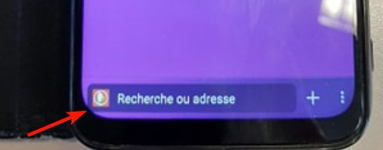
As you can see on this photo, the field is slightly truncated by the rounded corner of the screen.
Device information
Redmi Note 7
- Android device: 9
- Fenix version: #2015726195
 klint
klint
All 7 comments
It's the same with a OnePlus 6T when the toolbar is at the bottom and gesture navigation is on:
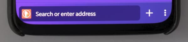
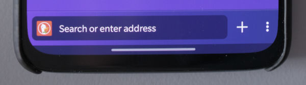
It's less of an issue when there's the gesture blip at the bottom, but things are still clipped a bit. I _think_ this is the current default for most Android phones:
And here's what it looks like with the traditional old-style icon navigation (which is an option, but not the default on Android phones that ship with Android 10 or higher):
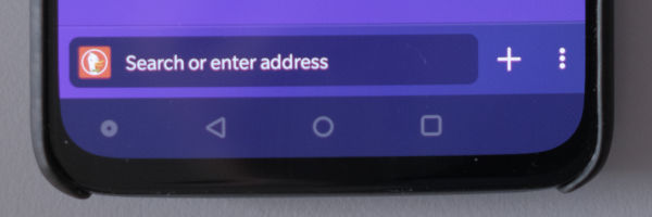
Functionally, everything still works regardless of the state. Other apps do have the same clipping too, but usually it's either: content at the bottom that's clipped or it's navigation at the bottom and it's icon based (without the box).
Dropping the URL/search box would make it look less problematic on edges with rounded corners, but then it wouldn't look clickable (and that's probably a worse issue).
Chrome used to have a flag to enable a bottom bar. It looked like this:
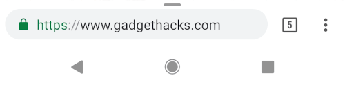
(Source: https://android.gadgethacks.com/how-to/move-chromes-address-bar-bottom-your-screen-android-0176946/)
They've also experimented with icons on the bottom as a replacement:
(Source: https://tunecomp.net/move-chrome-tabs-toolbar-to-screen-bottom-android/)
...however, when I tried it out today, I got fewer icons on the bottom bar and still had a URL bar, so Chrome is probably not the best example to follow. That said, they (intentionally or not) worked around the issue by rounding the URL bar more or using icons instead.
I actually like knowing which page I'm looking at (Chrome has been trying to get rid of this on both mobile and desktop over the past couple years) and it's great to have the common browser actions at my fingertips… so following Chrome's design, at least the more recent ones, would probably be a step back.
Summary:
- It's a visual issue
- Affects phones with curved screens and gesture navigation without a small bar below
- Affects other apps, but usually not as much (due to using icons, not going to the edges, or having clipped content which is usually scrollable)
- Possible solutions
- Remove the URL bar box? (But then it doesn't look clickable)
- Round the URL bar more?
- Use icons instead?
- Padding on the edges?
- Ignore this for the time being?
 garrett
on 4 Mar 2020
garrett
on 4 Mar 2020
Great analysis! Thank you @garrett!
Unfortunately Android offers APIs for querying for display cutouts but doesn't contain any APIs for rounded corners that would allow us to programatically set a different UX in this cases.
Seeing more and more devices with rounded corners I think this kind of issues are important to be addressed and have clear UX directions for the future.
Passing this to ux team to maybe choose a default UX from the above possible solutions.
 Mugurell
on 25 May 2020
Mugurell
on 25 May 2020
Assigned to @brampitoyo
 AmyYLee
on 4 Jun 2020
AmyYLee
on 4 Jun 2020
Thanks for the analysis @garrett and suggestion @Mugurell.
This issue is on my to-do list. I will bring it up with the rest of our team (chiefly @topotropic and @shorlander) and get back to you with a solution.
I believe that rounding the URL bar could be a good solution, but I don’t want to be hasty. After all, this will impact the users of _all_ phone models.
If only there’s a way to programmatically round the bar when it detects phones with rounded corners.
 brampitoyo
on 8 Jun 2020
brampitoyo
on 8 Jun 2020
Until such an API will be available, maybe we could just maintain a list of device models with rounded corners and adjust UI just for devices in that list? 🤔
 mcarare
on 16 Jun 2020
mcarare
on 16 Jun 2020
@mcarare Based on my discussion with the team, we’ve reached this answer: if it’s possible to know when to adapt the UI based on device, then that’s a solution that we should pursue.
If it’s not possible, then we should do nothing, because we are going to make things worse for the majority of devices that aren’t clipping.
brampitoyo
on 18 Jun 2020
Sorry, did not get to leave a comment before closing:
Based on Bram's feedback and the lack of clear, stable APIs to know when the device has "exaggerated" rounded corners and when the gesture navigation is on with the app fully occupying the screen so that this issue may produce it's effects from an engineering perspective there's no feasible solution to know precisely when to adapt the interface.
The only real solution would've been to adapt the current design to better support all devices but based on Bram's comment that is not an options since it may worsen the experience for devices which are not clipping the url bar.
If in the future we'll have the needed APIs or the majority of devices will be affected by this we should definitely reconsider.
Mugurell
on 18 Jun 2020
Related issues
 csadilek
·
3Comments
csadilek
·
3Comments
 topotropic
·
3Comments
csadilek
·
3Comments
topotropic
·
3Comments
csadilek
·
3Comments
 bbinto
·
3Comments
bbinto
·
3Comments
 thelazyoxymoron
·
3Comments
thelazyoxymoron
·
3Comments