Fenix: Nest extension toolbar icons in a submenu entry
Been seeing feedback in various places that it the main menu is overly long when uBlock Origin is installed, and this is just going to get worse as more extensions are supported with toolbar icons.
In addition, it seems to me a little weird that an extension is allowed to place icons in the main menu, which feels like primary UI to me that doesn't really feel like a model that feels clean or thought through.
Why/User Benefit/User Problem
As a user, I would like to not clutter my main menu with extension icons, but still have them easily accessible in order to cleanly separate between Fenix functionality vs. extension functionality, and to make the menu a manageable size on smaller screens.
What/Requirements
- submenu entry labeled "Add-ons"
- Put "Add-ons manager" inside here
- Put extension icons here, like uBlock Origin's toolbar icon
Acceptance Criteria (how do I know when I’m done?)
There is a submenu containing both the add-on manager and add-on toolbar icons.
There is a similar idea in experiments on Chrome desktop, that may be interesting to look at from a UX perspective: https://lifehacker.com/how-to-enable-chromes-new-extension-menu-1837559402
 yoasif
All 15 comments
Thanks for filing @yoasif. I think there's an updated design in the works /cc @brampitoyo.
 csadilek
on 12 Feb 2020
csadilek
on 12 Feb 2020
@yoasif It’s exactly as you’ve described.
Our problem today:
- Fenix’s main menu is too full
- In addition to other items, we have 2 more: “Add-ons Manager” and “uBlock Origin”
- We’re planning to support more add-ons in the future
- To add to our 2 items, we might have anywhere between one and many
The solution:
- Either take add-ons out of the menu
- Or keep it in the menu, but make it scaleable
Solution 2 seems the most realistic in the short term. Note: we should still try other solutions e.g. putting add-ons as an icon in the toolbar, but remember that the toolbar is also full with URL at the moment.
So here’s what I’m proposing – something that we will do post-release:
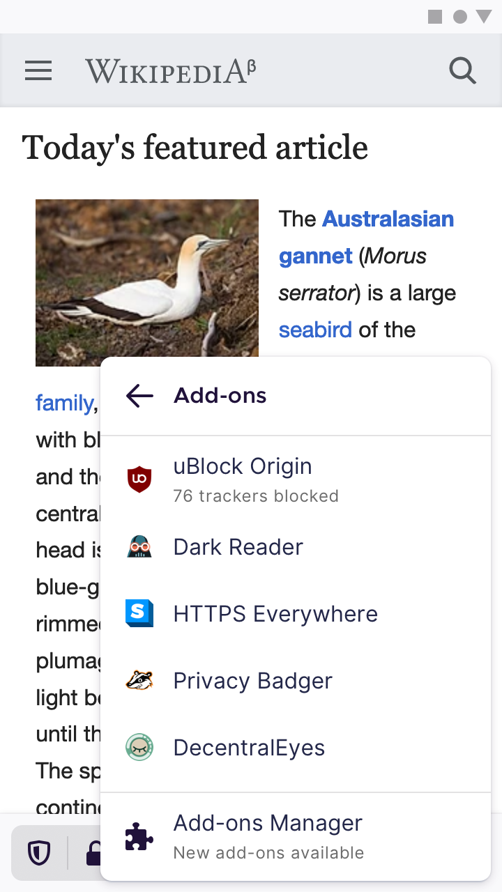
- There’s only one item in the main menu: “Add-ons”
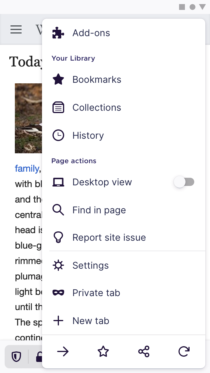
- When tapped, it will show a submenu
- To dismiss, tap anywhere outside the menu
- To go back to the main menu, tap the back arrow – is this necessary?
- For the moment, the first add-on is located up top and Add-ons Manager is on bottom.
- We could think of a more thumb-friendly design, where perhaps the order is reversed.
Any thoughts @yoasif?
 brampitoyo
on 13 Feb 2020
brampitoyo
on 13 Feb 2020
@brampitoyo I like the sub-menu item a lot!
I need to stop watching all issues here because actual replies to me get lost, sorry.
To dismiss, tap anywhere outside the menu
To go back to the main menu, tap the back arrow
This seems smart to me.
We could think of a more thumb-friendly design, where perhaps the order is reversed.
I don't think this is required.
I have a question about ordering the add-ons in the menu, though -- right now it is unclear what order your mockup shows.
yoasif
on 27 Feb 2020
@yoasif Great. Thanks for the feedback, and the very important question about ordering.
I think our ordering should be alphabetical: A–Z.
The user flow looks like this:
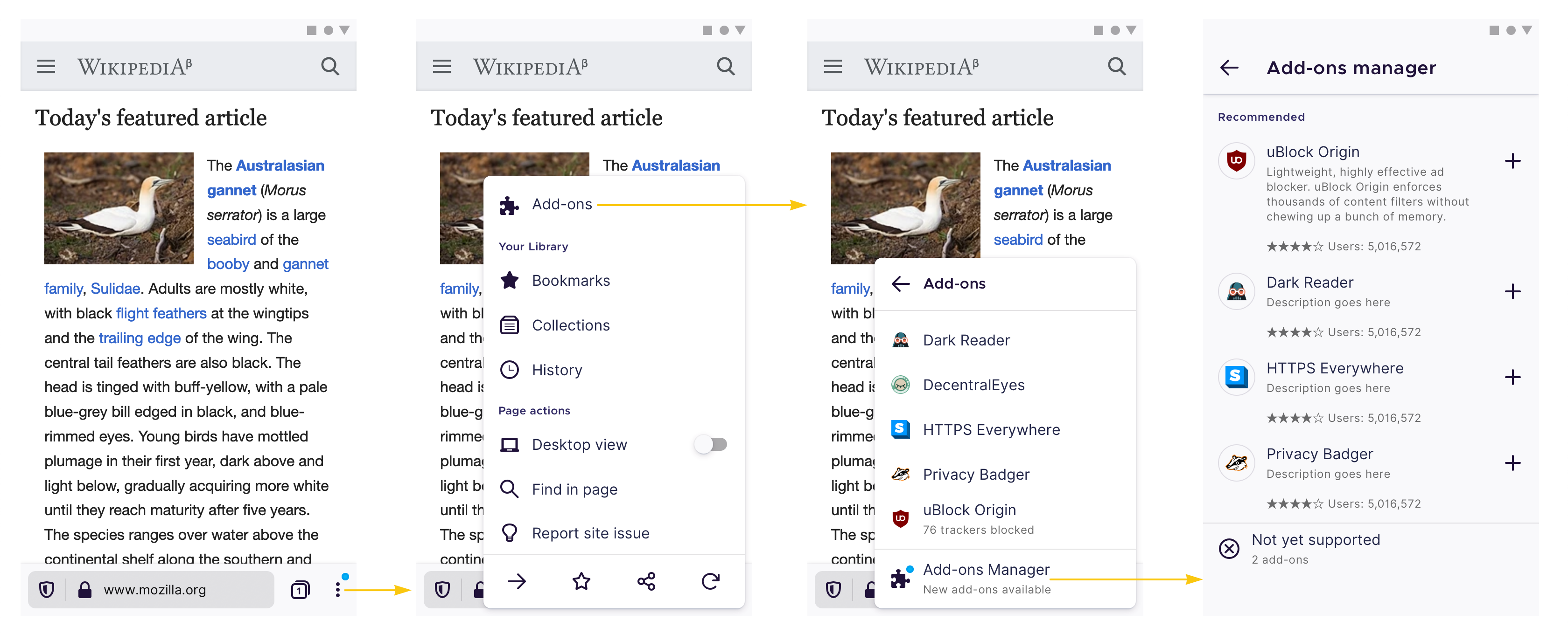
One important thing to be aware of: if users don’t have any add-on installed, we won’t show the submenu. Instead, we simply show “Add-ons Manager” in the main menu. The submenu will show up only after at least one add-on has been installed.
And the inspectable mockups are located here:
https://share.goabstract.com/9c2fe208-c596-420c-b85f-da01df295fdf?
@psymoon I think this issue is now ready for implementation?
brampitoyo
on 27 Feb 2020
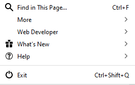
@brampitoyo since the new menu is a sub-menu and not a new page in the app, I think it makes sense to add a "❯" in the main menu next to the add-on menu item.
I think it makes sense to match this as well in the submenu itself with ❮, since you aren't really going back, you are just traversing a menu in both cases.
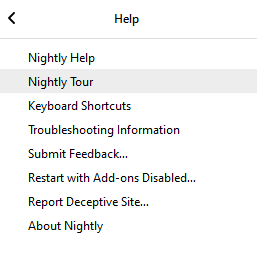
There is also prior art for this in Firefox desktop's main menu, for example:
yoasif
on 27 Feb 2020
@vesta0 I understand there's a bigger menu refactoring going on in fenix right now, should this wait until that is resolved?
 psymoon
on 27 Feb 2020
psymoon
on 27 Feb 2020
I am good with moving forward with this issue as long as #8474 has also been considered.
@brampitoyo I assume your designs are final since this has the eng ready label?
@lime124 @liuche tagging you here to make sure that there isn't any other related work happening.
 vesta0
on 2 Mar 2020
vesta0
on 2 Mar 2020
@vesta0 Correct. This design is final.
@yoasif Agreed. There’s already a way to traverse back to the main menu. In the submenu, use the back arrow to the left of the “Add-ons” heading.
brampitoyo
on 2 Mar 2020
@psymoon I’ve added an important thing to note, above on https://github.com/mozilla-mobile/fenix/issues/8319#issuecomment-591762287
It has to do with the fact that the submenu will only show up after at least one add-on has been installed. If the user hasn’t installed any add-on, we can simply show “Add-ons manager” in the main menu.
brampitoyo
on 2 Mar 2020
@yoasif Agreed. There’s already a way to traverse back to the main menu. In the submenu, use the back arrow to the left of the “Add-ons” heading.
I know -- I'm talking about the addition of an affordance in the main menu that shows that this is a submenu (right facing arrow).
yoasif
on 2 Mar 2020
@yoasif Android doesn’t have the right-facing arrow affordance, but Firefox for Android does. Let me think about this some more – but just for the moment, I think it’s okay not to have it.
brampitoyo
on 5 Mar 2020
It would be great if the old swipe-up toolbar that was removed could be repurposed for extensions. Have it function just like it does on desktop, long-press opens a menu allowing you to move the icon to the overflow menu (the main Add-ons submenu you're discussing here). You could fit up to 8 icons across depending on screen resolution. This would allow extensions to function in a more traditional way on mobile, generating their own overlay popups without navigating away from the page and require less modification from extension developers.
 hackel
on 8 Mar 2020
hackel
on 8 Mar 2020
@yoasif this is available in nightly now.
psymoon
on 2 Jun 2020
@psymoon Yes, it is great! :+1:
yoasif
on 2 Jun 2020
Verified as fixed on Fenix Nightly Build 21550609 GV 78.0a1 from 6/3 with Huawei P9 Lite (Android 7), Nexus 5 (Android 6.0.1).
✔️ The submenu is showing up only after at least one add-on is installed, and the right chevron arrow is visible.
✔️ If there is no add-on installed, the “Add-ons manager” will open when Add-ons is tapped.
✔️ The add-ons ordering is alphabetical: A–Z.
✔️ In the submenu, using the back arrow to the left of the “Add-ons” heading, is traversing back to the main menu.
✔️ Tapping anywhere outside the menu, will dismiss the submenu.
✔️ The Add-ons Manager is at the bottom of the submenu, after the installed add-ons.
I will remove the qa:needed.
 ebalazs-sv
on 3 Jun 2020
ebalazs-sv
on 3 Jun 2020
Related issues
 abodea
·
3Comments
abodea
·
3Comments
 softvision-miralobontiu
·
3Comments
softvision-miralobontiu
·
3Comments
 AndiAJ
·
3Comments
AndiAJ
·
3Comments
 andreicristianpetcu
·
3Comments
andreicristianpetcu
·
3Comments
andreicristianpetcu
·
3Comments
andreicristianpetcu
·
3Comments
Most helpful comment
@yoasif Android doesn’t have the right-facing arrow affordance, but Firefox for Android does. Let me think about this some more – but just for the moment, I think it’s okay not to have it.