Fenix: [Bug] There is no limit of how many top-sites you can add
Update from UX:
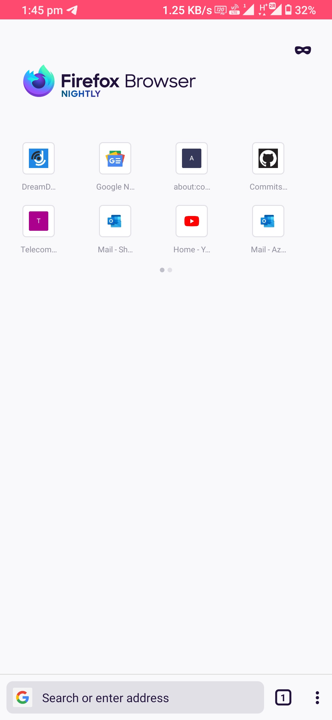
- To keep the design scalable, let's limit top sites to 16 (2 x 8 swipe-able, see screenshot and please ignore the pin icon on the first three tabs for now)
- Once people add their 9th top site we show dots below top sites to indicate that there's more
- People can swipe (similar to how it works in Fennec) to see their 9th-16th top site
- When people are about to add a 17th top site a dialog is displayed telling them that they reached the max amount for top sites

Original request:
Steps to reproduce
- Launch Fenix.
- Add 50+ top-sites.
Expected behavior
There should be a limit regarding how many top-sites you can add.
Actual behavior
50+ top-sites can be added.
Device information
- Android device: Samsung Galaxy S10+(Android 9)
- Fenix version: Latest Nightly from 2/11.

 abodea
All 47 comments
Paging @topotropic for feedback. Should there be a limit to how many items users can add under Top Sites?
@mcarare just to be aware of the fact that most users will probably not create enough Top Sites to ever see this problem.
 brampitoyo
on 1 Apr 2020
brampitoyo
on 1 Apr 2020
@topotropic to follow-up
 AmyYLee
on 4 Jun 2020
AmyYLee
on 4 Jun 2020
Let's limit to 8 top sites (2 rows a 4 sites) – when people add the 9th top site we remove the oldest.
 topotropic
on 4 Jun 2020
topotropic
on 4 Jun 2020
@topotropic:
I already saw a screenshot of a user with more top sites. Why should this be limited at all? Sure, it doesn't look great but it's the user's decision, no? I don't need top sites at all but if it's useful for someone to have 20 top sites or even more why should this not be allowed? Is there a technical reason why it should be limited? Unfortunately there is no explanation in this issue what the benefit of such a limit is.
Please also note that with the new tabs tray and the removal of the tabs from the start screen there is more room that could be used for top sites now - when the user wants it.
Also I am not convinved that it's a good idea to remove the oldest top site when trying to add more top sites than allowed. If I were to use the top sites feature, I would probably add the most important website at first. But with this proposal the website I consider as the most important will be the first website that get removed again.
 cadeyrn
on 4 Jun 2020
cadeyrn
on 4 Jun 2020
We want to keep our design scalable for other things we want to add to the homescreen (synced tabs, bookmarks, etc)
Should be a non-destructive method.
 liuche
on 4 Jun 2020
liuche
on 4 Jun 2020
for release minimum, we need to have a way to cap this before release, but can improve it in subsequent releases.
liuche
on 4 Jun 2020
Strings for the dialog when top site limit is reached.
Top site limit reached
To add a new top site, remove one. Touch and hold the site and select remove.
OK, Got It
 betsymi
on 12 Jun 2020
betsymi
on 12 Jun 2020
As discussed with @gabrielluong we are not setting a limit on how many topsites you can add since we cannot accommodate our various screen layouts and sizes (tablet and landscape) with a set number of top sites.
AmyYLee
on 23 Jun 2020
Can somebody here please clarify me that you are not going to limit the number of Top Sites I can add? Top Sites are a very important feature for me. And they act like a Speed Dial for me, I use them very frequently regularly. And I'm not with having a swipe menu either, there's reason why I called them Speed Dials, they should be accessible very speedily. As said in the comment here: https://github.com/mozilla-mobile/fenix/issues/8312#issuecomment-607006900 most users are never going to have too many top sites to have the issue this issue is mentioning. I'm a very avid user of Top Sites and I have never created too many top sites. My current top sites are about 30.
@topotropic please don't remove the last oldest top sites or any of them! Top Sites are an extremely important feature for me and I cannot afford to lose a single Top site, in fact I'm going to file a new issue asking to add an undo button when each top site is deleted.
Please keep this feature's behaviour as it is right now there's no need to add or remove anything to related to number of Top Sites, I think. Nobody is going to create too many top sites and even if they do it it should be their choice they will do this by keeping in mind that other parts of the homescreen are going to be hidden further and they will know this. Please, I request you to don't limit the number of sites I can add to top sites or try to delete them suddenly out of nowhere! There's a reason why users are asking the top site to be synced #7936 because they are just as important.
~If you still insist on giving the Top Sites a limited area in Fenix homescreen. I would suggest instead of making the top sites scroll horizontally make them scroll vertically by giving them a certain amount of area on the Fenix homescreen and then allow all the extra top sites more than the given area to be scrolled vertically. I am not sure if this is a good solution engineering-wise and aesthetics-wise but as the human brain is hard-wired to look things vertically easily not horizontally this will make it easy to find the top sites and swiping horizontally is harder than swiping vertically too. And I think these may be the reasons why most things in mobile as well as desktops scroll most of the things vertically not horizontally.~
~But it'll also make it harder to scroll the Fenix's homescreen itself. I am really not sure what to do here.~
~Please let me know if I should file a new issue for this idea. I'll be waiting.~
Update: forget about what I said about making the top sites scroll vertically within a given space. It's not a good idea! But if you're still going to limit number of top sites then at least make the grid more bigger something like 5×5 would work. Or you could just let the users decide the grid's length and width by giving them the control. By default you can keep the layout to 2×4 or whatever then give the control to users like me to have as many top sites as I want (to be honest I don't think I'll go beyond 30 or so top sites).
Thanks!
 ghost
on 23 Jul 2020
ghost
on 23 Jul 2020
@gabrielluong I really like the idea of re-using the concept of Firefox Lite to have multiple slides for users with more top sites. It solves the problem of keeping the design scalable but it still allows users to add more than eight top sites.
With this concept in place is it really necessary to limit the top sites to a maximum of two slides for users who really want to use more top sites? I agree it's useful to have a limit because 100 slides (to be extreme) would obviously cause other issues. But it should be possible without a big risk to give the user the option to have… let's say… five rows. What do you think?
cadeyrn
on 24 Aug 2020
From @topotropic on the pager dot colours,
lighter color is <color name=“light_grey_30”>#E0E0E6</color>
and darker color <color name=“light_grey_50">#BFBFC9</color>

and for dark mode:
lighter color
<color name=“dark_grey_05”>#5B5B66</color>
darker color
<color name=“dark_grey_40">#3A3944</color>
 gabrielluong
on 24 Aug 2020
gabrielluong
on 24 Aug 2020
The new top site design is bad...💔
The screen can definitely accommodate 5 icons so why 4 icons? Also why just 2 rows for top sites when there is too much space in the homescreen??
 sheikh-azharuddin
on 25 Aug 2020
sheikh-azharuddin
on 25 Aug 2020
there must be a customisable option to configure number of columns and number of rows like android quick toggle panel
sheikh-azharuddin
on 25 Aug 2020
The screen can definitely accommodate 5 icons so why 4 icons?
This issue is not about the layout, this feedback belongs to #13765. See also https://github.com/mozilla-mobile/fenix/pull/14116#issuecomment-679257809:
The proper layout of the items and grid will be done in #13765.
Also why just 2 rows for top sites when there is too much space in the homescreen??
This was already answered:
We want to keep our design scalable for other things we want to add to the homescreen (synced tabs, bookmarks, etc)
Also note that for other users collections are shown on the homescreen. To have multiple slides is a great solution because more than eight top sites are possible and still easy accessible but it allows to keep the design scalable for other things. But as I said in my previous comment, it would be great to allow more slides than only two.
cadeyrn
on 25 Aug 2020
Uff this synced tabs and collection.... These are promoted everywhere... The desktop version has synced tabs setting hidden but in mobile version this is being promoted too much!
The collection is being given too much importance compared to top sites when there is literally no difference between these 2... Unless collections are synced...these add an extra step to access as compared to top sites.
After reading this many will see sync feature is being considered as per #xxxxx number which is literally I am hearing since months!
The homepage should be customisable as per as user choice...in particularly the number of number of icons and rows should be flexible so that user can change as per as device screen size or need . I have a large screen device and icons now feels too far apart. This is probably because the icons have fix size px rather than scable size%
In a nutshell now it is difficult to access top sites as I need to take one more step to scroll.. Not to mention there is no option to rearrange the top sites adding another frustration!
sheikh-azharuddin
on 25 Aug 2020
[collections] These are promoted everywhere
For the startscreen it's already solved by #12377. It doesn't belong to this issue.
Unless collections are synced
That's #6512. It doesn't belong to this issue.
The homepage should be customisable as per as user choice
This depends on the specific features on the startscreen. So far everything can be removed from the home screen. I can't speak about future features that are not yet implemented. But it doesn't belong to this issue.
in particularly the number of number of icons and rows should be flexible so that user can change as per as device screen size or need
It doesn't make much sense to customize the number of items per row. It has to work out of the box. But as I already told you that's #13765 and doesn't belong to this issue.
In my opinion the number of rows doesn't need to be customizable with the new slides implementation. But at least this feedback is on-topic. If other people think three rows are better, I won't argue against.
But the advantage of the slides concept is that no customization option is needed to have more top sites. A second slide will only be displayed if there are more top sites. The same idea would work for three, four or five slides. But at the moment there is a limit of two slides. So incrasing the limit would give more flexibility to the users while keeping the home screen clean.
Not to mention there is no option to rearrange the top sites adding another frustration!
That's #8305. It doesn't belong to this issue.
cadeyrn
on 25 Aug 2020
Hi all,
I don't see the benefit in having a limit. In any case by only allowing 8 on screen at a time the limit really becomes 8, regardless of how many slides there are.
Any limit could be compensated for by finally adding #10342 (frequently used sites) which is a feature I'm sure many people migrated from Fennec will miss.
Cheers 🙂
 madb1lly
on 25 Aug 2020
madb1lly
on 25 Aug 2020
In any case by only allowing 8 on screen at a time the limit really becomes 8, regardless of how many slides there are.
Nope. Did you already try it? I already know this from Firefox Lite and it's really not that bad. It's definitively not the same as only having one slide with a limit.
cadeyrn
on 25 Aug 2020
But why have slides when whole screen can be utilized... You say screen can be used for other things like synced tabs and bookmarks.... Do you really think the screen can accommodate all the bookmarks? It is just a mini screen device 5-6" and everyone is expectating to fit everything! The synced tab is being promoted everywhere... Tab menu, 3 dot menu and the only place left was home screen... Now i am hearing there also it will be added😓
@cadeyrn for some things you said this is referenced here and there and not related to this which I don't understand... When you do a change it directly or indirectly affect other things and user experience... The number of icons and layout is limited so obviously user will demand customizations but you say that one is part of another request! 😬😬
So fix those issues first and then limit the features....
sheikh-azharuddin
on 25 Aug 2020
You say screen can be used for other things like synced tabs and bookmarks.... Do you really think the screen can accommodate all the bookmarks?
I didn't say this, it was said by a Mozilla team member and I quoted it. I can't answer your question because I can' talk about a feature that is not yet implemented. But so far nobody said that _all_ bookmarks will be displayed on the homescreen. But again: It's the wrong issue to discuss this.
The synced tab is being promoted everywhere... Tab menu, 3 dot menu and the only place left was home screen... Now i am hearing there also it will be added😓
It was mentioned as an example, I don't think it's already clear at all how the new homescreen will look like. There is still no UX spec and we have to wait to see what Mozilla's plans are. But again: It's the wrong issue to discuss this.
@cadeyrn for some things you said this is referenced here and there and not related to this which I don't understand... When you do a change it directly or indirectly affect other things and user experience... The number of icons and layout is limited so obviously user will demand customizations but you say that one is part of another request! 😬😬
Please just read the title of the issue: This issue is about the limit of how many top sites you can add. It's not about the layout of the top sites, not about collections, not about synced tabs, not about bookmarks. This is not a meta issue about every aspect of the homescreen. It's about one specific task and I told you the issues numbers where you can discuss the other topics. With too much off-topic it's unnecessarily difficult for the developers to follow the relevant parts of the discussion about the top sites limit.
cadeyrn
on 25 Aug 2020
Hi @sheikh-azharuddin,
Here's a signpost I hope you find helpful => #12065.
Cheers 🙂
madb1lly
on 25 Aug 2020
Hi @sheikh-azharuddin,
Here's a signpost I hope you find helpful => #12065.
Cheers 🙂
Developer own story🤣🤣
I am using Firefox till it is user friendly and secure ....i think that day is near when I will switch to edge or chrome 🙏🏼
sheikh-azharuddin
on 25 Aug 2020
Displeasure in the wild: https://www.reddit.com/r/firefox/comments/igheq5/current_firefox_version_made_me_remove_it_from/g2u00sr/
even worse today nighlty build had redisigned home page we can have 8 top sites at max, this is unbearable I finally switched to a Samsung internet and as for now zero regrets
Agree with some other folks here - I don't quite understand why there is a limit at all. Pagination makes it scalable to begin with.
 yoasif
on 25 Aug 2020
yoasif
on 25 Aug 2020
Hi, this looks really weird when you set the android display size to smallest(from android settings)

I don't see why we need to have the hard limit at 8 when the screen can clearly accomodate more in the same space. Looking at the screen shot you can fit 16 there easily
As a side note, it would be great if all ui changes were tested with different display sizes
 s-ankur
on 25 Aug 2020
s-ankur
on 25 Aug 2020
this looks really weird
https://github.com/mozilla-mobile/fenix/pull/14116#issuecomment-679257809:
The proper layout of the items and grid will be done in #13765.
cadeyrn
on 25 Aug 2020
@cadeyrn I am not sure how the layout could be fixed while still limiting the max number of top sites to 8(which I think is the current issue). Forgive me if I am missing something obvious here. _(I think you meant to quote #13765.)_
Edit: looking at #13765, it does feel like the proper place for this feedback. disregard
s-ankur
on 25 Aug 2020
(I think you meant to quote #13765.)
Thanks. I have no idea how i managed to change the number when copying the quote. I fixed my previous comment.
cadeyrn
on 25 Aug 2020
Hi all,
Looking at what we now have, there is no way this issue should have been marked bug - it's a usability preference at best not a bug. Personally I consider the new top sites layout more of a bug than the previous one.
Cheers 🙂
madb1lly
on 26 Aug 2020
Hi all,
Looking at what we now have, there is no way this issue should have been marked bug - it's a usability preference at best not a bug. Personally I consider the new top sites layout more of a bug than the previous one.
Cheers 🙂
The new layout is simply trash! Also check user frustration in reddit
sheikh-azharuddin
on 26 Aug 2020
is simply trash!
https://www.mozilla.org/en-US/about/governance/policies/participation/:
Be Respectful
Value each other’s ideas, styles and viewpoints. We may not always agree, but disagreement is no excuse for poor manners. Be open to different possibilities and to being wrong. Be respectful in all interactions and communications, especially when debating the merits of different options.
cadeyrn
on 26 Aug 2020
Uff sorry @cadeyrn Mozilla fanboy.... Do Mozilla listens..or they simply do what they think is right! .
sheikh-azharuddin
on 26 Aug 2020
@cadeyrn : you said that the current limit is 2 slides? But I had far more than 16 top sites before this was implemented and now I have 5 slides which I can swipe to. The only issue is that there are only 2 progress dots instead of 5.
Édit: all that being said, why is there a limit on the the number of slides here? Apart from the wrong number of dots, it is quite usable with more than 2 slides.
 klint
on 26 Aug 2020
klint
on 26 Aug 2020
Another comment on the swipe action itself : maybe because it is an horizontal swipe on a narrow band at the top of the screen, I find it rather uneasy to swipe. It often ends up in a diagonal gesture that actually scrolls the page down instead of scrolling through the slides...
klint
on 26 Aug 2020
Uff sorry @cadeyrn Mozilla fanboy....
I am a "fanboy" because I asked you not to be disrepectful. Wow, against such a logic it's hard to argue… Really, it's not okay how you interact with other people! 😐
you said that the current limit is 2 slides? But I had far more than 16 top sites before this was implemented and now I have 5 slides which I can swipe to.
Interesting. Maybe I misunderstood the code? @gabrielluong should be able to clarify. 😊
cadeyrn
on 26 Aug 2020
Currently, it is indeed designed to be a max of 16 top sites displayed in 4 x 2 grid. We can revisit the max of 16 top sites. I imagine the rationale for the 4 x 2 grid and paging is to preserve the vertical space of the home screen. This is an active development space, so expect continual improvements.
gabrielluong
on 26 Aug 2020
you said that the current limit is 2 slides? But I had far more than 16 top sites before this was implemented and now I have 5 slides which I can swipe to.
Interesting. Maybe I misunderstood the code? @gabrielluong should be able to clarify. 😊
@cadeyrn It seems the code was changed yesterday as I'm able to swipe through 2 slides only, now. Which I find quite sad, as I don't really understand why the slides should be limited to 2 (and 16 top sites), after being able to play with more yesterday :)
klint
on 27 Aug 2020
Another comment on the swipe action itself : maybe because it is an horizontal swipe on a narrow band at the top of the screen, I find it rather uneasy to swipe. It often ends up in a diagonal gesture that actually scrolls the page down instead of scrolling through the slides...
FYI, I have opened a new issue #14287 that is somehow related to my remark above
klint
on 27 Aug 2020
I don't agree on limiting top sites: I use many and don't want any limit, it's my decision how much top sites I should see.
However I agree about adding "dots below top sites to indicate that there's more", once reached a limit (maybe 2 rows?).
But ONLY if fenix remembers the user choice about showing all top sites or showing less rows and the dots.
If the user want to see all top sites he just taps on the dots, and fenix will always show all top sites, without limits.
 tortino
on 28 Aug 2020
tortino
on 28 Aug 2020
User customisation of rows and columns could be very useful. Current solution with two sides of the Top Pages is not comfortable and is much worse than previous version. Sliding between two sides is really annoying. I hope, that in next updates it will be improved.
 OUTDOOOR
on 28 Aug 2020
OUTDOOOR
on 28 Aug 2020
I have tested the issue on Firefox Preview Nightly 200831 (Build #2015761139). Only 16 websites can be added to topsites, however when trying to add the 17th top site there is no dialog informing the user that they reached the max amount of top sites.
Devices used:
- OnePlus 6T (Android 9)
- Huawei MediaPad M3 (Android 7.0)
 LaurentiuApahideanSV
on 31 Aug 2020
LaurentiuApahideanSV
on 31 Aug 2020
I have tested the issue on Firefox Preview Nightly 200831 (Build #2015761139). Only 16 websites can be added to topsites, however when trying to add the 17th top site there is no dialog informing the user that they reached the max amount of top sites.
Devices used:
- OnePlus 6T (Android 9)
- Huawei MediaPad M3 (Android 7.0)
@LaurentiuApahideanSV Thanks for the catch! I have filed #14529 for the dialog. This wasn't a release blocker for this feature so I didn't end up implementing it just yet.
gabrielluong
on 31 Aug 2020
@LaurentiuApahideanSV Given the above, should we say this is qa-verified? I am also curious about the qa on the add/remove top sites. The visited sites should display "Delete from history" and also delete the item from the History.
gabrielluong
on 31 Aug 2020
@gabrielluong I just tried this and without that limitation, users can re-try adding a top site 10 times until they give up. Doing so, will create a queue of 10 identical items to add to the top sites list, and once you remove a top site it gets added. If you have the same website 10x times in that list, you will see it and have to remove it 10 times to get rid of it.
 sv-ohorvath
on 1 Sep 2020
sv-ohorvath
on 1 Sep 2020
@gabrielluong Sites present on the Top Sites section do have an option to remove them but two issue have been encountered regarding this: https://github.com/mozilla-mobile/fenix/issues/14538 and https://github.com/mozilla-mobile/fenix/issues/11188. I will mark this issue as verfied as all other encountered issues have been reported.
LaurentiuApahideanSV
on 1 Sep 2020
Hi all,
The new larger icons introduced today (tonight? 😉) in Nightly are much better, #13765. However, On my Nokia 8 it's still not a good use of space, I could comfortably fit 6 icons per row.
Maybe if the spacing between icons in rows and columns was the same it would be more aesthetically pleasing too, because it would be a grid of squares rather than a grid of rectangles.
Cheers 🙂
madb1lly
on 1 Sep 2020
Closing this issue now that it is eng:qa:verified
gabrielluong
on 2 Sep 2020
Verified as fixed on Firefox Preview Beta 81.1.0-beta.2 (Build #2015761657).
Devices used:
- Huawei MediaPad M3 (Android 7.0)
- OnePlus 6T (Android 9)
LaurentiuApahideanSV
on 3 Sep 2020
Related issues
 AndiAJ
·
3Comments
AndiAJ
·
3Comments
 andreicristianpetcu
·
3Comments
abodea
·
3Comments
andreicristianpetcu
·
3Comments
abodea
·
3Comments
 Chris01277
·
3Comments
abodea
·
3Comments
Chris01277
·
3Comments
abodea
·
3Comments
Most helpful comment
@topotropic:
I already saw a screenshot of a user with more top sites. Why should this be limited at all? Sure, it doesn't look great but it's the user's decision, no? I don't need top sites at all but if it's useful for someone to have 20 top sites or even more why should this not be allowed? Is there a technical reason why it should be limited? Unfortunately there is no explanation in this issue what the benefit of such a limit is.
Please also note that with the new tabs tray and the removal of the tabs from the start screen there is more room that could be used for top sites now - when the user wants it.
Also I am not convinved that it's a good idea to remove the oldest top site when trying to add more top sites than allowed. If I were to use the top sites feature, I would probably add the most important website at first. But with this proposal the website I consider as the most important will be the first website that get removed again.