Why/User Benefit/User Problem
As a Fenix user, I want to be well informed when a page is secured or not.
A color should be added for https:// - green and http:// - red for secure and not secure connections.
Also there is a lot of space between TP icon and Secure connection button.
What/Requirements
To redesign the URL bar.
Acceptance Criteria (how do I know when I’m done?)
The URL bar is redesigned.
Notes
For more details please see the attachment:
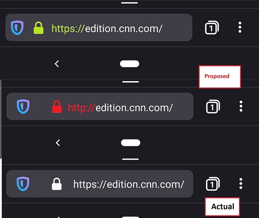
- On the first picture I tried to rearrange the TP, Secure connection and URL position making more space for the text url and I added the green color for
https:// - On the second picture it's the same as actual but added the red color for the
http://insecure connection.
 abodea
All 8 comments
@vesta0 note that the colors maybe are not the right ones(i'm sure there are some other better options for green and red).
abodea
on 10 Oct 2019
Firefox for desktop will change the green padlock for HTTPS to a grey one with Firefox 70. Fenix should not go into the opposite direction.
 cadeyrn
on 10 Oct 2019
cadeyrn
on 10 Oct 2019
Why is the HTTPS protocol even needed when a secure lock is shown? There's already minimal space in the address-bar.
 AaronMT
on 10 Oct 2019
AaronMT
on 10 Oct 2019
My uninformed suggestions...
Please avoid color in the URL bar, or check with users with poor eyesight first. I am pretty long sighted now, with phone at arms length I can see white text but red is really hard.
Check your competitors, Android Chrome & Samsung Internet hide the https and the www and just show "mozilla.org" or whatever.
My experience with casual users is they just look for the padlock icon, they have no idea what https means. If power users want to see the alphabetti spaghetti prefix "https://www." then make it an option which is off by default?
 Cheap-Skate
on 11 Oct 2019
Cheap-Skate
on 11 Oct 2019
I talked to a very smart but non-geeky friend of mine, an iOS (Safari) user
- she has no idea what difference between https:// and http:// means, looking for the "s" character (httpS) to determine site safety seemed absurd.
- she has no idea what www means and doesn't particularly want to see it
- she knows the padlock icon is very important
- she is aware that the url ending should be .com, .org etc and if it's .ru or something it might be sketchy
Just one person so poor statistics, have you guys done any research into this?
My suggestions are to remove the http[s]:// and rely on the padlock, remove the www. where it's safe to do so, and do the Fennec thing of scrolling long urls to show the .com, .org ending
That's what Chrome Android Beta seems to do:-
Chrom, short URL, padlock plus basics of the URL
Chrome, long URL, no padlock (site is not secure) and URL scrolled to show the .com ending

Fenix at the moment shows all the alphabetti spaghetti and virtually none of the useful bit
Cheap-Skate
on 11 Oct 2019
Some of the other Android browsers (Chrome Beta, Samsung Internet, more?) seem to be adopting a two row UI as default, one row just padlock & URL, the other row of buttons home/share etc.
Maybe Fenix needs to accept that you just can't fit everything into one row and have two rows e.g. URL bar with shield & padlock and nothing else + second row with open in app; share; reader; tabs button; 3 dot menu???
Cheap-Skate
on 13 Oct 2019
Add the preference item to firefox android to get a green padlock icon similar to desktop version
security.secure_connection_icon_color_gray
 sheikh-azharuddin
on 29 May 2020
sheikh-azharuddin
on 29 May 2020
Is this relevant anymore? fenix now hides the https://www. part and indicates the http using a broken padlock. Basically what @Cheap-Skate suggested is implemented now. I think this can be closed
 s-ankur
on 22 Aug 2020
s-ankur
on 22 Aug 2020
Related issues
 softvision-miralobontiu
·
3Comments
softvision-miralobontiu
·
3Comments
 topotropic
·
3Comments
topotropic
·
3Comments
 Chris01277
·
3Comments
abodea
·
3Comments
abodea
·
3Comments
Chris01277
·
3Comments
abodea
·
3Comments
abodea
·
3Comments
Most helpful comment
Firefox for desktop will change the green padlock for HTTPS to a grey one with Firefox 70. Fenix should not go into the opposite direction.